How to Optimize Images for 10x Faster WordPress Product Pages
Do you have a WooCommerce store with slow product pages? Images could be the speed bump. Research shows that 60-85% of page load size comes from photos. And excess seconds cripple conversions—a 1-second delay causes a 7% drop in sales!
Properly optimized images can drastically accelerate the loading speed of a WordPress online store. Simple compression techniques reduce file sizes by 50-60% while quickly resizing product images into shape.
A few tweaks unlock quicker page loads, helping you capture more mobile sales instead of losing 53% of tap-impatient visitors.
This guide explores must-know image optimizations for WooCommerce and other WordPress store templates.
- Assessing Image Usage on Your WordPress Site
- Effective Image Optimization Strategies for WordPress
- Automating Image Optimization with Plugins
- Optimizing Image Delivery and Performance
- Conclusion
Assessing Image Usage on Your WordPress Site
The most image-heavy page types demanding optimization are product galleries, banners, slideshows, and blogs with featured images.
Auditing usage starts by identifying where large uncompressed images lurk across your WordPress site. Install an image optimization plugin to analyze every image file type, format, dimension, and size globally.
Flag any images exceeding 2MB and oddly oversized images that appear smaller than their original resolution to achieve optimal compression.
Evaluate if your theme efficiently handles images using best practices like lazy loading and compression capabilities.
Optimization-focused templates incorporate these at the core, while legacy themes rely on plugins requiring manual configuration per page.
Switching to a lightweight theme designed for speed can improve image handling across the site.
Ensure product pages use placeholder icons and CSS image loading techniques to prioritize above-the-fold images before background images further down the page load.
Analyze if huge slideshow banners could work better as focused highlight images with text overlay instead.
Effective Image Optimization Strategies for WordPress
Here are a few hacks for optimizing your WordPress product pages.
1. Resizing and Compressing Existing Images
Resizing and compressing images is a highly effective yet often overlooked optimization strategy for WordPress product pages.
Those massive 5000px wide product photos you uploaded probably display at 800px max.
Resizing them to actual dimensions chops file sizes by 50-80% without quality loss.
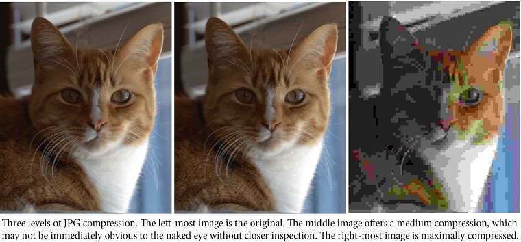
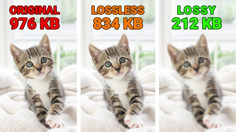
Next, crush sizes further with compression —either lossy for maximum shrinkage or lossless for quality retention.
Using a speed-optimized eCommerce theme puts you in luck.
Most have built-in resizing and compression that preps images as you upload, like a magic optimization genie. Woostroid2 and Styler WooCommerce themes exemplify this performance boosting.
Set it to compress new uploads, too, and watch your product pages load faster without lifting a finger.
2. Converting to Performant Formats Like WebP
WebP's advanced compression squeezes image file sizes by 25-35% compared to standard formats.
But your product photos still look razor-sharp. It's best for faster load times without sacrificing quality.
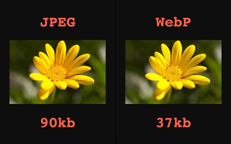
All popular browsers like Chrome, Firefox, and Edge work best with WebP. Your site visitors get a turbocharged shopping experience with no fuss. Easy speed upgrade for your store, done.
Some eCommerce themes, like the slick options from TemplateMonster, have WebP support built right in. If you're using one of those, you're golden.
Just upload your images normally, and poof, they're converted to speedy WebP automatically in the backend.
But if your theme is a bit older or doesn't have the WebP auto-convert, no worries. You can use a handy WordPress image optimization plugin to retrofit existing images to WebP.
It'll also ensure any future uploaded product images get the WebP treatment.
3. Generating Appropriately Sized Thumbnails
Optimizing thumbnail sizes speeds up your WordPress eCommerce site. Create only the sizes you need for your product pages, and ditch the extras generated by WordPress.
It declutters your server, resulting in faster-loading pages and a smoother shopping experience.
Newer TemplateMonster eCommerce themes have this optimization built-in, but plugins like Regenerate Thumbnails can help trim your thumbnail library for older templates. Also, strategically place thumbnails—use smaller sizes in product grids and larger ones on individual product pages to balance speed and visuals.
4. Delivering Responsive Images for Different Devices
Serving responsive images tailored to each device's screen size and resolution ensures optimal visual experiences without bloating load times.
Your high-res product images still pop on laptops, while lightweight thumbnails render quickly on smartphones.
Here are some techniques for optimizing responsive images on your WordPress store:
Responsive Images with "srcset"
The srcset attribute makes images responsive-ready by specifying file sources based on device characteristics.
For example:
<img src="product-500.jpg"
srcset="product-500.jpg 500w,
       product-800.jpg 800w,
       product-1200.jpg 1200w"
sizes="(max-width: 700px) 500px,
      (max-width: 900px) 800px,
      1200px">
Browsers analyze each device's screen size and pixel density to serve the optimal image variation listed in srcset automatically.
Smaller images load on mobiles, while hi-res versions display perfectly on desktops and retina displays.
Configuring srcset is tedious, but handy plugins like Responsive Image Source Control streamline everything for WordPress sites.
CSS Media Queries for Customization
Media queries allow you to tweak images' appearance across different viewport sizes with pure CSS. This fine-tunes responsive images beyond srcset's single-image resizing.
Here’s a basic example:
@media (max-width: 768px) {
.product-image {
width: 300px;
object-fit: cover;
}
}

@media (min-width: 769px) {
.product-image {
width: 500px;
}
}
Styles adjust the .product-image dimensions when the screen hits 768px, preventing mobile overflow. Advanced queries can modify image filters, positioning, and more for granular art direction across breakpoints.
Some responsive WooCommerce themes leverage media queries under the hood. But you can easily enhance any WordPress site with custom CSS.
Responsive Galleries
Product galleries commonly feature image grids or sliders loaded with enormous files—a huge problem for mobile users. Optimizing galleries demands hacking both responsive techniques and compression.
Use the <picture> tag to serve different image versions per viewport. For example, load a lightweight strip version for screens under 600px, mid-size for tablets, and hi-res originals on desktops.
Then, lazy load the images to avoid bloating pages further. WordPress plugins like Smush Pro automatically handle lazy loading and <picture> responsive serving.
Real Device Testing
Of course, armchair optimization only gets you so far. Thoroughly testing your imagery across real smartphones, tablets, and various network conditions is essential.
Tools like WebPageTest and Chrome DevTools do a decent job mocking mobile scenarios—but physical device testing catches real-world bugs that often slip through.
Start by snapping screenshots of your product pages on mobile hardware, like the latest iPhone, Samsung Galaxy, and some popular budget devices. Tweak offending images lacking crisp clarity or efficient compression there.
Then, audit performance metrics like Largest Contentful Paint and First Input Delay from WebPageTest's real device lab. Optimize any laggy outliers weighing down user experiences.
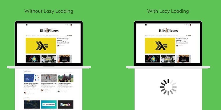
5. Implementing Lazy Loading for Above-the-Fold Images
Lazy loading defers offscreen content like images until users scroll to that area.
This prioritizes only loading images within the viewport—offering an incredible speed boost.
The main benefit is shrinking initial page weight by omitting unnecessary HTTP requests for below-the-fold imagery. Less data requested means blazing-fast load times.
It also improves metrics like:
- Largest Contentful Paint (LCP) by loading critical images promptly
- Cumulative Layout Shift (CLS) since placeholder spaces reserve layout
- Time to Interactive (TTI) with less initial script work
Not all images warrant equal lazy load priority on product pages. You'll want to separate above-the-fold (in the initial viewport) and below-the-fold imagery.
The product gallery shots, featured images, and callout banners demand instant loading for that premium first impression. Meanwhile, user-submitted review photos and related product thumbnails can lazy load later.
How to Implement Lazy Loading
There are three main lazy loading methods for WordPress product pages:
1. Native Browser Lazy Loading
Modern browsers now support the loading="lazy" attribute to automatically lazy load offscreen images/iframes.
<img loading="lazy" src="huge-image.jpg" alt="...">This signals the browser to prioritize other resources until that image enters the viewport. It's easy, Native, and widely supported—but lacks fine-tuned controls.
2. WordPress Plugins
Dedicated plugins give you more robust lazy loading customizations.
These can instantly upgrade your existing content or apply lazy loading rules based on containers, image types/sizes, and viewport calculations.
3. Lazy Load Libraries
For complete programmatic control, use a lazy loading library like LazySizes or vanilla-lazyload. These integrate seamlessly with WordPress via custom code.
You'll need to set up placeholder/blurry image techniques, determine precise lazy loading boundaries with IntersectionObserver, and handle dynamic content additions.
While it's the most complex method, a lazy loading library offers pixel-perfect optimization. Lazy Loading on WooCommerce stores needs some considerations:
- Pre-lazy load initial product gallery shots for a good first impression
- Lazy load product variation imagery until selected
- Implement Native Image Lazy-loading for newly uploaded content
- Many optimization-focused WooCommerce themes like those from TemplateMonster incorporate best-practice lazy loading by default as well.
Native lazy loading is supported in Chrome, Firefox, and Safari—but not older versions of Internet Explorer.
You'll want to lazy load offscreen images using a JavaScript library/plugin with built-in polyfills for full backward compatibility.
This ensures the lazy load experience remains buttery-smooth for all visitors, not just the most current browser crowd.
6. Setting Expiry Times for Browser Caching of Images
Browser caching tells visitors' browsers to hold onto images locally instead of re-downloading them on every pageview.
This reduces server strain from repeat image requests and shrinks bandwidth needs. Plus, it accelerates load times since files are readily available from the cache.
Identifying Image Files
Not all images warrant the same caching treatment. You'll want to categorize which ones to cache aggressively versus which need more frequent refreshing.
Product galleries and marketing banners are prime candidates for extended caching periods since they rarely change.
But user-uploaded review photos should be cached for shorter durations to stay current.
Setting Expiry Times in WordPress
Most caching plugins make expiry customization straightforward. WP Rocket, for example, allows setting image cache lengths up to one year.
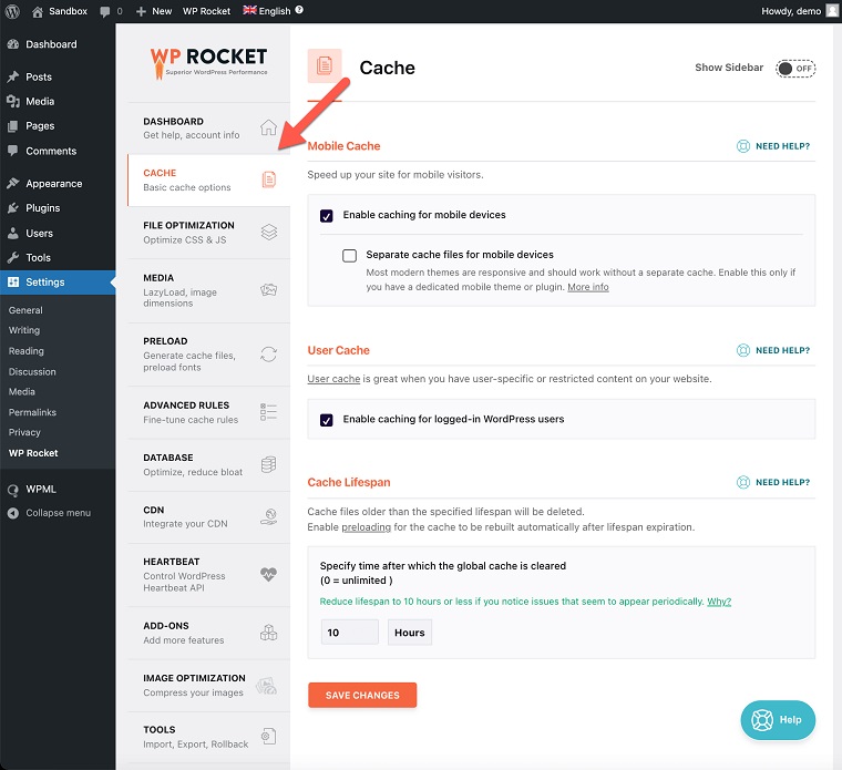
Adjust the Cache-Control headers to determine how browsers and intermediary proxies should treat cached files.
Cache desktop images for one year but mobile devices for a month to account for device/network differences.
Expiry Time Considerations
Consider caching images long enough to reap maximum speed benefits while invalidating the cache when you update product photos.
Overly aggressive cache expiration leads to stale content serving. It's too conservative, and you're revving the server needlessly with all those image re-requests.
Therefore, continuously monitoring cache hit rates and viewer patterns is crucial.
Analyze metrics from your server logs and browser DevTools to optimize those cache expiry times iteratively.
Automating Image Optimization with Plugins
WordPress plugins automate image compression, resizing, and format conversions.
With a few clicks, these handy tools will strip out excess metadata and optimize imagery behind the scenes. Saving you serious effort while delivering lightning-fast page loads.
Compact file compression and next-gen format conversion are the core functionalities of any optimizer worth its salt.
Bloated product shots get crushed down to their leanest possible sizes.
Most plugins employ lossy and lossless compression algorithms to balance maximum size savings and quality retention.
They'll also transcode images to hyper-efficient formats like WebP behind the scenes.
The best plugins automate optimization on new uploads and site images.
Adding new images through the WordPress Media Library gets compressed, resized, and converted in the background.
While many optimizers work great in their default settings, tinkering with the settings can make your WordPress site even faster. You can fine-tune:
- Compression levels for lossy/lossless quality
- Desired image format output (WebP, JPEG, PNG)
- Automated resizing dimensions for different usage
Bulk operations are also available to crunch existing product galleries and past uploads simultaneously.
For e-commerce sites, nailing those visuals is key—but optimizing every product shot for performance is a massive time drain.
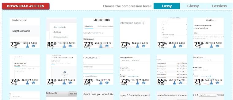
That's where tools like ShortPixel shine by automating the whole process.
This WordPress image optimization plugin uses smart compression and resizing to slash file sizes by up to 80%, all while keeping quality pristine. It'll even convert your images to WebP format behind the scenes for crazy fast delivery.
The tool doesn't just optimize new uploads; it also retroactively works through your entire existing media library. While advanced settings are there if needed, most stores see massive wins just from its automated defaults.
By integrating this tool, you offload that repetitive optimization grind, freeing you up to focus on other growth priorities.
All while delivering lightning-quick product galleries that create an unbeatable browsing experience for customers. For visual-heavy e-commerce brands craving maximum speed, ShortPixel is a no-brainer optimization move.
Optimizing Image Delivery and Performance
From leveraging content delivery networks to enabling next-gen image formats, various techniques maximize image performance for your WordPress site.
Let's dive into some key strategies:
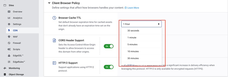
Serving images from a CDN
Even with compressed, next-gen image formats like WebP in play, efficient delivery is crucial for top-notch WordPress performance.
That's where scaling image optimization through CDNs and fine-tuning delivery rules come into play. Instead of serving all your product imagery from a single server location, offload that to a content delivery network (CDN).
CDNs use distributed data centers around the globe to cache and serve files as close as possible to the end user. This minimizes latency and speeds up delivery times drastically compared to origin hosting.
Setting up a CDN integration for image delivery on WordPress is straightforward:
- Sign up for a WordPress-friendly CDN service
- Follow their instructions to set up a pull zone for your domain
- Update your WordPress settings to use the CDN URLs
- Optionally, adjust CDN behavior like cache control headers
All your product images will be rapidly distributed worldwide from the CDN's Cloudflare network. CDN services also include image conversions to WebP format, resizing, and compression.
Enabling WebP Images with .htaccess
The WebP image format packs the same visual quality at significantly reduced file sizes courtesy of Google's advanced compression algorithms. It can shrink payload by up to 35% versus standard JPG/PNG.
While WordPress core doesn't natively handle WebP yet, enabling support is a simple .htaccess tweak away:
<IfModule mod_rewrite.c> RewriteEngine On RewriteCond %{HTTP_ACCEPT} image/webp RewriteCond %{DOCUMENT_ROOT}/$1.webp -f RewriteRule (.+)\.(jpe?g|png)$ $1.webp [T=image/webp,E=accept:1] </IfModule> <IfModule mod_headers.c> Header append Vary Accept env=REDIRECT_accept </IfModule>

AddType image/webp .webp
This ruleset checks if the visitor's browser supports WebP, then serves the WebP version when available—resulting in leaner image payloads.
You can automate WebP conversion using a plugin. Or use an all-in-one WordPress CDN with built-in support.
Scaling Image Optimization for WooCommerce
WooCommerce stores pose unique image optimization demands with dozens of product galleries, thumbnails, and user uploads to account for. You'll want a solution that scales images effortlessly:
- Automated WebP conversion and CDN serving
- Cloud-based optimization minimizing server load
- Background compression for massive uploads
- Intelligent handling of image metadata/EXIF
Managed CDNs specializing in WordPress have you covered. Their dedicated WooCommerce workflows crush images while enhancing delivery.
Conclusion
You just leveled up your WordPress store's performance by implementing multiple image optimization techniques. Image optimization is never truly "done." It's an endless cycle of monitoring, analyzing, and refining as your store evolves.
Images remain the heaviest asset, dragging download times. Unoptimized bloat continually creeps back in as you redesign product pages, run promotions with new banners, or expand to different gears.
Make a habit of analyzing and tweaking those optimization levels regularly.
Left unchecked, images pile up quickly—sabotaging the lightning-fast, app-like shopping experiences you've worked so hard to create.
Read also:
8 Effective Ways to Optimize Your Website for Mobile Speed
Web Design Trends: Are You Ready to Optimize Your Website and Increase Conversions?
40+ Best Drag and Drop WordPress Themes that Stand Out
Don’t miss out these all-time favourites
- The best hosting for a WordPress website. Tap our link to get the best price on the market with 82% off. If HostPapa didn’t impress you check out other alternatives.
- Monthly SEO service and On-Page SEO - to increase your website organic traffic.
- Website Installation service - to get your template up and running within just 6 hours without hassle. No minute is wasted and the work is going.
- ONE Membership - to download unlimited number of WordPress themes, plugins, ppt and other products within one license. Since bigger is always better.

Karol Krol is a seasoned web development and digital marketing pro boasting over 20 years of industry experience. He's the author of the ultimate WordPress guide, "WordPress Complete," and a contributing writer at ShortPixel, where he provides expert tips on image optimization and website performance. Karol has lent his expertise to renowned publications like Smashing Magazine and WebsiteSetup.org. He has worked with prominent companies, including Automattic, Adobe, Ahrefs, and WPAstra.com, mastering critical skills in website design, content creation, SEO, monetization strategies, and beyond.
Get more to your email
Subscribe to our newsletter and access exclusive content and offers available only to MonsterPost subscribers.
