Color Theory Explained: What Color Scheme Should I Choose?
Picking the right color scheme for your project may be a real pain, so we decided to make a small guide for you.
Interaction of colors is by all means one of the most important parts of your website design. I’m sure that many of you think: “Is there any way to make my life easier? Can I stop wasting tons of my time on choosing the right colors?”. And the answer is ‘Yes!’.
This article will come handy for those who make their first steps in web design or just simply want to upgrade their design skills and learn something new. Just think about it while creating your color palette: there are 10 million colors you can choose from. Doesn’t it sound fascinating to you? I bet it does.
First, let me introduce someone: Haaave you met the Color Wheel?
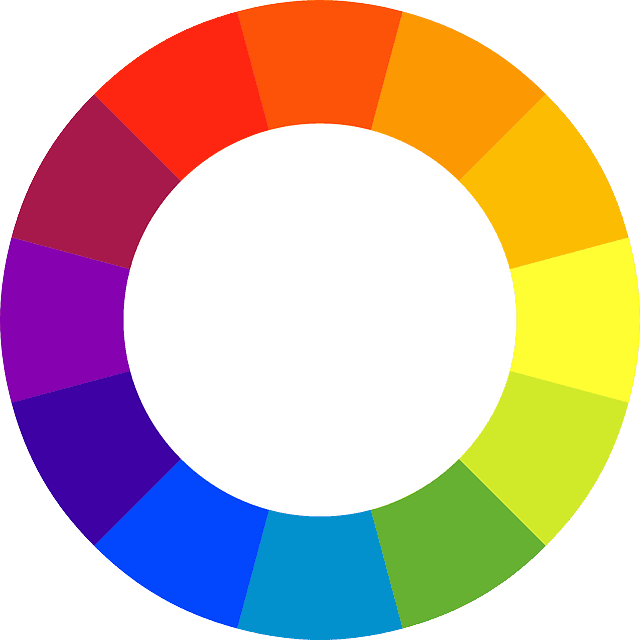
Yeah, this fella will be your best friend in your colorful journey, and it will help me to illustrate the basic formulas of color harmony.
The colors on the wheel above are divided into the following groups:
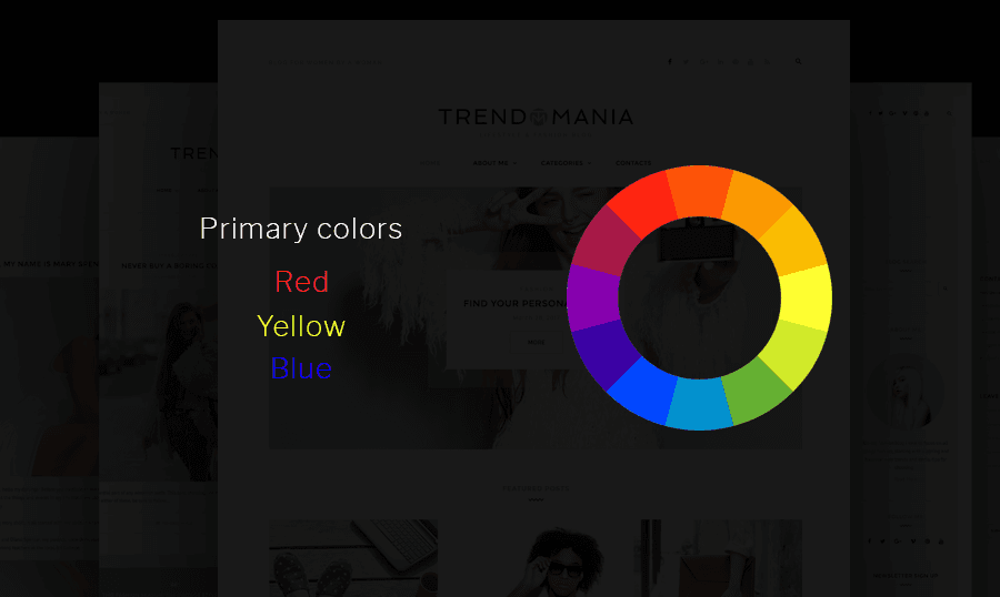
- Primary colors (Red, Blue, Yellow)
- Secondary colors (Orange, Green, Purple)
- Tertiary Colors (Any Primary Color + one Secondary Color)
All these colors are pure (you may also call them ‘saturated’) colors. Their pureness is intended to emphasize the intensity, brightness, and cheeriness.
The foundation of color theory includes three pillars: Complementation, Contrast, and Vibrancy. It may sound complicated, but it’s easy as pie, let me explain.
- Complementation is the way we see the relations between colors.
- Contrast is a great thing; its main purpose is not letting your website users die in agony of eyestrain.
- Vibrancy helps us to affect users’ emotions and attract them to something.
Color Harmony
Let’s dive deeper and check out the ways you can combine the colors and get yourself an eye-catching color scheme.
These are the pairs of colors on the Color Wheel that have a strong relationship. If you place them next to each other, you’ll see that they make the other look more intense and just brighter. That’s what is called the complementary colors.
Split Complementary
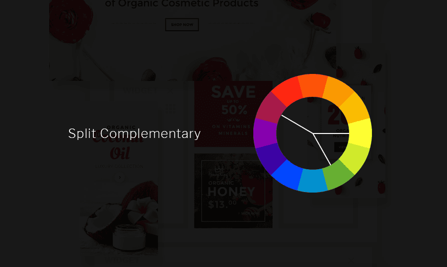
This type of color-scheme consists of three colors and is created the following way:
- Choose the main color of your future color scheme
- Select two other colors which are located on either side of its complementary color
The main idea of the Split Complementary is quite easy: since we are taking the opposite colors, one color will always be warm, and the other one will be cool. These colors will complement each other and create a great contrast.
via Bureau Oberhaeuser on Dribble.com
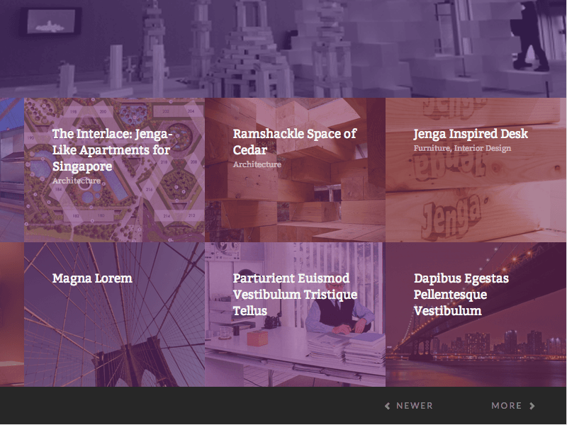
Analogous Complementary
This type of color scheme includes three or more colors that are selected one by one on the color wheel; they are always positioned next to each other.
Analogous color schemes please the eye and look pretty harmonious. If you want to check them out, just go out and enjoy the nature, that’s where you can find these type of color schemes.
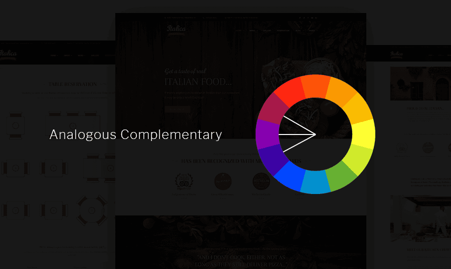
Once you decided on your ‘Mother Color’, just follow the color wheel and select as many additional colors as needed. Oh, and also, while choosing the colors make sure you have enough contrast.
One color will dominate, the second one will be supporting it, and the next one will help you work with the accent.
via Edin Vejzovic on Dribbble.com
Triadic Complementary
This type of color scheme includes the colors that are evenly placed on the color wheel. Just draw the triangle, and you’ll get yourself a color scheme.
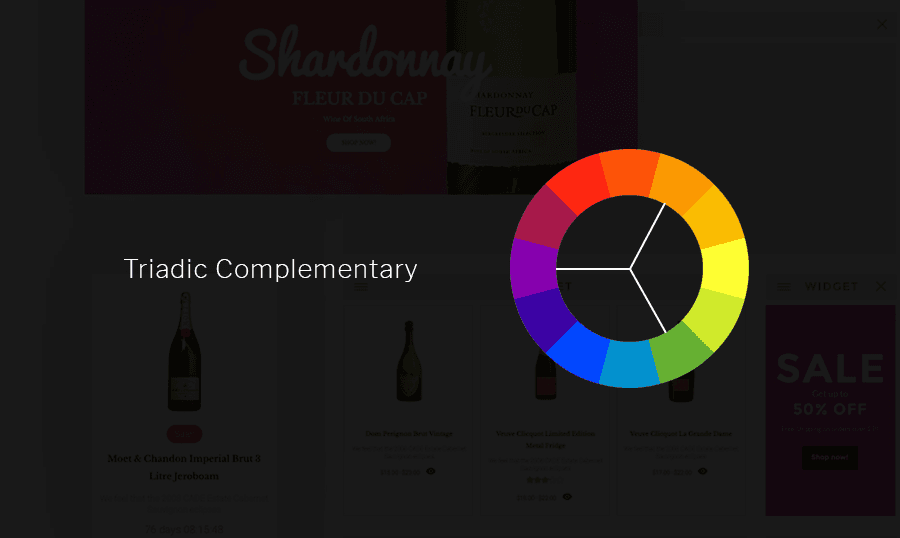
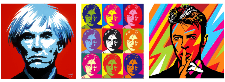
It doesn’t matter if you use a very pale version of the hues, you will still get pretty vibrant color scheme. Such schemes are usually used in pop-art and poster-like design.
Usually one of the colors just dominates, and the other two are used for accent, this is the right way to use the triadic color theme, note somewhere!
Monochromatic color scheme
Personally, I’d say that this is the simplest one. So here is what you gotta do to get yourself a Monochromatic color scheme:
- Pick one color
- ….
- Profit!
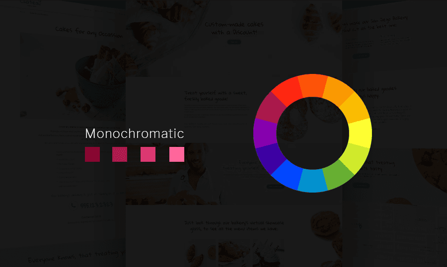
Just kidding. Once you’ve chosen the main color, you should just play with different variations (darkness, lightness) of this color. It will help you get your design a very calm and relaxing look.
via Eric E. Anderson on Dribbble.com
How To Use Contrast Correctly
I don’t think that it will be fair to discuss color techniques and leave the contrast without our attention. Contrast matters and is more than just important. This is one of the things that will get you in trouble with your client or designer. The contrast will always be discussed and will always give birth to lots of fights.
And we won’t even go too far. Last week I finished one of my design projects and decided to show it to several friends. You will be surprised, but each person told me something different about the contrast. Someone thought it’s amazing; someone thought that it’s not quite alright and my other friend told me that I gotta work on contrast and fix it. Otherwise this design looks ridiculous.
So as you can see, the contrast is something worth mastering if you want to make designs that everyone will enjoy and adore, so let’s dive deep into basics and go from there.
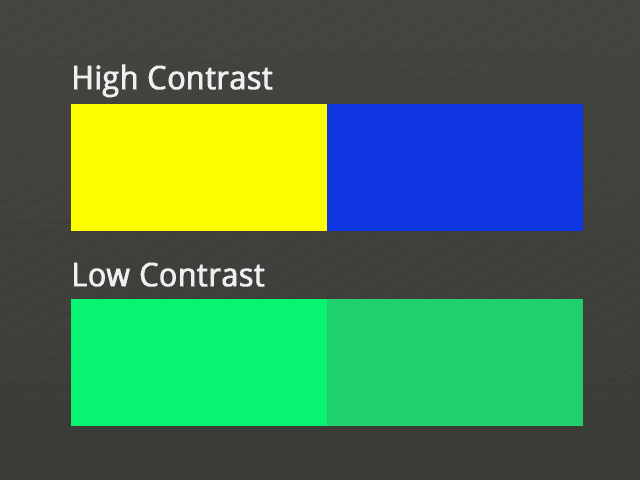
Contrast helps us to distinguish one color from another. This is how two colors stand apart from each other.
For me, this is a very sensitive topic. As you remember from one of my articles, I hate when people make it impossible to read the content on the website. And I truly hate when designers neglect the basics of contrast.
One of the most popular mistakes is thinking that if you have two different colors, you will have correct contrast. Oh damn, it’s so not true. If they are in the same tone, you are screwed, buddy.
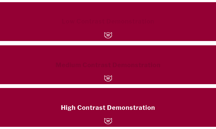
High And Low Contrast: What Fits You Best
This paragraph will be short, but still comprehensive enough, trust me.
If you are trying to get ahold of the customers’ attention and throw it at something very important - use high contrast. It will help you highlight the important information and make it eye-catching.
That’s what usually make content readable. Dark on Light and vice versa work best for that purpose.
An important thing to keep in mind: if you use high contrast all over your design, you will not highlight anything. It’s like trying to stand out in a crowd by wearing the same cloth as everyone.
And please, don’t try to be too creative in the blog posts and longreads. There is no need to reinvent the wheel and make the overall reading experience feel like a bad trip.
Your Life Can Be Easier!
Adobe Color CC
Guys, look around before reading this. It’s 2017 year, and everything gets automated, everything gets easier. I guess that’s the reason why such things like Adobe Kuler appeared. This is an amazing tool that will make it so easy to choose the right color scheme for your project!
As you can see, they use the same rules: Analogous, Triadic, Complementary and Monochromatic methods. And depending on the color, you choose Color CC will create a color scheme with the colors that will work with each other perfectly.
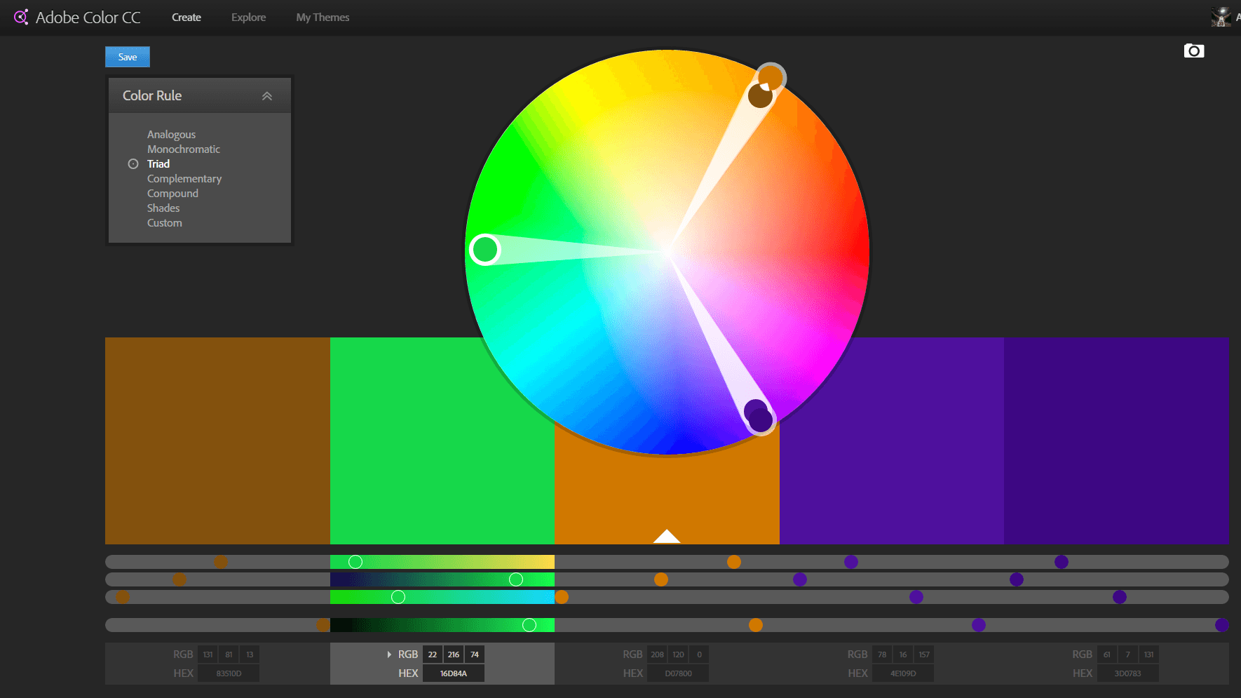
On top of it, you will get the all the color codes for the needed colors including the hexadecimal codes.
Paletton
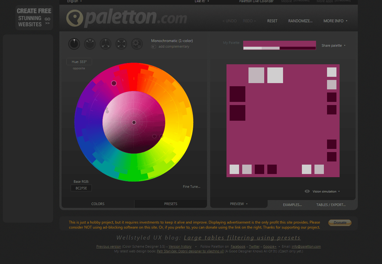
Paletton will be a perfect choice for the absolute beginners and someone who is in a hurry. It’s just simple in use and provides with some cool feature like changing the saturation of the whole color palette by a single move of your mouse.
However, if you are trying to get into Color Theory and learn something new - it should not be your primary choice since it does all the work for you and doesn’t teach you why the colors work with each other so good.
Case Study
Alright, folks, let’s take a look at the real website and determine what type of the color scheme is used there! I decided to show you one of my most favorite media websites - The Verge. Once you enter their website - you’ll notice that they use a solid black color to play with the contrast and highlight the news section for your best convenience.
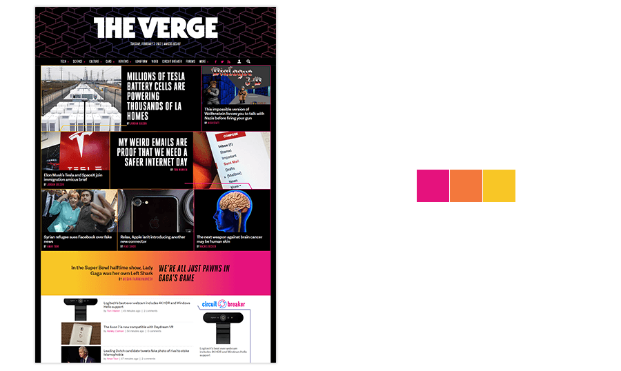
On the top, they have a showcase with the most interesting articles, and as you can see, they highlight each block with one of the colors from their brand palette.
Right after the showcase, you can see a single article showcase. What’s so interesting about it? The background of this block is a gradient that shows us the main palette of The Verge project.
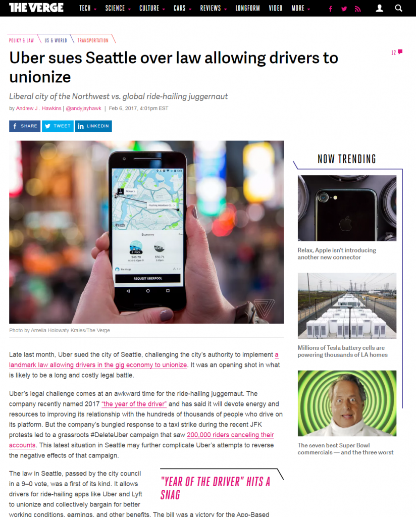
Once you enter any article or news, you will be sent to the page with nothing but black text and white background. And only links and headings will be highlighted with the other color. That’s a great minimalistic approach that, I think, should be used by mass media projects and magazines.
Here is what 'The Verge' team says about their new color scheme and redesign in general:
We've updated our entire design to be slicker, faster and more illuminating. All that 70's sci-fi orange is evolving into a new design language we're calling the 'Pathways' - bright laser lines that illuminate the stories we tell about the future. We think it looks like a neon sci-fi dream. We live in the future because there’s nowhere else to go.
Summary
The color is something you should carefully and attentively study. This is the backbone of successful design.
Unfortunately, you cannot determine what color scheme will work the best and will give you the best conversion, so you gotta test.
Don’t be too afraid to experiment and test out new color variations. But remember: your customer is not trying to have a bad trip, he just wants to read the content and interact with your website without a headache 🙂

If you are not sure what color scheme to use or how to design your website, just leave this headache to us! We have plenty of ready-made solutions designed by top quality designers and just passionate people with amazing skills and experience!

Creative writer passionate about WordPress and all that technical stuff. Meet Alex in person on LinkedIn.
Get more to your email
Subscribe to our newsletter and access exclusive content and offers available only to MonsterPost subscribers.

Leave a Reply
You must be logged in to post a comment.