CSS Grid: The New Way of Building Web Layouts
Have you heard of CSS Grid, the new technology for building web layouts? Perhaps after the introduction of Flexbox you thought that there would be no other big layout entity coming our way soon, but it turned out that Flexbox was only the beginning, and the real layout system was yet to come.
Meet CSS Grid, the most powerful CSS module that introduces us to a totally new way of building website layouts.
One thing that should be pointed out is that CSS Grid is not a replacement of Flexbox. On the contrary, they work very well together and allow for more versatile layout combinations. While Flexbox excels in 1D space, Grid gives you a mastery over 2D layouts.
Browser Support
Since CSS Grid is a still developing technology, the browser support is limited. If you’re using Chrome or Firefox, your browser has to be updated to the latest version (Chrome 57 and Firefox 52). IE 11 and Edge have only partial support with prefix -ms-.
| IE | Firefox | Chrome | Opera | Safari |
| 11 | 52 | 57 | 44 | 10.1 |
It is still a little early to use CSS Grid in production, however right now is the best time to learn it.
What Does CSS Grid Consist of?
There are several Grid components of which you should be aware when building Grid-based layouts.
Grid Cell
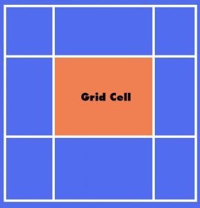
Grid cell is a basic measurement unit the grid consists of. It is a space between two adjacent row and column lines.
Grid Line
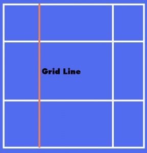
Grid line is a divider that separates the grid into columns and rows. There are vertical and horizontal grid lines.
Grid Area
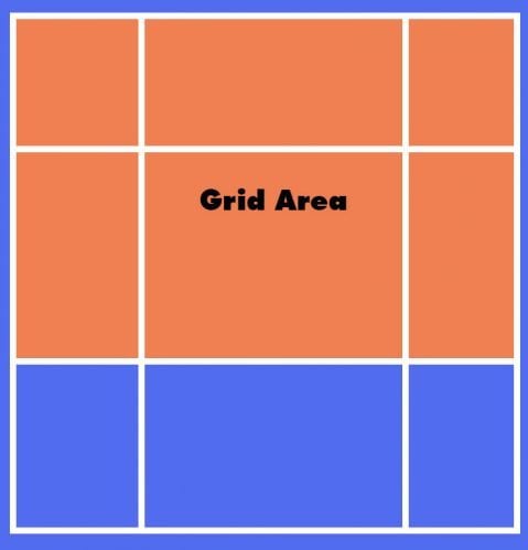
Grid area is a collection of adjacent grid cells that occupy a certain space in a grid. It can be comprised of any number of grid cells.
Grid Track
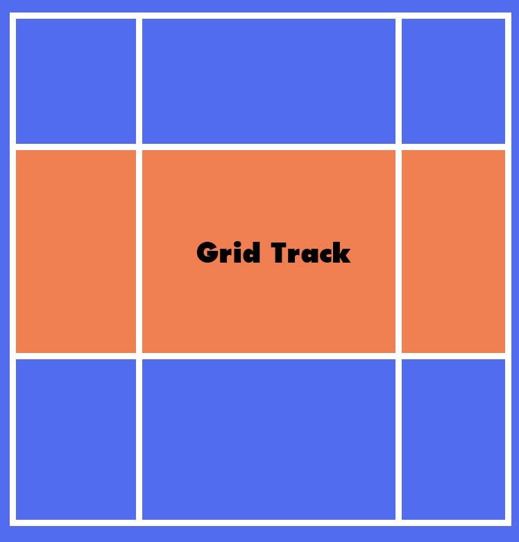
Grid tracks are basically grid columns and rows. They are comprised of space between two adjacent grid lines.
Columns and Rows
In its essence columns and rows, or grid tracks, are the main Grid elements. This may be reminiscent of old-school table layouts, however Grid takes a completely different approach.
In order to create a grid layout we have to pick a grid container element that would hold all the grid child items. Then we assign the display property to grid, like so:
.container {
    display: grid;
}
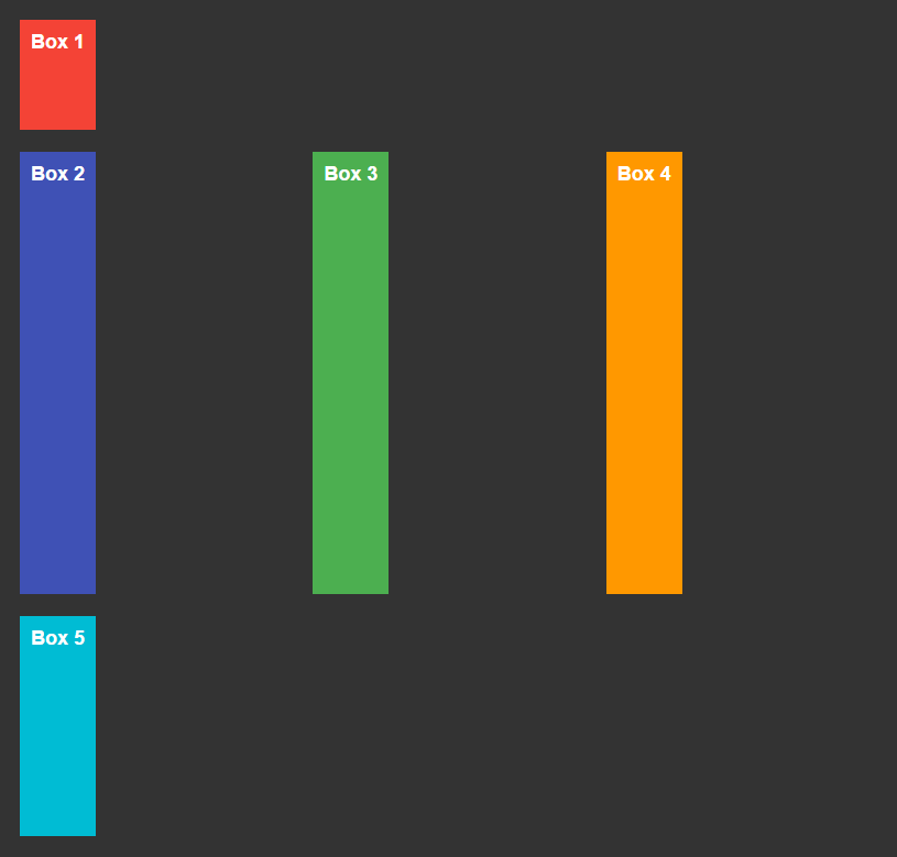
Now we can divide our container into as many rows and columns as we need. Let’s start with columns.
In order to do this we assign a list of values to the grid-template-columns property. The values can be represented in length units, percentage or fr units, which contain a fraction of a free space of the grid (I’ll cover the fr unit below in this post). For example, here I divide the grid into 4 columns.
.container {
    grid-template-columns: 20% auto 15% 10%;
}
A similar thing goes with rows, except we cannot use percentage unless our container has a specified height.
.container {
    grid-template-rows: 100px auto 200px;
}
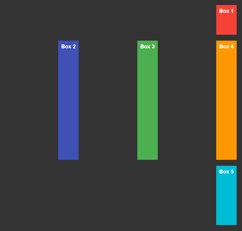
The result would be something like this:
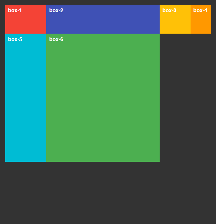
The container is divided into 4 columns and 3 rows. All the grid cells are stacked horizontally, and we can see an empty third row below.
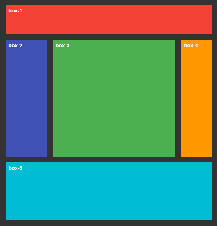
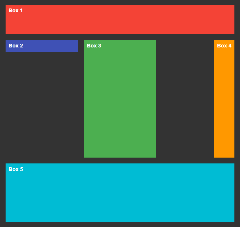
Specifying Grid Cell Position
When we divide a grid into columns and rows we create vertical and horizontal lines.
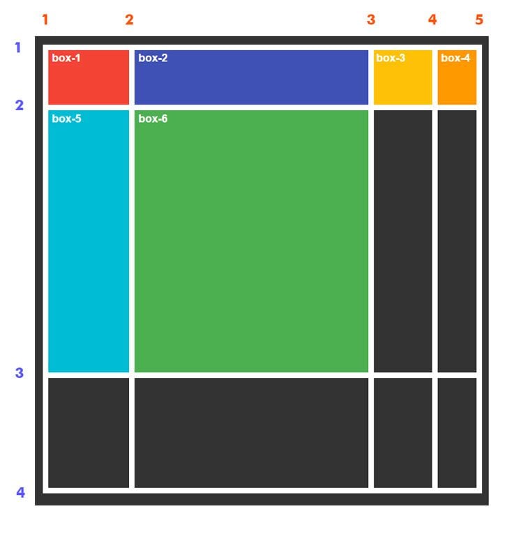
These lines can be used to control the position of grid cells. For example if we want box-1 to stretch through the whole first row, we assign the following set of rules to the grid child element:
.box-1 {
    grid-column-start: 1;
    grid-column-end: 5;
}
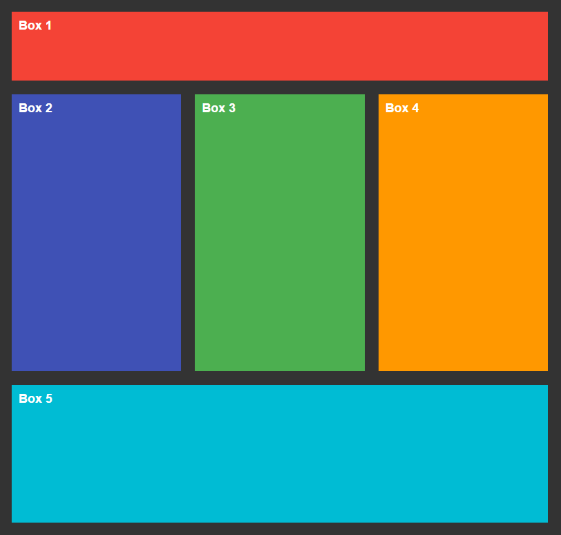
With the help of properties grid-column-start and grid-column-end we specify where the cell should start and where it should end, correspondingly. Now our box-1 element is stretching through the first row of the grid from the first to the fifth line:
Notice how the other elements moved 3 sections to the right and occupied a previously empty space.
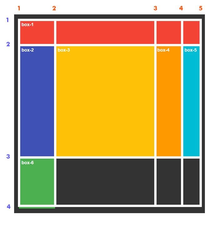
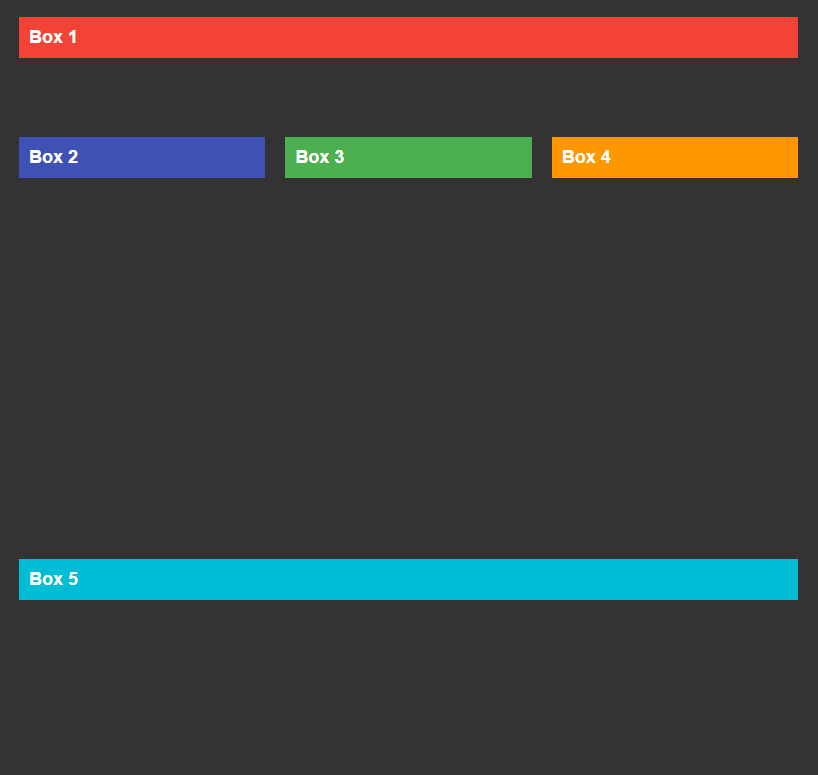
Similarly we can manipulate the rows using properties grid-row-start and grid-row-end. For example if we want the second box to span through the second and third rows we can specify that by using the following styles:
.box-2 {
    grid-row-start: 2;
    grid-row-end: 4;
}
You can use a shorthand for grid-column-start and grid-column-end properties, which is grid-column. It accepts values separated by a forward slash, for example if we want box-1 to span from the first to the fifth line we write this:
.box-1 {
    grid-column: 1 / 5;
}
The same applies to grid-row-start and grid-row-end. You can use grid-row as a shorthand instead.
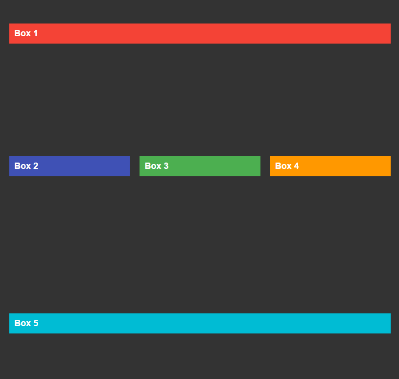
Grid Line Names
When building a grid there’s no need for us to use only numeric values to refer to certain grid lines. We can specify the line names ourselves. Instead of using numbers we can use more descriptive values.
Each line name is written in square brackets before and after a column or row.
.container {
    grid-template-columns: [col-1] 20% [col-2] auto [col-3] 20% [col-4];
}
We can also specify multiple line names for the same line.
.container {
    grid-template-rows: [row-1-start] 100px [row-1-end row-2-start] auto [row-2-end];
}
Once we have specified new line names we can use them in our styles:
.box-4 {
    grid-row: row-1-start / row-2-end;
}
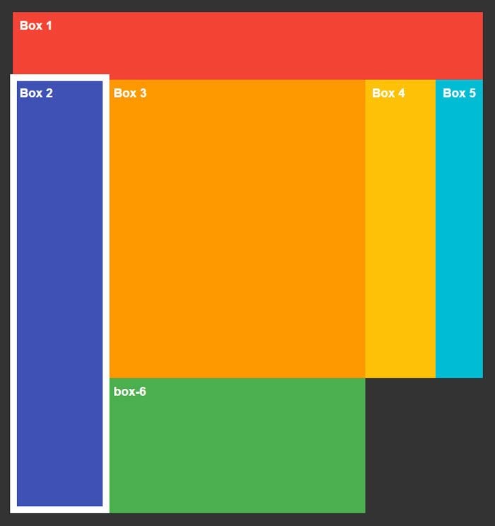
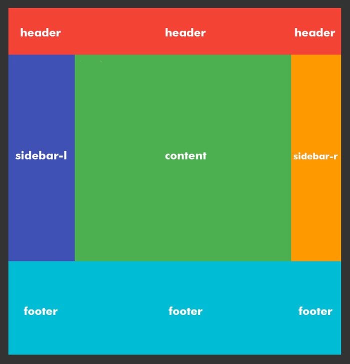
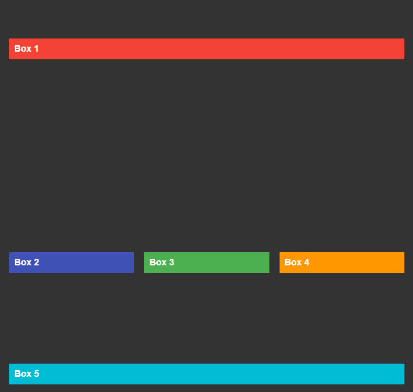
Grid Template Areas
Besides grid-column and grid-row properties which we apply to a grid child element, there’s another way of managing the position of grid cells. It involves specifying so called grid template areas. We do it with the grid-template-areas property accordingly.
.container {
    grid-template-columns: 20% auto 15%;
    grid-template-rows: 100px auto 200px;
    grid-template-areas:
        "header header header"
        "sidebar-l content sidebar-r"
        "footer footer footer";
}
In the above example, we’ve created 5 different template areas. We can name them however we want. If we want certain areas to occupy multiple cells, we repeat them multiple times.
In the example, our header and footer areas have to stretch horizontally across three columns, that’s why I repeated each area three times.
The next step would be to assign the template areas we’ve just created to our child elements using grid-area property:
.box-1 {
    grid-area: header;
}
.box-2 {
    grid-area: sidebar-l;
}
.box-3 {
    grid-area: content;
}
.box-4 {
    grid-area: sidebar-r;
}
.box-5 {
    grid-area: footer;
}
Basically we’re telling each of our grid elements what grid area it should occupy. The result would look as follows:
Grid Gap
We can decide if there should be an empty space between grid cells by assigning values to grid-column-gap and grid-row-gap properties.
.container {
    grid-column-gap: 20px;
    grid-row-gap: 15px;
}
The same can be achieved with the grid-gap property, which is a shorthand for grid-row-gap and grid-column-gap. The first value is a row gap, the second is a column gap.
.container {
    grid-gap: 15px 20px;
}
fr Unit
Earlier in this article I mentioned a new fr unit, that is used to measure grid tracks. Instead of using percentages or pixels, CSS Grid introduces a new measure unit that consists of a fraction of the available space in the grid.
For example if we want to divide a grid into 2 identical columns we write:
.container {
    grid-template-columns: 1fr 1fr;
}
If the first column has to be twice as big as the second one, we can assign 2fr to it. Layouts with fr units are responsive and change according to the container size.
Another great thing about fr units is that they can be combined with non-responsive units like pixels:
.container {
    grid-template-columns: 2fr 1fr 100px;
}
If we decrease the size of the container, the third column would preserve its width of 100px, while the first two would shrink according to the size of the container.
Repeat Notation
If your grid layout contains some repeating parts you can use repeat() notation to make your code more readable.
For example instead of writing this:
.container {
    grid-template-columns: 1fr 1fr 1fr 1fr;
}
You can write this:
.container {
    grid-template-columns: repeat(4, 1fr);
}
In the first parameter of the repeat() function you specify how many times you want to repeat a track, the second parameter would be the size of the track itself.
You can also combine repeated tracks with ordinary ones.
.container {
    grid-template-columns: 100px repeat(3, 1fr);
}
Justify & Align Items
The content of the grid can be positioned according to the column and row axes. We do this with the help of justify-items and align-items properties. Depending on which one we use, the grid cell wraps around the existing content and the rest of the space remains empty.
If we want to adjust the content to the column axis, the property we need to use is justify-items. It should be applied to the container element, and takes one of four values: start, center, end or stretch (default value).
Here are examples of justify-items set to one of the four values.
Justify Items
Start
.container {
    justify-items: start;
}
Center
.container {
    justify-items: center;
}
End
.container {
    justify-items: end;
}
Stretch
Since stretch is the default value we don’t see any changes made to the grid cells.
.container {
    justify-items: stretch;
}
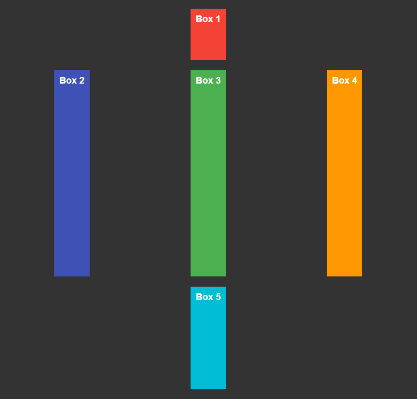
Align Items
A similar principle is applied if you want to position content relative to the row axis, only now you have to use the align-items property.
.container {
    align-items: start | center | end | stretch;
}
Here’s how the grid cells would look with different values of align-items:
Start
Center
End
You will notice how the red box-1 almost doesn’t move; that’s because it is positioned in the first row, which is rather narrow. Most of the changes are seen in the second and third rows.
Justify & Align Self
In the examples above we applied justify and align rules to the container element, with the result that every grid cell has been modified.
But what if you don’t want to change all the grid elements, and only apply those rules to a few grid cells?
In this case you can use justify-self and align-self properties that do exactly what justify-items and align-items do, but you use them for child elements of the grid. For example:
.box-2 {
    align-self: start;
}
.box-4 {
    justify-self: end;
}
Here we’re aligning the second box to the top and moving the fourth box to the right, while all the other elements stay in their place.
Minmax Function
In the CSS grid layout there is a way for us to specify a minimum and maximum width of a grid track using minmax() function.
For example if we don’t want our column to be less than 50px wide, we could do something like this:
.container {
    grid-template-columns: minmax(50px, 1fr);
}
In fact, we could also combine minmax() with the repeat() function and define a minimum width for multiple columns:
.container {
    grid-template-columns: repeat(3, minmax(50px, 1fr));
}
Further Reading
For further exploration of CSS Grid features you can check out Grid by Example, a great resource by Rachel Andrew, and official documentation.
Hopefully, this tutorial has helped you get acquainted with CSS Grid and learn about this new awesome way of building web layouts.
Good luck with implementing CSS Grid in your future projects!

I like to create websites from the ground up, coding them carefully with HTML and CSS. Sometimes even the best and professionally created templates need some coding tricks. And here is my Quora account.
Get more to your email
Subscribe to our newsletter and access exclusive content and offers available only to MonsterPost subscribers.

Leave a Reply
You must be logged in to post a comment.