Which Of These Design Gaffes Is Your Website Guilty Of?
When it comes to designing a website, there’s a tendency to follow the look of the season. Be it endless scroll, minimal copy, or the eye-catching parallax scrolling sites, every fad gets adopted fervently as soon as it gets the seal of approval by design gurus of the web.
However, in our hurry to churn out the most on-trend site of the year, we sometimes tend to overlook some very basic things that lay wasted to our best laid plans. Here are my top picks.
Jarring, too over-the-top design
Design is meant to help user navigate your website with ease while adding some artistic flair and personality to the site. Getting carried away with the ‘artistic flair’ bit, can be a bad idea. Especially if various design elements combine to overwhelm the user and stump them on things as basic as finding a Call to Action or moving on to the next page.
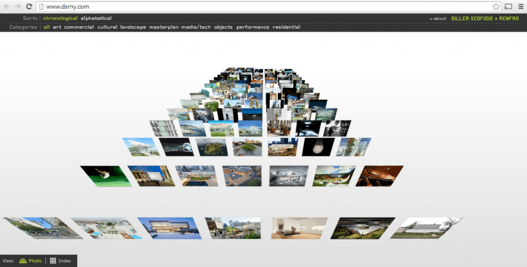
Design gone overboard: Figuring out what to do on this website is a real dilemma.
As a rule of thumb, try and use one standout design element that forms the axis around which the rest of your web design revolves. Anything more and your design – not your content – will be the focus of user’s attention. This is something that can take away your site conversions.
Advertising overload
Your website is a showcase for your products and services. While it’s OK (but not recommended) to have third-party ads on your site, try and keep them to a minimum. Ads do bring in critical revenue to your site, but it’s a call that you have to take – would you prioritize someone else’s brand over your own? The last thing I personally would want is a visitor to my site seeing a random ad and clicking away to some other site.
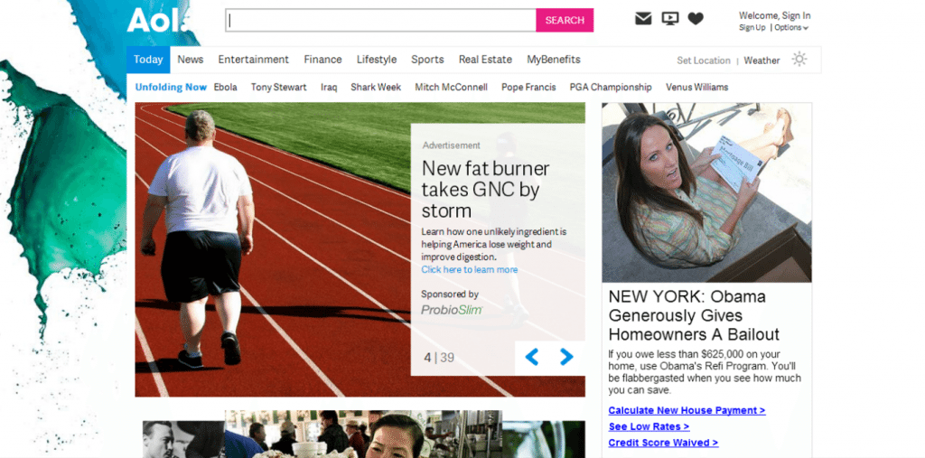
The two articles that take centre stage on the top scroll of AOL’s homepage are both ads. Not their smartest idea.
Another problem that every web user, without exception, hates is seeing pop-ups across the site. This could be an in-house pop-up or worse, an advertising pop-up. Whatever the case, avoid them like the plague. They mar the user experience on your site.
If you have to catch user’s attention and yet outwit pop-up blockers that have now become standard on most modern web browsers, use lightboxes instead. Lightboxes are cleaner and lighter than pop-ups, work on JavaScript, and are not blocked by browsers (unless JavaScript is disabled). They are simple (and free!) to install and have lately become quite popular as email collection tools on many websites.
Pages that don’t load right
Even more frustrating than pages that are scattered with ads are pages that take forever to load or those that break up while loading. Besides being an extremely fundamental error that leads to key content not being displayed to users while they’re on your site, this can mean that your code may not be compatible with all browsers, but it can also indicate more worrying problems like vulnerabilities in your website code. This can lead to not just the obvious security problems and visitors moving on from your site, but de-indexing from search engines as well.
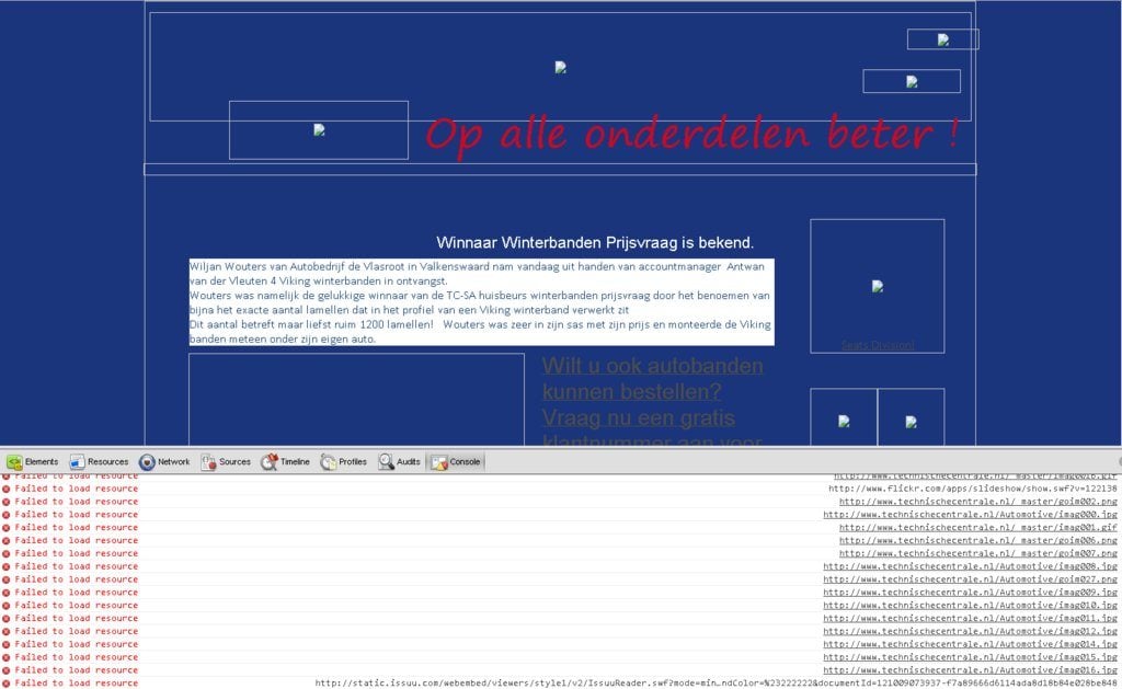
Make use of source code analysis tools such as CheckMarx to ensure that every page on site loads as it is meant to, and more importantly, that your website is protected from the latest security threats out there.
Overlong forms & checkout process, compulsory registration
When you have your user on the website, it truly is tempting to get every piece of information about them as possible. This rich profile information can then be used to customize user experiences across your site and improve conversions.
With these noble ideas in mind, a lot of websites go overboard quizzing their users for information that is not relevant for the current transaction. Avoid this rookie mistake.
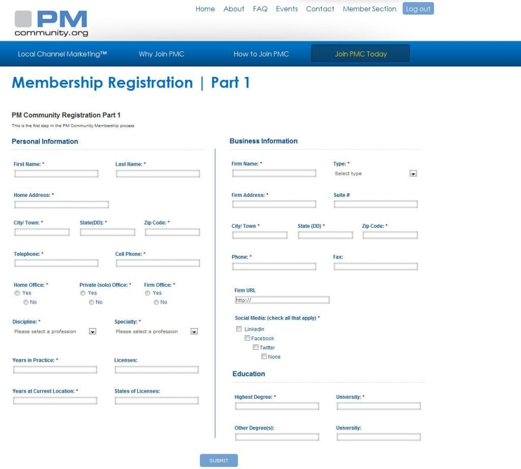
Too many form fields, too much information being sought.
Torturing potential customer by making them fill out endless fields in a landing page, form or a registration form is a sure fire way of losing them. Just as long registration forms are best avoided, so are long drawn checkout processes.
An ideal checkout process
- is short
- asks users only bare minimum information to charge them for the purchase and deliver the items
- avoids taking customers out of the checkout process for another purchase or creating a registered user account
- is enclosed and self-contained to avoid any distractions from the purchase process
- provides a progress indicator to show how many more steps are left to complete the transaction
- offers the requisite security (and displays seals as proof of a safe website to transact with)
Another no-no is forcing all users to register on your site. Offer guest checkouts – it's a sound design practice that gives real results. According to a study by Econsultancy, online fashion retailer Asos halved its cart abandonment rate at the registration page by removing any mentions of creating an account.
Outdated content, content not proof read
If your website is where your brand showcases itself, don’t you want the latest and best that your brand has to offer to be up on display? Many businesses, typically those that are primarily offline in nature, have websites that do not display their latest models or most updated services.
Granted that such websites do not sell anything online, but a website is more than an online store. It's your identity on the internet, it offers users information about your brand before they walk into your store or pick up the phone and speak to a sales representative.
Keep your website as current as possible with every new initiative you undertake, highlighted in ample measure online. It’s a simple and easy way to get the word out and let your users know about what’s going on with your brand.
Ditto with your blog. If you have a blog that’s hosted on your site, make sure you update it regularly. Fresh content boosts your rankings on Google. It also shows your users that you are active online and care about reaching out to them with new and fresh insights on a regular basis.
While on the topic of content, how can I overlook unedited, error ridden content? There’s no worse way to present information about your products and services than with grammatically incorrect, misspelled copy. Before your site goes live, make sure you proof read every single page of the website for inadvertent and embarrassing language errors.
Conclusion
It make a lot of sense to take care of the basics before your attention graduates to more complex aspects of web design. A good foundation after all is the first step to a great creation!
Don’t miss out these all-time favourites
- The best hosting for a WordPress website. Tap our link to get the best price on the market with 82% off. If HostPapa didn’t impress you check out other alternatives.
- Monthly SEO service and On-Page SEO - to increase your website organic traffic.
- Website Installation service - to get your template up and running within just 6 hours without hassle. No minute is wasted and the work is going.
- ONE Membership - to download unlimited number of WordPress themes, plugins, ppt and other products within one license. Since bigger is always better.

Get more to your email
Subscribe to our newsletter and access exclusive content and offers available only to MonsterPost subscribers.

Leave a Reply
You must be logged in to post a comment.