Six-System Design Philosophy For eCommerce Website Design
eCommerce is a lucrative yet a tricky business for online retailers. It offers better options for cross-selling and up-selling whereas on the other hand, it can drive you nuts with a variety of customer grievances. eCommerce web design must therefore be thoughtful of their customers of their preferences and about what will drive them to make purchases.
Let’s take a look at the 6 crucial elements to keep in mind for building reliable eCommerce web design:
Elaborate on Product Details
With an eCommerce site it becomes almost impossible to touch or feel the actual product. Online retailers must always provide descriptive yet interesting information about the product on their web pages. Offer competitive descriptions about the range, color, shape, size, weight and the value that the particular product can provide to its users. Though this sounds extra work for the product writers, there is a simple way to achieve this. Use product demos like videos or include 3D imagery to emphasize on the dimensions of the products especially for apparel.
Instead of one add four or five images of the same product with different colors, background or models. Offering multiple views will allow your customers to get a taste of the product beforehand. Put up 1024 x 768 pixels size images as smaller than this will withdraw user attention from your product.

It is a known fact that readers only scan through the web pages while looking for products. Thus make the descriptions more vivid by using better quality images and other graphics. Present your content in an active voice just like the way you would talk to your friends or colleagues. Do not over burden the page with unnecessary details like historical background of the product or an elaborate manufacturing process. It will simply bore your users to death! Use descriptive words rather than confusing adjectives. The best way is to place the information about several products in the form of a comparison chart. This will appear more professional and will be quick to scan through.
Tell Them Where You Are Located
To build the trust factor provide the appropriate contact details like email ids, addresses, phones numbers, fax information, chat ids and toll free numbers. Customers must be able to reach the staff anytime throughout the day or even 24/7. Since customers get the product in-hand only after purchase, at the time of delivery, it is crucial that online businesses keep the contact channels open for any sort of immediate communication. A quick response channel helps to reduce chances of grievances, as customers will get their issues resolved as soon as they occur.
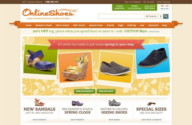
Place contact information at the top right corner of the site or in a separate web page which is properly linked with the homepage. Provide a contact form as well there so customers can mail their requests or complaints in writing. This is a must-have requirement if you are selling a product which is technical in nature like gadgets. Giving the option to chat to a customer care representative is an effective way to build an eCommerce business.
Offer An Easy Check- Out Process
More than half of the sales are lost during a clumsy or slow check-out process. Consumers don’t have the patience for hours on their devices for getting their online payments processed. Design a three-step check out process; do not ask them for the same information repeatedly like name, product id instead design an intuitive interface that captures the shopping details from the shopping carts. You can even link pages, and use two-column layouts for certain sections (like putting billing details, and shipping information next to each other) to create shorter pages.
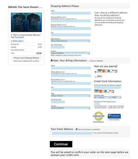
You can cross-sell here by placing a link of the related items on the check-out process. However, do not be pushy and squeeze in a lot of information as it will create a weak impression of your site. Acknowledge the time users spent on your sit by offering a free gift or free shipping option as per your business guidelines. This will work like an invitation for repeat purchase.
Make Shopping Easier and Faster
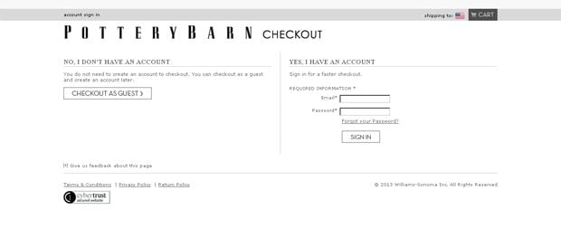
As per a survey conducted by PayPal, because of forced account registration, online users abandon their shopping carts 26% of the time. As a thumb rule, never ask your customers to open an account with your site before they even start looking for a product or even at the time they wish to buy any. There are customers who may visit your site just once or for only a single product. You can ask for registrations at the end of their shopping, after payments have been made. This way you will be able to generate a loyal customer base as only the serious shoppers will be willing to open an account while others may rush through that section.
Give them the option to check out as a guest if they wish to do so as in any case you will be getting revenue from your visitors. In addition, let users register as business or as private customers, so you know what products to offer during cross-selling. Use up-selling options with dedicated users only or the ones who spend a good amount of time on your site else the whole exercise will be in vain.
Design Unique Shopping Carts
This is the most vital aspect of your eCommerce web design. This is the place from where customers add products, and revise on them during their shopping. Build intuitive, smart and easy to follow shopping carts without adding too much frills.
Provide easy navigation throughout the cart so users can easily switch between multiple products. Allow users to add products to their carts without leaving the current page. Let shoppers modify their cart details in an easy way and give them the detailed preview of the purchase.
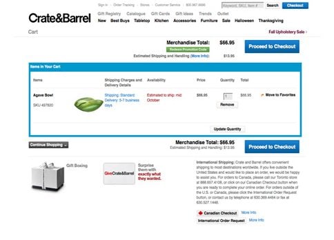
Include important information like the payment options, shipping rates and store policies in the cart. Make sure your users are clear about every step of the buying process. Offer as many payment options as possible to cater to a number of different customers. For shipping rates use flat rates or offer shipping calculators, plugins or widgets on your site. Mention about the freight surcharges for normally heavy item to indicate exactly what your customers are paying for. Use an FAQ section to accurately convey your store policies to first-time visitors. This practice will avoid any headache in the long run.
Create Intuitive Search Options
In order to offer interactive user experiences design the search option well. Visitors will use this very often to look for products they are interested in. Comprise a way for customers to filter their search results by category or feature leading to faster purchases. Devise effective search filters to help customers refine their search results.
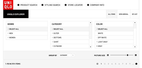
Create comprehensive navigation bars with sub-headings and not more than seven links to related category pages. Choose different colors for separate options so that the whole process is relaxing to the eye.
In Conclusion
As per a report by PayPal it confirms that 71% of shoppers believe they'll get a better deal online than in stores and the good news is that e-retail will grow to 9% in 2016, up from 7%. Thus there are plenty of opportunities that e-retailers can bank upon with their stores open 24/7 for customers. Thus use the above mentioned techniques to design effective eCommerce sites for your valued customers.
Get more to your email
Subscribe to our newsletter and access exclusive content and offers available only to MonsterPost subscribers.

Leave a Reply
You must be logged in to post a comment.