5 Design Qualities of a Good Landing Page Template
A landing page template is a very flexible tool. It lets you create a compelling marketing message thanks to a few key ingredients that are designed to not only look good but also to convert. Sometimes only due to the right placement. It’s common knowledge about what constitutes a good landing page. However, what about the layout itself? Discover 5 key rules that are common among well-designed landing page templates.

1. You can use a CTA more than once
When we think about a landing page, we think of a marketing vehicle that is designed for a targeted audience. We do all that we can to attract and convince users to buy something. We don’t want to scare them away, so we place a CTA button and hope it will work. We do it only once because that’s the rule, right? Don’t oversell it, don’t play whack-a-mole with people - don’t hit them in the head with a marketing hammer!
That’s the golden rule, right?
Wrong.
Or rather - it usually is the golden rule. No one is stopping marketers from creating a template (a common scheme for similar campaigns) with more than one CTA button. In order to do that, other golden rules must be in place.
First of all, all sections have to be interesting to the user and act as a magnet. If a landing page has multiple sections and is a little longer than a “coming soon” page, then there’s a chance that multiple usages of a CTA button will act as a magnet too. Think about it - I’m on a landing page, browsing, learning about the product or service via the first section. Then, I see a CTA button, but I don’t interact. I read the second section and then the third. Now I’m ready to buy. Where is the button? Is it at the beginning, hitting me in the face? At the end? Sometimes it’s good to disperse CTAs and discreetly help the user.
2. Placement of a form at the beginning or at the end
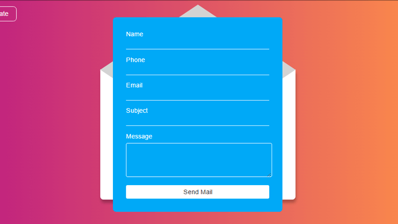
Placement of the form is a very tricky business. If it’s short, then putting it in front of the customer, in the first section of a landing page, is fine. It can also be fine if the form is a little longer (it has a few questions or when a company needs additional data) but it’s a risk.
The best place to put a form is in the first or the last section. When a landing page is short (one, two sections tops), visitors expect to be accommodated right away. If there are multiple sections, then the visitor naturally expects more informative content. Therefore the form is expected to summarize the whole page, not to get in front of what matters to the visitor - a quality message.
3. A balanced proliferation of elements (copy, photos, video, form, etc.)
One does not simply walk into Mordor… Oops, sorry. However, this Lord of the Rings quote suits landing pages as well. Balanced design is crucial; no one would want to visit a landing page with lots of orcish taste poured into it. Since a landing page works best if it’s rather short, the temptation can sometimes overshadow the original plan.
All elements - from copy, through graphics to testimonials and form, have to be evenly proliferated. The golden rule of modern day Internet, “no wall of text!” has to be respected. An over-concentration of graphics should be avoided unless the service promoted by the landing page is about selling high-quality graphics and it’s relevant to put a sample collection on a landing page.
The form should be placed in a place where it is not only clearly visible but also stands out in terms of used color, space (see argument 4) and its surrounding elements. No one would want to look at a landing page where the form is squeezed between a wall of copy on the left and two videos on the right. Everything is about the user experience, design and sales.
4. Whitespace rule
The “whitespace rule” is very simple. You want something to stand out? Surround it with emptiness. Every element on the landing page needs space to breathe. If you want them to work well together, you have to not only make them work with each other (see the previous argument) but also stand out individually.
Don’t count the pixels around each element; there is no golden rule here. You have to follow the grid and have enough expertise as a graphic designer (or a marketer when working with an online tool for landing page design) to know when not to cross the line. Disperse elements on the grid and treat them as individual inhabitants of the same landing page space, working together towards the common goal - conversion.
The greatest example of the whitespace rule is the homepage of this little page you might have heard about, called Google. Almost the whole page is one big whitespace, giving you the luxury of focusing on what’s most important: the search engine, the search field itself. When it comes to landing pages, there is no need to go to extremes. Just remember that it’s not a Rolling Stone concert - don’t fill the stadium with thousands of hopefuls looking to get noticed on camera for the tour documentary. A landing page is about clear messaging, not popularity 😉
5. Responsive is a synonym for responsible
Doesn’t make sense? Sure it does. The world has gone mobile, and no single brand on the face of the Earth can afford not to have responsive design. To meticulous - the design for landing pages is not responsive; it’s adaptive. The difference may be subtle, but it’s there.
What does this mean? When you design a page, landing pages included, you have to remember that users consume media on different platforms - desktop screens, tablets, smartphones. The page has to look identical on every single one of them, meaning that designers have to achieve the same usability.
Summary
Designing a landing page is a little more complicated than it sounds. When you have the right tool, it’s fast and easy, but it still requires taste and expertise. Fortunately, TemplateMonster has templates to help you out. You can also use our base of more than 100+ templates to kick off your campaign.

Read Also
Best Squeeze And Landing Page Templates For WordPress
Create A Landing Page That Converts [MotoCMS Free eBook]
How to Increase Your Landing Page Conversion Rate
Best Landing Pages That Convert 100% – Top 10 Templates [UPDATED]
Get more to your email
Subscribe to our newsletter and access exclusive content and offers available only to MonsterPost subscribers.


Leave a Reply
You must be logged in to post a comment.