Designing the Perfect eCommerce Store Checkout Page
As a growing multi-billion dollar industry, the e-commerce market needs top-notch web design to attract and retain customers. When we talk about design, it’s not just about how your site looks. Design includes everything from the navigation to the features that make an e-commerce store usable and convenient for shoppers.
One of the most pervasive problem e-commerce site owners experience is shopping cart abandonment. Cart abandonment can be caused by many things but the most common reason turns out to be a poorly designed checkout page. A checkout page that fails in functionality, design and overall usability encourages shoppers to abandon their carts, leave your website, and never return again.
Check our free Web Design eBooks:
Making Your Website Responsive. What Are Your Options?
What Can Go Wrong When Launching a Website
UI Tips for Web Design Enthusiasts

In this article, I’m going to discuss ways on how you can improve your checkout page design. But before that let’s first answer the question - Why do people abandon carts? According to a VWO e-commerce survey, shoppers abandon their carts because:
- 28% says they were put off by unexpected shipping
High shipping costs are a big NO to customers as much as slow shipping. People order online because it’s easy and fast. A high shipping rate takes away their motivation to buy the product if they can look for a much cheaper item elsewhere.
- 23% says they didn’t like having to create a new user account prior purchase
The checkout process should be simple and straightforward. You don’t want your customer to feel overwhelmed when making a purchase.
- 16% says they weren’t ready to buy… yet.
Not every online buyer is an impulse shopper. Some need a little more prodding or engagement to complete their purchase.
- 12% says they had a poor user experience
Perhaps the design is not intuitive for users. Some didn’t find any indication of progress during the checkout process, while some had a hard time navigating the website.
- 13% says they were concerned about security during payment.
Your site will not look trustworthy if you don’t provide any proof of security for common credit card problems.

Customers abandon carts all the time. It becomes a problem only when you don’t do something to win them back. The good news is there are smart ways to prevent our valued customers from leaving their carts. And it starts with designing the perfect checkout page, here’s how:
1. Create a One Page Checkout
Keep the checkout process simple by allowing customers to buy items with just one click. By reducing all the unnecessary features and making this step fast and easy for customers, you help them save time and effort.
A one-page checkout should provide information about the product, shipping, and payment method all on one page. While some may find listing all details overwhelming in one page, many consumers, like myself, feel that one-page checkout pages are more convenient.
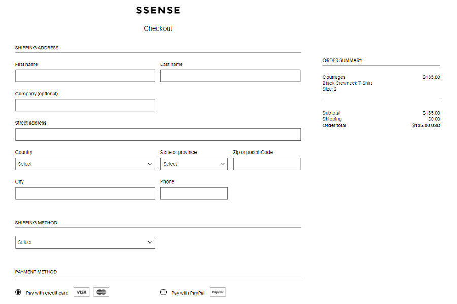
Image Source: SSENSE
With a one-page checkout, you will have fewer clicks, fewer pages to load, and a faster check flow compared to multi-page design.
2. Put Emphasis on Call to Action Buttons
Have you ever come across an e-commerce site where you can’t find the button to click for signing up or checking out? That’s bad design and it’s one of the main causes of cart abandonment. Call to action buttons are the most important buttons on your checkout pages. Therefore they need to stand out. If you’re using a white background, then your call-to-action buttons must be showed in a striking dark color.
Here you can find the best Magento themes that will help you design an e-commerce page with the striking call to action buttons.
3. Post Free Shipping on the Checkout Page
Not every e-commerce store can afford to offer free shipping. But study after study has shown that NOT providing free shipping is the top reason many consumers abandon shopping carts. In a comScore study, researchers found that more than 35% of online shoppers hesitate to make a purchase online unless free shipping is offered. Like a crazy deal or incentive, free shipping is something people love to get.4. Include Progress Bars for Multi-Page Checkouts
You don’t want to scare away buyers with an endless checkout process (that’s why I recommend using a one-page checkout). But for those who find multi-page checkout pages easier, how can you make it work?
Online shoppers are probably the most impatient kind of customer you’ll ever encounter. If they have no way of knowing how long the checkout process will take, they might get frustrated and leave. The solution? Progress bars. Progress bars help customers know where they are in the checkout process. It keeps the whole checkout process clear especially for customers who aren’t very tech-savvy.
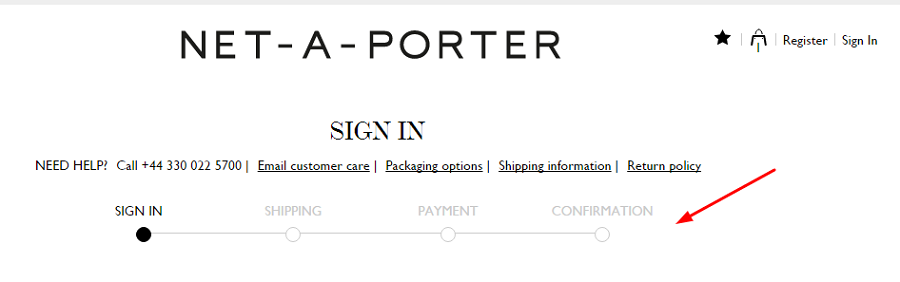
Image Source: Net-A-Porter
This is a good example of a clear progress bar for checkout page. The progress indicator is highlighted in black to show the current section of the checkout process.
5. Live Chat Options on Checkout Page
Most e-commerce stores don’t offer real-time customer service. The thing is: not all online shoppers are good with tech. Sometimes, they need a little help to use your e-commerce website. During these times, what your store needs is a good chat support that will provide answers and solutions to customers who are having trouble. Get the best Woocommerce themes to create your e-commerce store with added live chat options.
6. Trust Signals
All e-commerce site needs to have trust signals. Without it, you can’t instill credibility or trust in the minds of your customers. After all, trust is what makes a visitor a buyer. When he sees that your site can be safely entrusted with his credit card details, he’ll not hesitate to make a purchase.
Now, there are different kinds of trust signals. While some e-commerce use testimonials and reviews from people who had successful transactions, some e-commerce stores will put contact and communication as trust signal for their users.
The third kind of trust signal is the most important of all: Payment security. Let your store inspire trust by showing payment assurance in the checkout process. Here you should display third party badges and certifications that will help inform users that their details are safe when they make a purchase.
Conclusion
- Not every customer that arrives on your website is going to buy something. Some are just window shopping, some are comparison shopping. But those who have gone on the checkout page are the customers you want to watch out for because they’re likely the ones who are thinking about purchasing. By optimizing your checkout page with the tips above, you can reduce abandoned carts and provide an encouraging checkout process that will promote more sales and trust from your customers.

Armela runs her own eCommerce store. Eager to discover new effective eCommerce tools and web design techniques, she doesn't miss a chance to share knowledge with her readers. LinkedIn
Get more to your email
Subscribe to our newsletter and access exclusive content and offers available only to MonsterPost subscribers.

Leave a Reply
You must be logged in to post a comment.