15 Successful Fashion E-commerce Websites to Admire and Emulate in 2021
How can fashion websites survive and grow in 2021?
Most executives are proactively adjusting to the new nature of the industry which they have described as “changing,” “digital,” and “fast.” Fashion businesses strive to create new opportunities in the digital sphere instead of just solving challenges the internet creates.
As you probably know, the competition for online customers in 2021 will be as fierce as ever. Every small to medium sized fashion business will have to fight not only with direct competitors in the segment but also with the expansion of luxury brands that offer less expensive mass market goods.
What can you do to stand up to such competition?
Start by offering the best online shopping experience in terms of aesthetics, technology, and relationship.
In this article, we will be exploring the best fashion e-commerce websites of 2021. You will learn from the best and see how you can improve or recreate your own fashion website.
Table of Contents:
- The characteristics of a successful fashion website
- A collection of top ecommerce fashion websites
- The final takeaway
The characteristics of a successful fashion website
Global trends in e-commerce web design are the same for luxury brands and smaller fashion businesses. Digital stores that are capable of drawing customers and making them stay loyal share a certain set of qualities:
- An impressive visual presentation that tells an inspiring brand story - one that appeals to feelings and creates a deep emotional response.
- Powerful and customer-oriented product display - one that understands what customers want to know about the products and gives them exactly that information.
- A well-thought-out brand story in the About section and throughout the website - one that creates a distinct brand personality, explains the brand mission and goals, and also invites customers to identify with that personality.
- Smart selling practices - not selling on the homepage, and no aggressive upselling.
- Great website navigation and product sorting that allows customers to quickly find the right items, as well as select the right size and fitting.
- Powerful community practices that invite loyalty and brand connection - these include but are not limited to email subscriptions and social media integration.
- Attention to a user-generated response to the brand and separate products - social proof that includes testimonials (text and video), as well as reviews and ratings.
How To Use WordPress For E-Commerce [Free Ebook]
By clicking the button you agree to the Privacy Policy and Terms and Conditions.
A collection of top e-commerce fashion websites
Now let’s look at the examples of the top performing fashion websites and see how you can apply their experience to your e-commerce web presence.
1. Conspiracy
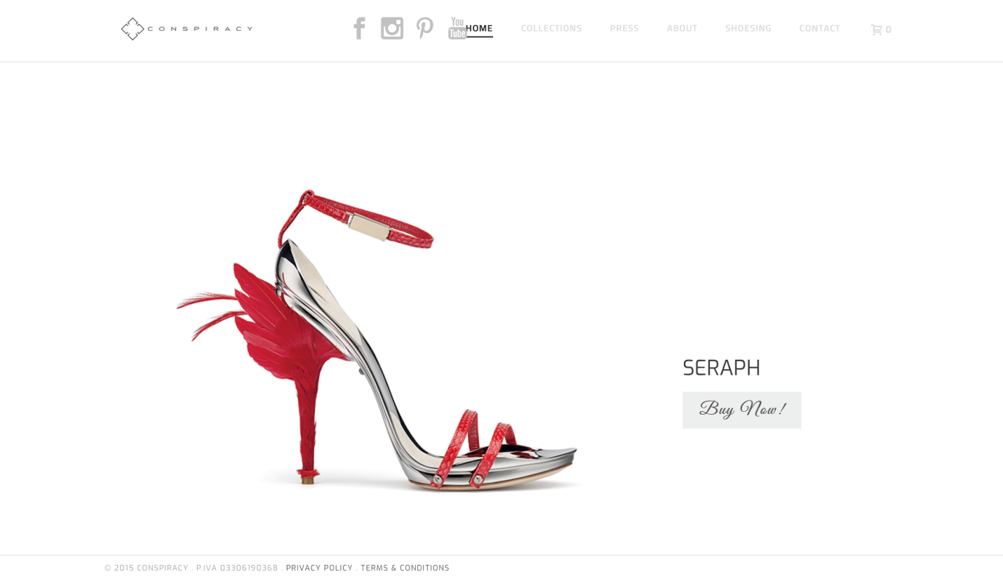
Gianluca Tamburini is an Italian designer who sells handcrafted women’s shoes. The shoes are manufactured out of premium materials using technology that has been borrowed from aeronautics.
The website features breathtaking product photos and Call to Action buttons with exquisite typography.
In the product galleries, you will again see some spectacular photos of shoes. The galleries allow filtering by size and model. There, you can also place fast orders and connect with the producer directly by leaving your contact details.
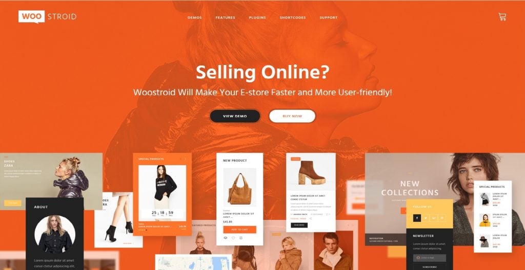
The following theme will help you create a similar website design and WOW your customers into becoming fans of your brand.
2. Jonesy
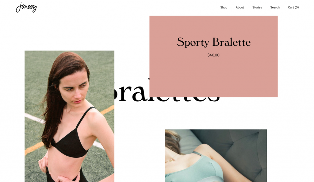
Founded by a former advertising staffer from New York, this online store sells affordable underwear with a peculiar style and character. The website offers bralettes, undies, lingerie sets, and accessories designed by Rachel Jones herself.
On the product pages you will find three types of information:
- A few high-quality photos of girls wearing a particular product. Notice the originality of the images and the beauty of the models.
- Product details.
- Sizes and colors.
- Additional products one can buy to match with the items.
If you want to build a website with similar independent vibes and sassy design, we have a theme for you. It features even more product display options than the website above, so you’ll have ample space for experimenting.
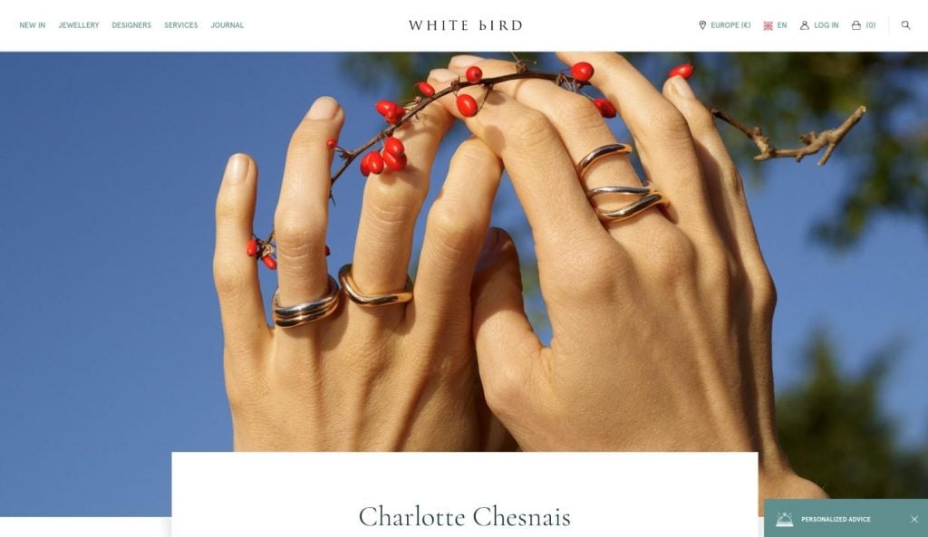
3. WHITE bIRD
WHITE bIRD is an international resource selling handmade jewelry made by designers from all over the world. The website operates in different languages and currencies. It specializes in all kinds of rings, earrings, wedding bands, and stones (including diamonds).
Each product page tells a visual story for each jewelry piece. You can see all the information about the product and then choose the size. To the right of the Call to action button, you will see social media icons. This is a very smart move because many clients will want to share their dream rings with their friends and family before making a purchase.
Go to the NEW IN tab to see a wonderful categorized product gallery. It allows for sorting products by category, designer, price, availability, and many other parameters.
If you need such functionality for your website, please see the theme below and explore its product gallery. It offers premium sorting functionalities and a beautiful minimalistic design.
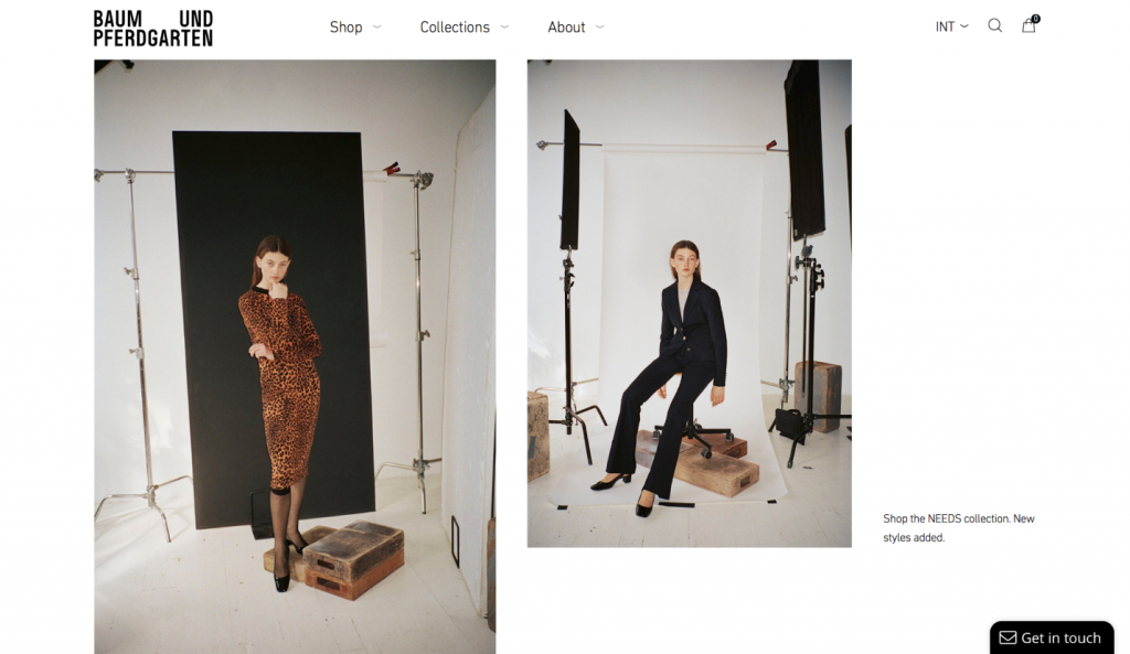
4. Baum und Pferdgarten
Helle Hestehave and Rikke Baumgarten, creative directors of Baum und Pferdgarten say:
We want to create designs for fashion-forward thinking women who want to have fun with their personal expression. Our collections can be worn in many different ways by many different women. We create clothes that help you tell your own story.
Their website also tells the story of an independent and ambitious young woman - someone many customers would want to relate to.
On the product pages, you can zoom in to every item and examine its smallest details. One of the ways the brand uses to help users navigate their website is MegaMenus. Every tab opens a dropdown menu with product categories and fancy fashion photos.
The following theme features the same MegaMenu technology and Quick View options. Click on LIVE DEMO to see that you can have the same effects on your fashion website.
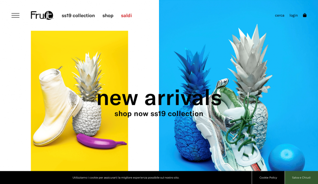
5. FRU.IT
FRU.IT. is a shoe brand from Italy. The homepage of its website features impressive and vivid product images. Click on any of them and you will enter the shoe gallery where hundreds of product photos can be filtered and looked through.
As you hover over each item, it shows it to you from a different angle. There is an Ajax shopping cart and login functionality. As you scroll down the homepage, you see content modules arranged into asymmetrical grids. There’s also a minimalistic sidebar menu that balances the homepage images.
The following theme from the TemplateMonster collection allows you to display full-width product images on the homepage and offers a beautiful slider to help you do that. The theme also allows for experimenting with content modules and media content. You can also add animation effects to your headlines or image boxes.
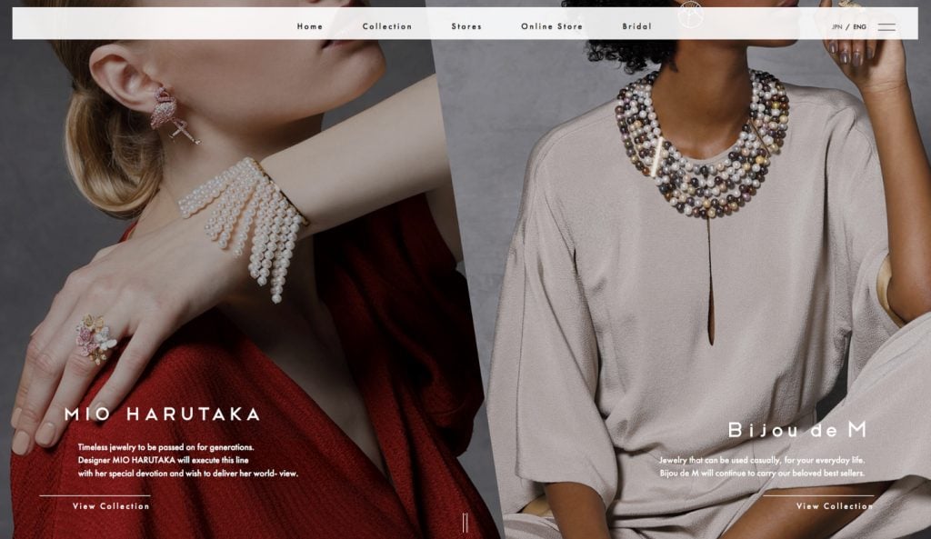
6. Bijou de M
Bijou de M is a luxury jewelry brand that originated in Japan and sells its products all over the world. The company has a magnificent website that communicates timeless chic and elegant minimalism.
If we try to describe the buying experience that this website offers, we need to explore the following elements:
- Full-width Retina ready layouts with original images.
- Parallax scroll that adds depth to the design.
- Hover animation.
- A sticky menu.
- When you travel through the Online Shop tab to the e-store, you see a big gallery, social login, and the Wishlist functionality. Wishlists allow for saving the items you like in a wishlist and returning to it later.
We have an awesome theme that also creates a unique UI and invites customers to join your brand community. This tool features similar product display features, Wishlist functionality, as well as the Product Compare feature. It will help you expand the possibilities of your store and allow customers to make wiser buying decisions.
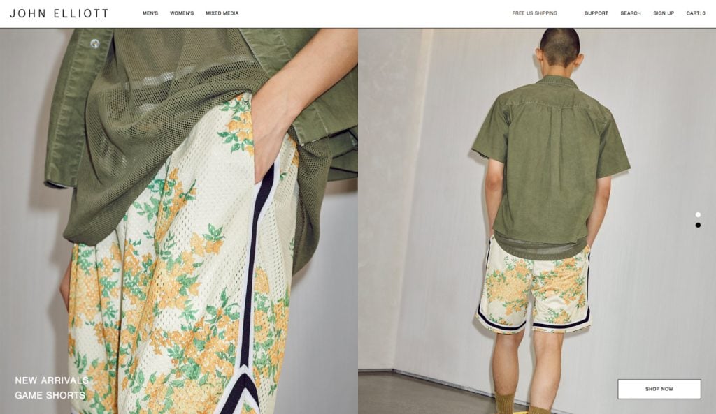
7. John Elliott
John Elliott is a US-based fashion brand formed in 2012. The company’s website combines minimalism with dynamism and creates a unique bold impression. On the homepage, you see a vertical slider hosting original product photos. Notice how wisely the Call to Action buttons are placed near all the images, just waiting to be pressed!
There are some additional characteristics of this website that are worthy of our attention:
- Advanced search should be available on the homepage and gallery pages.
- There’s a signup form that greets you upon entering the website.
- Dropdown MegaMenus with product categories and images.
- A footer with comfortable animation.
- You can go to the product pages with a beautiful full-width slider.
We are offering a beautiful theme from our collection for those who need an amazing product-oriented e-commerce website with the working Contact form, live search, multiple headers, footers, etc.
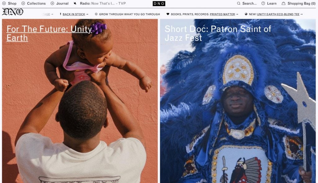
8. DNO
DNO is a very peculiar store based in New Orleans that sells vintage-like clothing items with the DNO letters printed on them (DNO stands for Defend New Orleans). Their website is all about community and diversity. It combines a rich heritage with youthfulness and optimism.
At the top of the website, you can see beautiful MegaMenus with images and animated text.
There are four product lists (Back in stock, Destination vintage, Crops, and Stacked City) and product tiles where you can choose the color of an item.
On the product pages, we find more details about each item, social media buttons, and two product carousels - Related products and You May Also Like.
The following theme offers a similar product display and listing features to help you tell customers more about your products and suggest the right items to them.
9. Ports 1961
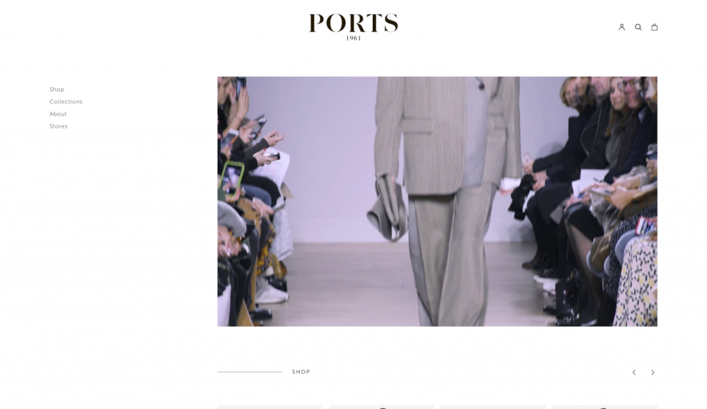
Ports 1961 is a luxury fashion brand led by the Creative Director Nataša Cagalj. The clothes are designed in England, manufactured in Italy, and stored in Paris and Hong Kong.
As you enter the website, you get a chance to watch a runway show right on the spot. To the left from the full-width video player, we see a simple sidebar. A beautiful product carousel is present below the video. There are two product boxes leading to the Collection pages where you can see all the models on beautiful vertical sliders.
In the shop section, product photos are arranged in a beautiful masonry on a clear white background. There’s a simple comfy filter at the top of the page. Product pages allow for choosing sizes and seeing all the items in Quick View.
Here’s a beautiful theme from our collection that will help you build an equally beautiful website for your own fashion brand.
10. Won Hundred
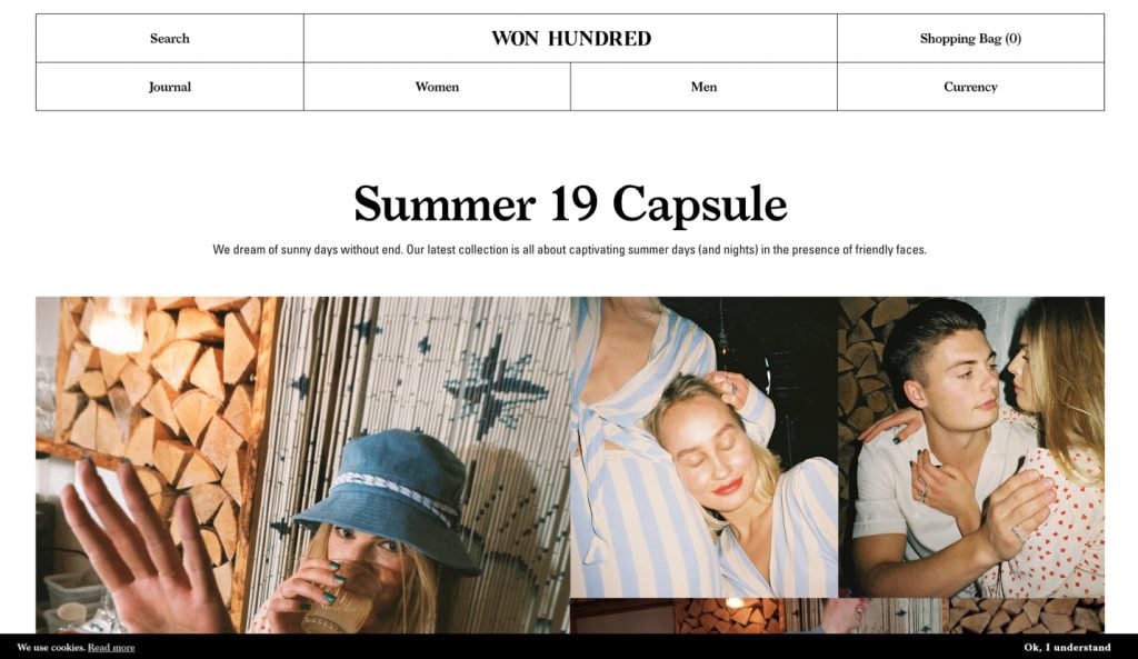
Won Hundred is a Scandinavian “rock and roll” fashion brand founded in 2004. They offer ready-to-wear unisex collections that also include shoes and accessories.
We see beautiful character images arranged into grids. A beautiful menu at the top of the page includes animated text and dropdown elements. Live Search functionality helps you navigate the large product collection.
We can see that there are many photos showing the same item from different angles on the product pages. The overall design is very minimalistic and grid-based, so the Call to Action button is very schematic and not filled with color. However, it is certainly visible and portrays a bit of fun due to the animated elements.
In the theme below, you will see the same product grids and navigation elements. You can add animation effects and edit every inch in terms of color and texture. The theme also includes free images, so you can use some of them to create an impressive visual presentation.
11. Tommy X Lewis
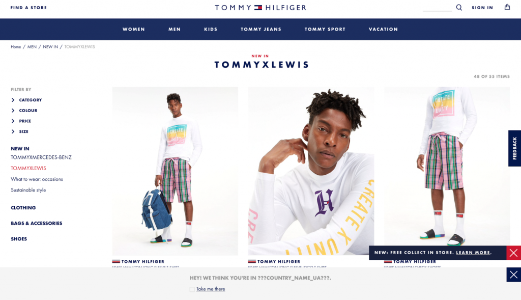
This is a pre-collection page for the world-famous fashion brand Tommy Hilfiger, intended for clients who reside in the UK. The design is very goal-oriented and breaks the common fashion website practice of not selling directly on the homepage. If you press the brand logo at the top of the website, you will be redirected to the global website of the fashion network. On the global page’s homepage, you will see beautiful photos and names of the categories, no products.
The website design is built around contrasts, so you see white backgrounds, vivid blue headers, and contrasting blue/red footers. As you scroll down the collection, you will encounter a few banners inviting you to learn more about company discounts. The banners are pretty small and do not cause much irritation. At the bottom of the page, there’s a popup suggesting the current location and an invitation to go to a local website.
In the product gallery, we see that most of the items have tags. You can select the color of an item, and you will be redirected to the product page. On the product pages, photos can be zoomed and seen in more detail. All these features are present in the theme we are offering you below.
12. MISELA
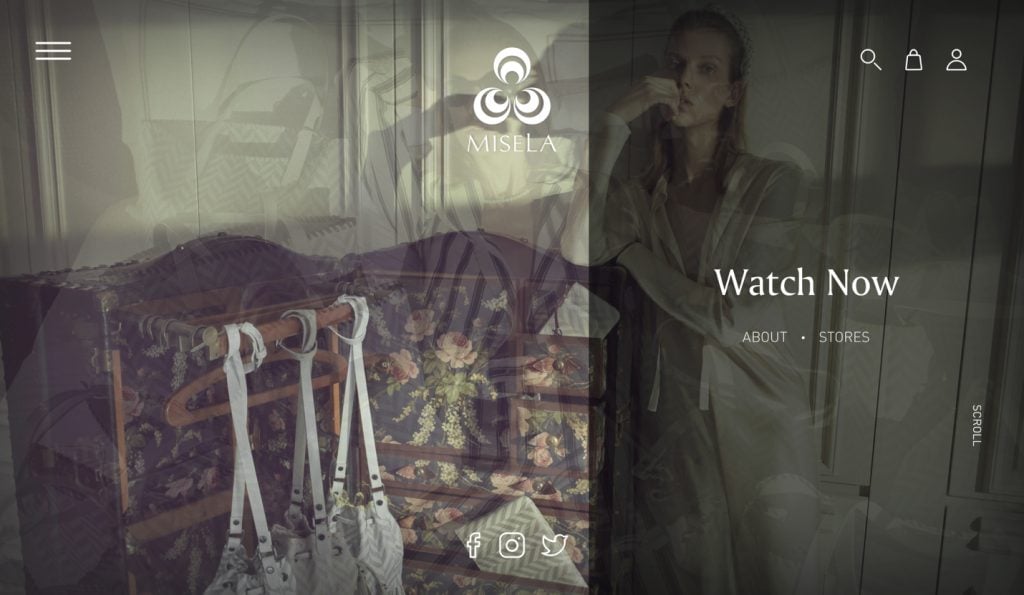
Misela is a Turkish brand selling designer handbags. The company has a truly magnificent website, the beauty of which is mostly due to amazing product photography. Other design elements serve as one beautiful frame for the photos and create a unique rustic and luxurious atmosphere.
The homepage opens with full-width images that change automatically. Right below them, you will see a small string of text inviting you to sign up or register. Next, you will find a product carousel with the top-selling items and also one product displayed separately with a large description.
What’s interesting about this website, there’s a separate section dedicated to Press. Right below, we see a smart Instagram board which looks very appropriate. This website is full of beautiful photos. Who wouldn’t want to save and share them?
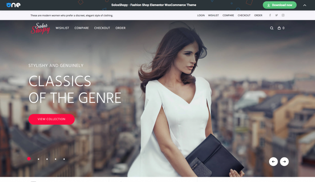
The SolosShopy theme offers almost the same features from the start and can be easily customized to create a website of equal beauty to Misela’s. Scroll down to the LIVE DEMO and you will see the same sections, the Latest New section, the Instagram board, and other important elements.
13. Couple.co
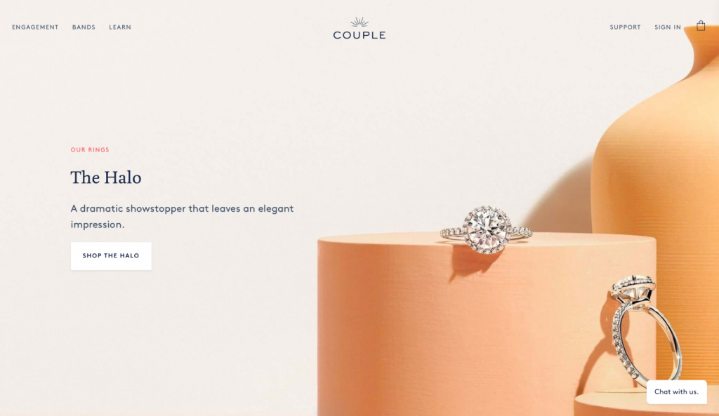
Couple.co is a UK based jewelry brand that revolutionizes the entire experience of buying a wedding ring. The company sells engagement rings with big spectacular diamonds while building nourishing relationships with its clients.
The website design is rendered in pastel hues with a big focus on the photos featuring rings and precious stones. When you open the MegaMenu, your breath gets taken away by the beauty of the images.
There’s a big section dedicated to testimonials. It is built with a slider, so clients can see many testimonials without scrolling. The website capitalizes on social proof: it offers relatable character images for people to identify with.
The website also features a blog that is mostly visual and filled with original photos. The blog modules are arranged in a symmetrical grid with a simple filter above it.
The brand also enhances customer loyalty by inviting site visitors to subscribe to their newsletter and by offering an Instagram board at the bottom of the website.
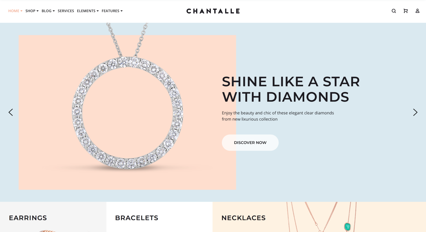
This fancy theme from the TemplateMonster collection will help you create a luxurious buying experience for your customers. If you want to build a jewelry e-store like the one shown above, all you need is this theme and a few hours.
14. Sonkia
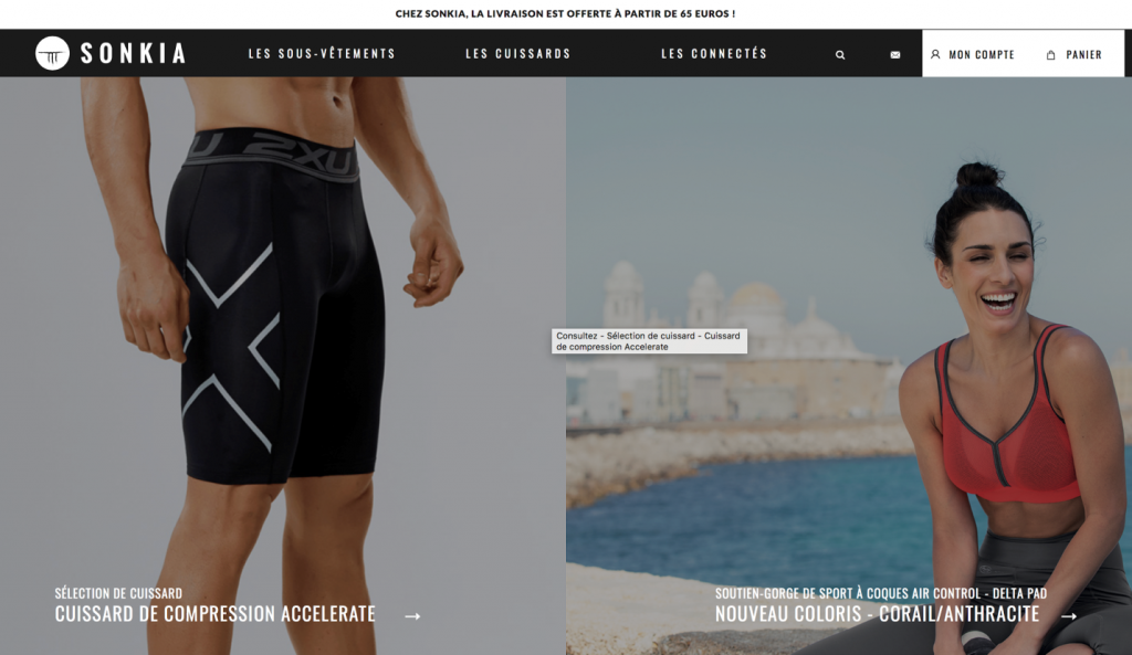
Sonkia is a French sportswear brand with a beautiful website. The first layout is divided into two sections with two character images. Below, you see a nice asymmetrical product grid with prices and an animated Call to Action button.
The website is rather simple but it has all the functionality you need to buy sport laces. The gallery is also simple. The filter allows you to choose the size, category, and color of an item. You have to click on the animated card to be directed to the product page.
The design invites you to register your client account and choose between two payment options - Visa and MasterCard. The website is integrated with Facebook, so you can follow the brand’s account and share your favorite products with friends.
Creating a similar functional website is easy if you choose the right theme. All the main features in the above example and even more product display functions are present in our themes. Make sure you press LIVE DEMO to see what we’re talking about.
15. Scotch & Soda
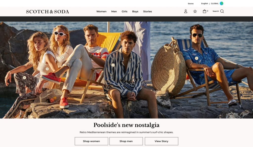
Scotch & Soda is an independent fashion brand based in Amsterdam. The clothes have spicy vintage videos, and the website is filled with color and breathtaking visuals.
The first thing we see upon entering the website is a pop-up that asks us to login or register as a new customer.
Three dropdown menus include text only. The fourth one invites you to explore the brand’s newest collections by displaying beautiful photos. In the corner of the header, we see the Login, WishList, and Cart icons. The website works in several languages, as the company delivers its goods worldwide.
There’s an impressive full-width image at the top of the homepage with hover animation and three navigation tabs right under it.
There’s an attractive product carousel down the website with a very relaxing video above it. First, you look at the ocean waves and then move your eyes down and see beautiful beach clothes - this is how the selling magic happens.
At the bottom of the website, there’s an Instagram board with a brand hashtag. The photos make you want to grab your suitcase and set off for a holiday ride.
If you got inspired by the beauty of this website, look at the theme below. Launching your own e-store is just a few clicks away.
The final takeaway
I hope you enjoyed my collection of fashion e-commerce websites as much as I did.
To sum up, let’s go through the main features of a successful and beautiful e-commerce website:
- Original photo content
- Product display options that include carousels, product lists, tags, Quick View, product zoom, and diverse filters.
- MegaMenus that include images and smart headers/footers for better navigation.
- Parallax scroll and other animation effects.
- Testimonials and customer reviews.
- Customizable banners and pop-ups.
- Comprehensive social media integration.
There are many other features you will find in our themes. Make sure you create your own checklist of desired features and then implement all of them in your website design.
All of the themes you’ve seen in this selection are available for only $19 per month with the ONE subscription.
Here’s the full list of the themes:
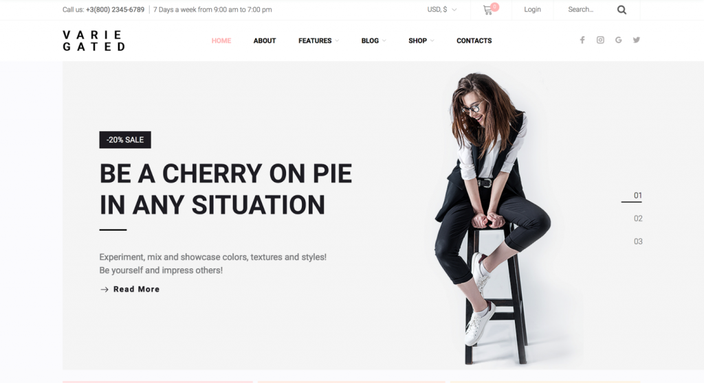
| Varie Gated | Apparel | Subscribe for $19 a month and get all these themes in ONE. |
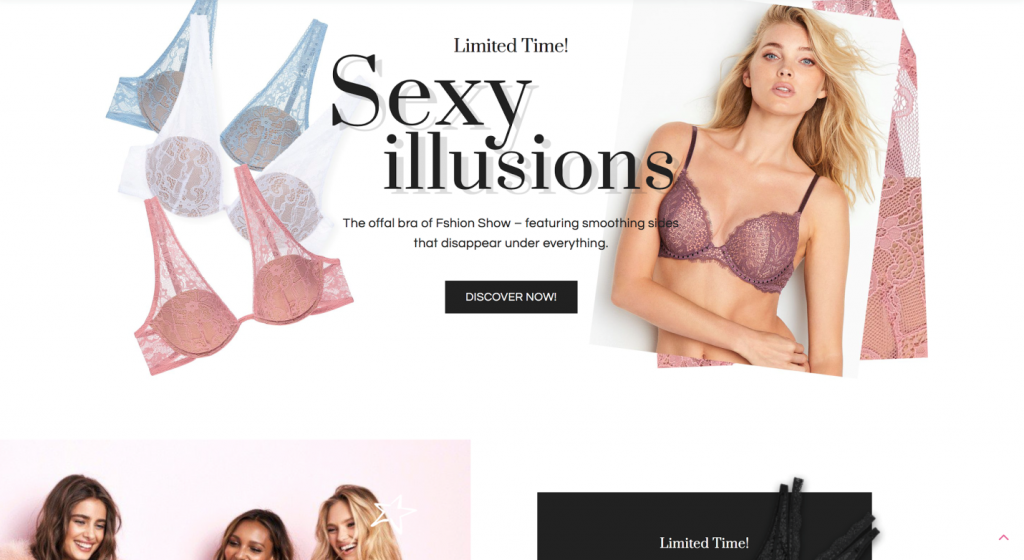
| InLaces | Lingerie | Subscribe for $19 a month and get all these themes in ONE. |
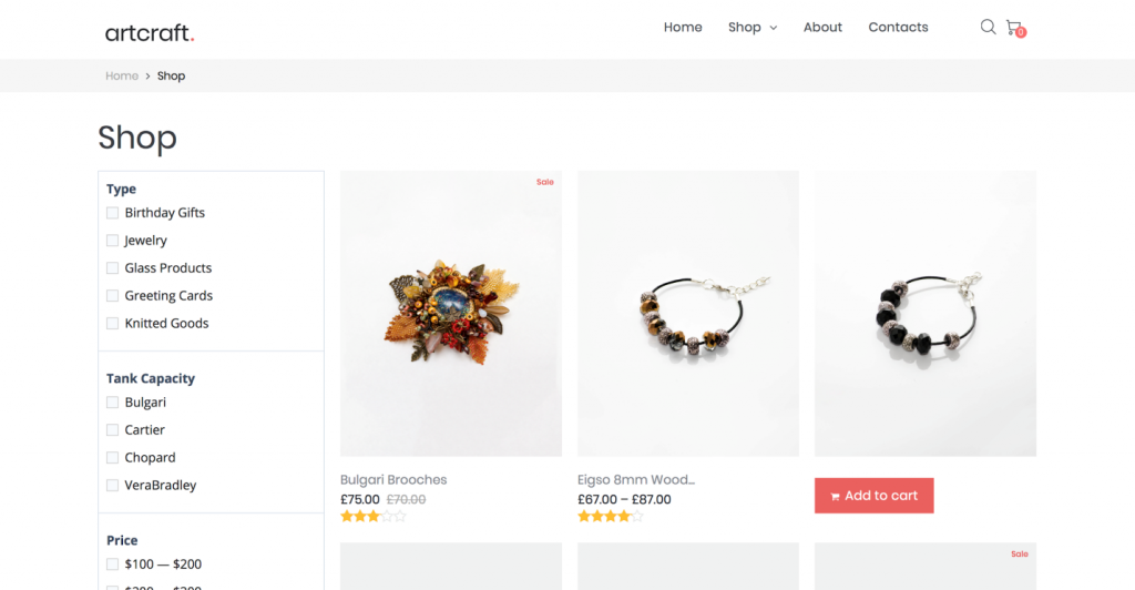
| Artcraft | Accessories | Subscribe for $19 a month and get all these themes in ONE. |
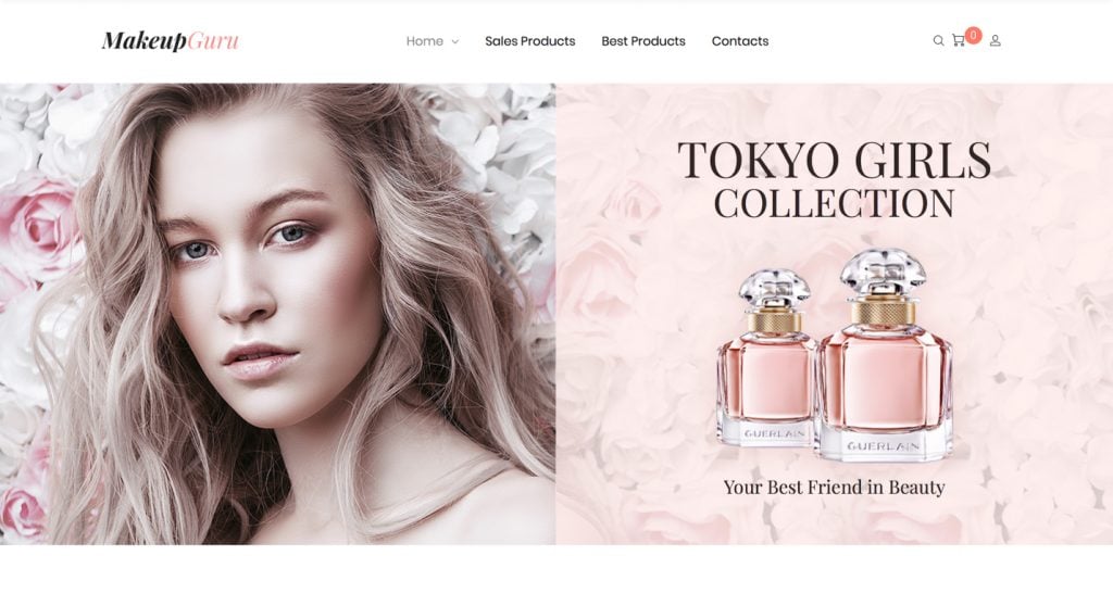
| MakeupGuru | Beauty products | Subscribe for $19 a month and get all these themes in ONE. |
| Sneaky | Shoes | Subscribe for $19 a month and get all these themes in ONE. |
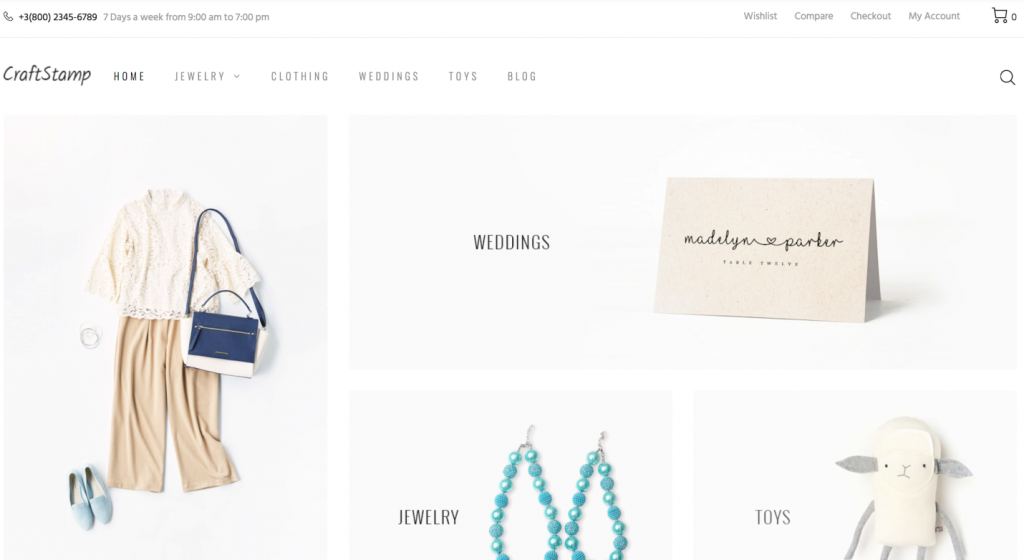
| Craftstamp | Accessories | Subscribe for $19 a month and get all these themes in ONE. |
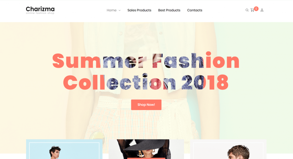
| Charizma | Apparel | Subscribe for $19 a month and get all these themes in ONE. |
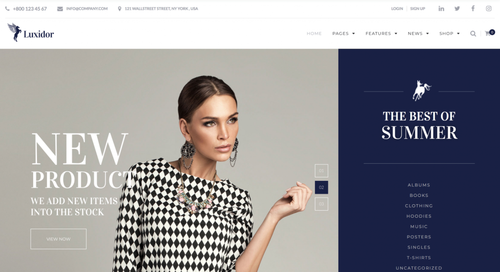
| Luxidor | Accessories | Subscribe for $19 a month and get all these themes in ONE. |
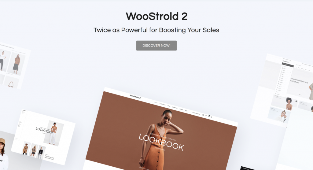
| Woostroid2 | Multipurpose | Subscribe for $19 a month and get all these themes in ONE. |
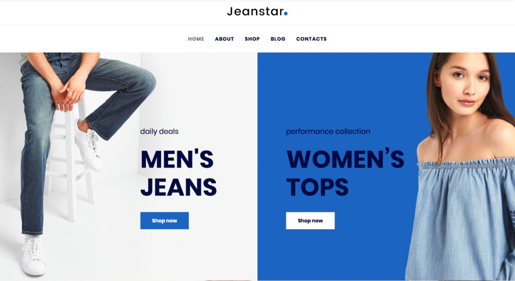
| Jeanstar | Apparel | Subscribe for $19 a month and get all these themes in ONE. |
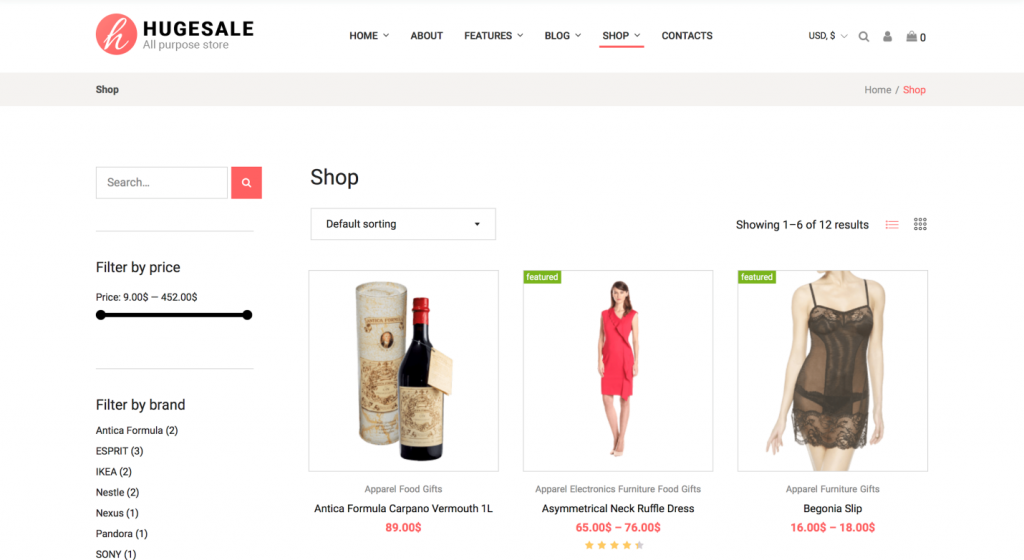
| Hugesale | Multipurpose | Subscribe for $19 a month and get all these themes in ONE. |
| MISELA | Apparel | Subscribe for $19 a month and get all these themes in ONE. |
| Gemstonic | Jewelry | Subscribe for $19 a month and get all these themes in ONE. |
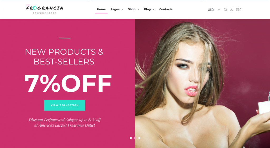
| Fragrancia | Beauty products | Subscribe for $19 a month and get all these themes in ONE. |
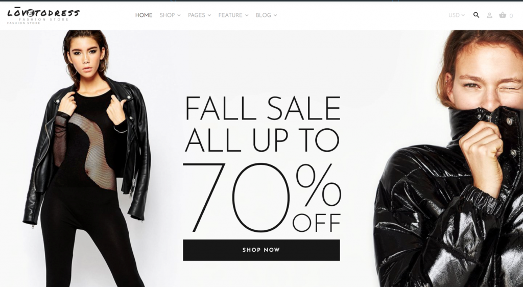
| LovetoDress | Apparel | Subscribe for $19 a month and get all these themes in ONE. |
Read Also
A Lucky Ticket For a Fashionista Rising Star – Brillook [Free Fashion Blog WordPress Theme Review]
Best Fashion Shopify Themes 2020
Ultimate Fashion Blog WordPress Templates 2020
TOP 100 Fashion & Beauty WordPress Themes Templates 2020
Top 50 Fashion and Beauty WooCommerce Templates
Don’t miss out these all-time favourites
- The best hosting for a WordPress website. Tap our link to get the best price on the market with 82% off. If HostPapa didn’t impress you check out other alternatives.
- Monthly SEO service and On-Page SEO - to increase your website organic traffic.
- Website Installation service - to get your template up and running within just 6 hours without hassle. No minute is wasted and the work is going.
- ONE Membership - to download unlimited number of WordPress themes, plugins, ppt and other products within one license. Since bigger is always better.
Get more to your email
Subscribe to our newsletter and access exclusive content and offers available only to MonsterPost subscribers.



Leave a Reply
You must be logged in to post a comment.