eCommerce UI – Categories and Navigation
Creating simple and user-friendly navigation is a real challenge for any web designer or developer. Any website’s navigation must be functional, accessible and usable. There are many examples that prove that what first seemed to be original navigation solutions in fact bury good projects due to how unusable these navigations are. The smart and non-frustrating user interface for the eCommerce projects is truly a crucial thing. It is a very sad situation when a visitor of your store can’t find what he/she wants to find, wastes tons of his/her precious time and leaves your store full of anger and completely unsatisfied. Not to mention that you’ve lost a sale which we think wasn’t exactly what you were after when launching a store.
Anyways, the attractive appearance of your shop is an effective marketing tool but without smart navigation solutions it might be useless for your business because a profitable shop must be a real sales machine. There are two main components for eCommerce navigation – categories and visual coherence. You should build semantically proper categories that will be informative and simple at the same time.
Basic Website Navigation Rules
Check out some of the rules which we think will help you create the easily understandable interface for your website:
- Consistent Navigation
You must have a consistent navigation throughout the whole website - all pages must have same navigation tools;
- Site Map
Create Site Map page because often it is much easier to find what you need via a scheme;
- Logo link
Link a logo to your Home page, most of web users are familiar with this very user-friendly feature;
- Search
Don’t forget about good old “Search” box that could be a last hope for the frustrated visitors;
- Keep It Simple
Extensive “out of the box” navigation experiments often cause visitors’ frustration
eCommerce Navigation Tips & Tricks
Keep in the mind that there are navigation aspects that are typical only for eCommerce. Make sure you take those into account while creating an online store:
- Combined menu
Any eCommerce website must combine the typical eCommerce products menu with the classical website navigation menu (contacts, about us, home and other links). We’ve noticed that most popular solution is putting classical navigation menu into the top part of a header (less frequently into a footer), while providing a visual emphasis on the products menu. After all, selling products is your main objective;
- Count the clicks
Make sure that the path from Home page to Shopping cart page is no longer than 3 clicks. The perfect scheme is Home => Category Page => Product Page => Shopping cart page.;
- Filters and search
Use filters as an alternative to products navigation. The classical “search” box may also do well here;
- Navigation Structure
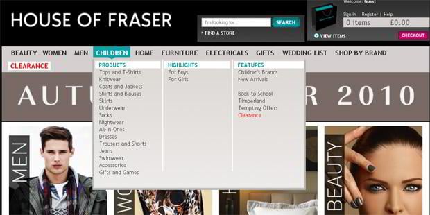
Use advanced 2- or 3-level structure for main navigation menu which will enlighten your efforts in delivering sub-categories to shoppers;
- Navigation usability
You may also want to use the navigation tricks such as tabs, drop-down menus, sliders etc;
- Minimum graphics
Using graphic elements in navigation is not considered a very user-friendly thing for eCommerce visitors, graphic elements take time to load and are not as descriptive as text;
- Group links by type
All navigation links must be of the same type, you shouldn’t mix Bestsellers, Registration and Laptops in one menu for example;
- Do not overload
Keep the number of top categories within 6 to 10 (that's a perfect variant that won’t make your navigation too simple/too complicated);
- Colors
Use color theory tricks in your navigation. For example the “Sign Up” buttons are more effective with red background because red is a color that calls to action, if you want people to spend money on your website you may want to consider the overall green color scheme (green is thought to be a color stimulating the inclination to purchase. Also make sure you mark out the “Buy Now” buttons with more saturated hue;;
Examples from Actual Online Stores
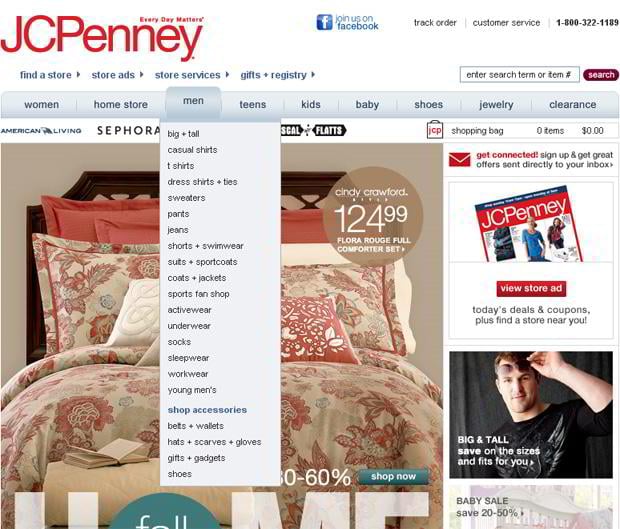
Horizontal Menus with Drop-Down Submenu
* * *
Jcpenney
* * *
* * *
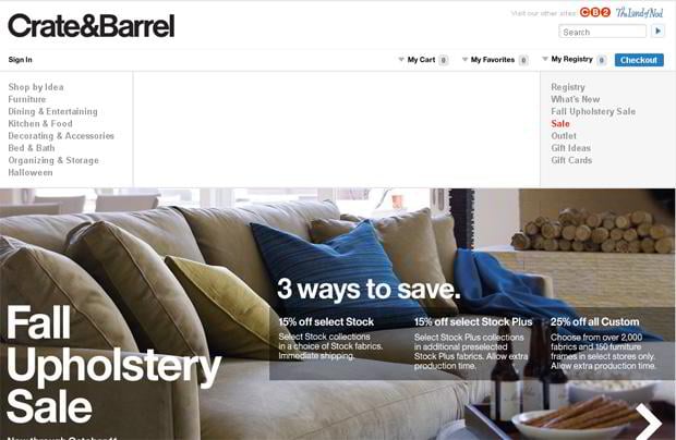
Right and Left Vertical Navigation
* * *
* * *
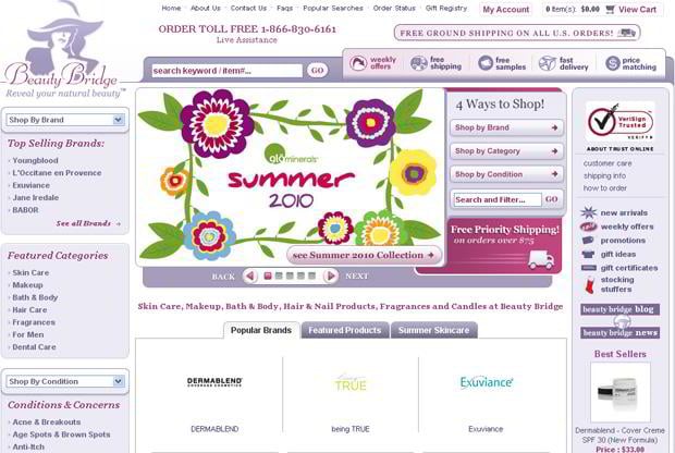
Left Vertical Navigation
* * *
* * *
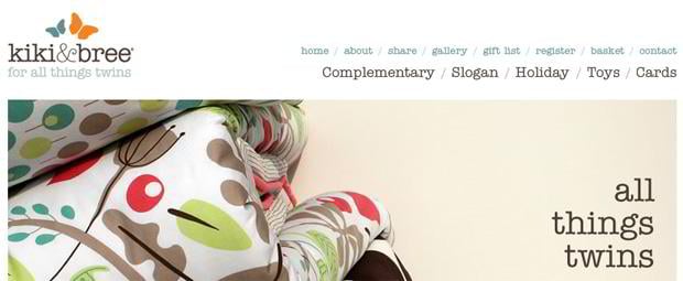
Simple Horizontal Menues
* * *
* * *
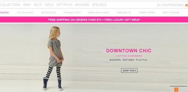
Horizontal Double Menues
* * *
* * *
* * *
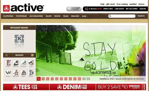
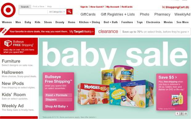
Horizontal Triple Menues
* * *
* * *
* * *
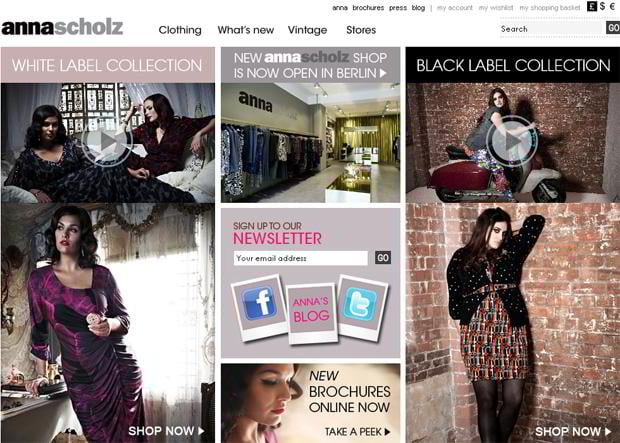
Content Area Navigation
My-Wardrobe
* * *
Shopflick
* * *
* * *
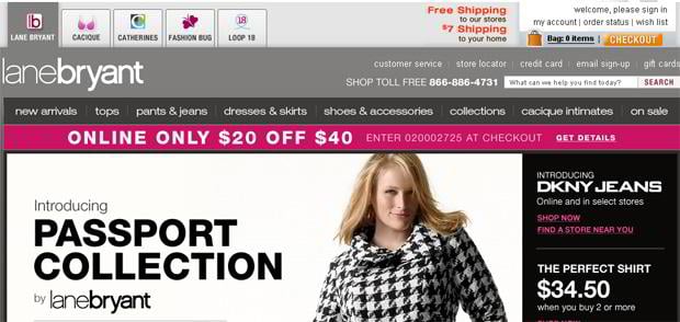
Multiple Stores
* * *
* * *
Lanebryant
* * *
Get more to your email
Subscribe to our newsletter and access exclusive content and offers available only to MonsterPost subscribers.











Leave a Reply
You must be logged in to post a comment.