Email Signature Design Tips: the Edge of Creativity and Reputation
A decent email signature is a relatively easy way of contributing to corporate or personal brand. If your company has a strong design message, a well-done email signature will only complement to it.
If you are not a design clinched person, email signature can easily give you an elegant hint of style without huge efforts.
Now, you decided that “Regards, Dave” isn’t working for you, or for your business any more. Here are some tips you’ll need to consider while making an email signature that works.
- Design is Important, As Always...
Always remember that your signature is an addition to what you send in the email body.
Thus, the design should do its work without distracting from the main message. Treat it like the cherry on top.
- Meet Expectations
You email signature design should be chosen not only considering who you are, and what you do, but also who will see it the emails. If you’re worried that your email looks too formal or too creative, feel free to use several signatures for different occasions or choose a very simple option.
- Less is More [Color]
Because of the point 1 (of this list), multiple colors are not welcomed for an email signature. Use one color, perhaps two or three, and be careful either you signature will be turn into the rainbow.
- Less is More [Typography]
Using more than two fonts is not necessary for email signatures. A single one is even better.
Three plus italic is way too much:
- Use Font Hierarchy
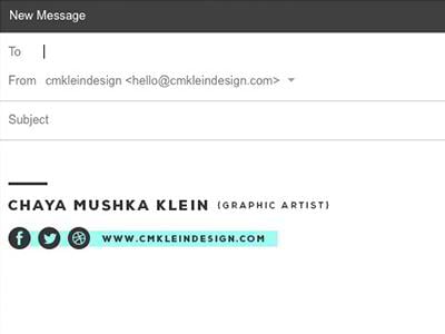
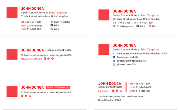
Instead of using multiple fonts and messing things up, use font hierarchy to highlight the most important information in your email signature.
- Avoid Small Letters
Make sure your logo, banners or other graphics don’t contain letters that are too small. Remember that the signature is usually rather small, plus this tiny lettering won’t be readable on mobile as well.
- Use Tappable Links and Icons
This is 100% about mobile usability; make sure that your links can be clicked on mobile without slip-ups and that icons (for example, social media ones) are properly spaced and of enough size so the recipient is able to tap the right element without mistakes.
- Decide on Shape and Orientation
The most common shape is a horizontal rectangle. But horizontal signatures won’t show well on mobile, so a square or a vertical rectangle is a good solution today.
- Personal Photo is not a Must
Think business cards. Did you see many of them with a headshot, really? However, your picture might work well if you need to establish some personal communications, or if you often meet the recipients in person – it helps recognizing people offline.
And… Two faces are way too much.
- Add a small tweak or a personal touch
It could be your motto or slogan, or anything you could think of. Such a tweak will work well if you contact the recipient for the first time, as it catches attention and makes an impression. But there’s no need to include this item into long threads and routine emails.
Some semi techie tips you should know about as well
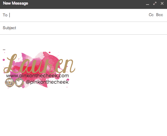
- Your entire signature shouldn’t be a single image. Besides, the recipient should be able to copy the most important info as text.
Very creative, but if images are blocked by default, the recipient will see nothing.
- Make sure your signature is useful even if the images are blocked or aren’t displayed.
- Animation is not welcome.
Fun! But does the recipient need to know you’re able to make faces?
- As many email clients send signature pics as attachments or block images by default, a good solution is to host images on a separate server.
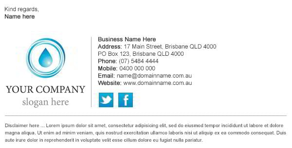
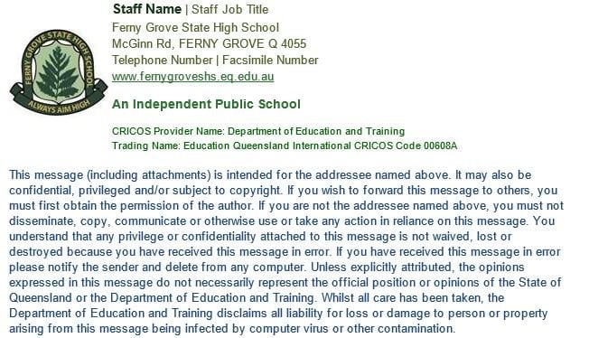
- Confidentiality clauses can be a pain when it comes to design. In fact, these huge pieces of text in small font size, probably, grey, which makes a text no one reads even more unreadable, are somewhat the opposite of decent design. If your corporate policy stands on using them in emails, find a way to make them shorter or use only in the first email of the thread.
This example looks too bulky:
- Stay away from complex HTML formatting. Some articles suggest you can use inline CSS, but in reality it’s better to avoid CSS at all.
- Make sure your signature also looks good in plain text.
- Use standard or common web fonts.
- It isn’t a strong must, but it’s better to use GIF pics in your email signature.
- Make sure your image is always displayed in 100% size. To do that, never scale it and always input height and width attributes into the code.
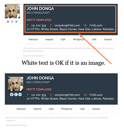
- Avoid white fonts. Even if it is a creative step, it increases your chances of going directly to spam folder.
- Don’t use image mapping (when parts of an image contain links). One can hardly imagine a reason why you would need that!
- The journey of an email is complex. It is opened in various email clients and web interfaces, it is forwarded many times, so it may face different transformations: spaces or empty lines are added, links change their color or receive/lose underlining, fonts may be converted. So you can’t be always 100% sure that it will look the same after all.
- If your signature has a lot of elements, and it gets degraded when forwarded, think about creating a shorter variant for using in long threads so it won’t takes space and attention from the actual conversation.
Email Signature Tools
If you don’t have human resources to design and code the signature and then test the results or buy professional services of creating email signatures, you can use an online tool for generating a decent signature. Here are several examples:
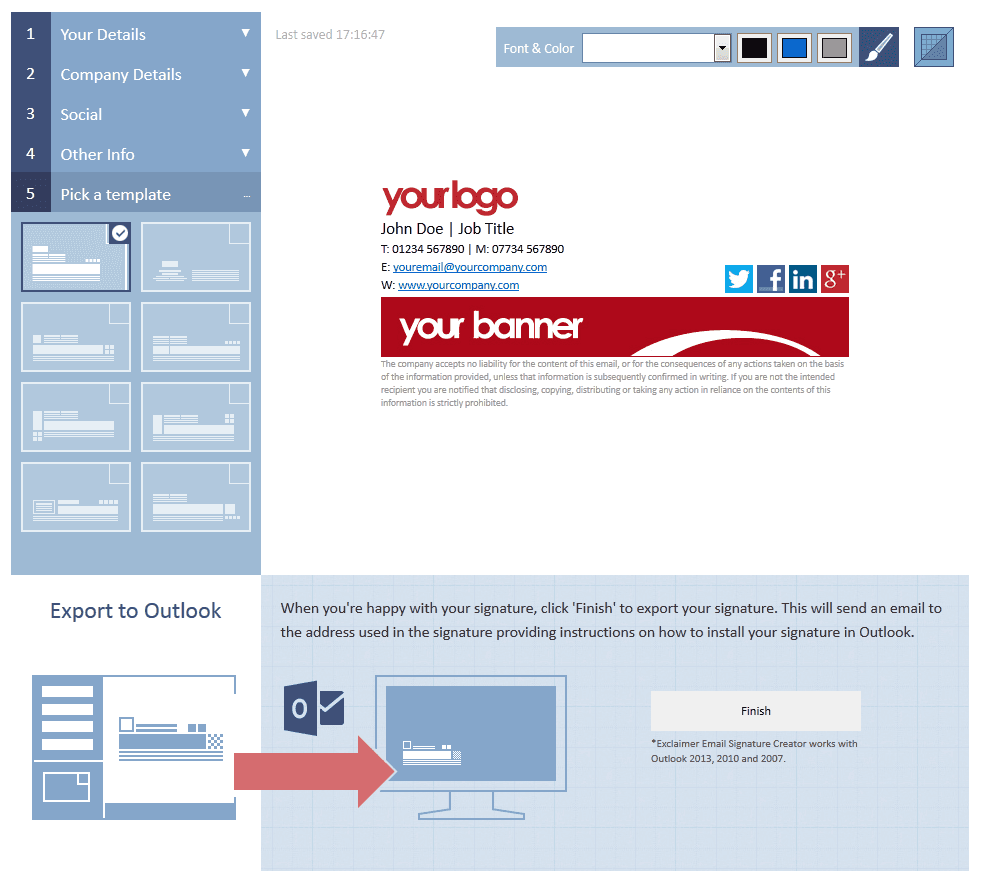
Exclaimer Email Signature Creator
The tool helps you create a signature for Outlook. No coding required; you just upload your logo, banner and enter your contacts. The tool has several standard templates, you could also change the font and its color.
Newoldstamp is a very simple solution for creating signatures for several email clients. However, it is very limited when it comes to editing the layout, so it’ll go for a very simple signature.
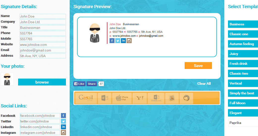
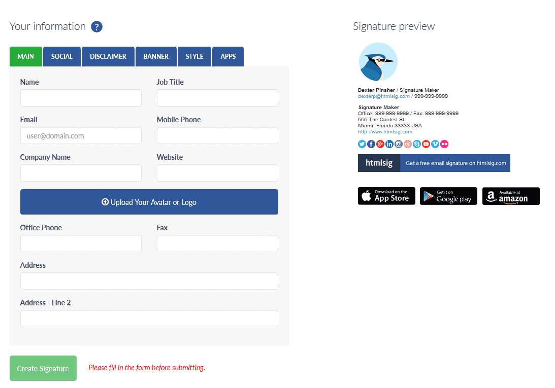
This tool has a free version which pretty much all the settings, including the disclaimer and the banner. The free version is powered by ads, but you can download the source code and with a bit of HTML knowledge delete it if you want.
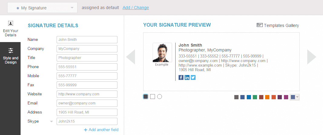
A very powerful solution for creating email signatures, but most of the cool features need a paid upgrade.
What’s your fav example of a cool email signature? Share it in comments!
Don’t miss out these all-time favourites
- The best hosting for a WordPress website. Tap our link to get the best price on the market with 82% off. If HostPapa didn’t impress you check out other alternatives.
- Monthly SEO service and On-Page SEO - to increase your website organic traffic.
- Website Installation service - to get your template up and running within just 6 hours without hassle. No minute is wasted and the work is going.
- ONE Membership - to download unlimited number of WordPress themes, plugins, ppt and other products within one license. Since bigger is always better.
Get more to your email
Subscribe to our newsletter and access exclusive content and offers available only to MonsterPost subscribers.






Leave a Reply
You must be logged in to post a comment.