The Evolution of WordPress Theme Design (From the beginning to 2019)
- Not really a theme: b2layout
- Still not a theme: WordPress Classic
- The first real template: Kubrick
- First of the annual themes: Twenty Ten
- First of the flexible ones: Twenty Eleven
- First of the responsive themes: Twenty Twelve
- The brightest of all: Twenty Thirteen
- “Magazine” type: Twenty Fourteen
- Good old blogging: Twenty Fifteen
- The simplest: Twenty Sixteen
- Born to be a businessperson: Twenty Seventeen
- Flexible as Play-Doh: Twenty Nineteen
- A glimpse into the future
- Wrapping up
Investigating the past could not only show you how the thing used to be but also allow to predict the future. History gives us lots of useful lessons in all spheres – people never change, in the core, their behavior and tastes stay the same from the ancient times. This statement is right for politics, economics, fashion, and even website templates design. To understand why some design trends are popular now we should take a look at what transformations did happen to the themes from the time they appeared to the current state. WordPress default themes are always created according to the newest design requirements and could serve as an indicator. So, I’m going to take you on a little trip through the WordPress templates design evolution. In the end, I will recommend you a few themes I consider to be best for any type of website. Let’s start!
Not really a theme: b2layout
Here it is, the first of its kind. It is like a Neanderthal man of the template creation world. Matt Mullenweg, the founding developer of WordPress designed it for WP 0.71-gold. On that times WordPress was focused only on blogging, it was far away from the huge bunch of functionalities it offers to users now. And b2layout that wasn’t actually a template, reflects the needs of the platform perfectly. The design is very simple – the speed of the internet was awful then and to make downloading faster the theme is as simple as possible. The main thing you have to pay attention to is the sidebar. This template is the starting point when sidebars were born. It was very popular back then and it is still very popular now. From that time every WordPress default theme would have a sidebar, except the Twenty Thirteen.
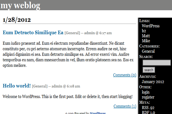
Still not a theme: WordPress Classic
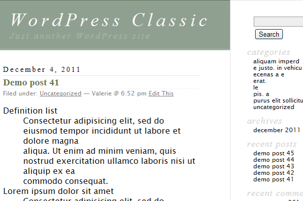
This is still not a template I could call, actually, a “template”. It was created by Dave Shea (Matt Mullenweg do only some little modifications) and it was a big step forward. I mean, look at it – this theme is much more beautiful than the previous dark one. It was still very simple – only one page with the list of posts and a sidebar where a user could put his blogroll. By the way, blogrolls (a list of links to other blogs author likes) was such an important functionality, that there was even a way to add them to sidebar automatically.
WordPress Classic was released with WP 1.2 update and that version has also given birth to plugins. WordPress was an open source software, new ideas and reviews were encouraged, so the huge number of useful tools appeared. Experienced developers who created blogs on WordPress loved that it is flexible for customizations. So they gladly used plugins, shared their own creations and wrote requests for some necessary functionalities which helped WordPress to grow rapidly and be really a user-oriented software.
The first real template: Kubrick
Witness the first real default WordPress theme! It divided the website into sections and then customize those sections with templates. When the user modified something – the modifications were automatically set for the whole site, which was very convenient. Kubrick was designed by Michael Heilemann for the WordPress 1.5 and it remained a default WP theme up to the version 3.0 and appearance of Twenty Ten. The author named the theme “Kubrick” because he loved that director but in the template’s design there was nothing from his films. The color scheme was white & blue, but the structure was really revolutionary. Those nice curved edges and big customizable header stepped out of the line. It looks nice even for a modern eye and that is not a task that could be easily achieved – to create a design that will survive for 16 years.
WordPress 1.5 version allowed users to install customized themes. From that option, the modern versatility of WordPress had grown. In 2008 WordPress opened a Theme Repository, where users could download themes for free and then upload their templates for others to use them. And that is the place where some skilled developers started to create templates that looked more like real websites, not just simple blogs.
First of the annual themes: Twenty Ten
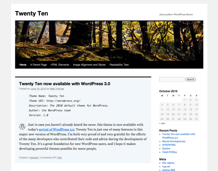
WordPress 3.0 was launched with a new theme that replaced Kubrick on the throne. Till this time Twenty Ten is the most downloaded theme ever, no other template has the same enormous number of downloads. This template started a great tradition to launch a new theme every year. As all the default themes it was simple but left lots of space for customization. It has a black & white color scheme but some new fonts, customizable background picture, and page customization menu made it a real breakthrough. Even now exist hundreds of templates that were built on the basis of Twenty Ten.
With this theme, WordPress became a real content management system that gave users an opportunity to set a custom background, post types, taxonomies, headers, and menus. And after customizations users got an opportunity to see exactly how the pages will look like on the website (using TinyMCE). Twenty Ten is so popular that there are articles, describing how to make it responsive or convert it to HTML5.
First of the flexible ones: Twenty Eleven
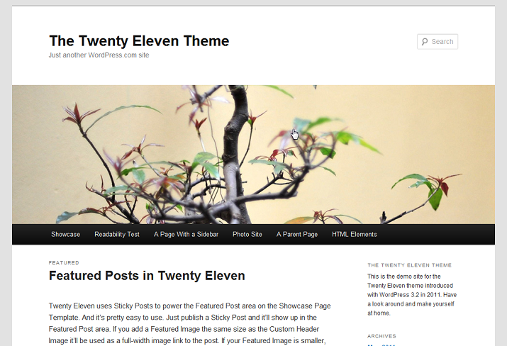
Every next annual default theme showed to the users what WordPress team had achieved during the year. As I said previously – it also displayed the most popular design trends of its time. Twenty Eleven came up with the WordPress 3.2 and didn’t have some shocking updates – in general, its look remained the same. Developers team changed the fonts and the size of the letters and added a good-looking search bar. However, there were major changes inside the template. Customization features became more flexible, the user got an opportunity to change background colors, custom headers, and layouts. There was functionality that changed a header image randomly when the user opened different pages and that was pretty cool for 2011. Besides all that, Twenty Eleven had three areas for widgets in the footer which pointed out the popularity of plugins.
First of the responsive themes: Twenty Twelve
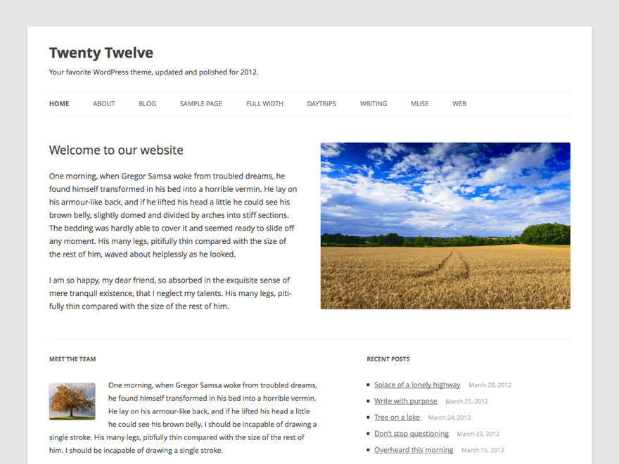
It is the moment when responsiveness came to the templates design. Smartphones became more popular and more available, so website design has to adapt. Nowadays every theme is made responsive, but for 2012 it was a real step forward. Another cool innovation was a separate homepage. The website no longer had to display blog posts on the homepage – the user could customize it according to his needs.
WordPress 3.4 matched its transformation from a monotask blogging platform to a full-scaled CMS. The functionalities of the administrative dashboard and available templates gave users the opportunity to create commercial websites. There was even an option to turn off the blog module completely.
The brightest of all: Twenty Thirteen
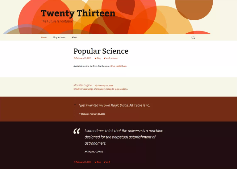
After strict black & white previous default themes, Twenty Thirteen was a burst of brightness. The eye-catching color scheme and used sans-serif font make it attractive and pleasant to look at. As I said earlier – this is the only default WordPress theme that has no sidebar. To be more precise – it has a sidebar, but it can be easily turned off. The main widget area that was placed to the sidebar in the previous versions moved to the footer here.
This theme was launched with WordPress 3.6 release and offered users even more customization options without losing the responsiveness. Some of the “blog” flavors, though, returned in Twenty Thirteen – different new post formats highlighted the work with content. This template looks really modern and for some websites, it will still be a perfect choice. And that means its look is really versatile and was well-thought-out.
“Magazine” type: Twenty Fourteen
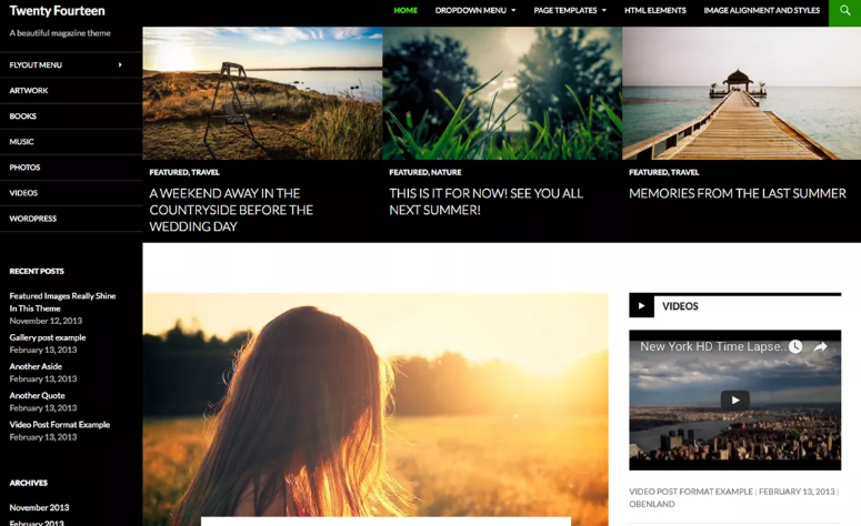
Blogging was evolving too, and personal pages that were filled and managed by a single author start transforming into websites where content was created by big groups. The blog was no longer a diary, it starts to transform into a magazine. And so the default WordPress 3.8 theme looked more like a glossy magazine. Big featured images, very clear font and layout – Twenty Fourteen was easy to read and navigate. Manu moved to the sidebar, as it was in the earliest themes, but became more understandable.
Another important innovation was a special area for ads. Lots of people wanted to make money on their blogs, so creating a special place to put advertisements were convenient for them. And thanks to a very clean design and exceptional readability Twenty Fourteen was very search engine friendly, which positively affected traffic.
Good old blogging: Twenty Fifteen
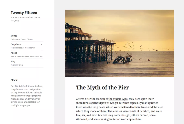
In exchange for other WordPress default themes, Twenty Fifteen is not a step forward but rather a step backward. There are a few advantages in this template. For example, it goes with several color schemes user can easily choose in the Customizer, has a better font and icon-shaped social media buttons. But in fact, Twenty Fifteen is repeating the previous templates. It has a simple design, looks nice, but it is a theme for blogging. It is a milestone because it shows the growth of social media importance but in general, it is not really revolutionary.
The simplest: Twenty Sixteen
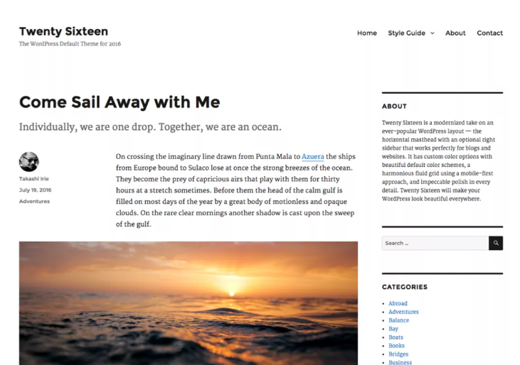
Being as simple as the previous template, yet this WordPress default theme released with 4.4 version is more versatile. It offers sidebar navigation, but it is easily removed. Every page has flexible customization options and the homepage could look almost any way you like. The template goes with several different color schemes and layouts. It is completely responsive to match the requirements of the time. This is the first default WordPress template that started to use excerpts (short introduction texts in the list of posts) and pull quotes.
Born to be a businessperson: Twenty Seventeen
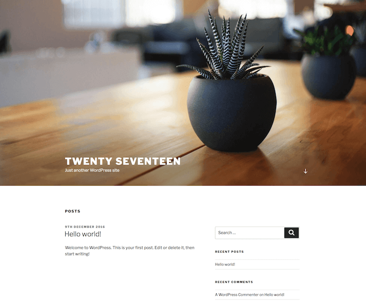
This one is the first business-oriented default WordPress theme. I mean, previous templates were also quite good for the commercial purposes, but Twenty Seventeen was created especially for it. That huge hero image at the top is an object the visitor simply can’t miss, so if you put a correct brand picture there – it will attract attention. Besides that, a hero image could be replaced with a video and that won’t affect the loading speed.
All the information displayed on the homepage is pulled from pages you create for the website. The user can combine the look very fast by just adding blocks like “featured posts” or “user testimonials”. A summary of all the website’s content gathered to the homepage with just a few clicks. Twenty Seventeen has several color options and a couple of fonts to choose from.
Flexible as Play-Doh: Twenty Nineteen
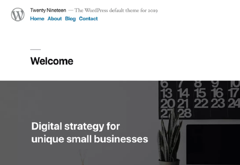
In the 5.0 release, WordPress offered users a built-in page builder, Gutenberg. So the template that is the default right now (yeah, if you are going to install the WordPress – your default theme will look like that) is extremely minimalistic. That is because the users are able to customize its look completely without writing any code at all – just drag-and-dropping elements to the page. You don’t have to switch pages and update them to see how your website will look – you are working with the look of the website without any intermediaries. The user can make, literally, any kind of website from Twenty Nineteen, so it is an indeed versatile template.
A glimpse into the future
So, let me make a little prediction about what templates will be popular in the next couple of years. Website creation is becoming more and more simple with the flourishing of page builders such as Gutenberg or Elementor. Yes, there are lots of page builders except the Gutenberg and no, I don’t think they will disappear now when Gutenberg became a default WordPress software. Windows default browser is InternetExplorer, but I don’t think you use it. Gutenberg, of course, it much better than IE, but the other page builders are great too.
That’s why all modern themes will become compatible with the page builders. I guess soon it will be as necessary as responsiveness and every new template will be ready for customizing it with drag-and-drop builder. And if we are talking about design – minimalistic style and breathtaking sharp pictures are the most popular trends. The taste for the look is changing very fast, so I can’t tell with a 100% confidence. However, I would still like to recommend a few professionally created templates. They were built to be compatible both with Elementor Page Builder and Gutenberg, so you will be able to choose which one will fit you best.
Monstroid2
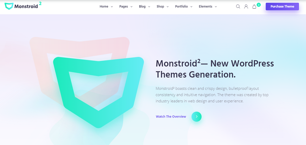
Versatility will be the key to success in the niche of template creation. Monstroid2 is a template that, in fact, has more than 20 themes inside – the collection of skins could help you create a website for every business you can think of. Or you can take any of it and customize it with Elementor or Gutenberg to make it fit perfectly for your business. The template is very light and has an incredibly low downloading time, so your website will be efficient and SEO-friendly. And the design – just look at it, it is marvelous!
Imperion
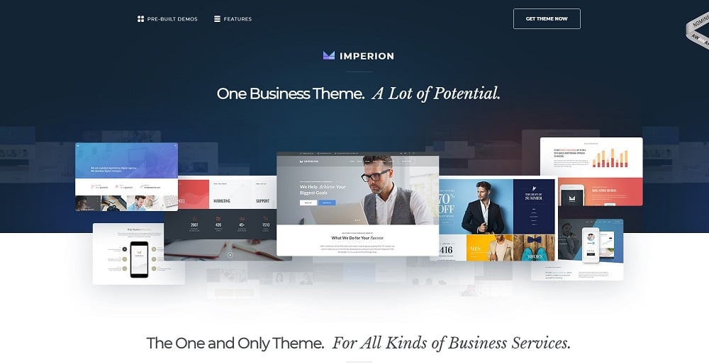
Another super-versatile theme but for different services and business companies. It also has a big library of skins that could help you to transform it to any website you would like to. The template pack includes not only the theme itself but also a few useful plugins for Elementor that will sufficiently expand its functionality. And as a little pleasant bonus – all the pictures you see in the demos are also at your disposal, so you can leave them on the places they are currently settled or replace by your own photos.
Meltony
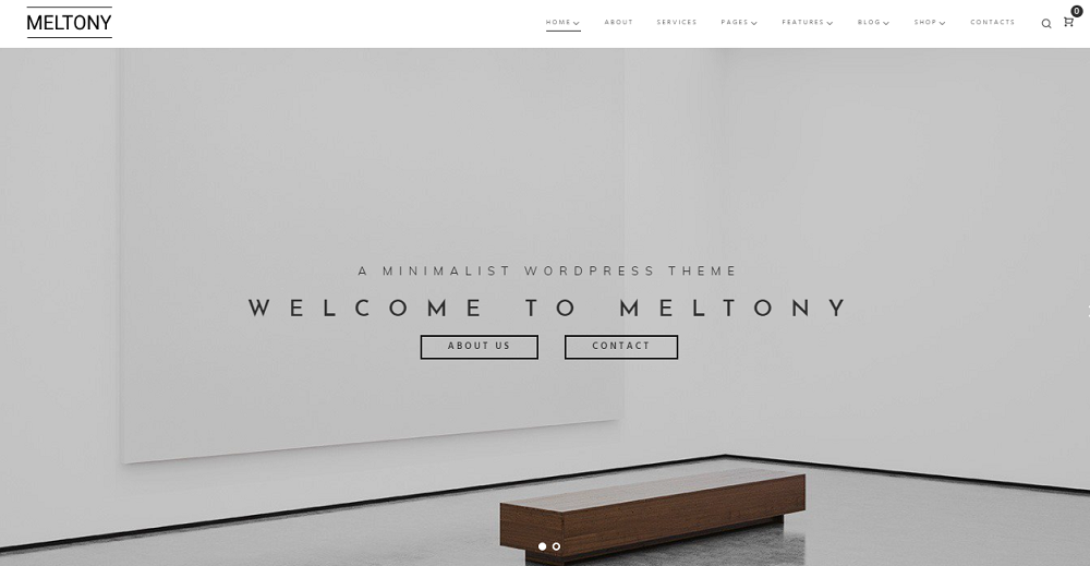
As a fan of the minimalistic design, I love this template very much. Design created by professionals is so delicate, sophisticated and elegant! It doesn’t have dozens of skins inside, only a few different homepages, but the theme itself is quite universal. Everything, starting from white-grey-black color scheme to this beautiful font is filled with elegance. Both architecture agency or perfume store, designer portfolio or clothes shop will look gorgeous with this template.

Wrapping up
Every change in the design or functionalities is a risk. An exception is only if you change something according to the requirements of time and evolution. The themes have to change and adapt to be efficient and to increase the traffic. So, I wish you to choose a template that will be as well-thought-out as Twenty Thirteen or as flexible as Twenty Nineteen. Good luck!
I hope you found the article interesting and entertaining. If you have some comments or reviews – leave them in the comment section below. I’m interested in any kind of feedback to make the article even better.
Read Also
Top-20 Personal Blog WordPress Themes In 2019
57 Best eCommerce WordPress Themes: Free and Paid
Top-30 Elementor WordPress Templates In 2019
ONE by TemplateMonster: Access Best-Selling WordPress Themes
Don’t miss out these all-time favourites
- The best hosting for a WordPress website. Tap our link to get the best price on the market with 82% off. If HostPapa didn’t impress you check out other alternatives.
- Monthly SEO service and On-Page SEO - to increase your website organic traffic.
- Website Installation service - to get your template up and running within just 6 hours without hassle. No minute is wasted and the work is going.
- ONE Membership - to download unlimited number of WordPress themes, plugins, ppt and other products within one license. Since bigger is always better.

A passionate WordPress monster since 2018. Loves professionally built website templates, is Elementor Page Builder fan and becomes extremely curious when it comes to trying some new site creation tools. Quora account
Get more to your email
Subscribe to our newsletter and access exclusive content and offers available only to MonsterPost subscribers.

Leave a Reply
You must be logged in to post a comment.