Find Your Perfect Landing Page Template
Some say that a landing page can’t be good without a great template. In other words: no matter how brilliant your offer, event or e-book will be - if the landing page is repulsive, nothing can save it. People will just enter your website and… leave it. To create a highly converting landing page, you’ll need to find your perfect template first or design it yourself.
Can an ugly landing page work well?
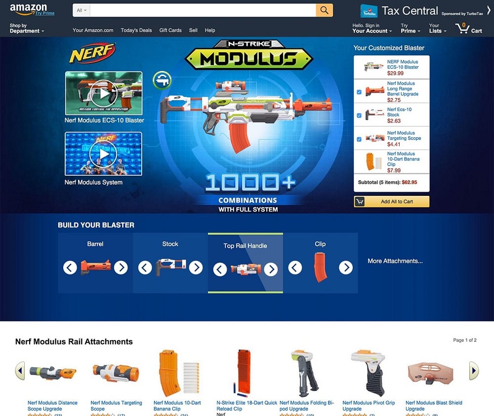
This Amazon’s landing page maybe isn’t the ugliest thing on the Web, but it’s built in a way that makes it hard to focus on any specific point. Instead, there is a large picture, two video clips, Nerf “generator”, allowing you to build up your own toy, and Amazon search and tabs - all on one screen!
If you’re interested in conversion rate and landing page efficiency, you’ve probably heard of not-so-beautiful landing pages that still convert (sometimes better than the pretty ones!).
Wait a minute! Why should I hire a designer then? Why spend hours on creating a perfect landing page if ugly works better? That question is being asked quite frequently and it comes from a little misunderstanding. You see…
Ugly Better
The reason why ugly landing pages sometimes(!) convert better is that they are incredibly simple. And this answers our question - an ugly website can work well, but only if it’s simple and only in comparison to a complex landing page.
Pretty Better
This situation is analogous - no matter how pretty your landing page is, it will drive users crazy if they can’t find what they’re looking for! This is exactly why we use “well-designed” to describe landing pages instead of “good-looking” or… “pretty.”

Both “ugly” and “pretty” landing pages (remember: beauty is in the eye of the beholder) can be great converters, but to do so, both have to be well-designed. That is the secret.
DIY - Design It Yourself
This looks like obviously the best way to achieve precisely what you expect. Building a landing page from scratch gives you the opportunity to make it 100% your own. But there’s always a catch: designing a landing page basically needs… a designer’s experience. Without skills, your landing page won’t win any contests. Things you find attractive and probably converting don’t make them necessarily so - after all, it’s just your impression.
If you happen to know a skillful graphic designer who’s willing to create a landing page for you, that would be a great idea. Especially if you don’t have any experience in the matter.
Keep in mind, though, that it will be costly and it makes sense only if you need a few landing pages. The greater your needs, the more varied a template you should select. If you use landing pages on a regular basis, sticking to one design isn’t a good idea at all. Some may think that there’s nothing new in your offer and you’re just selling the same thing over and over again. That means you need…
A Template Base
Many websites offer a template catalog to choose from - either paid or free. But there’s still the programming part - you’ve got to install the selected template and adjust it to your needs, and you’ll need a professional to do so.
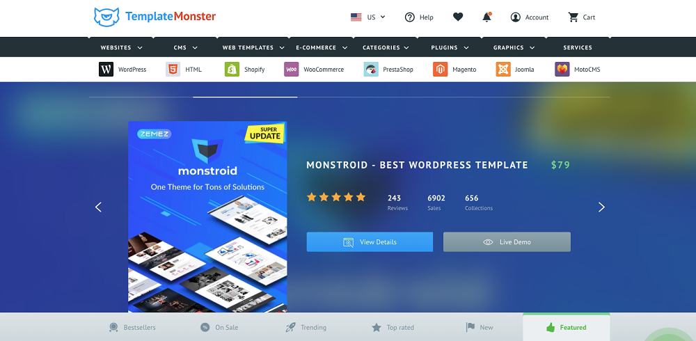
If you happen to know a skillful developer, check out Template Monster library - you’ll find many themes ready to use on various CMS platforms, like WordPress, Joomla, Magento, or MotoCMS.
But what should you do if you really have to build a landing page and yet have no IT knowledge? There’s still a way out of this! What you need is called a landing page builder.
Where to look for the perfect landing page template
One of the ways to create a highly-converting website is to use the landing page platform. Usually, it’s software that offers not only templates with an editor, but also publishing and split testing tools.
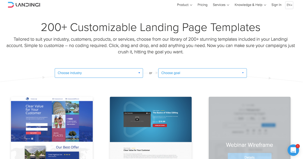
The Landingi app offers a rich template library (over 200 to choose from!) and a flexible editor that allows you to adjust almost every element of a landing page to your needs. Add helpful customer service, analytic tools, and an unlimited number of pages, leads, and traffic - all of this at an affordable price (starting from $29 per month) - and you’ve got one of the best landing page platforms for both professionals and beginners.
Higher plans offer an A/B testing tool, up to 40 sub-accounts and advanced integrations with third-party tools. There are also additional services, e.g., Landing Page Design - you can ask Landingi team to prepare fully personalized landing pages for you.
Pros:
- 200+ landing page templates included
- Price starting at $29/month
- Third-party tools integration
- Full English support
- Landing Page Design Service - available at an additional cost
- Free hosting
- Free 14-day trial
Cons:
- Only basic statistics available
- Not fully automatic mobile view (sometimes it needs correction)
Choose, edit, publish!
If you think that it can’t be that simple, I’m here to assure you that it can! These three steps are all you need to create your converting and good-looking landing page. Let’s follow them!
Choose a template
Many landing page platforms offer dozens of free (or paid) themes for various purposes. Select one that fits your needs, but keep in mind that you don’t have to take it or leave it - most of the templates can be edited. Give it a shot!

Edit and personalize
Once you’ve selected your template, it’s time to adjust it to your campaign’s needs. If it isn’t a closed design, you can change pretty much everything: colors, fonts, sections, forms, buttons, CTAs, images, and videos.
Creating a perfect landing page out of someone else’s vision is an art - don’t expect it to be a walk in the park. Of course, it’s still much more accessible than building up a whole design from a blank page to achieve the end result. Done yet? No!
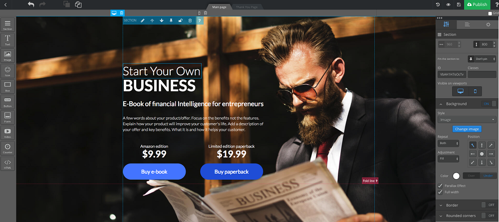
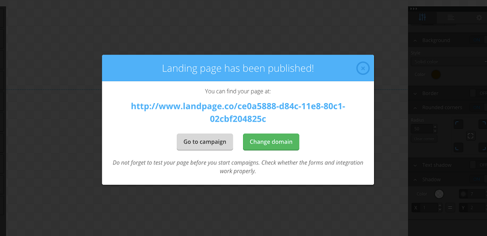
Publish your landing page
If it’s ready, hit the “publish” button and wait for the results to come pouring in… not. To really milk your landing page to the last drop, you should start monitoring its effects right after release. It’s going to take some work to learn what’s happening with your page as visitors start to arrive. Do they stay or go?
What’s next?
Your landing page is up and running, a quick glance at stats says that it’s doing its job… so, is there anything else we can do? Yes, there is! Every landing page should be split tested. Let’s figure out what this is:
Split testing or A/B testing is a technique in which we examine one element of a landing page - e.g., a button color or a form position. Launching the test means that a landing page will be published in two (or more) versions simultaneously - some visitors will see A, while the others will experience B (and so on, if there are any other versions).
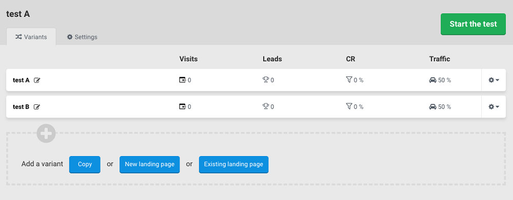
After some time testing, you should compare the results of every landing page variant and select a winner. Implement changes and… run another test, this time with a different element. This may seem like a lot of work, but it’s worth it and you’ll notice this with every version of your website.

How to build a landing page in WordPress
If you’re not convinced by templates available on the internet, you can always try something else, though other ways will surely by more time-consuming. One of the most popular tools for website (and landing pages) creation is WordPress. What are its capabilities? It’s worth checking out!
Landing page in PHP
Do you know programming basics? Try building a landing page in WordPress using a default template and place your own CSS/HTML code inside.
If you’ve got the necessary knowledge, you can create a landing page which can be easily adjusted to your needs - writing a piece of code yourself gives you total control over it. Keep in mind, though, that you’ll need web-developing experience to avoid making costly mistakes.
WordPress templates
Even without proper knowledge and experience, you can create something yourself. Take a look at the WordPress theme library. The most well-known CMS has tons of templates (either free or paid) in its repository. Maybe the free ones are not so flexible and versatile, but they will suffice for the beginning. If that’s not enough for you, check out Template Monster templates - i.e. Monstroid2.

WordPress plugins
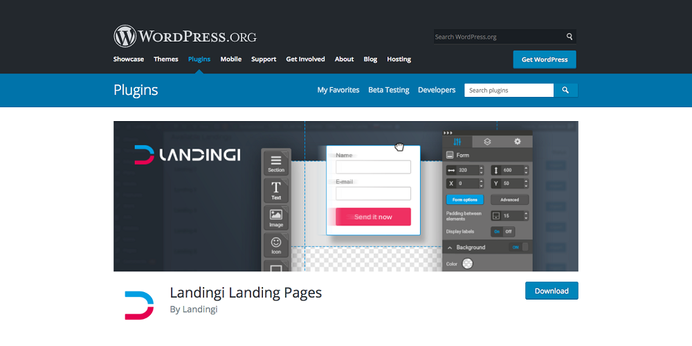
WordPress is a good, functional tool, but it’s not perfect, and some of you may want to extend its functionality. This is what plugins are for. Of course if you want to enable a landing page builder plugin, you’d need an account in the service first. Choose a plugin from WordPress shop, install it and enable it - all using the left bar menu.
Looking for the Perfect Solution
It isn’t easy to find a perfect landing page template, but it’s worth trying. If all you need is a landing page for a one-time campaign, you should look for it on template library or hire a designer to create one tailored for you.
But if you’re a marketing agency or a company that plans to launch multiple landing pages, then a landing page builder app will be much better for you, with plenty of templates to choose from and useful marketing tools like integrations, analytics and split testing.
After all, the choice remains yours. Good luck on finding the best solution!
Read Also
How to Increase Your Landing Page Conversion Rate
Boost Conversions with the Best WordPress Landing Page Plugins
5 Design Qualities of a Good Landing Page Template
Easy Steps to Launch a Business Landing Page Code-free
Best Landing Pages That Convert 100% – Top 10 Templates [UPDATED]
Don’t miss out these all-time favourites
- The best hosting for a WordPress website. Tap our link to get the best price on the market with 82% off. If HostPapa didn’t impress you check out other alternatives.
- Monthly SEO service and On-Page SEO - to increase your website organic traffic.
- Website Installation service - to get your template up and running within just 6 hours without hassle. No minute is wasted and the work is going.
- ONE Membership - to download unlimited number of WordPress themes, plugins, ppt and other products within one license. Since bigger is always better.
Get more to your email
Subscribe to our newsletter and access exclusive content and offers available only to MonsterPost subscribers.

Leave a Reply
You must be logged in to post a comment.