30 Slab Serif Fonts for Bright Headlines [Free for Download]
Slab fonts - this is a collective naming for a group of fonts with rectangular shaped serifs. These fonts can be with or without roundings in the points of attachment to the basic strokes.
The earliest fonts of this type appeared in England in the early XIX-s century. According to the shape of ovals and serifs, these fonts can be divided into several subgroups: Egyptian, Geometric, Humanist fonts and slab fonts of a Clarendon group. Also, into this group some designers refer squared fonts with reverse contrast (Italic).
Geometric Slab Serif Fonts
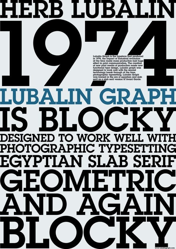
These are rectangular serif fonts built on the basis of simple geometric shapes - circles, squares, equilateral triangles. These fonts have appeared in the 20's and 30 's of the XXs century as a modification of fashionable geometric grotesque fonts. These are characterized by complete absence of contrast. Examples: City, ITC Lubalin Graph, Memphis, Stymie, Rockwell.
Egyptian Slab Serif Fonts
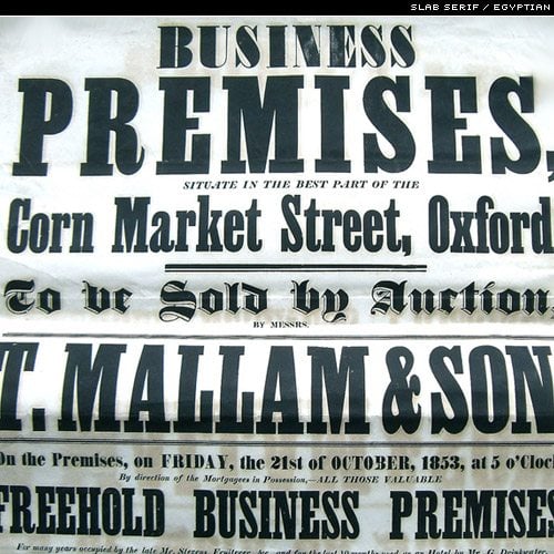
The first knows Egyptian Slab Serifs appeared in 1815 in the catalogue of a London typefounder Vincent Figgins (Vincent Figgins, 1766-1844). Egyptian Slab Serif is characterized by complete lack of contrast between strokes, single-width building, vertical axis of ovals, powerful rectangular serifs without roundings. The name is associated with Egyptian campaign of Napoleon Bonaparte (1799), when Europe learned about civilization of ancient Egypt, as well as the name of a French frigate Egyptienne, captured by the British in 1802 and was driven to London as a trophy.
Humanist Slab Serif Fonts
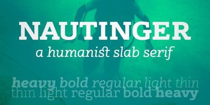
This is a group of squared fonts based on humanist grotesque, partly reminiscence of Venetian Humanist serif old style, but with low contrast and strong rectangular serifs. As there were developed lots of humanistic grotesques along with them there were created humanistic slab fonts. Generally, these fonts include several italics fonts. Tilt angles in the characters can be both small and large. Examples: PMN Caecilia, Joanna, ITC Officina Serif.
Clarendon Slab Serif Fonts
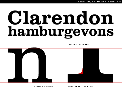
This is a collective name for a subgroup of low-contrast squared fonts, where serifs are attached to main strokes of roundings. The first font called Clarendon was created in London in 1845 by Robert Besley (Robert Besley). As it turned out these fonts are very well read in small point sizes in high-speed rotary printing, on a low-quality paper, by a non-prepared reader. This is why most newspaper fonts have been developed on the basis of Clarendon. Furthermore, this typeface is often used in textbooks.
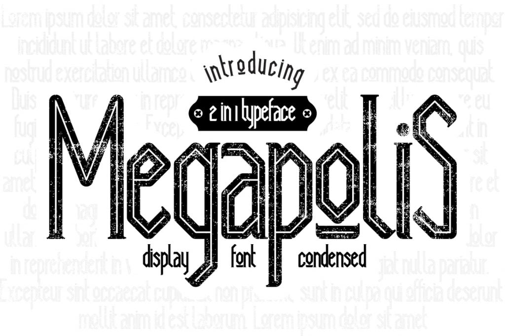
Megapolis Font
Italic Slab Serif Fonts
This is a variety of squared fonts with reverse contrast is where horizontal strokes are thicker than vertical. Fonts of this group appeared in the first half of the XIX century, but gained popularity in late XIX - early XX century as accidentals. Examples: Figaro, Playbill, Old Town.
* * *
Typography plays a huge role in any design. Here we've collected 28 free and high quality Slab Serif Fonts for you to use. If you like these free fonts you might also want to check out our previous post below.
* * *
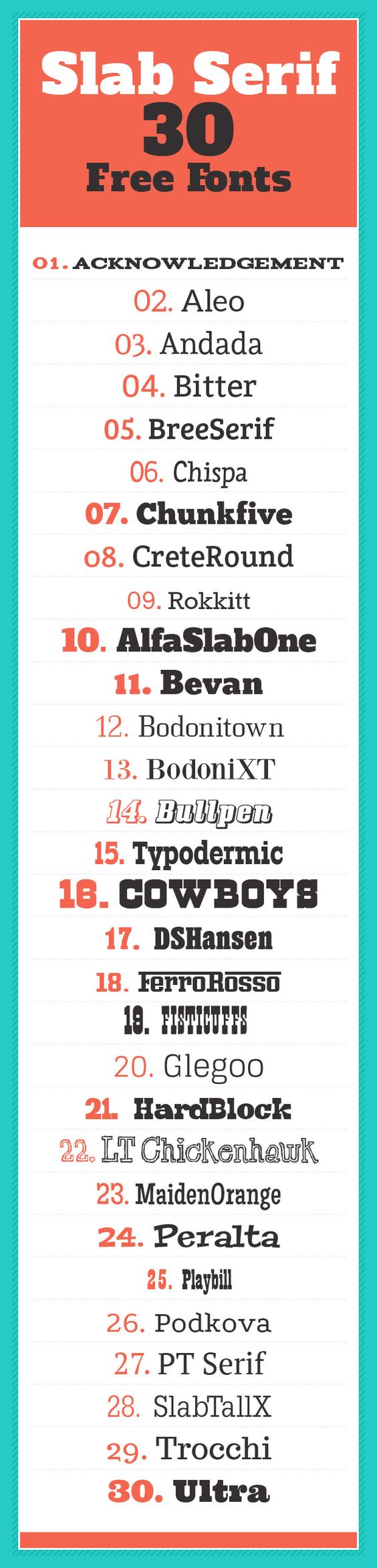
1, 2, 3, 4, 5, 6, 7, 8, 9, 10, 11, 12, 13, 14, 15, 16, 17, 18, 19, 20, 21, 22, 23, 24, 25, 26, 27, 28, 29, 30.
* * *
SPEAK UP! Be so kind to share your experience with Slab fonts. If you design layouts or you’re engaged with customization how often are you using these fonts? Or if you’re an opponent of Slab fonts which are you using instead?
7 Typography Mistakes - Checklist

Get more to your email
Subscribe to our newsletter and access exclusive content and offers available only to MonsterPost subscribers.

Leave a Reply
You must be logged in to post a comment.