Fat or Skinny? Which Font Do You Need Right Now?
Fat fonts. How many fonts will it be enough for a web designer? And how many is it enough? Each project requires an individual approach; otherwise, all websites will look like clones. Did you see the famous movie Star Wars Episode II: Attack of the Clones? An eerie sight, isn’t it?
Each time when you start a new project first of all you get acquainted with products, services, corporate feel, and style. Then goes the phase of brainstorming. The whole team is sweating on how to present the given item in the most beneficial way. You choose various design elements, photos, videos, colors, and fonts. We are sure that your web design library is rather rich, though nobody will refuse an extra freebie just because their depository is packed full.
Web design is a fluid industry and objects that were on the peak of popularity yesterday might look badly outdated today. So, professionals should trace the slightest trends and refresh their storage regularly. Are you ready for spring-cleaning of your font pile? Don’t be a lazy-bone! They say: “No song, no supper”. Actually, the entire routine job has been already done instead of you. All you need to do is to view the fonts we’ve collected under this text, remember numbers of the ones you like and click the relevant link below the image. The linked number will take you to the download page. The good news is that all fonts are free to use.
C’mon and join the game. Guess what we’ve cooked for you today? What fonts do you like the best? Fat or skinny? We suppose the right answer will be “it depends on the circumstances…” In any case, it’s never too much of a good thing, so you are welcome to make your pick. We bet that you’ll have what to feast your eyes upon. But, enough talk, please, meet the 40 free fat and skinny fonts that will help you cater to various customers’ needs.
PREMIUM Fat and Skinny fonts
Lazyday - Bold Script Font

This cool fat font is perfect for launching a new brand of men’s perfume, clothing brand or just looks good in a designer’s portfolio. Can be used for logos and in posters, for example, to advertise the brand of a barbershop, themed restaurant or cafe. Agree that these letters just smell of expensive Scotch whiskey and you can feel a strong energy.
Not suitable for the design of long texts, like any other from our fat fonts list, because the bold large style is nevertheless created for accents and not for detailed monotonous conversations.
Features:
- TTF/OTF/WOFF;
- extra swash;
- support Adobe Illustrator, Adobe Photoshop, Adobe InDesign, Microsoft Word.
Roquero Sport Font

An interesting fact: earlier serifs helped to make better prints in typography and did not wear out the letters themselves. Until the 19th century, all fonts in the world were serif. Today it is believed that serifs help reading because the eye catches on the drawing of the letter itself and the words do not merge into one picture. “Roquero” is a loud decorative fat font specially reinforced with a sporty theme, as it is ideal for depicting catchy phrases in clothing prints, logos of various sports teams or organizations. Such a font is easy to read, so it is well suited for headings or presentations.
Features:
- TTF/OTF/WOFF;
- easy installation;
- accents (multilingual characters);
- works on PC and Mac.
Kalled | Modern Typeface Script Font
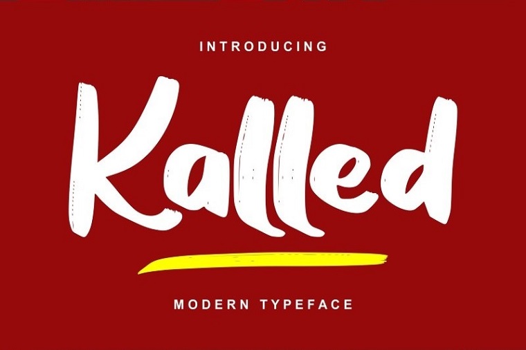
Looks super modern and stylish. This font will look good in web design. Suitable for musicians, fashion designers, photographers to design a personal blog. Great for short, impactful lettering such as a billboard or motivational posters that look great when paired with soothing classic fonts. Therefore, “Kalled” is well suited for the design of travel and fashion brochures, leaflets and posters. Pay special attention to the stylish numbers in this fat font.
Features:
- TTF/OTF;
- a large number of glyphs;
- multilingual technical support.
Smoking Typeface + Illustration Font

This fat font inspired by vintage print that adds dimension and realism to any design. A decorative font that looks like it was specially designed for site logos, signage and printing on, for example, craft hoodies. Will look good in a cafe or hotel name, for bar signs, roadside motels on US Texas highways, book and movie titles. “Smoking” is dynamic and quickly attracts attention.
Features:
- TTF/OTF/WOFF;
- Illustrations;
- textured volume effect.
Trackers - Bold Script Font
Rounded calligraphic letters take us back to childhood with fairy tales and mythical stories. Such a fat font can be used on thematic sites and in print. An unusual font with an airy structure, light and elegant, which is perfect for packaging design or for creative business identity. Trackers catches the eye well in logos, headlines and short texts. It looks especially stylish if you make it accentuated.
Features:
- TTF/OTF/WOFF trackers;
- universal style;
- PUA unicode.
Macadamia Handwritten Font
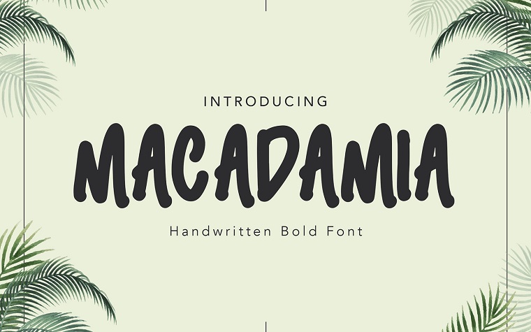
Cool font, the letters of which are like painted with a brush. Well suited for the design of posters and posts on social networks on cheerful topics. And now girls love so much to carry various notebooks, diaries, craft leaflets in a folder for paper, planners, smash books. Such a font on stationery products or in their web versions will clearly attract creative people.
Features:
- OTF;
- nature theme;
- handwritten style.
Redneck Bold Typeface Font

This experimental fat font is great for headlines and small text. Powerful and brutal, it attracts attention at first sight. Visually associated with the American “bald eagle”. Ideal for boxing posters, sports team logos, sports posters and video games.
Features:
- TTF/OTF/WOFF;
- a large number of glyphs;
- for the sports brand industry.
Manly Dack Font

Simple yet cool font with interesting letterforms. It reads well and attracts attention. Such a fat font reads well in print, web pages and mobile interfaces. Ideal for movie title writing on posters, especially horror movies, concert posters, especially rock or Halloween, catchy invitations and vinyl records.
Features:
- TTF/OTF/WOFF;
- grunge style;
- easy to use.
Blackink - Street Brush Display Font
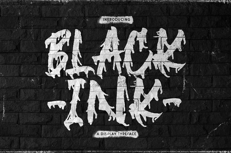
More like a stencil than a font. You just want to use it to draw something bright and inviting. For example, an advertisement for a new loft establishment, underground parties or a poster for a new contemporary art exhibition. Ideal for design artwork, stylish lettering on a T-shirt or interior decoration. Now it is very fashionable to use street art for decorating walls. This style can inspire you to paint your workspace or portfolio as well. “Blackink” will look great in combination with the same design on store websites, magazines and media.
Features:
- TTF/OTF/WOFF;
- hand brush style;
- support Adobe Illustrator, Adobe Photoshop, Adobe InDesign, Microsoft Word.
Magic Wand - Bold Script Font
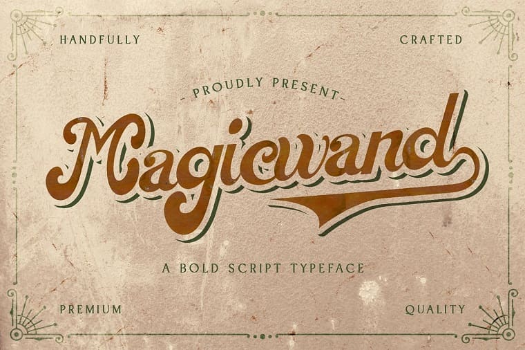
The main feature of this retro style is the oblique ovals of the letters and asymmetrical curves. The text typed in such a fat font immediately takes on a refined style and a beautiful bookish, fabulous mood. “Magic Wand” will look good in the design of retro magazines and newspapers, on business cards, on auto banners or billboards. And remember the first bottles of Pepsi Cola. Huh?
FREE Fat and Skinny fonts
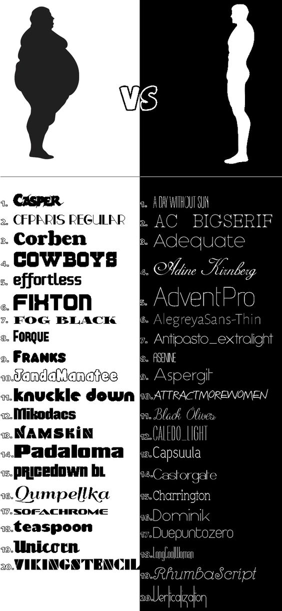
Free Fat Fonts:
1, 2, 3, 4, 5, 6, 7, 8, 9, 10, 11, 12, 13, 14, 15, 16, 17, 18, 19, 20.
Free Skinny Fonts:
1, 2, 3, 4, 5, 6, 7, 8, 9, 10, 11, 12, 13, 14, 15, 16, 17, 18, 19, 20.
...or download all.
So, what’s your choice? Fat or skinny? Take a little bit of both or all of them in a bulk, better yet. We are sure that all of the selected fonts will come in handy someday. And what’s your opinion? Do you like our free fat – skinny fonts collection? Will you download and use some of them in your future designs? Want to make a compliment or criticize the author? The comment section is for your service. Please, don’t keep silence and help us make Monster Post the most useful resource, fitting all your professional requirements.
Get more to your email
Subscribe to our newsletter and access exclusive content and offers available only to MonsterPost subscribers.

Leave a Reply
You must be logged in to post a comment.