Symmetry in TemplateMonster’s Website Templates [Die Gestalt im Design]
What is hidden under the term of “graphic design”? Basically it is the ability of creators to give visual forms to pics and ideas produced in their heads. In other words, it is form-making which requires substantial technical and creative skills, experience and even manual work. Form-making isn't all-sufficient - it calls for psychology, flexible thinking and constant self-development.
You as a graphic designer or webmaster need to cultivate the seeds of intuition, critical thinking and understanding of viewers' psychology. To make progress you just ought to know the principles of visual perception and put them in use. Gestalt theory is all about these visual principles. Last times we were speaking about the laws of Proximity and Similarity and today we'd like to cover the law of Symmetry in web design.
Gestalt theory doesn't want to make design dead mathematics or science. It just serves to figure out the patterns that help to convey the message efficiently. So you don't have to be afraid of design laws - they are unlikely to limit your artistic vision and creativity. Gestalt principles will rather help you to learn how human minds organize visual data and manage it all orderly.
Essence and Types of Symmetry in Design
In Greek “Symmetria” stands for symmetry - the proper proportion of different parts of our body to each other. The other synonyms of the term are commensurability and coherence. If we apply the word to web design industry, it rather means the balanced “variety in unity”.
You probably agree with me that we all strive for balance, and this phenomenon covers the proper order, harmony and aesthetic appearance. We need symmetry to achieve pleasing effect in our works. We tend to discern even invisible centre that combines parts of an object. And we observe this centre in nature around, which gives us the feeling of beauty. You don't even need to be design experts and dig into advanced theories to find symmetry cute.
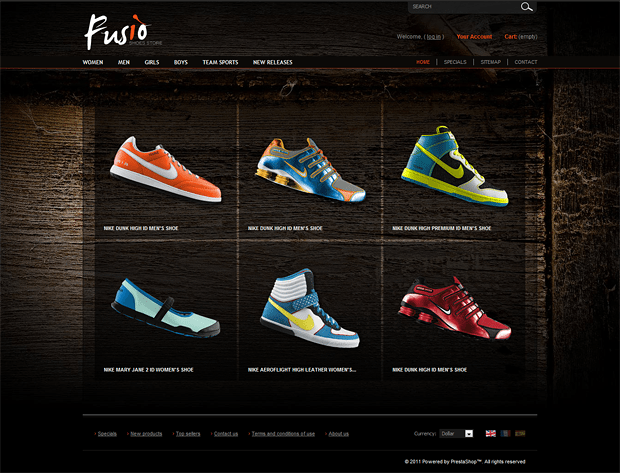
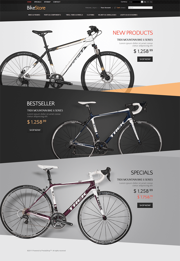
Generally we distinguish three major types of symmetry - translational symmetry, bilateral symmetry (reflection) and radial symmetry(rotational). All three types of symmetry can be effectively used in today's web design.

***
***
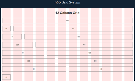
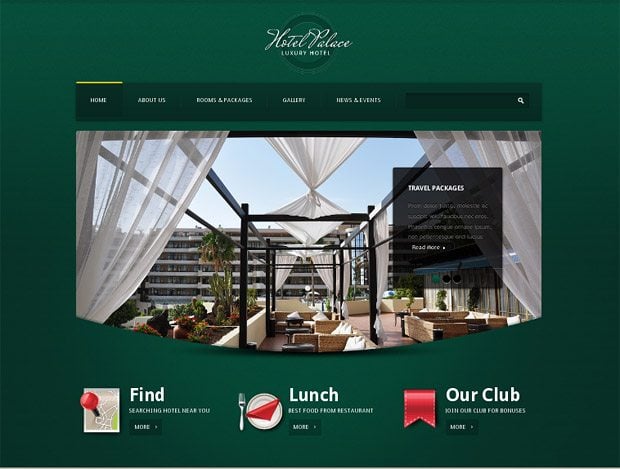
This type of symmetry is also perfect for building an optimal layout structure. Examples can be designs based on grid layout patterns (like 960 Grid System):
***

***
***
***

***
***
***
Symmetry and Order
The law of symmetry is also associated with an idea of order. Looking at symmetrically placed items, viewers get an impression that nothing is missing and everything is on its right place. Asymmetry should be used with caution as in some cases it looks wrong and unbalanced. Have you ever noticed that looking at asymmetrical objects you waste a few seconds to find explanation? And this lowers concentration on the content itself.
Order means structure, stability and clarity. A clear order in web design may have either a positive or a negative effect on viewer's mind and this highly depends on his/her personality and the purpose of the message. Symmetry and order work greatly with any helpful, educational or technical information, with the utility content, written instructions or video tutorials resources. In this case online presence of orderly material is seized quickly and effortlessly. This concerns not only texts but also visuals. But there is always a group of people who associate the order with excessive scrupulousness or even conservatism. So you should get ready to them finding your clear symmetrical designs boring. Well, every man to his own taste!
Dynamic Symmetry Phenomenon
There is a popular concept of “dynamic symmetry” introduced by Jay Hambidge. Some experts consider dynamic symmetry to be a great facility to improve the efficiency of any design. What on earth is dynamic symmetry about? Dynamic Symmetry takes growth spiral of nature as its basis. Its golden proportion makes 1.618 and is persistent. Hambridge derived the term of “dynamic symmetry” from works of Plato and drew inspiration from the writings of Vitruvius.

Dynamic means energy of growth and life cycle of natural components, while symmetry is associated with commensurability. Following this principle you'll create live images and make them breathe. That's something we often lack in web design.
Prof Detrie speaks about the connection of natural order and graphic design as follows: "We are born with innate design potential through our connection to natural order and our figure-based perceptual system. We do not add design topics into our world. Instead, we grow design potential from our internal nucleus. Viewer connection is an event. The viewer connects with the visual form when we prepare the form and context to engage the viewer's perceptual response. While the message may be external, communication results when the meaning forms internally in the viewer's mind."
Hambidge states that dynamic symmetry is rather a complement to creativity than limitation of its application. Eventually, if you grasp its working principle you'll open your minds to create natural harmonious designs.
***
In conclusion, I would say that symmetrical objects are visually lighter than asymmetrical ones. And the quicker viewers get your message, the better. Symmetry is ideal for repeating blocks and backgrounds, for patterns and pieces of content. Being calm and monotonous, it can fill the whole layout. Whereas asymmetrical elements make content look visually active and thus lure viewers' attention. People got used to perceive structured and clear information, and symmetry is the first-aid medium for achieving the goal.
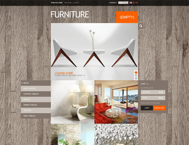
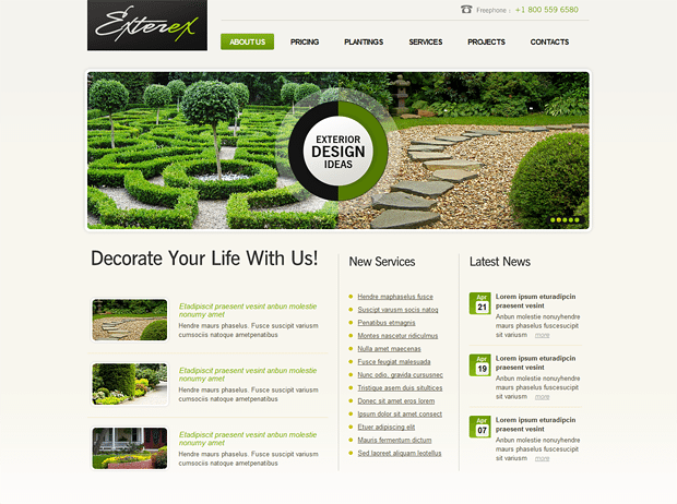
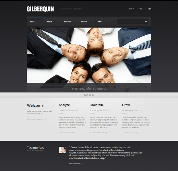
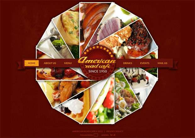
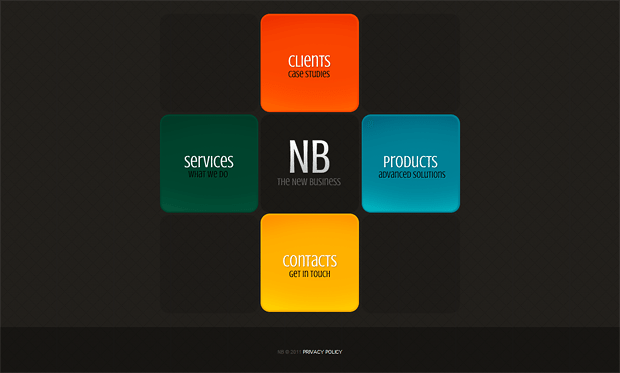
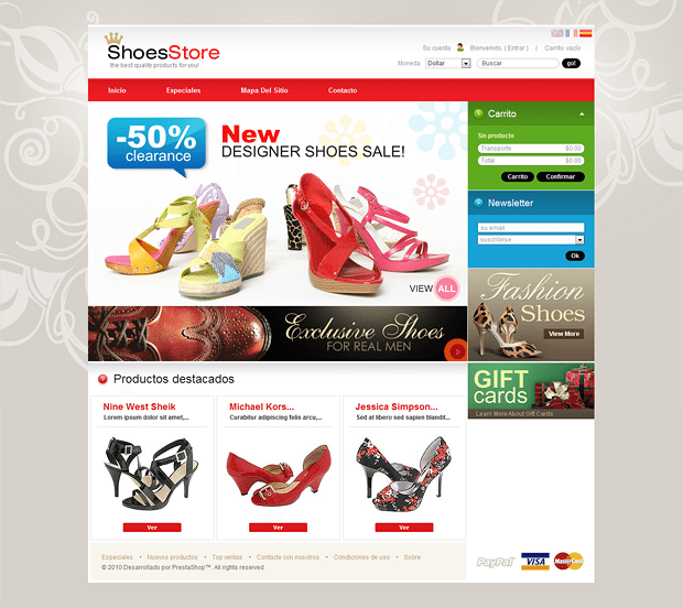
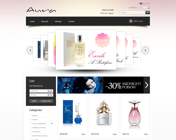
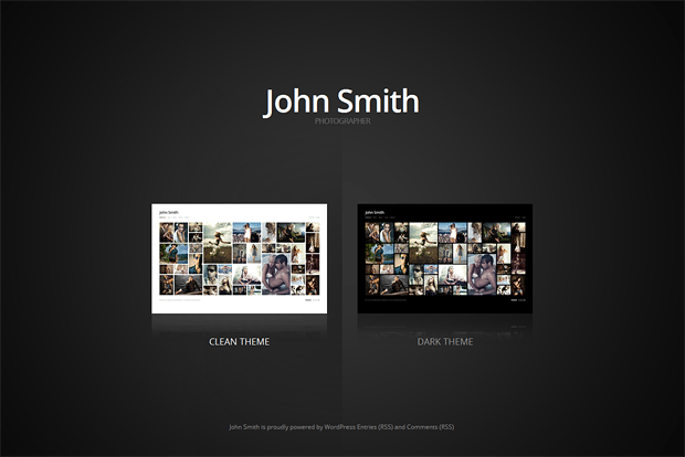
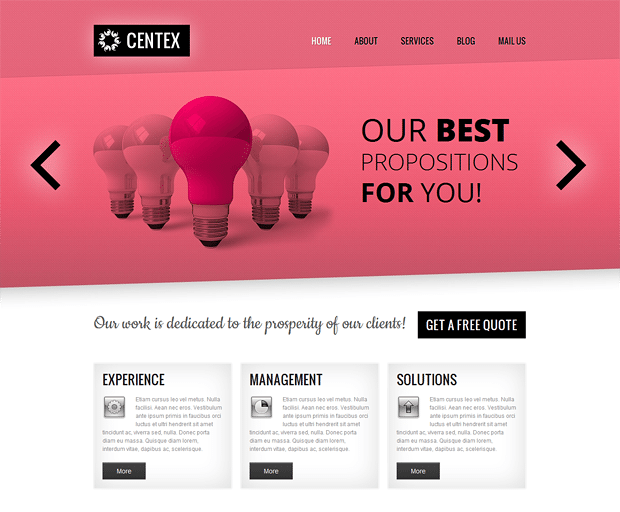
Enjoy other great samples of symmetry used in TemplateMonster’s designs:
***
***
***
***
***
***
***
***
Don’t miss out these all-time favourites
- The best hosting for a WordPress website. Tap our link to get the best price on the market with 82% off. If HostPapa didn’t impress you check out other alternatives.
- Monthly SEO service and On-Page SEO - to increase your website organic traffic.
- Website Installation service - to get your template up and running within just 6 hours without hassle. No minute is wasted and the work is going.
- ONE Membership - to download unlimited number of WordPress themes, plugins, ppt and other products within one license. Since bigger is always better.
Get more to your email
Subscribe to our newsletter and access exclusive content and offers available only to MonsterPost subscribers.






Leave a Reply
You must be logged in to post a comment.