Grid System Trends in Web Design – Which Way is it All Really Going?
Web design audience can’t stop buzzing about the grid system. On one hand it allows flexibility and encourages correlation between web page elements, eases the integration of pics and texts, lets us forget about the outdated HTML tables and helps to eliminate significant coding errors.
But even cross-browser support doesn't save it from bulging at the seams. Even though the most popular 960 grid system tries to lull us into a false sense of security, experts feel its inconsistency with the upcoming web trends. So in today's post we've decided to dig deeper into the future of the grid system in web design and to try to figure out what this future will mean for us.
What seems to be the problem, officer?
So the tech world keeps moving forward. Since we are more accustomed to logical organization of information, web pages need to be well structured. Grid experts track the stats on the number of Internet users at different periods of time, on screen resolutions, operating systems and devices they work with. And they come to a conclusion that we lack some universal grid system to meet the modern standards, some new approach to comply with technologies that keep the web going. Today we'd like to place this question on the agenda and list the best traditional and innovative grid systems found on the web, just so you know better what we're talking about.
* * *
960 Grid System
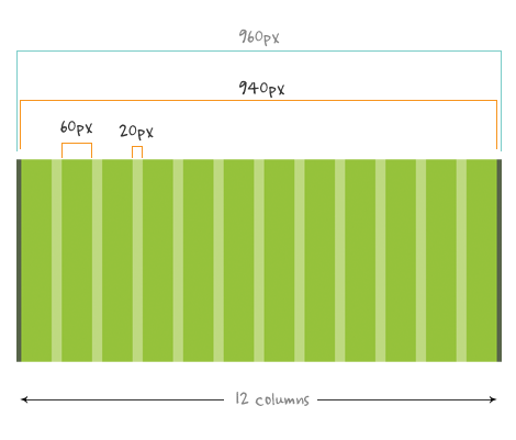
960 grid system is the most honorable and long-standing grid system used by web developers today. It comprises the fixed number of columns within the width of 960px. Why 960? It makes for many clean divisions with the whole numbers – it's surely convenient for calculating the margins and widths as well as the columns location. 960gs is rendered by 12-column and 16-column grid types. If you need extra structure complexity the option of the 24-column grid is also at your disposal. What's good about the 960gs is a nice multi-platform and cross-browser support, easy calculations and source ordering. If you feel 960gs is enough for your needs, feel free to build it using special ready-made tutorials and actions that don't require much knowledge and skills.
Although it does a pretty good job in its field and fits the majority of screens, new screens and resolutions are getting larger, so 960 is sometimes not enough for them. This is because of its 20px gutters and gutter spaces that leave just 940px for the content area itself. And the modern web requires higher parameters. Let's take fonts for instance: the sizes have increased within the last couple of years which should lead to larger content area and gutter space. Operating Systems are able to display much higher resolutions and complex layouts within the last decade. And even classic standard resolution of 1024×768 seems to be getting out-of-date. So it gets obvious that 960gs is not a panacea nowadays.
* * *
Emerging Grid Approaches
978 Grid System
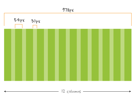
Considering the lack of space and size, 978 grid system can boast of displaying larger fonts correctly. While the majority of designs were recently made with the 12px font, you may observe more and more 13-14px fonts on pages. The new 978 grid system allows for the designs with larger fonts but it doesn't solve the problem. Web experts won't recommend you to use the layouts with 978 px width if your site needs to be displayed on iPad and similar devices correctly. When loaded on iPad it may lack white spaces on each side.
It's hard to foresee the Grid's future in web environment, but it's already clear that we need a nice framing solution applicable for different types of websites. You probably wonder what looms at the horizon when it comes to grid usage for responsive web design. So the question is - will a single solution be able to combine and provide everything? So it's time to look around and migrate to the new extended frameworks like 1 KB Grid, lessframework, CSS Boilerplaite, 1140px grid, Blueprint CSS, YAML Grid, SenCSS and other promising grid systems we are listing below.
* * *
1140px Grid
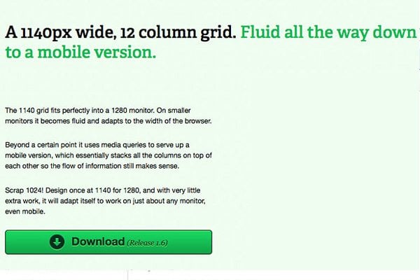
Another grid for higher resolutions is 1140px grid system. The puppy here is released and regularly updated by Andy Taylor and is nice for many web pages. After some efforts you can even build your own column widths with it. But considering the fact that the average screen resolution is 1280x1024px today, we come to the conclusion it's not perfect either. 1140px Grid includes 12 columns and is scalable on many devices. The grid displays a certain layout due to the media queries is works with.
* * *
Blueprint CSS
Blueprint CSS can boast of the strong sides provided by Baseline and has got an authoritative and recognizable brand name. Besides, it's classes library is being constantly updated by web developers. The model offers grids as well as frameworks for mobile and print screens as well as typography.
* * *
YAML Grid
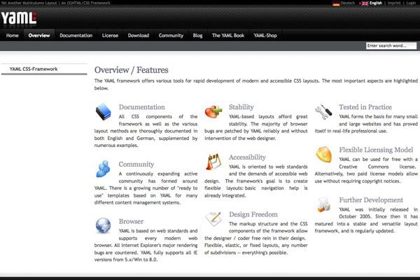
What is YAML like? It is widely popular among the current CSS systems. The full name reads as Yet Another Multicolumn Layout (YAML). Due to the consistent base of code for working with flexible CSS and XHTML models. The open source framework is being updated by the community members and developers. It allows for different fixed-width layouts starting from 740px for resolutions of 800×600px and ending with 80 em, which is good for both desktop and mobile browsing. YAML provides with the impressive multi-browser support. To get more details go to the YAML overview and features page.
* * *
Yahoo! User Interface Library
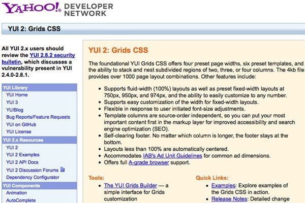
YUI comprises huge CSS and JavaScript libraries presented by Yahoo. The range of unique page structures is imposing – it counts over 1000 exclusive layouts. YUI is known for offering some options of layouts for mobile display. As for the drawbacks, the frameworks are good for being used on browsers with more recent versions of the Webkit engine. This makes it applicable for iPhones, BlackBerry and Android devices as well as various Windows Mobile devices.
YUI2 Grids is a newer version of the Yahoo framework providing better code for both fixed and fluid layouts. It supposrt both CSS2 and CSS3 and offers great documentation. All this makes it one of the best frameworks for the newbies.
* * *
1 KB Grid
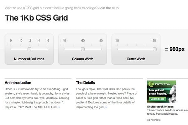
The layout of the 1 KB Grid consists of a 12 column grid system. 1KB Grid offers 60 pixels width of columns and 20px of gutter and is able to spread out over 960 pixels. All columns are associated with their own classes setting their widths. The separate row clears the floating columns.
* * *
Baseline CSS
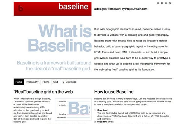
Baseline is one more open source CSS framework solution. Its features include the compatibility with CSS3 and HTML5 elements, presenting both code for grids and nice arrangement of page typography. You possess full control over the way of structuring the page flow. The framework helps to play with vertical space due to the implementation of page typography into the flexible grid.
* * *
CSS Boilerplate
CSS Boilerplate springs from the Blueprint concept and is provided by one of its developers. Its code resembles Blueprint but looks more like its upgraded and optimized version, providing high speed and more readable interface. It's a nice assistant for the rookies to start working with their CSS-based project based on the pre-made grid solution.
* * *
Tripoli Framework
Tripoli is a powerful HTML rendering tool that offers a perfect basis for making dynamic layouts of your web resources without making any special typographic measurements. It resets and rebuilds browser standards and makes a reliable and stable rendering foundation for your web projects.
* * *
SenCSS
Sensible Standards CSS offers sensible styling for the recurring CSS fragments. You don't have to accept the imposed layout but can influence the structure and create your own personal web page style. SenCSS offers the ready-made codes for the headers and forms, fonts, margins and paddings, tables and lists etc. Sensible Standards CSS will be more helpful for the advanced users.
* * *
So the point is?..
All this makes it evident - there is the need for the higher grid CSS systems and solutions. And the web design world as a self-regulating eco-system has already started healing itself by offering new kinds of grid systems. Occupying more space is not even as critical for the interface design as the correct displaying on smaller screens of smartphones, tablets and other handheld devices that are of great demand today. Less space, less images and content, getting rid of any unnecessary elements makes it easier to move the web projects to smaller screens. Real professionalism lies in eliminating the unneeded stuff and leaving the right ones but not in occupying each and every pixel on the screen.
The grid also depends on the amount of content you need to present. Some web pages don’t necessarily need even 960px or 978px for their width and other sites feature wider horizontal structure and need to fill in the maximum space. Select the proper grid solution for your needs and keep in mind that the excessive usage of any system may result in the lack of creativity. Web designers should perfectly adapt his/her imagination to real needs of the popular screens. It's not so easy to combine adaptability and beauty, flexibility and the divine ratio which is a perfect proportion for a human eye. So we'd like to wish our readers success in making professional responsive designs with CSS grids.
P.S. For the additional screen-resolution measurements look at the data table from Web Statistics and Trends provided by W3Schools. Some other helpful and inspiring info on grids and their usage can be found on Grid-Based page.
You may also find more info about other grids and responsive web design itself in the interactive infographic where all valuable information about RWD is gathered.
Don’t miss out these all-time favourites
- The best hosting for a WordPress website. Tap our link to get the best price on the market with 82% off. If HostPapa didn’t impress you check out other alternatives.
- Monthly SEO service and On-Page SEO - to increase your website organic traffic.
- Website Installation service - to get your template up and running within just 6 hours without hassle. No minute is wasted and the work is going.
- ONE Membership - to download unlimited number of WordPress themes, plugins, ppt and other products within one license. Since bigger is always better.

Helga Weber is an experienced columnist, enthusiastic about web design and digital arts. Find her on Flickr
Get more to your email
Subscribe to our newsletter and access exclusive content and offers available only to MonsterPost subscribers.

Leave a Reply
You must be logged in to post a comment.