Green Color in Web Design [Infographics]
Just-launched Green Color in Web Design Infographics is the next great episode in the color psychology series we have started last week with Red infographics. Today you’ll learn about the most easy-on-the-eyes, calming and eco-friendly color in design.
Green Power
Nature, green lights, money – green color is everywhere. It’s the most common color in the natural world, and, what’s more important for us, in web design. With its power, and a variety of meanings (reliability, safety, growth, balance, etc.) its turns out to be the second most used after blue in web design.
Both informational and ecommerce sites make use of green color because of its effects and impact on the viewers. Of course, there are some spheres of business where green doesn’t work. Don't forget about this fact when designing a site.
The most interesting point is a variety of green shades, and the meanings they convey. When applying it in design, please note that each tint of green calls certain emotions. Taking it into account you can drive the target audience in, and manage their behavior. There is no mystery in it, only psychology of colors which has a power of boosting revenue. Make use of this color in your designs, and give your projects a green light.
* * *
And now take your Starbucks cup (with famous green sirene logo), enjoy your lucky day (by the way, the symbol of good luck is a green shamrock), relax, and have a look at the new infographics, of course, about green color.
Green Color in Web Design

Green WordPress Themes
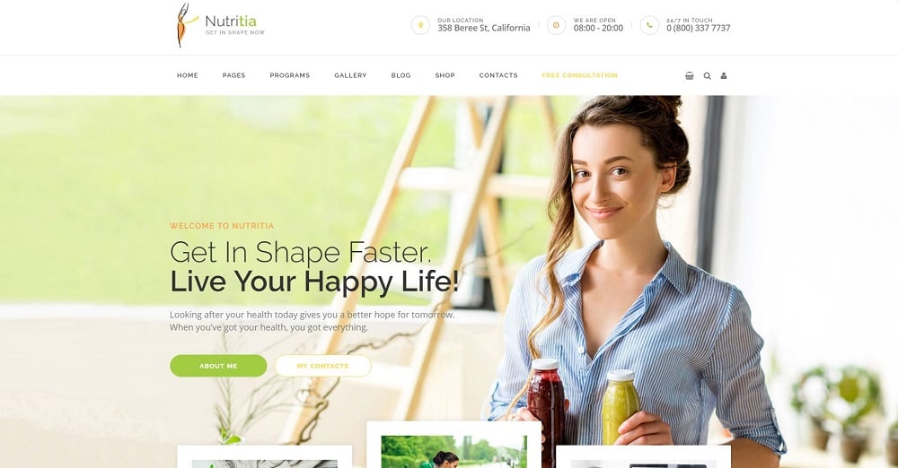
Nutritia - Healthy Nutrition and Dietology . WordPress Theme
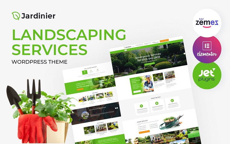
Jardinier - Landscaping Services Green WordPress Theme
Govnet - City Government and Municipal Responsive WordPress Theme

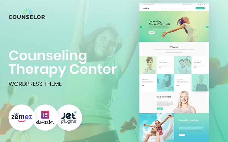
Counselor - Counseling Therapy Center Responsive WordPress Theme
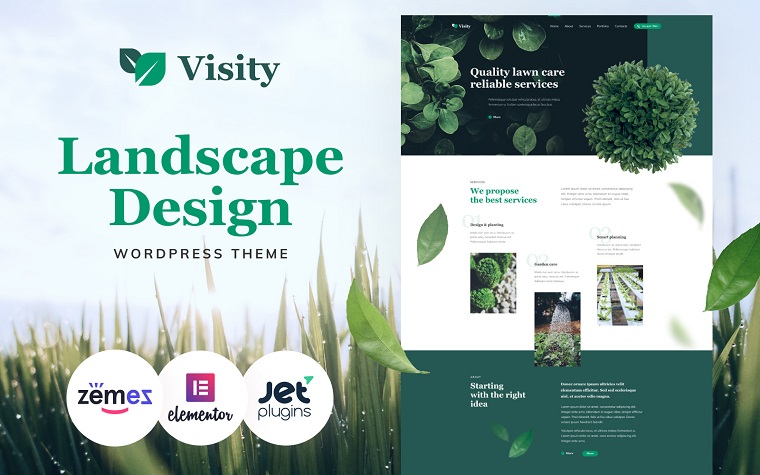
Visity - Landscape Design with Elementor Green WordPress Theme
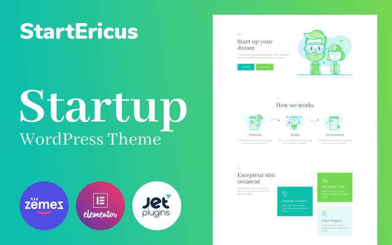
StartEricus - Clean and Minimalistic Startup Landing Page WordPress Theme
Journeo - Travel Agency Elementor WordPress Theme

WorldMap - Travel Photo Blog Elementor Green WordPress Theme

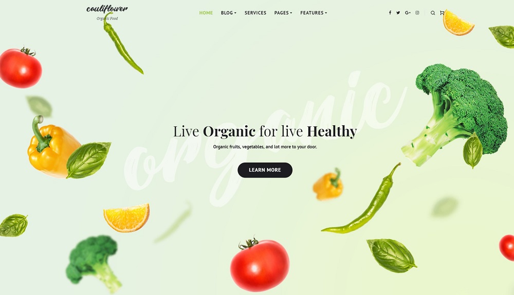
Cauliflower - Organic Food Blog Elementor WordPress Theme
Metricon - Corporate Business Elementor WordPress Theme
Read Also
Orange Color in Web Design [Infographics]
Purple Color in Web Design [Infographics]
Red Color in Web Design [Infographics]
Don’t miss out these all-time favourites
- The best hosting for a WordPress website. Tap our link to get the best price on the market with 82% off. If HostPapa didn’t impress you check out other alternatives.
- Monthly SEO service and On-Page SEO - to increase your website organic traffic.
- Website Installation service - to get your template up and running within just 6 hours without hassle. No minute is wasted and the work is going.
- ONE Membership - to download unlimited number of WordPress themes, plugins, ppt and other products within one license. Since bigger is always better.
Get more to your email
Subscribe to our newsletter and access exclusive content and offers available only to MonsterPost subscribers.

Leave a Reply
You must be logged in to post a comment.