Affiliate Tool Spotlight: Highly Converting Banners for TemplateMonster Affiliates
Banners are the most easy-to-implement and cost-effective type of display advertising, which, like any tool, has its pros and cons. Today we would like to introduce you to the core principles of banner advertising in 2016, and help you understand its pitfalls, and develop your ‘unsinkable’ strategy.
Banner advertising and how to benefit from it in 2016
You will get the best results only when you know precisely what banners are intended for, and what to expect of them.
The first thing you need to learn is that the old methods of display advertising are gone for good. To cut a long story short, banners should not be used as a standalone advertising method. The reason is in the pretty low conversion rates of banners compared to native ads, pop-up windows, and other modern advertising techniques.
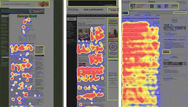
Examples of banner blindness
Why is this happening?
Over the decades of using banners as the primary advertising option, web surfers have learned to ignore them consciously or subconsciously. This phenomenon is called “banner blindness.” If you take a look at a heat map of a typical web page, you will notice that users click everywhere, except for banners. This is happening because:
- People are tired of banners and don’t trust them anymore;
- People often have ad blockers installed on their web browsing devices;
- Banners are often irrelevant to the content of a page where they are displayed.
How do you overcome this?
This doesn’t mean that you shouldn’t use banner ads. After all, they can be very effective if used properly. There are several viable ways of implementing banners on your website:
Use them to increase brand awareness and trust
Featuring famous companies on your website, as if they were your direct partners, works as a powerful trust booster. That’s why many companies place a block incorporating their partners onto their homepages. Don’t expect these ads to convert well: they are intended to increase the loyalty of your visitors, not for direct sales.
Incorporate them into your content marketing
We have already acknowledged that banner advertising by itself doesn’t perform well, but it shines in combination with other advertising techniques and tools.
For example, you can use a banner as a call-to-action button. What’s amazing is that such banners will perform much better than regular CSS-based buttons and text links.
Become friends with the F-pattern
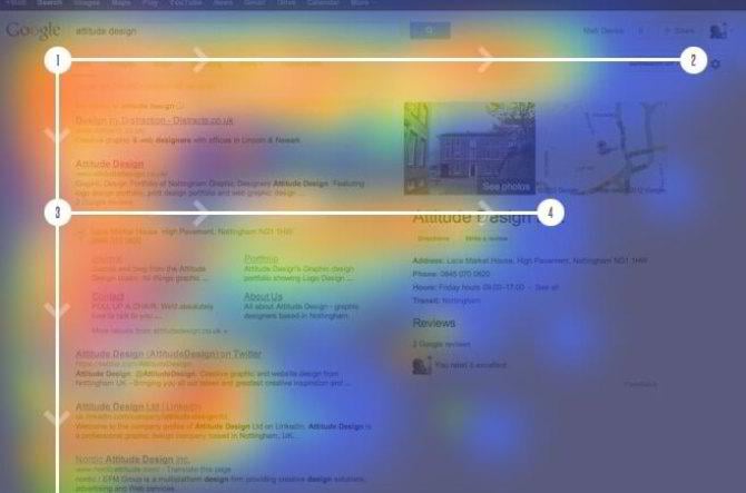
A heat map of a typical Google search results page
Most web surfers browse websites in an F-shaped pattern. They read the headline, and then scan the content from left to right, often skipping the rightmost part of the page. Their attention fades away as they scroll down. In other words, the left side is the most clickable part of almost any web page. You might even want to embed a banner block into this part of your page to achieve higher CTR scores.
But the best way to track the effectiveness of your display ads is the good old A/B testing. Every website is unique regarding design and content, and only practice can tell you exactly what is wrong with your conversion rates, and how to fix this.
TemplateMonster affiliate banners with incredible conversion rates
Why are the banners created for TemplateMonster affiliates different?
First of all, affiliate marketing is a win-win strategy, which means your success is our success. That’s why we tailor our affiliate ads with the same precision and care to each pixel, as we would do for our campaigns.
Another undeniable advantage of our banners is that they are undetectable by ad blockers. They are, basically, just images that can be embedded into any area of your website.
Check out the various types of banners offered on MyTemplateStorage.com and choose your perfect combination.
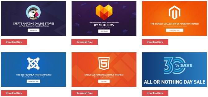
Evergreen banners
Basic TemplateMonster affiliate banners are perfectly styled marketing masterpieces with a polished design and outstanding call-to-action abilities. They are not only visually attractive but are also timeless.
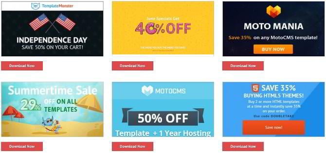
Banners timed to coincide with special offers
Besides the evergreen banners, there are dozens of solutions dedicated to limited-time sales and discounts. Each time TemplateMonster launches a new sale, a pack of new beautiful and conversion-optimized banners is waiting for you on MyTemplateStorage.com. You can inform your visitors about the latest discounts and reap the benefits of your affiliate marketing campaigns instantly.
To squeeze the most out of limited-time offers check the banner page regularly, and don’t forget to visit the main page of TemplateMonster.com from time to time. Products on sale are proven to be much better converting, so this might be your way to boosting affiliate sales.
Multiple sizes suitable for any design
To fit any website layout, affiliate banners by TemplateMonster come in a variety of shapes and sizes. Available are small and medium-sized squares, towers and horizontal strips. Each package contains the whole array of ads designed in a unified style, which you can combine with other banners and types of display advertising for a better effect.
How banners help our affiliates make money
Many of our top-earning affiliates make thousands of dollars monthly with our handcrafted affiliate banners. They have kindly agreed to share their experience with us.
Our special guests today are Graham Billz, CEO at Freshdesignweb.com and Daan Toll, CEO at Wplift.com.
Graham Billz, Freshdesignweb.com
Daan Toll, Wplift.com
It’s time to act!
Do you want to make as much money as our top partners do? Check out the complete collection of TemplateMonster banners for affiliates, and start earning today!
Get more to your email
Subscribe to our newsletter and access exclusive content and offers available only to MonsterPost subscribers.

Leave a Reply
You must be logged in to post a comment.