Hipster-Friendly Logos that Won’t Look Lame in 2019 (with Free Examples)
Hipsters, right? You may love or hate them, but you can’t deny the colossal impact of hipsters on mass culture. You’ve probably heard that hipsterism has gone mainstream, which means the design elements associated with this subculture are growing more commonplace than ever. Does this trend affect logos? You bet!
Create your logo with TemplateMonster!
Need an attractive logotype for your website, but have no way out? Professional web designers from MotoCMS will help you.
Our team will come up with the best solution for your brand according to your personal requirements. If the logo doesn't sit with your requests, we will redesign it up to 3 times. Just add this offer to your cart or contact our Service center
Note: The process of your logo creation will take up to 10 business days since you take the offer.
As a designer, you might’ve been finding yourself working on hipster-ish logos more often in the recent months. Although the subculture has surpassed its peak, the demand for its aesthetics is still strong and varied.
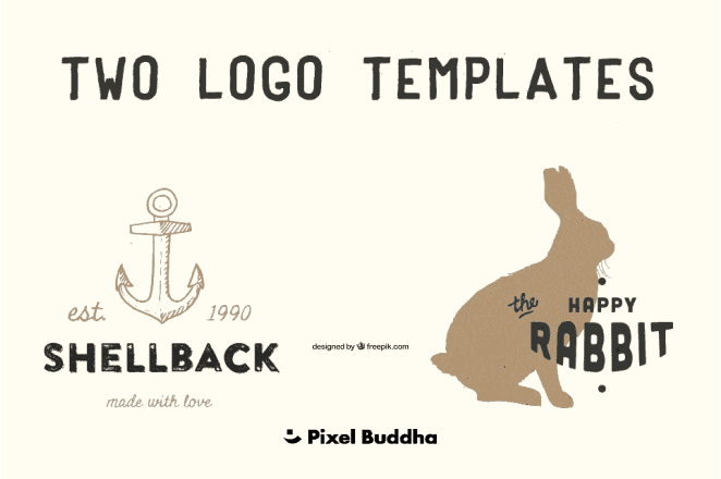
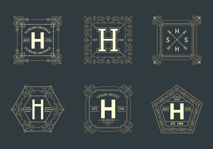
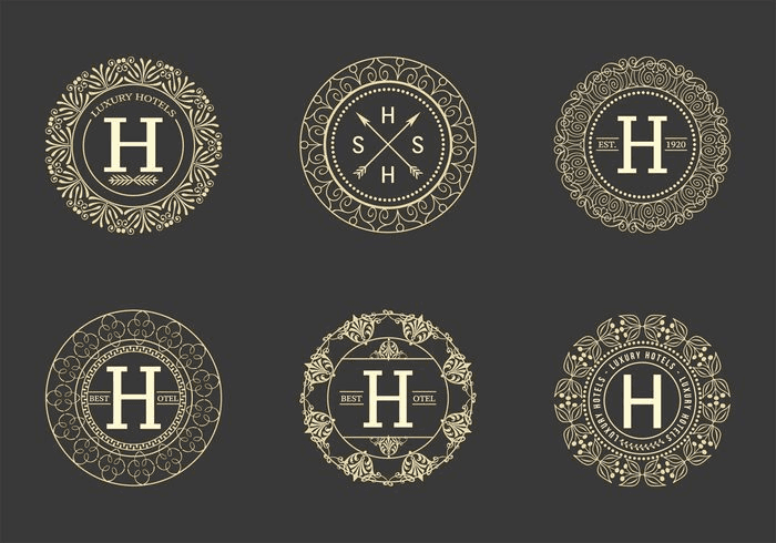
Gig posters, social profiles for artistic events, websites for recording studios, night clubs, bakeries, barber shops, coffee shops, book shops, apparel shops ... you name it. With so many projects involving the same design paradigm, you might feel stuck with using and reusing standard-looking elements over and over again. Have a look at these logos to see what I’m talking about:
Don’t get me wrong, these logos look neat. Still, there are so many of them that at some point they kinda start to resemble something crafted with Hipster Logo Generator. If fresh ideas are what you’re searching for, looking at other designers’ works might turn out to be a worthy idea. For this reason, I thought it might prove handy if MonsterPost featured a couple of less common variations of hipster logos.
Every sample logo mentioned in this post is free to download from Vecteezy, Pixel Buddha, or Freepik (the same goes for the images above). This means, the 10 design trends that you’ll find below will also prove useful for people looking for actual new logos for their own websites or other projects. In case you like a particular sample, click on it, and you will discover more logos of the same type.
1. Watercolour Backgrounds
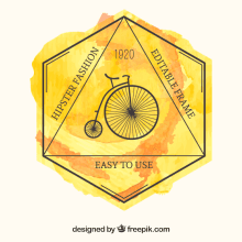
A splash of colour is a great way to liven up a design. In fact, that’s exactly what you can do with a basic hipster-ish logo. You can experiment with small, strategically-placed watercolour drops and stains, or add a watercolour background to your logo. Ultimately, you can leave out all nonessential components and put a stronger visual emphasis on the colourful background:

2. Painted Accents
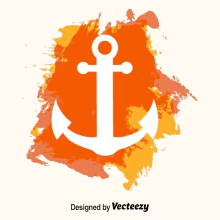
This one seems nearly identical a bit similar to the examples mentioned above, doesn’t it? Now look closer. Notice how the colours are given greater prominence as compared to the previous examples? Thanks to a thicker visual texture, the colours in the examples below act as foreground elements. You can also use stencil effect to convey the meaning of the logo, just like in one of the examples below:
3. Hand-Drawn Stuff
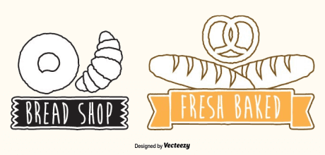
Adding a handmade feel to your logos is a worthy idea for anything related to the hipster aesthetics. As a matter of fact, this is the reason why watercolour effects work for hipster logos in the first place. To make the most of the same approach, you can use hand-painted and hand-drawn elements in your designs:
Download sets: 1, 2.
4. Handwriting Fonts
Handwriting fonts provide another great opportunity for adding a handmade feel to your designs. Handwritten logos work great for shops, restaurants, and events. Besides, designs of this type look super cute:

5. Lineal Shapes
If playful, cartoon-like logos don’t agree with your taste (or your project), and you strive for a clearer look, mixing hipster aesthetics with the style of lineal icons is the way to go. Basically, this approach implies combining bold lineal shapes with the symbols and layouts reminiscent of the hipster subculture:
6. Flat Design
Now that you’ve seen lineal hipster logos, let’s mix hipsterism with something that’s even more mainstream. For instance, how about flat design? Now, I realize that designs of this type will bear just a slight resemblance to hipster logos. Still, the examples that you can find below prove that you can have the best of both worlds:
7. Complex Geometry
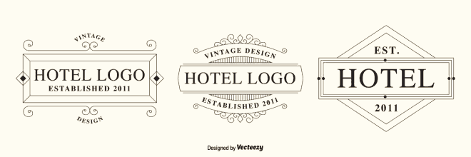
Some projects require that you stick to a more traditional look. In case you need to keep the recognizable hipster-ish profile but still want to stand out from the crowd, there’s a good practice that you can follow. Try elaborating your logo by getting rid of the run-of-the-mill triangles and hexagons and opting for more complex shape:
8. Floral and Animalistic Logos
You can further elaborate the technique mentioned above, and move from abstract geometric patterns to more concrete images. Here’s an example of how you can use this approach to create cool hipster-friendly floral and animalistic logos:
9. Polygonal Backgrounds
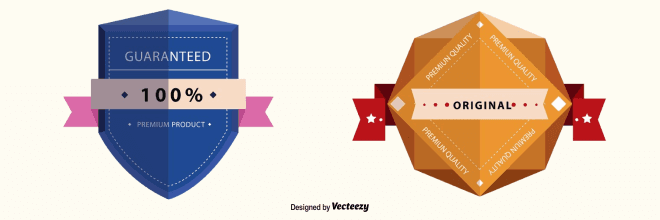
Adding colorful polygonal backgrounds to hipster logos is another way to combine seemingly incompatible styles. Give it a try, and you’ll see that combinations of this kind produce a powerful effect that you could characterise as pure synergy (yeah, I know that’s a buzzword, sue me:)). Consider these examples if you’re looking for something less common than space backgrounds:
10. Chalk on Blackboard
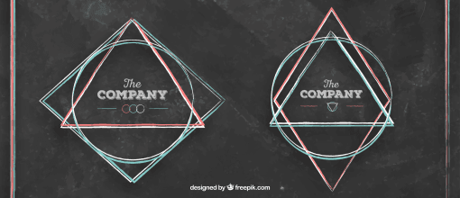
Chalk-on-blackboard styling is actually a pretty ancient trend, especially when hipster logos are concerned. However, you can always improve these logos by ditching the diner-style layouts in favour of minimalism. Here’s how you can pull this off with multicolored geometric patterns:
It’s Hip to Be Mainstream
See, there’s much more to hipster logos than triangles, deer horns, and diagonal crosses. In a nutshell, the examples outlined above prove that you can easily keep you logo hipster-friendly and still add the whole gamut of colors, shapes, and stylistic patterns to the overall composition. Isn’t that great? Turns out you can be both hip and mainstream, after all.
Related Posts
- Get a Logo To Kill & Be Sure It Will [MotoCMS Logo Design Services]
- Just Do It! Or How a Logo for $35 Can Rock Worldwide
- Develop Market Value and Give Your Brand Representation with Animal Logos
- Sketch on the Go with iOS and Android Logo Design Apps
- Be My St Valentine’s Monster. Logo Customization Photoshop Tutorial
Don’t miss out these all-time favourites
- The best hosting for a WordPress website. Tap our link to get the best price on the market with 82% off. If HostPapa didn’t impress you check out other alternatives.
- Monthly SEO service and On-Page SEO - to increase your website organic traffic.
- Website Installation service - to get your template up and running within just 6 hours without hassle. No minute is wasted and the work is going.
- ONE Membership - to download unlimited number of WordPress themes, plugins, ppt and other products within one license. Since bigger is always better.
Get more to your email
Subscribe to our newsletter and access exclusive content and offers available only to MonsterPost subscribers.





Leave a Reply
You must be logged in to post a comment.