How to Code a Hidden Sliding Navigation for Responsive Websites
Mobile responsive web design has no doubt changed the way visitors are browsing websites. The process of building a single website layout which can adapt to any platform is becoming essential. It is often easier to follow this route instead of building separate versions for desktop and mobile.
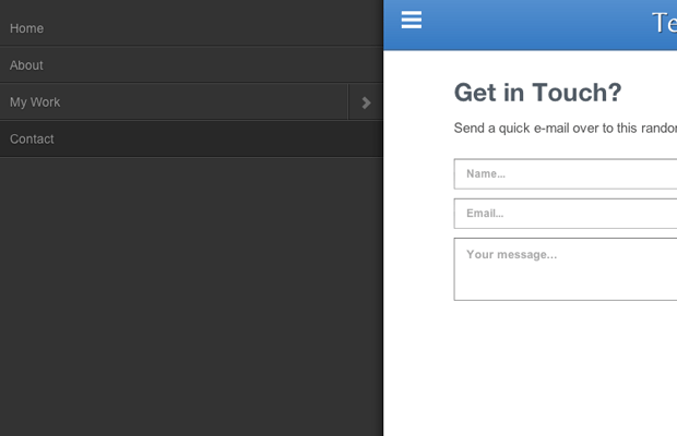
For this tutorial I want to showcase the open source jQuery plugin mmenu. It is designed to work as a slick navigation for web applications which need a responsive design. The plugin homepage includes a number of smaller demos, but nothing which takes up the entirety of the browser window. Take a peek at my live tutorial sample to get an idea of what we're building.
Live Demo - Download Source Code
Getting Started
First we need to download a copy of the mmenu plugin along with a sample copy of the jQuery library. This could be downloaded locally or hosted externally using a CDN. Either way it is important that you have the jQuery script added before jquery.mmenu.min.js.
<!doctype html>
<html lang="en-US">
<head>
  <meta charset="utf-8">
  <meta http-equiv="Content-Type" content="text/html">
  <title>Template Monster Sliding Navigation Demo</title>
  <meta name="author" content="Jake Rocheleau">
  <link rel="shortcut icon" href="https://secure.templatemonster.com/favicon.ico">
  <link rel="icon" href="https://secure.templatemonster.com/favicon.ico">
  <meta name="viewport" content="width=device-width initial-scale=1.0 maximum-scale=1.0 user-scalable=no">
  <link rel="stylesheet" type="text/css" media="all" href="css/styles.css">
  <link rel="stylesheet" type="text/css" media="all" href="css/mmenu.css">
  <link rel="stylesheet" type="text/css" media="all and (min-width: 960px)" href="css/mmenu-widescreen.css">
  <script type="text/javascript" src="js/jquery-1.10.2.min.js"></script>
  <script type="text/javascript" src="js/jquery.mmenu.min.js"></script>
</head>
The additional meta viewport tag is crucial to get a natural behavior from the browser. This means you will need to force users into a 1x1 ratio on all devices. Scaling could be possible but for this demo I have it disabled.
Beneath the meta tags I have included three separate CSS stylesheets. The first is my regular document which focuses on the overall page structure. The mmenu.css is all we need to get the effect working properly. But there is a second stylesheet for desktop users which should only be applied using CSS media queries. Thankfully we can include this into one header call which only adds mmenu-widescreen.css in an viewing environment larger than 960 pixels.
Creating the Page
Inside the body tag I have two separate content sections. The navigation menu has to be styled with an outer <nav> or <div> tag followed by an unordered list. The mmenu plugin will hide this by default so it really does not matter where it appears in the HTML.
<pre class="wp-block-code"><code><nav id="slidemenu">
<ul>
<li class="mm-selected"><a href="#home">Home</a></li>
<li><a href="#about">About</a></li>
<li><a href="#work">My Work</a>
<ul>
<li><a href="#proj1">Some Project</a></li>
<li><a href="#proj2">Cool Item</a></li>
<li><a href="#proj3">Seriously So Cool</a></li>
</ul>
</li>
<li><a href="#contact">Contact</a></li>
</ul>
</nav></code></pre>
The nav ID #slidemenu is how I target this navigation in jQuery. Also notice the additional list item class .mm-selected is applied onto the home link by default. Once the page is loaded it will reset back onto the home view which is automatically selected.
<div id="wrapper"><header id="topbar"><a id="menulink" href="#slidemenu"></a>
<p></p>
<h1>TemplateMonster Demo</h1>
</header>
<p><!-- @end #topbar --></p>
<div id="content">
<section id="home">
<h2>A Simple HTML5 Webapp</h2>
<p>Inner content is courtesy of <a href="http://bluthipsum.com/">Bluth Ipsum</a>.</p>
</section>
My inner wrapper div is separated from this navigation semantically to avoid complicating the layout style. The header #topbar with the navigation link #menulink has to be added manually into the HTML. This menu link triggers the responsive navigation once the screen is below 960px. If you don't include the widescreen stylesheet then this hidden navigation is the only display style no matter what the screen resolution.
Each inner content section is used to represent a different page. Only the first home page setup is displayed initially, so each other section to follow is using the class .hideme. jQuery can be used when switching between items so this class is a good organization system for my little mini-demonstration.
Custom Design Styles
I haven't gone into either of the mmenu stylesheets because it is easier to write in your own. But keep in mind it is possible to merge these together and include the media query directly within the CSS file itself. mmenu is very flexible so don't be afraid to switch around code getting it to work exactly as you need.
/** page structure **/
#wrapper {
  display: block;
  width: 100%;
  background: #fff;
}

#topbar {
  display: block;
  height: 65px;
  background: #5892d1;
  background: -moz-linear-gradient(top,  #5892d1 0%, #367ac3 100%);
  background: -webkit-gradient(linear, left top, left bottom, color-stop(0%,#5892d1), color-stop(100%,#367ac3));
  background: -webkit-linear-gradient(top,  #5892d1 0%,#367ac3 100%);
  background: -o-linear-gradient(top,  #5892d1 0%,#367ac3 100%);
  background: -ms-linear-gradient(top,  #5892d1 0%,#367ac3 100%);
  background: linear-gradient(to bottom,  #5892d1 0%,#367ac3 100%);
  filter: progid:DXImageTransform.Microsoft.gradient( startColorstr='#5892d1', endColorstr='#367ac3',GradientType=0 );
  border-bottom: 2px solid #4a74a2;
}

#topbar h1 {
  line-height: 65px;
  text-align: center;
  font-size: 3.2em;
  font-weight: normal;
  color: #fff;
  font-family: 'Belleza', 'Trebuchet MS', Arial, sans-serif;
  text-shadow: 1px 1px 0 rgba(0,0,0,0.56);
}

#topbar #menulink {
	background: center center no-repeat transparent;
	background-image: url(data:image/png;base64,iVBORw0KGgoAAAANSUhEUgAAABkAAAAZCAYAAADE6YVjAAAAGXRFWHRTb2Z0d2FyZQBBZG9iZSBJbWFnZVJlYWR5ccllPAAAAE1JREFUeNpi/P//PwOtARMDHQBdLGFBYt+nkR2KjEhxQqvIYaR7cD2glSWMo0mY3DiJo5Edi4ZPEqZ7nMSP5pPRon60qB9NwpQDgAADAMIxHUJvWs/TAAAAAElFTkSuQmCC);
	display: block;
	width: 40px;
	height: 40px;
	position: absolute;
	top: 10px;
	left: 10px;
}

#content {
  max-width: 800px;
  padding: 12px 22px;
  height: 100%;
  margin: 0 auto;
  background: #fff;
  margin-top: 15px;
}


.hideme {  /* use for hidden content sections */
  display: none;
}
I was intrigued looking at the original mmenu CSS to find the toggle background image was generated using base64 code. There are lots of online tools for converting images into base64, and it helps if you already have an image handy. These can scale nicely with the object itself but it is also difficult to customize without regenerating more code.
Most of the core page is simple and easy to understand. The h1 element in the top navigation bar is resized to make the text smaller as the screen gets smaller. This is beneficial since we need to keep the navigation link as a central focus point. But you notice how easy it is to replicate the iOS UI design concept right within CSS3.
Frontend jQuery Codes
Now we can tackle the final piece to this puzzle wrapping the whole thing together. mmenu has a large number of options for customizing the display and functionality. I have tried to keep my list to a minimum, but it can be fun toying with different options. This code is added into the page right before my closing </body> tag.
$(function(){
  $('nav#slidemenu').mmenu({
    slidingSubmenus: false,
    moveBackground: false,
    onClick: {
      close             : true,
      setSelected       : true,
      setLocationHref   : null,
      delayLocationHref : true,
      blockUI           : null,
      callback          : function(){
        // check which link has been clicked
        var newpageurl = $(this).attr('href');
        var newsection = "section"+newpageurl;

        $('#content section').each(function(){ // add the .hideme class onto every section
          if(!$(this).hasClass('hideme')) { $(this).addClass('hideme'); }
        });

        $(newsection).removeClass('hideme'); // display only the selected content section
      }
   }
  });
});
If you have questions then definitely check out the mmenu options documentation for a better idea of how these work. slidingSubmenus will prevent the submenus from sliding left/right and instead appear directly beneath the navigation link. You should try both and see which works best for your web application.
Also the moveBackground option is important because without a background color your page will appear glitchy between opening and closing the menu. These two are very simple bits of code however the onClick parameter takes a list of new options.
Here we can rewrite settings and even a callback function which is triggered whenever a user clicks on a link. setLocationHref is used to force the browser into loading whichever value you have in the link's HREF attribute. Instead of using this method I have put together my own function which is written into the callback option.
We can get the new section name by obtaining an ID from the link and then adding it into a jQuery selector. I am checking each content section to make them all use the .hideme class, then we remove that class from the new content section. This will hide everything in the page content and only display new content based on which link the user has clicked.
There are many jQuery plugins for animation which you could add into the content display. But these are also very aesthetic and not necessary to get your application working. This is a great foundation to lay out any mobile webapp or responsive website without struggling to write your own JavaScript from scratch.
Live Demo - Download Source Code
Final Thoughts
I really love this plugin because it is almost no-struggle to install once you understand the basics. It is also a rudimentary process to go in and customize the stylesheet to match your own website layout. Mobile developers will love this plugin because it provides easy-access on desktop screens as well. Feel free to download a copy of my demo codes and see how you can work this responsive navigation into your own websites.

First it was design, then writing, and now affiliate marketing. Over a period of 6-7 years he wrote a lot of content for many websites. You can reach Jake on Twitter.
Get more to your email
Subscribe to our newsletter and access exclusive content and offers available only to MonsterPost subscribers.

Leave a Reply
You must be logged in to post a comment.