How to Make Your Site 22% Faster to Navigate
According to the research from the Smashing magazine, sticky menus are 22% quicker compared to the regular ones. You may see no difference on small and simple sites, but when you need to scroll large pages, fixed menu bar is a great option to save about 36 seconds of a five minute visit. Besides quicker navigation, fixed menus increase conversion approximately to 3-5%.
Smashing magazine also claims that 100% participants prefered sticky menus to the regular ones without even giving the actual reason why. If you still have any doubts about using this kind of navigation, take a look at how it works live.
So, what is a fixed menu and how it differs from the regular navigation bars?
Basically, everything is pretty much the same, but sticky bars remain at the same position as you scroll the page. In this way, there is no need to go to the top of the site to navigate to another section. You may say that this kind of design is pricy and you can’t afford it if short on budget. However, everything is much easier than it seems. Actually, you can do everything at no cost and all by yourself. Just a couple lines of code can totally change the performance of the website, and it is another good reason to integrate sticky navigation to your site.
33 Channel is a great example of website with fixed navigation.
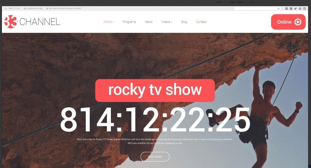
As you can see, the top menu remains at the same position all the time. Now imagine how long will it take you to scroll back to the top.
So, how to create fixed header menu on the new website or transform the regular menu on the running site. Generally, there are only two ways to have the job done?
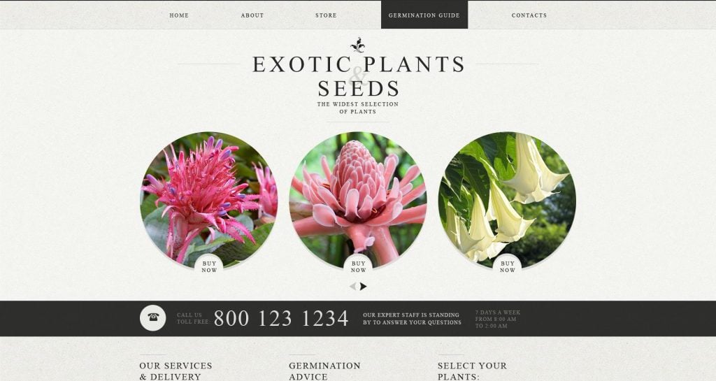
The first way is based on pure HTML and CSS. For that we are going to build a carcass of the menu. Let’s try to build a fixed top menu on one of our templates with regular navigation. We will be using the Garden Design template as an example.
Let’s open the HTML file and find the piece of code we are going to change.
Now, go to the CSS file and find the necessary selector
1 2 3 4 5 6 | header { margin: 0; padding: 0; background: #eeede8 url(../img/pattern1.png) repeat; border-bottom: 1px solid #d7d7d4; } |
Add the command position:fixed. Open the index.html file. As you can see, the menu remains at the same position as you scroll the page, but it ruined the design of the site.
Let’s fix it. First of all, we need to alight the navigation bar. Add the following commands to the css rule.
1 2 3 4 | top:0; left:0; right:0; margin: 0 auto; |
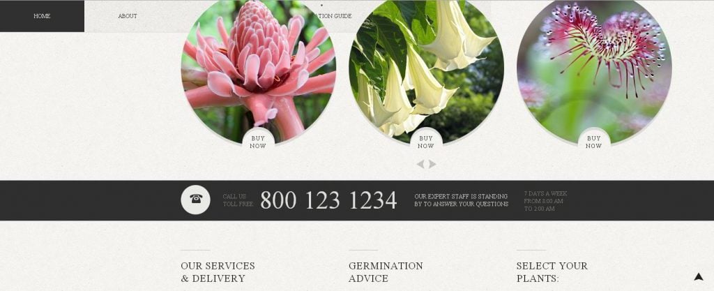
Now the navigation is centered, however there are still some changes to do. As you can see, some of the elements cover the content as you scroll the page.
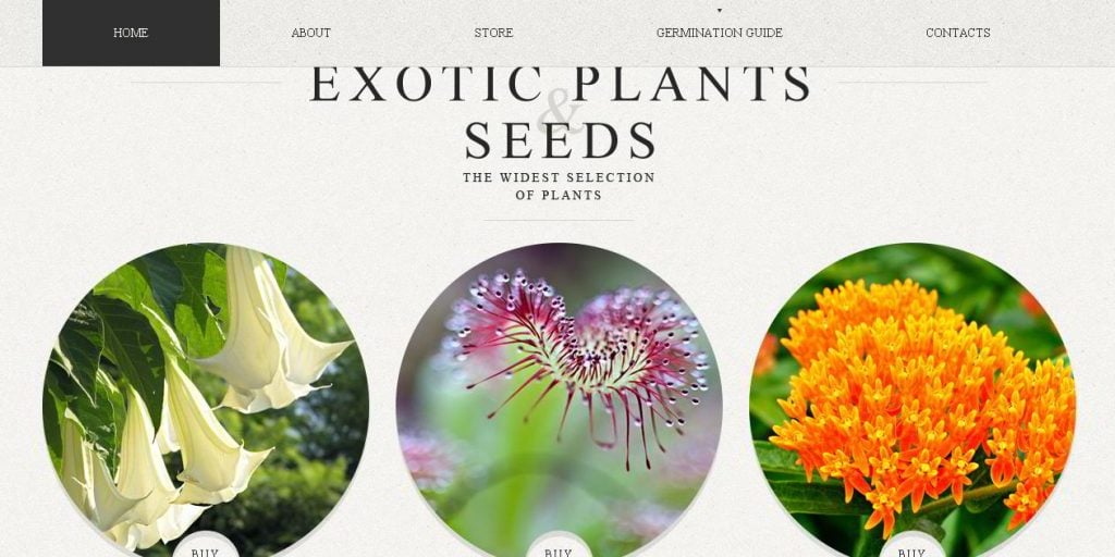
Let’s start from the logo section that is hidden behind the navigation bar. To make it look properly, we need to give the top padding to the main container that is equal to the height of the navigation bar. So, let’s find the .global class in the css file, and give it a proper padding.
1 2 3 4 | .global { padding: 90px 0 0 0; background: #f4f4ef url(../img/pattern3.png) repeat; } |
Note: In our case, the main content is wrapped inside the “global” container, the class of container may be different.
The final step would be to give the header a proper z-index, to make it display above all layers.
1 2 3 4 5 6 7 8 9 10 11 | header { margin: 0; padding: 0; background: #eeede8 url(../img/pattern1.png) repeat; border-bottom: 1px solid #d7d7d4; position:fixed; left:0; right:0; margin: 0 auto; z-index:999; } |
That’s it, everything works perfectly. You can open the index.html and take a look.
You can also use a readymade jQ script to make the menu perform more smoothly. On jqueryscript.net you can find a lightweight plugin that can be adapted right to your project without any efforts. The method is pretty much the same. Create an HTML code, give it styles and add the jQuery library, and the script.
To get a clear picture of this method, check the step by step tutorial on how to create fixed header with the help of jQuery from Jake Rocheleau. This solution will work for both long and short pages as the navigation bar hides once you scroll down and comes up when you scroll back to the top of the page.
If you are too busy of redesigning your website, choose one of the ready-made templates from TemplateMonster. Check the collection below and find a proper solution right for you. All the themes are designed in accordance with the modern trends and standards, and, of course, feature sticky navigation.
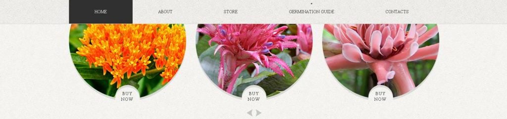
Here is a professional child-theme of our top-notch, universal product - Monstroid. It brings a compelling look along with an unmatched performance. It is both simple and powerful and can be adapted to any project.
***
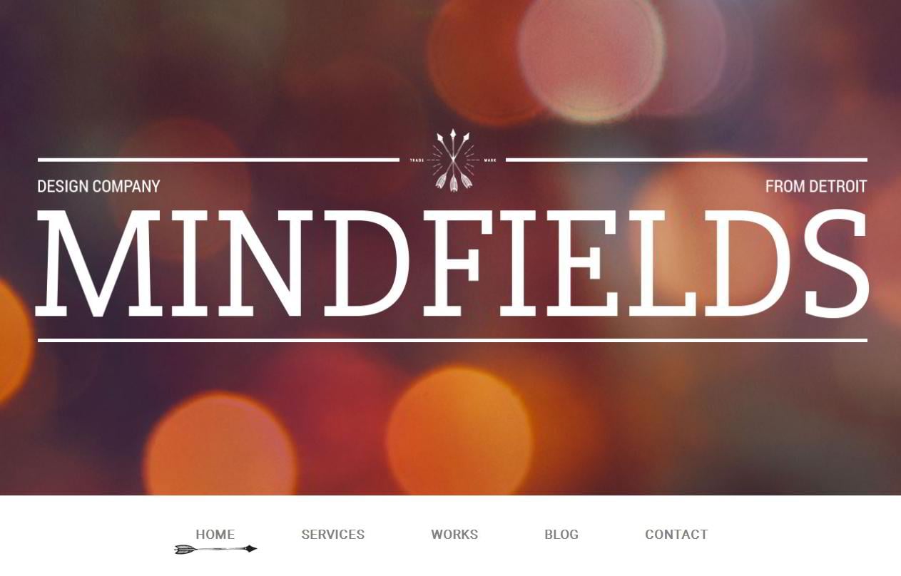
This template combines an attractive look with great functionality. It will be a perfect fit for various business projects. A fully responsive design allows the theme to adapt to any screen resolution on the fly. An animated fixed navigation adds some usability to the site and keeps the menu items organized and structured.
***

Djucy is a professional theme for web design agencies and corporate sites. Thanks to a clean code and flat layout, it ensures a fast loading speed and top of the line performance on all screens and browsers.
***
Wegy Joomla Multipurpose Theme
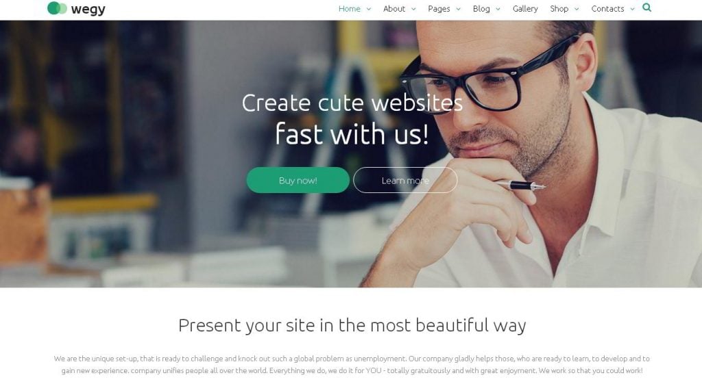
This universal Joomla theme is loaded with an assortment of custom tools and features that will make it a perfect solution for almost any kind of business project whether it is a corporate site or an online store.
***
Hockey Shop PrestaShop Template
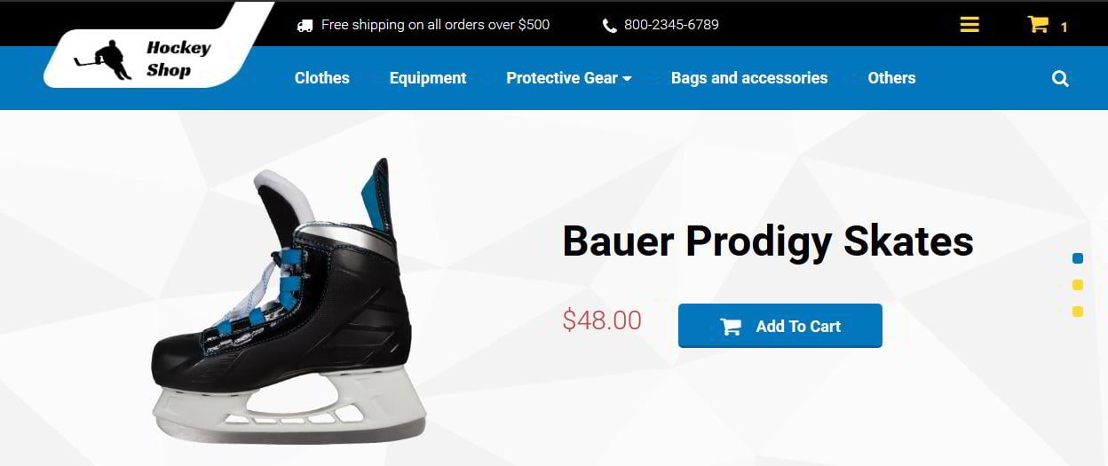
Use this template for designing a professional online store. Thanks to a fixed mega menu it ensures a first rate buying experience and an unmatched navigation and allows visitors to find any kind of products just in seconds.
***
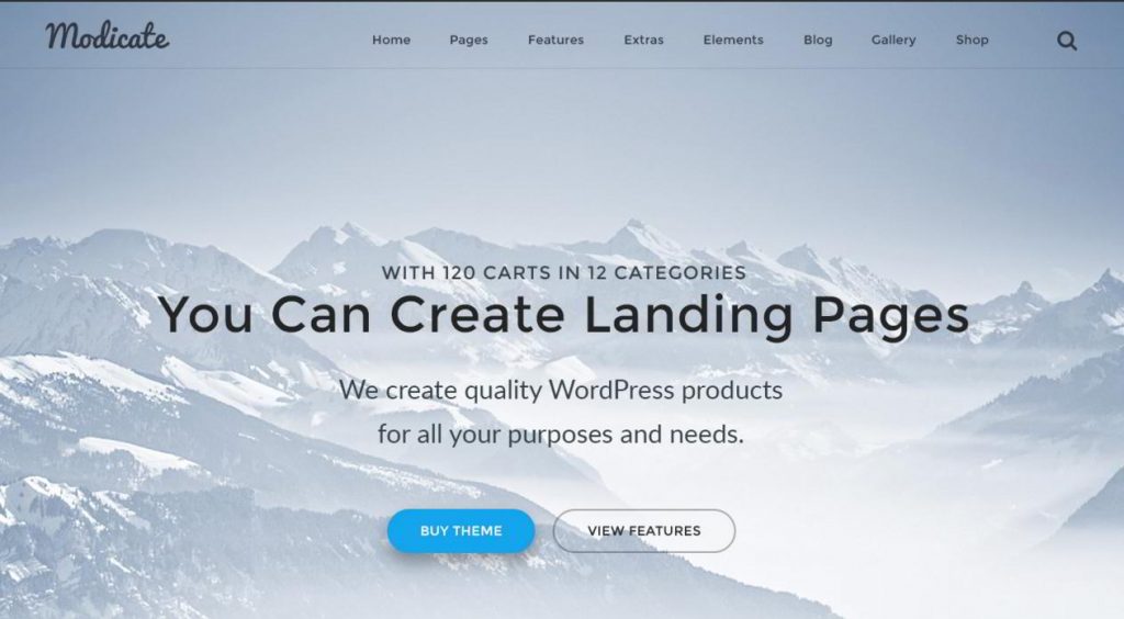
Modicate is a fully responsive Bootstrap theme that also can be used for a variety of online projects. It combines a modern and up to date look with powerful functionality and smooth performance.
***
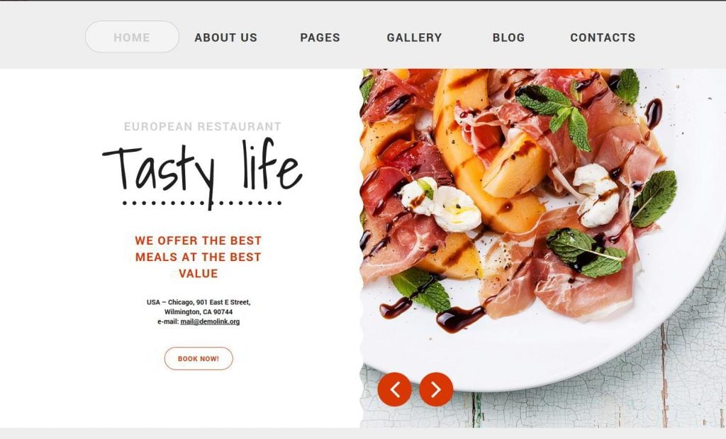
This theme will be a perfect fit for restaurants and cafes. It features a clean code along with stylish design and user-friendly interface. In addition to that webmasters will be able to adapt the template to any other project quickly and easily.
***

Here is a great theme to start a professional travel blog. It is designed in accordance with the specifications of such sites and makes the content look clear and structured on all screens.
***

This template can be used for building sites for travel companies and tourists blogs. It is not overloaded with visual effects and ensures smooth and fast performance. It is also fully customizable, so you won’t experience any troubles with redesigning it.
***
If you are looking for how to build a professional portfolio, this theme will become in hand. It offers a clean and minimal design that allows users to focus on the content. The theme also offers some stylish visual effects that add a bit of personal touch to the design.
***
Have any suggestions on how to make build fixed navigation in another way? Feel free to leave your comments and let us know if the method works for your website.

Alex is passionate about all the things related to WordPress and Elementor in particular. At MonsterPost, you can find a handful of cool tutorials shared by him.
Get more to your email
Subscribe to our newsletter and access exclusive content and offers available only to MonsterPost subscribers.

Leave a Reply
You must be logged in to post a comment.