How not to Fail Choosing IT PowerPoint Templates and Create an Impressive IT Presentation
- Tips on how to create a professional IT presentation
- How to make creative slides
- The showcase of IT PowerPoint templates
- Where to find IT and computers PPT backgrounds
IT Powerpoint Templates. We live in an amazing time. The world is changing rapidly, and by 2020 the digital universe has grown tenfold. The internet is full of diverse content, and perceiving it in our overloaded brain is more and more difficult than ever.
To cope with this influx of information, you have to learn to structure and present it properly.
A good presentation helps to understand the speaker, while a bad presentation only makes us bored or confused. You know this if you have ever listened to a colleague speak at a meeting. Unfortunately, there are more bad presentations than good ones. And even professional IT specialists do not always manage to create good presentations. I am sure that this post will help you to understand what a professional IT presentation is and how to take advantage of IT PowerPoint templates, especially if you are a beginner.
The showcase of IT PowerPoint templates
Templates are one of the quickest and most reliable ways to make a presentation, especially if you choose a quality and professional one. The purpose of a template is to automate the creation of presentations. You also need a template to save time. TemplateMonster will help you do just that. After all, the site has more than 4000 templates that you can use for any of your purposes.
Hangasa PowerPoint Template
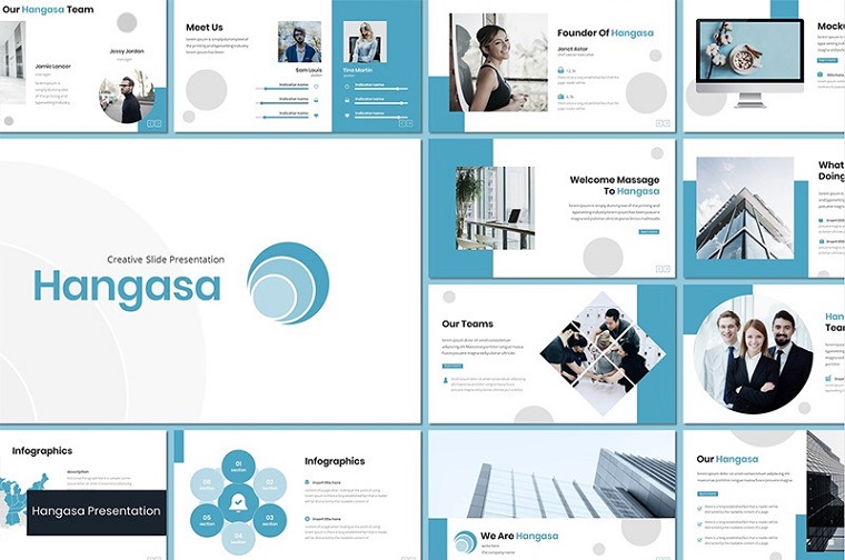
Hangasa is another great template among IT PowerPoint templates. Hangasa has a very stylish and fresh design combined with a set of features to help you create a great presentation in a very short time. The main features of Hangasa are:
- 30 unique and stylish slides
- built-in documentation
- 5 color schemes
- built-in free font
- quick and easy adjustment of all elements
- picture placeholder
- based on Master Slide
Blueprint PowerPoint Template

This template differs from others in the presence of a variety of charts, graphs, and diagrams. This in turn is a great opportunity to visualize complex material. The Blueprint theme includes:
- 120 slides
- full adjustment of all template elements
- different types of infographics
- 3 color schemes
- slide size: standard(4:3) or wide(16:9)
- documentation and all the necessary files
Pixel Minimal PowerPoint Template
This is a very cool minimalistic IT PowerPoint template. It has everything to help you quickly create a cool presentation. The Pixel Minimal template has:
- a lot of slides available
- fresh, fashionable, and stylish design
- aspect 16:9
- fast workflow
- easy and fully editable
- graphics and charts
Operating system PowerPoint Template
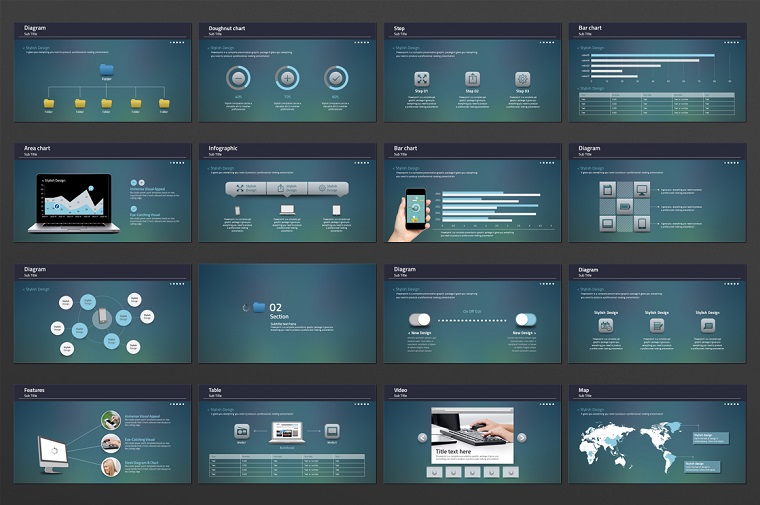
This IT PPT template is designed by professional developers and includes enough features to help you create your presentation quickly and easily. The Operating System template is a technology themed PowerPoint template that boasts of:
- 120 slides
- fully customizable and editable elements, colors, shapes, and charts
- 2 slide resolutions
- PowerPoint 2003 or 2007 compatibility
Baros - Creative Business PowerPoint Template

Baros is one of the IT PowerPoint templates that have a lot of features. This template has a very beautiful design, making Baros suitable for any kind of presentation. Among the main features:
- 30 unique slides
- fully customizable template elements
- free web fonts, namely Montserrat and Poppins
- PowerPoint 2007 or PowerPoint 2003 compatibility
- includes PowerPoint .PPTX file and Icon.pptx
This IT PowerPoint template will provide the opportunity to make your presentation professional and attractive.
Tips on how to create a professional IT presentation
Distinguishing good presentations from the bad is very simple: it helps to keep the attention of listeners. In a bad presentation, it is all in a cluster: eyes try to focus on bright slides, the brain tries to process the text, and at the same time the speaker mutters something about it.
To make a good presentation, you don't need to be able to draw, use Photoshop, or spend hours on slide making. A good presentation is a clear explanation and a proper presentation above all. It works equally in public speeches and presentations as it does on websites.
Follow these tips and you will be able to create a great, professional, and easy to understand IT presentation.
- Structured content. Above all - interesting, structured, and successfully presented content is the key to the success of your IT presentation. The content should be such that during the presentation the listener looks into the phone with only one purpose - to take photos of slides, not to check the feed of social networks. You want them to be inspired to create something new for his or her own project.
- Small font. Remember that 50% of people don't like small fonts in presentations, and it doesn't just depend on their preference. Simply because of visual impairments, a person may not see the text at all. You can come up with an ingenious text for each slide, but all your creativity will be wasted if the text cannot be seen.
- Too much text. This is the most common mistake. Everyone is always trying to accommodate as much text as possible on a slide in order to familiarize the audience with a huge amount of information available. Try to distribute the information carefully. It is better to put less information on the slides and expand the provided print materials during the presentation. In addition, most people read the presentations diagonally. Do not discourage them from studying your presentation by cluttering it with large amounts of text.
- The right fonts. It is always recommended to use no more than two fonts in any presentation. Of course, the fonts should be easy to read.
- Pictures, diagrams, and charts. Remember that it is better to add images than to explain it in words. It is best to present any complex information in the form of ready-made images and diagrams. At first, it attracts more attention and does not let the audience get bored as you move through the slides.
- Simplify it. The simpler an IT presentation is, the better it will be perceived. Minimalism is one of the trends of 2020, so be in the trend!
- Use no more than five colors in the entire presentation. Do not turn your presentation into a rainbow. Be professional with your IT presentation. A large number of colors can interfere with reading and perception of the meaning of the slides. On one slide, it is best to use no more than 2-3 colors, taking into account the basic background color. Throughout the whole presentation - no more than five colors in total.
- Keep the contrast between text and background. It is quite simple: if the background is dark, use a light font; if it is light, use a dark font. The text should be clearly read on your slide, otherwise, your audience will be uncomfortable, and instead of listening to you, they will spend their attention on what you have written there.
- Avoid poor-quality stock images. Poor quality stock images will ruin the essence of your presentation, even if the slides are written with smart thoughts. Please do not use them. It is better to spend more time to find images that are pleasant to look at and are better suited to your topic.
- One slide is one thought. Keep the pace of the presentation slow so the listener can see and hear exactly what you want to tell him with each slide. It is considered that a slide should not be more than 25-30 words long for the listener to read. Determine the number of words in your presentation and draw conclusions to the length of the entirety.
- Title slide. The title slide always sells your presentation. Your first picture should be provocative and non-standard. Looking at it, a person should want to know more. Do not describe in the title what is on the slide; formulate a conclusion that your audience should make on their own.
- Do not be afraid to divide the information into separate slides. Do not create complicated structures for perception. Let the content be free and flowing. You can show each element step by step at a steady pace.
- Do not add elements to your slide that you cannot explain.

How to make creative slides
To make a good presentation, you don't need to be a designer. You just need to be on the listener's side, learn to clean up the superfluous, and focus on the key things. The creativity of slides is displayed in their proper design.
The main secret of a successful presentation is a pleasant design and a confident storyteller with an interesting story. If you add some creativity to this mix, your material will be even more powerful. Here are the trends in 2020 that will help you make creative slides in your IT presentation:
- Ideally, use one color for the accent, and no more than two total. In addition, the use of two-tones on slides is one of the modern trends, and it is not inferior to minimalism. The duotone effect is achieved by combining two contrasting tones of different shades. Depending on the selected tones, the design can be quiet and restrained, or active and eye-catching.
- Use minimal animation and complex transitions - they are more distracting than helpful.
- The minimalistic composition is a great way to stand out from other presentations. The trick is to leave only the most important thoughts and visual details on the slides. The minimalistic design creates a sense of calm and confidence. The main thing is to be able to find the line between minimalism and boredom.
- Add colorful accents on a black and white background. When a colored accent appears within the black and white design of a presentation, it attracts attention perfectly. The accent color can be used only to highlight important details, or to "cheer up" the design and attract the attention of the audience. The main thing is to maintain a balance between basic colors and a bright accent.
- Full-screen video is a powerful method: it immerses the viewer in the theme of the presentation. The key to success is to choose the right video. In the context of the presentation, the video should either independently tell the story you need or harmoniously complement the slide content.
- You might want to use the monochrome palette. This palette is based on colors of the same tone, but different saturation levels. For example, you can take shades of blue or orange. The palest shades can be used as a background, while the brighter ones can be used for titles and decorative elements, or vice versa.
- Try interesting photo frames. There are a million ways to frame pictures and photos in your presentation, from elementary circles and squares to the effect of torn paper, etc. When using frames, the main thing is that collages and frames do not distract the viewer from the information on the slide.
- Considering that this is an IT presentation, you can use circles. With circles, you may make your presentation design more friendly and emotionally appealing. You can use the circles as a decoration or as a photo frame for example.
- Animated objects on the slide help to illustrate and emphasize the main idea. The purpose of animated objects is to add motion to your presentation.
- Using music can also be a nice trick in your presentation. Even the most interesting lecture can be boring if you listen to it without interruption. Music can help you quickly switch the attention and mood of your audience.
- A timeline is a great way to visualize a sequence of events or a plan of action. You can place the timeline on a separate slide or let it run through the entire presentation.
- Stripes are a classic pattern in design. They can be used both as an unobtrusive texture for the background and as a powerful accent. In addition, the stripes are perfect for IT presentations.
- Watercolor will add vivid colors to the presentation. You can have a background with watercolor effect or individual strokes as if painted with paints. The watercolor will fit almost any theme - just choose the right color. For IT presentations, you may choose more cool colors.
Where to find IT and computers PPT backgrounds
You can find images anywhere. The most important thing is that they should be of high quality. Choose carefully and do not use the first image you see. Here are sites that you can easily use and not worry about the quality of your background PPT IT.
Shutterstock. There are a lot of cool images on this site that you can use as presentation backgrounds. Here you can find many images by searching background PPT technology or background PPT science.

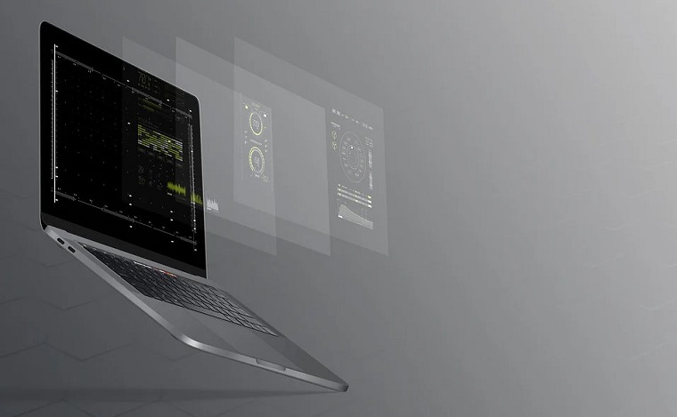
Pixabay. There are also many beautiful backgrounds that can make your presentation unusual and stylish. For example, this PPT laptop background:
Or images like this technology PPT background:

DepositPhotos. This site is rich in a large number of high-quality and colorful images. For example, on this site you can find such IT PPT backgrounds:


FAQ
For the template to be user-friendly, it must include elements such as:
- Fonts
- Color palette
- Guides
- The logo fixed in a specific place on the slide
- Headers of the right size
- Monotone background
- Fillers
You can use the recommended sites listed in this post, or just Google "PPT background technology" or "background PPT IT".
Like other presentations, the purpose of an IT PowerPoint presentation is to inform, convince, and induce. It all depends on what kind of presentation you want to make. So it is necessary before you create your IT PowerPoint presentation to decide what you want to do with it and make sure that the template is clearly suitable for that purpose.
Read Also
25+ Best Business Powerpoint Templates of 2020
How to Make a Poster in PowerPoint
Green PowerPoint Templates: Create an Impressive Slideshow for Your Presentation
Rules of a Compelling PowerPoint Presentation [Tips and Tricks]
Get more to your email
Subscribe to our newsletter and access exclusive content and offers available only to MonsterPost subscribers.

Leave a Reply
You must be logged in to post a comment.