Lesson 3. Landing Page Anatomy or Function Blocks in Focus
*This article is a part of the Landing Page Building Course by TemplateMonster
Hello to every person who has reached the fifth step called “Create a Landing”! You’ve already done great preparatory work and got a mock-up. Now it’s time to enhance it and make it real.

Together, we’ll attend a class of landing pages anatomy to clarify every element that can increase its potential. And, what are the main parts of the musculoskeletal system of landings? Of course, blocks! We’ll explain where and how to place them, and what to put inside them!
- What is an Effective Landing Page?
- The Power of Function Blocks
- Function Blocks and Content Tips: Step by Step
- About Design of Landing Pages
- Go Ahead with a Ready-to-Use Solution
What is an Effective Landing Page?
A landing is really effective if it gets the desired number of visitors and turns these visitors into buyers with 100% conversion. That is beyond of reality! However, some landings can brag of very high rates. Those are designed and built to attract only targeted traffic.
NB! The more targeted traffic you get, the more powerful your landing page is!
An effective landing page is:
- Developed to be a powerful landing page website
- Used to attract visitors customers
It’s like building a brand-new house. Imagine you have an empty area, ideas, and a bit later—some calculations and drawings. At last, you start building. And, finally, you can decorate your house to adjust it for leaving. What to do to make a landing inviting for visitors, you’ll find out in the next article.
So, now, take your instruments and let’s start working... working on blocks for a super landing page website!
Professional Views

An effective landing page is one that convinces that visitor to take an action - buy a product, subscribe to a newsletter, book a demo, etc. There are lots of factors that make a landing page effective, including great copy, design and user interface. I would point out social proof as an element that contributes to the effectiveness of a landing page. For example, a great testimonial or a review can significantly affect the overall conversion rate.
You need to place the function blocks on a landing page according to UI best practices. For a shorter landing page, you can place them next to CTAs. A working cover of a landing page is an unfinished landing page that’s missing some key elements. You can create it from scratch or using a landing page builder.
As for landing page usability, it depends on a variety of factors - how long it is, how good the copy is, what the design is like, what CTAs are included, etc.. I would say the most important factor is the copy because you can get away with a sloppy design but poor copy will kill your conversions.
An effective landing page has a clear, single call to action. Don’t leave the user confused about what their next step is. This can either be a BUY button, a prominent form to fill in, a telephone number to call, download button or similar.
You should also resist mixing offers. Your landing page should focus on a single offer, service or product. If you have multiple distinct offers, the best option is to create individual landing pages for each of them.
Avoid linking to other webpages if possible. You want to keep the user on your landing page, and links away serve as distractions - even your main website navigation. Hide it on landing pages and make sure any clicks are for your CTA.

The Power of Function Blocks
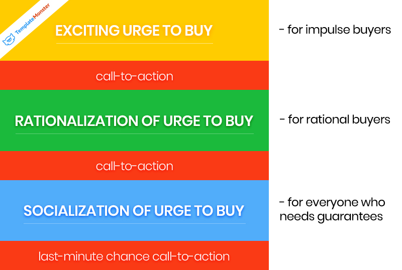
Have you ever heard that visitors of any landing can be divided into three groups?
The first one rounds up people that get an interest in the first zone, which is responsible for arousing the urge to purchase goods. Generally, emotional personalities are the most vulnerable to the influence of these blocks.
For those that think rationally, there is the second zone of blocks. They should include all facts that prove the values of a current proposition. There is usually the info of what a person will get by buying a product and what they can lose. In this part, it’s also necessary to mention price, a full list of benefits, delivery, and others.
As for the third type of visitors, they are in the majority. For them, as you must have already guessed, there’s the special third zone. It’s an attention span of those who might have liked the slogan and images or even agreed with your position to their problem. What’s wrong then? They just don’t want to be first. It really matters for them if someone has already tried your product. Such clients are looking for some positive realistic testimonials. Sometimes they make a purchase just because everyone does the same.
That is how an effective powerful landing should be created up to the complexity of human nature. Considering these facts, it can be suggested that a basic landing page website should include three main blocks crossed by smaller call-to-action blocks. They are responsible for influencing three different types of buyers.
Function Blocks and Content Tips: Step by Step
Every block on landing matters — that’s undeniable. Yet, different experts have their own approaches to a universal win-win way of building landing pages.
As for TemplateMonster, our developers and designers are not afraid of experiments, even though they may be long and complicated. Still, for those who want to save time, our developers and designers have prepared a few easy steps to a multipurpose landing. By following them, you’ll create a working landing page for your business and customers. All stages are provided with real print screens of our new All-in-One Landing Page Template - Lintense.
Professional Views

Creating a landing page the main thing is to adhere to the rule of focusing on one Call-To-Action element: contact form, subscription form, order form, booking form, e-book download button after entering the e-mail of your website visitor and so on. In other words, one specific action should pass through the entire website and nothing should distract from this action.
You do not need any external links that will increase the chance that a visitor will follow the link and forget about your site. Also, you should be as clear and concise about your product. Good photos, illustrations, infographics, and videos come in handy.
It’s very important to keep the download speed of your landing page website on maximum not only on desktops but also on mobile devices. Despite the high-speed Internet that surrounds us, it is highly recommended to test the download speed on a slow connection to show your product to the maximum number of people.
As well, you can use simple scripts for simple but beautiful visual effects.
Still, If you want to load something heavy (mega effect with a canvas of 15mb) then do it in parallel while the page is loading or even after.

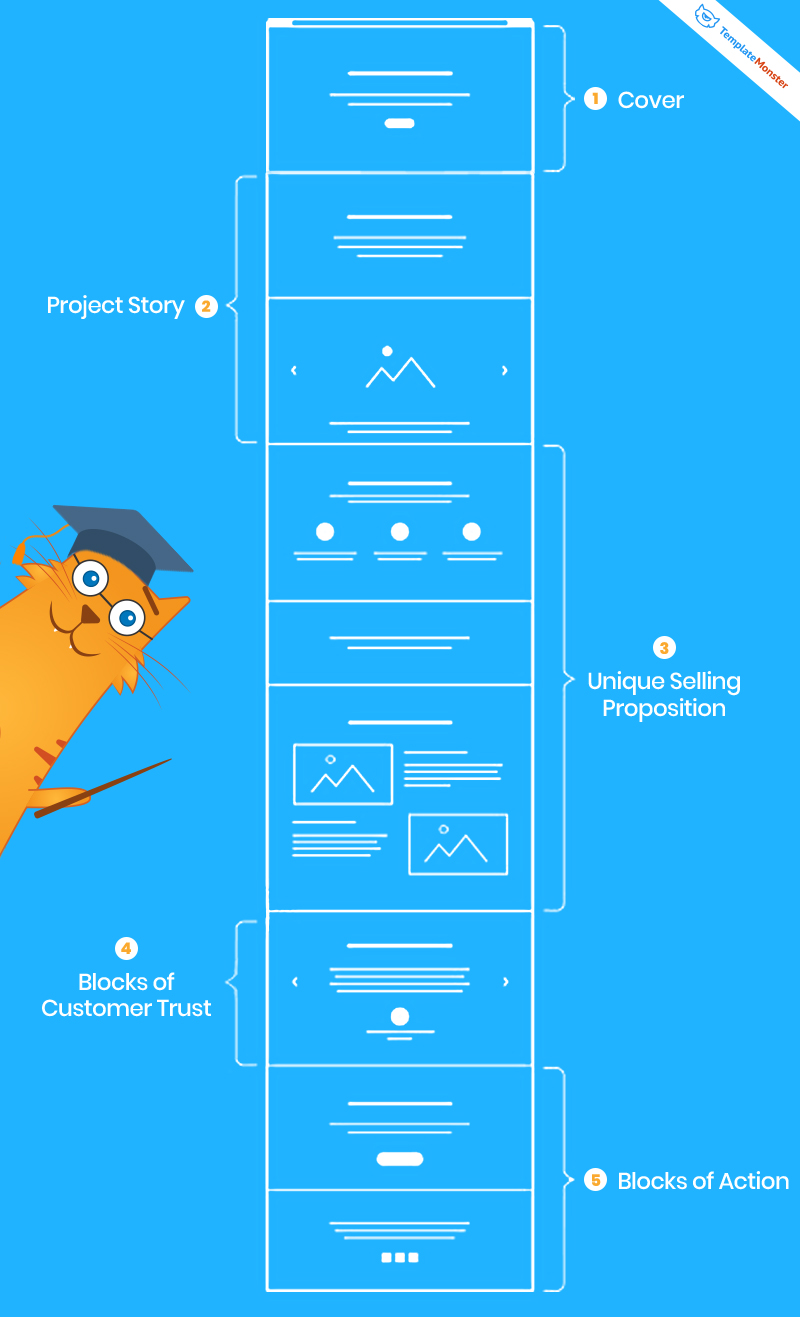
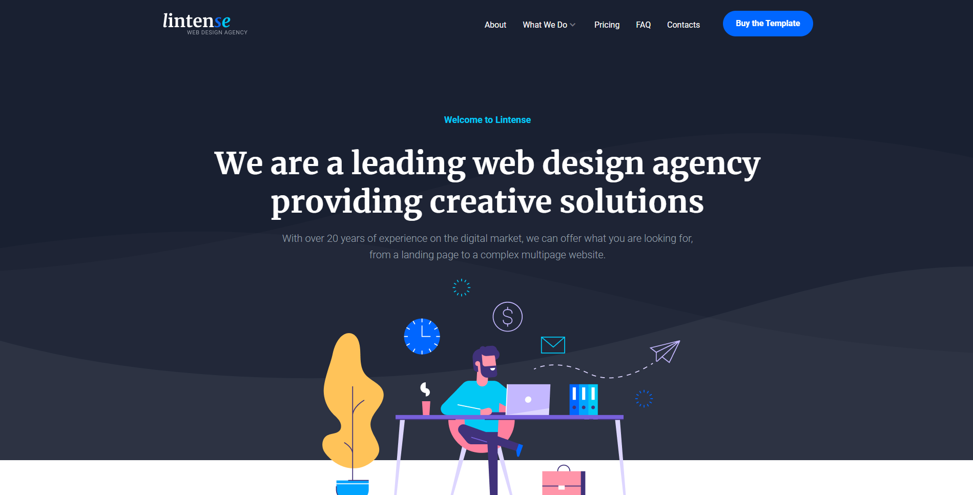
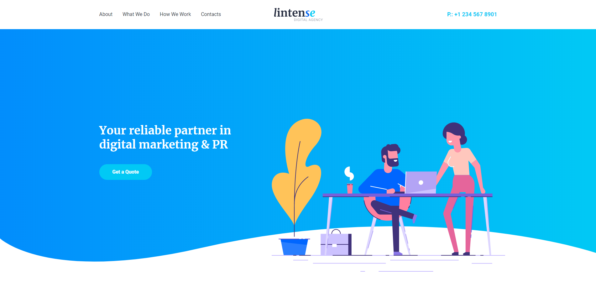
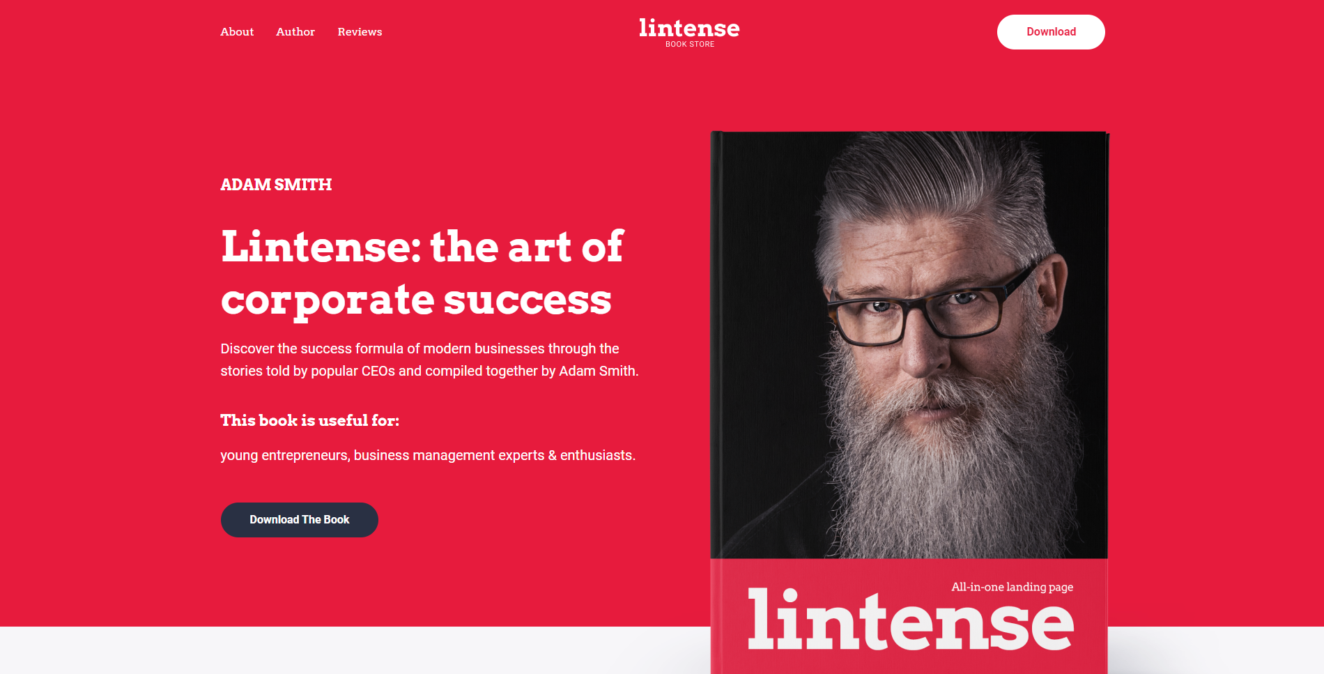
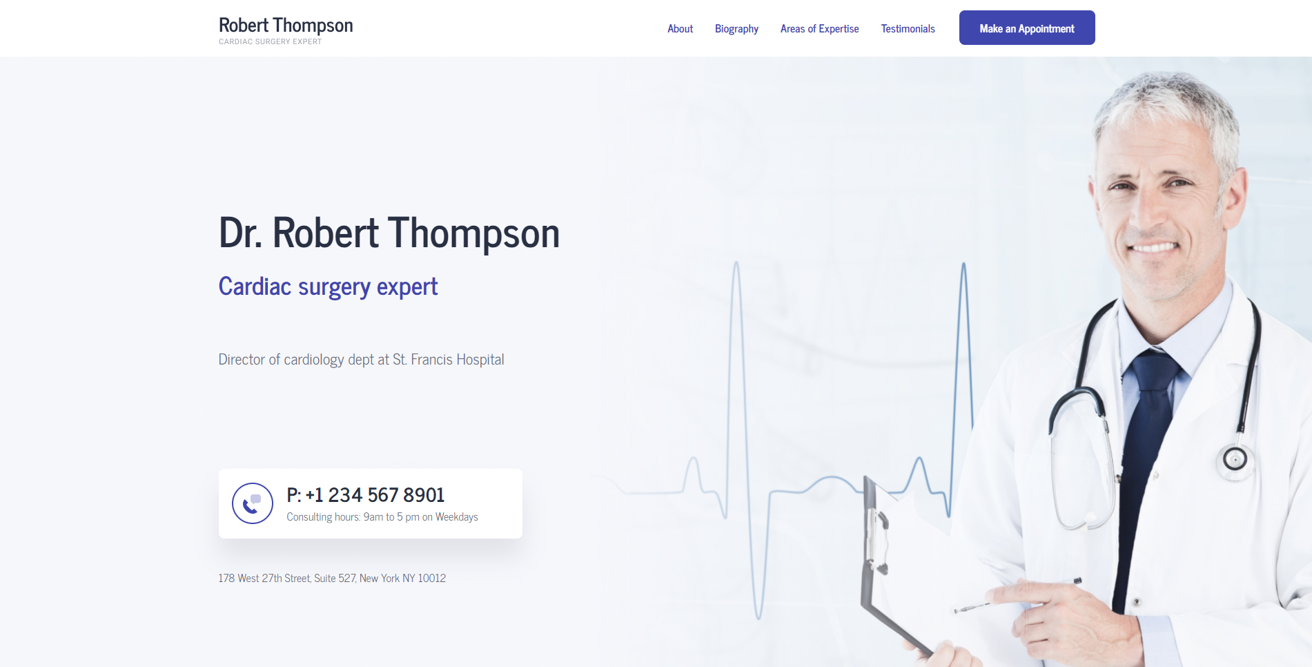
Step #1 - Cover Blocks
Always dressed for success? Anyway, cover plays the first violin on a landing page. After looking at it, visitors may stay or leave. And, yes, it’s a time to win the attention of the most emotional part of your audience.
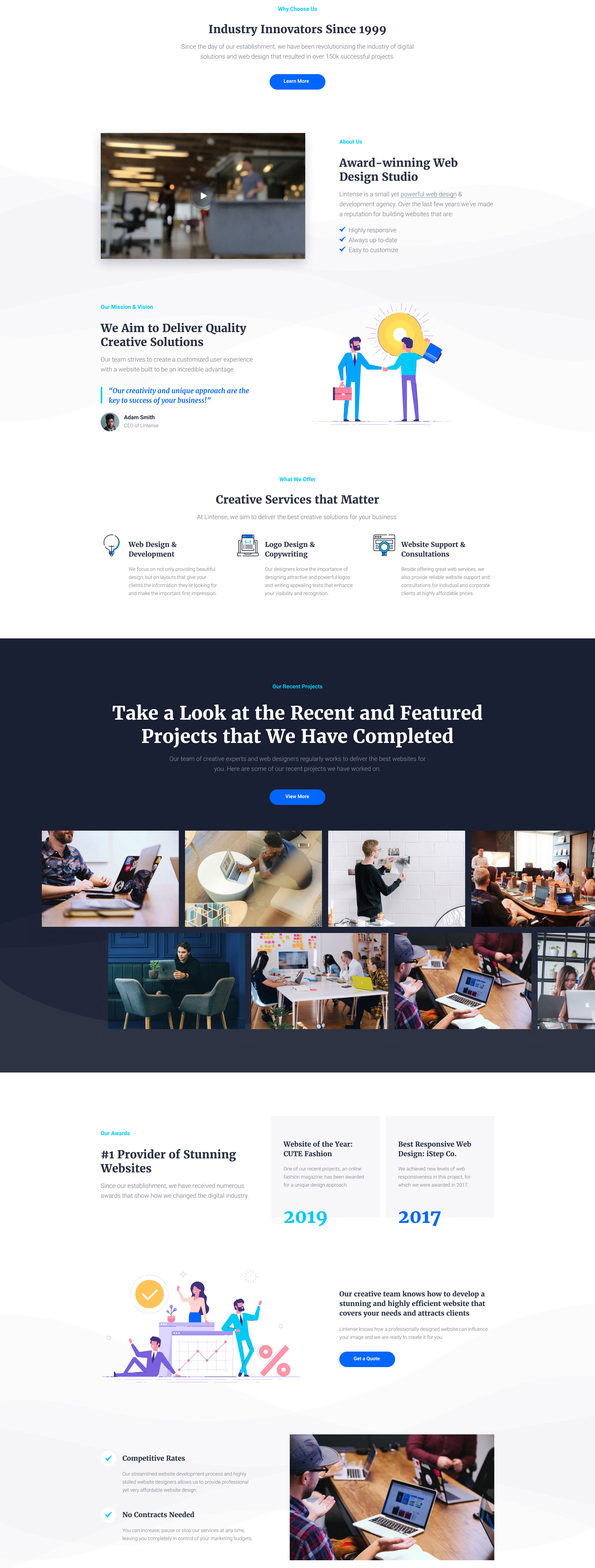
A headline and subheading are especially important for products you have high expectations of. The title should reflect your unique selling proposition. Let it be expressive and clear to attract your target audience. Otherwise, the conversion will be low. For background, you can pick out a stylish photo or video, gradient illustration or texture. A cover is the first impression of a product and of a company.
Example:
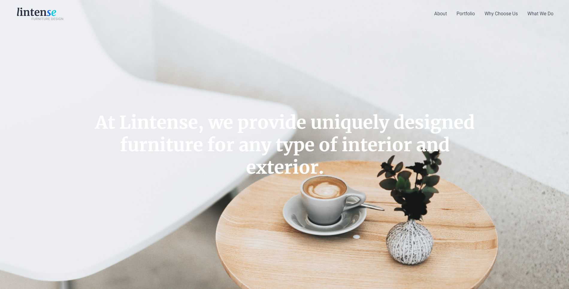
Step #2 - Project Story Blocks
As you remember from the previous lessons, a powerful landing responds to the clients’ main questions. Your task is to present the answers in these blocks.
“The buyer journey is nothing more than a series of questions that must be answered.”
Analyst Firm IDC
- Step-by-Step. If you need to highlight some features of a product, do it step-by-step. Don’t scare your visitors with wordy paragraphs. Also, include images, like parts of an interface, a product diagram, or a sequence of actions, etc.
- Pricing Plans. Tell about varied ways of buying your product. It gives visitors more answers and time to think of your proposition. For example, if you provide a subscription, it can be annual or monthly (or other). Or, in this section, you can mention the general price for some items and a current hot one.
- Target Audience. Highlight the main groups of people for whom the product or service is designed and describe them.
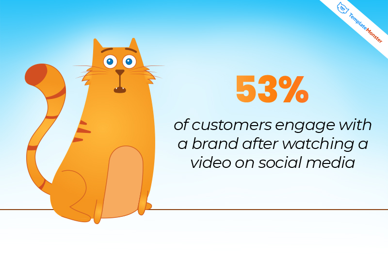
- Gallery. Visuals increase the desire to read content for 80%. So, show your product or service with the help of quality photos. This trick will appeal to customers.
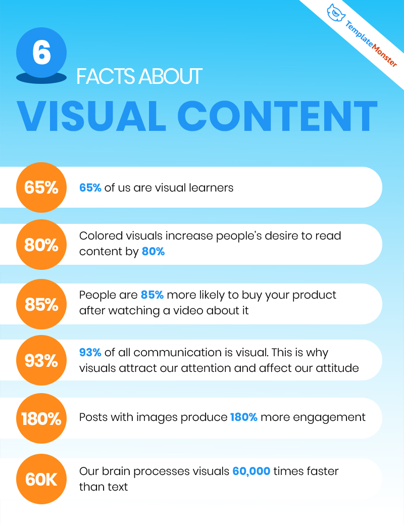
- Videos. 83% of marketing specialists have no doubt that video content is becoming even more important. A promo video or screencast is the right way to show how a product works.
Content marketing is the gap between what brands produce and what consumers actually want.
Michael Brenner
Example:
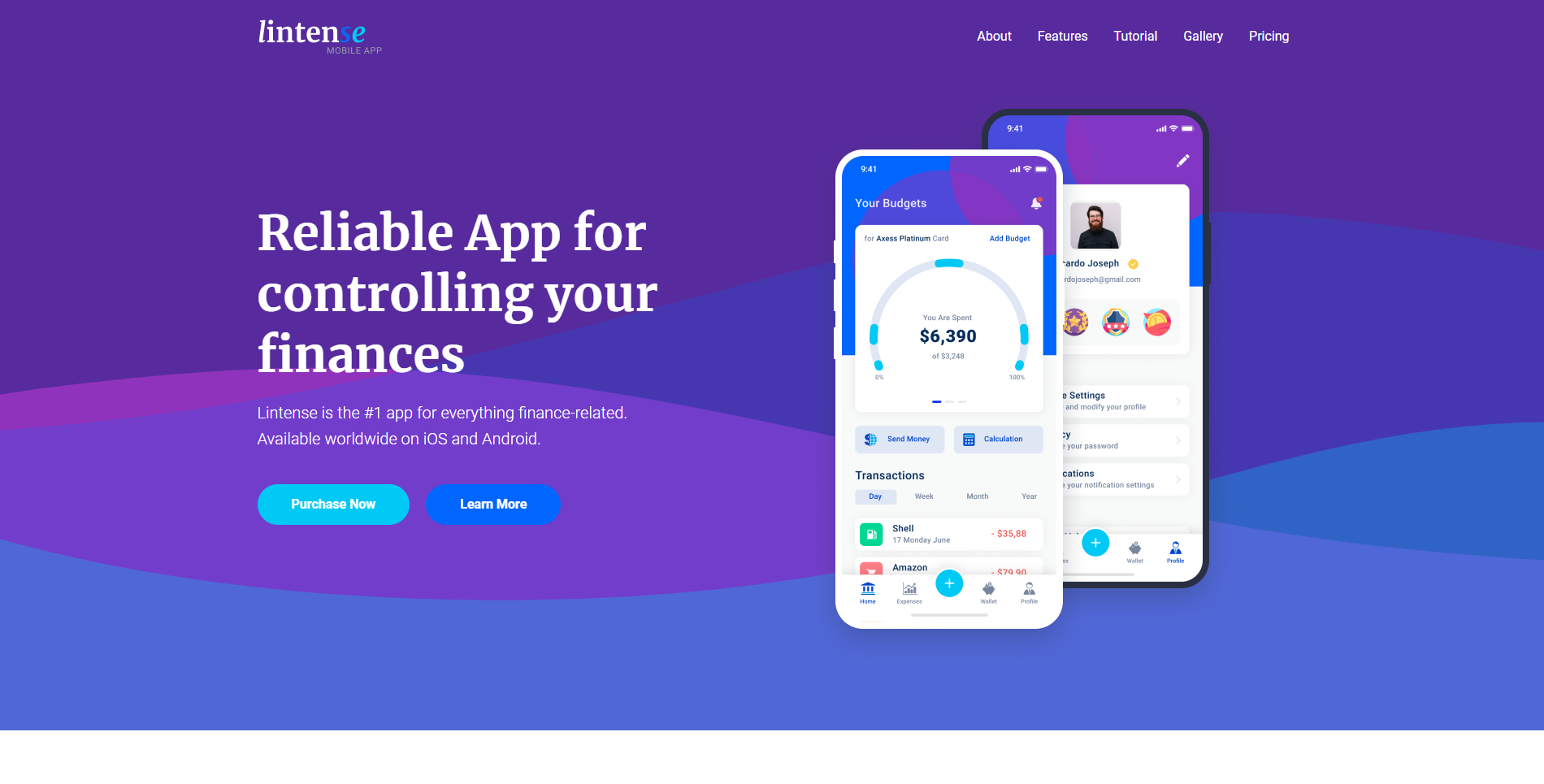
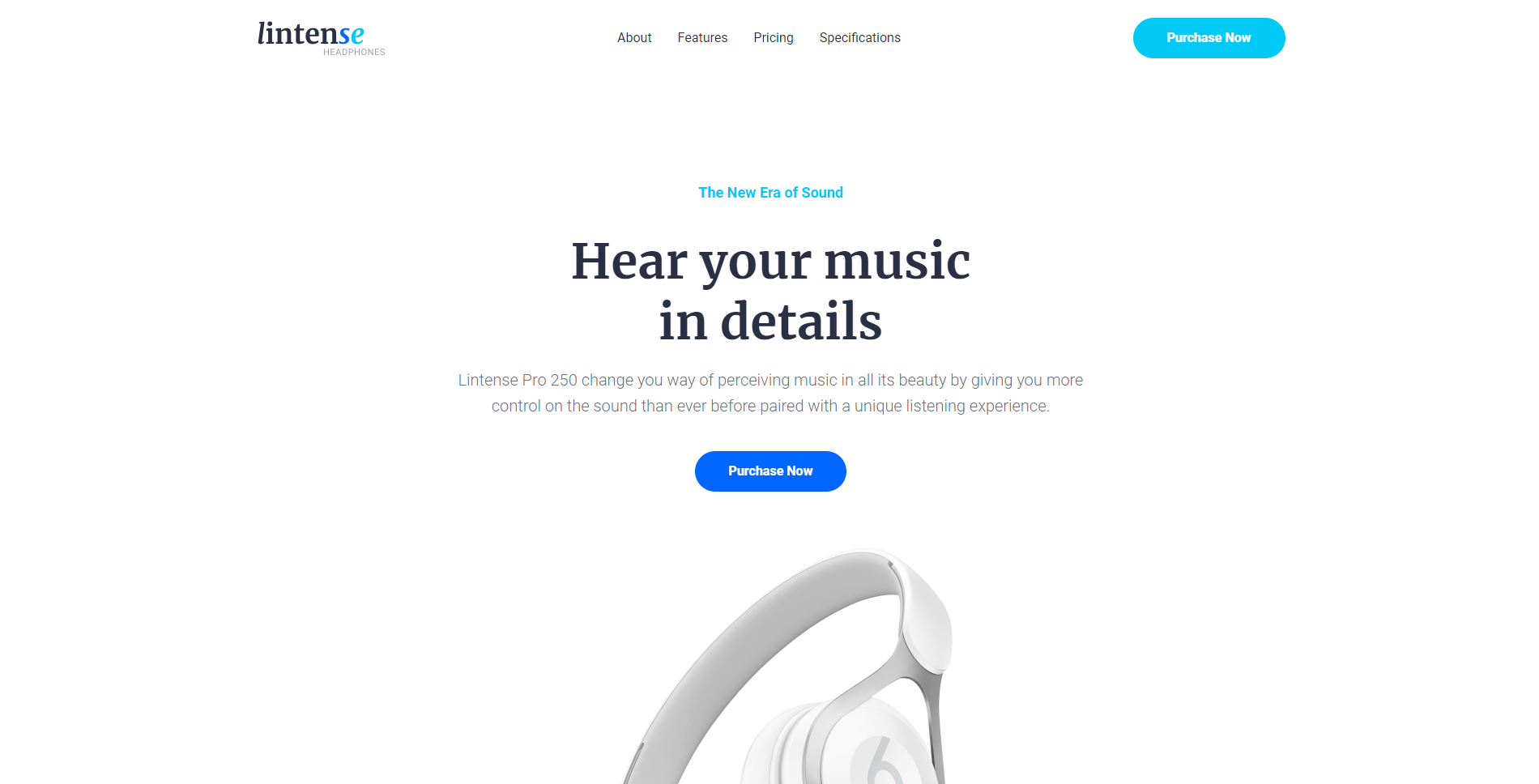
Step #3 - Blocks of Your Unique Selling Proposition
If site visitors don’t understand why they need your product, they won’t buy it. Clearly identify the benefits that are important for your target audience. Remember to explain why it’s reasonable to buy from you but not from your competitors.
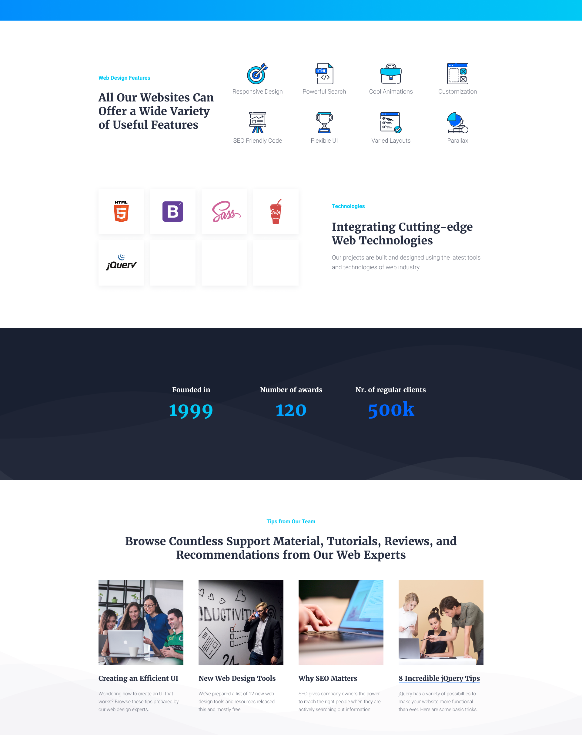
- Killer Features. Explain what makes your product cool and unique. The best variant is to formulate it in two to three core features. Power these with stylish infographics.
- Benefits. A block with listed benefits works on buyers-thinkers. They are the most likely to be in doubt. So, get assured that your benefits are quite understandable and also numbered.
- Words to Inspire. To make a landing less formal, add some inspirational phrase or quote supplied with a nice photo or a colorful background. Words in this block should support the main interests of your customers. Having been placed in the middle of the page, they can help your site visitors to unwind.
For example, this sounds nice for a travel agency, doesn't it? “Somewhere, something incredible is waiting to be known.” Or, a good quote for a charitable campaign: “You don't need a reason to help people…”
Example:
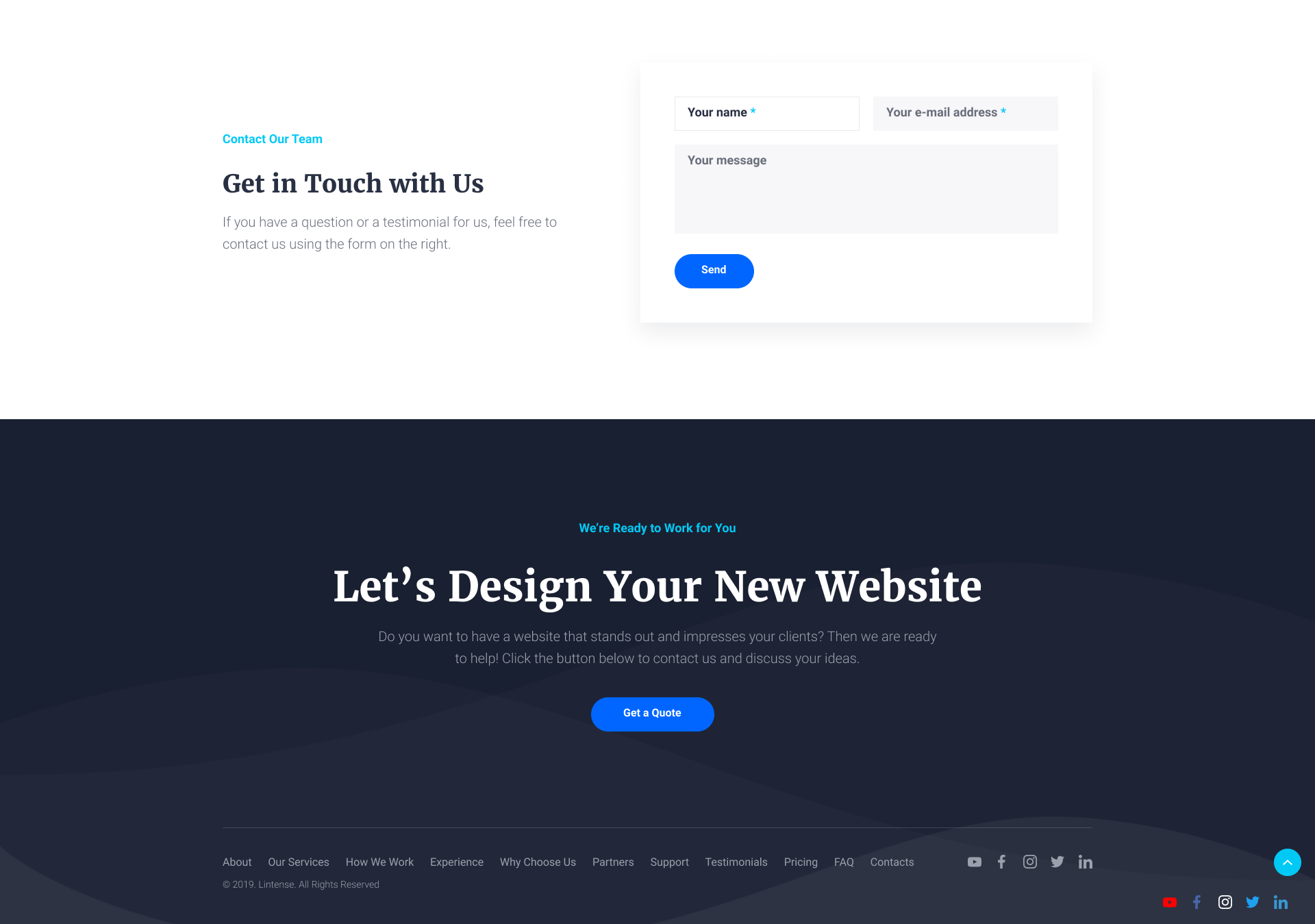
Step #4 - Blocks of Customer Trust
Do you remember those who don’t want to be first? Let’s make spells on them! Read “let’s show the closest to real client’s reviews.” Also, give them guarantees.
In these blocks, you’ll absolutely need the results of your target audience analyzes.
- Clients’ Reviews. Feedback from real people influences visitors to make a decision to buy. Ask clients to describe their experience with your product. Or, write comments on your own if you have no clients yet. Note not only the pros but also the cons of your product. Add a photo, name, and position of a person.
- Guarantees and Certificates. Post information that can guarantee the previously mentioned benefits. Show certificates, especially when it comes to health care products.
- Partners. If there are well-known companies among your customers, add their logos. This will make the visitors of your landing more loyal. Sometimes logos are difficult to put together, as they are differently styled. The solution may be to choose one color for all of them. And when someone hovers over a logo the original color is shown.
- Success Stories. It would be great if your customers share their success stories. Let them tell how your product has helped them and what they have achieved with it. This block is supposed to inspire and motivate to buy.
- Your Team. Use high-quality photos to show your team or even some parts of your office. In such a way, you’ll assure visitors that the product is fully real. And, of course, this block is a must-have for your landing if you provide a service. Plus, such a virtual meeting is important for your future clients if they have to collaborate with your specialists in person.
- Frequently Asked Questions. Here, you can present the questions from your focus groups or customers' avatars. Pick out three to four questions that prevent people from making a purchase and provide illuminating answers.
For example:
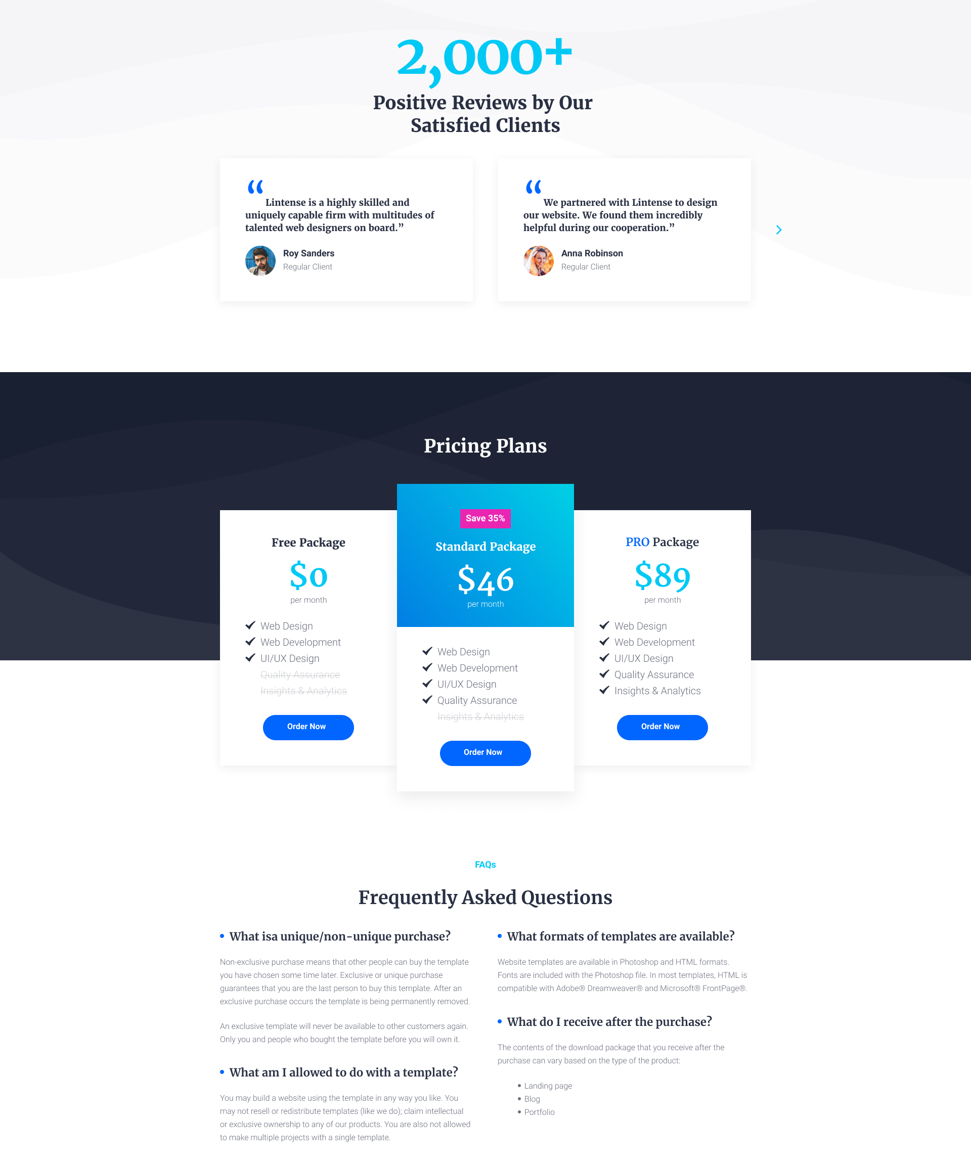
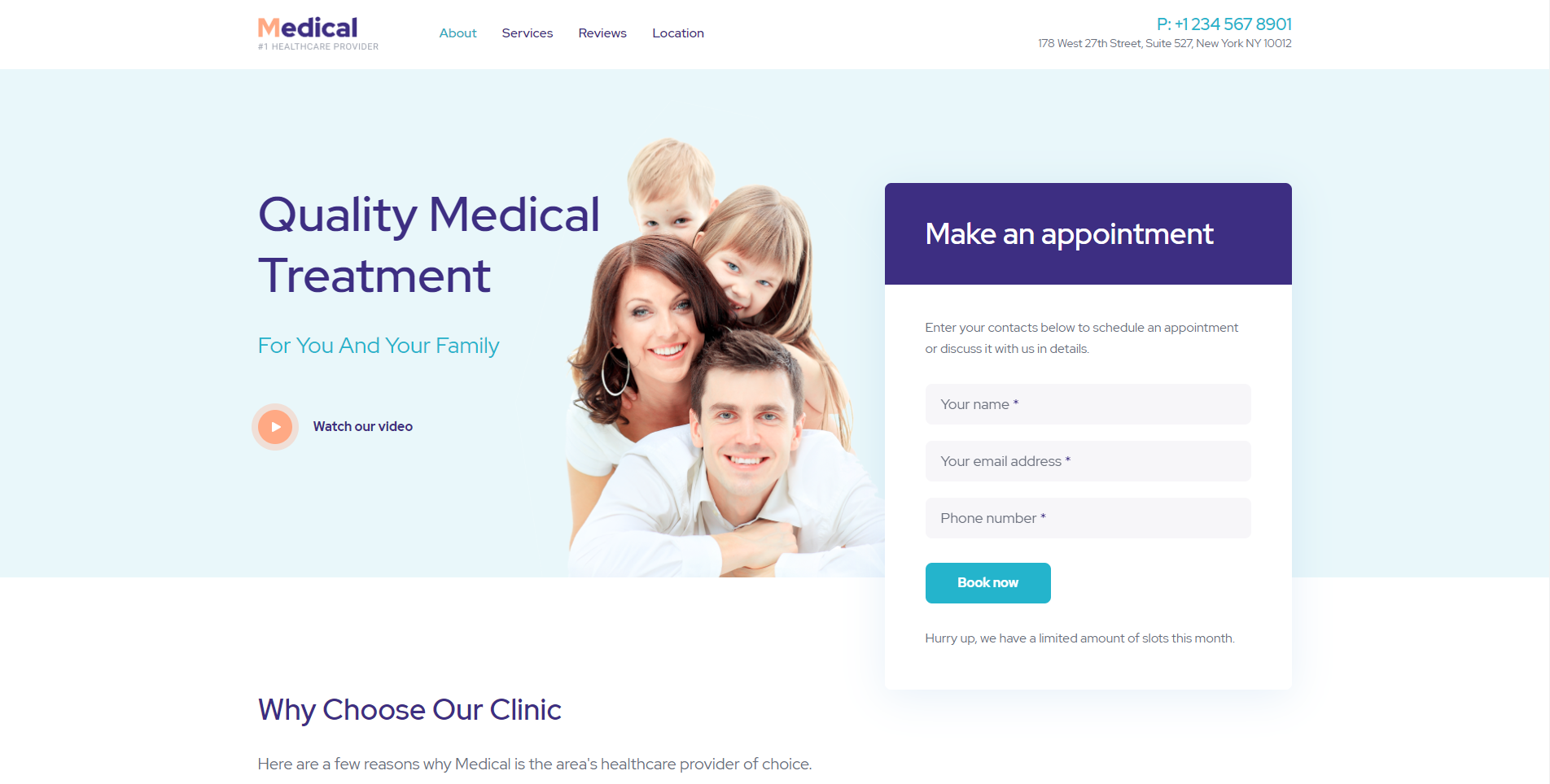
Step #5 - Target-Action Blocks
The main task of a landing is to convince a visitor to take action: to buy, subscribe, donate, etc.
So, get assured that your landing includes the necessary working forms and buttons!
- Registration/ Subscription Forms. If the goal of your landing is to collect subscribers, then filling out the form is the main action. To make visitors fill out the fields, explain why you are asking for their info, as concisely as possible.
- Call-to-Action Button. This block should be simple, convincing and understandable. Call for a specific action on a button. Use verbs in the imperative mood or in the infinitive.
- Contact Details. Be sure to add contacts to your landing page including a phone number, email, and address. You can also insert a map with a mark where your office is located. Don’t forget to mention the working hours.
For example:
That’s how you need to place blocks on a landing to make them truly function.
And what do you think of the landing below?
Unique selling proposition, benefits, cases, reviews… is something missed?
About Design of Landing Pages
“Don’t Make Me Think”
Steve Krug
On any landing, there’s a place for only one task, which is determined by the low attention span of modern visitors. In the 2000s a website visitor’s attention span was 12 seconds, while today it is 6-8 seconds.
Attention span is the ratio of the number of clickable elements to the number of page goals.
Perhaps you are familiar with the message match approach. This is nothing more than the combination of pre-click messages and post-click experiences on your landing page (for example, ads and offers).
For this reason, to run a powerful landing you need to match its design with the design of your advertisements. Duplicate the colors, images, icons, headers, fonts of your landing on your ads on the Web.
NB! When choosing an appropriate theme or template for your landing, keep in mind some of the most necessary features:
- Flexibility;
- Modernity;
- Cleanliness;
- Mobile-Friendliness;
- Variety of fonts, widgets, buttons and so on.
Mobile-friendliness is at the center of the talks about coding, web design or site promotion. Maybe it’s already the time when responsive designs are general things. Still, unfortunately, there are only a few who’ve become real experts in this field.
Even if inexperienced website owners can do some SEO, it’s impossible to adjust a website for all screen resolutions without the relevant skills. The best option is to look for a responsive theme at the very beginning.
Professional Views

An effective landing page today is modern, simple, unique and straight to the point. The user does not want to be overwhelmed with too much information. In terms of visuals, as a designer, I can say that white space, striking imagery, and limited small text, is what produces the most professional landing pages. But you also want to entice your audience by adding an air of mystery and intrigue - do not divulge into your entire business plan straight away. The audience should want to explore the full website for themselves. The holding back of information will encourage the audience to want to sign up to more information to seek that out without it being presented to them as a hard sell.
Make the CTA prominent and easy to find. This usually means including it above the fold, so the user doesn’t need to scroll to find it. Make sure it stands out from the rest of the content, you don’t want to use a basic text link when a button in a contrast colour can really draw the eye.
Images are key - users want to know what they’re getting. If it’s a whitepaper or ebook, display a nicely designed front cover. If it’s a product, be sure to include professional product photography.

UX/UI - You'd be surprised how many landing pages I've seen that are stuck in the 90s. Or even worse, landing pages that have so many marketing pop-ups you immediately want to leave. You want to have a page that looks polished and represents the level of quality a visitor would get if they decided to work with you or purchase your services. You also want to make sure it's user-friendly in that it's easy to navigate and find the information the user needs. It's okay to have pop-ups here and there but make sure they're implemented correctly and don't interfere with the user experience.
In today’s digital world, images break the text and define an appealing experience. Depending on the audience, sometimes design needs to be sleek and modern, other times cheesy or minimal. But even when minimal, a compelling visual and a de-cluttered page improves conversion rates significantly.

Go Ahead with a Ready-to-Use Solution
If you find the process of landing page creating to be rather complicated and time-consuming, get a hold of our new flagship, Lintense.
Lintense is an all-in-one landing page template. Why do you need it? Or, do you need it?
- First of all, you can take it as a base for your future projects, as Lintense suits any purpose. Plus, it saves time.
- With this template, you’ll grow several websites you can tweak for a specific client quicker than on your own.
- And, YES, you need the template if you have no idea of website creating and want a product to rely on. Moreover, with Lintense you’ll make a powerful drag-n-drop driven HTML5 website.
Lintense is an actual set of landing pages for completely different purposes. They all are made up to uniform principles and rules which facilitate the process of their customization. It’s worth to mention that every 2 weeks a new theme is being added after the release of the flagship. And we are not going to stop enhancing Lintense. The number of its ready-made skins will also increase to cover the most required topics modern users may be interested in (from a press conference landing page to a chicken farm). As well, we monitor the freshest vectors of modern technology to upkeep everything timely updated. So, you can always be sure to get the best from Lintense.
New pages, like a splash page, squeeze page for sale (appears after successful execution of the script for the main call to action) must increase the lead generation.
The Lintense template is very helpful for developers. Using it they can easily cover the needs of more than one of their clients. As for site owners, who want to create their own page and start selling, Lintense is an optimal solution and reasonable investment. In addition to the regular HTML version, we apply the cool Novi Builder for free. This drag-n-drop tool lets everyone edit and customize any of the skins up to their needs without knowledge of coding.
A good landing page should perform the same flawless on all modern devices. And its simplicity is not an indicator of fast loading. Therefore, creating Lintense we’ve tried to make its codes as clean as possible, without anything superfluous. This enables Lintense to look attractive and stylish showing high speed on all possible devices. As it’s known, the faster the landing page loads, the more users stay on it.
Use Lintense and build a featured landing page effortlessly!
Lintense - All-in-one Landing Page Template

Need more valid reasons? Then, let’s have a close look at the main features of Lintense!
- Clean Design. All the ready-to-use topics are created up to the latest requirements. We believe your visitors will enjoy the combination of minimalism and vivid colours. The template allows highlighting the most necessary content on your landing. Using the handy UI Kit, anyone can adjust the look of pages up to their own view. Nine perfectly designed niche themes are available for now. They are promised to grow in number.
- Parallax Transitions. This design element is a must-have for all modern websites. With it, you’ll brighten up your landing page. No one will stand away from its influence.
- Guaranteed Updates. That means buying Lintense once you’ve been provided all the possible updates including new ready-to-use topics, cool features, and everything that can ease your user experience.
- Novi Builder. Have you ever dreamed of building HTML5 sites automatically? So, it’s possible with flagships like Lintense and drag-n-drop technologies. That means you don’t need to “speak” Hypertext Markup Language. Novi Builder enables you to manage everything with a few mouse clicks. Add new pages or elements, customize them and just be happy.
- SEO-Friendly. This landing page template is accustomed for high Google ranks and conversions. Be sure to save money on SEO specialists.
- Valid Coding.
- Cross Browser Compatibility.
- Working Web Forms.
- Google Fonts.
- HTML5 & Bootstrap.
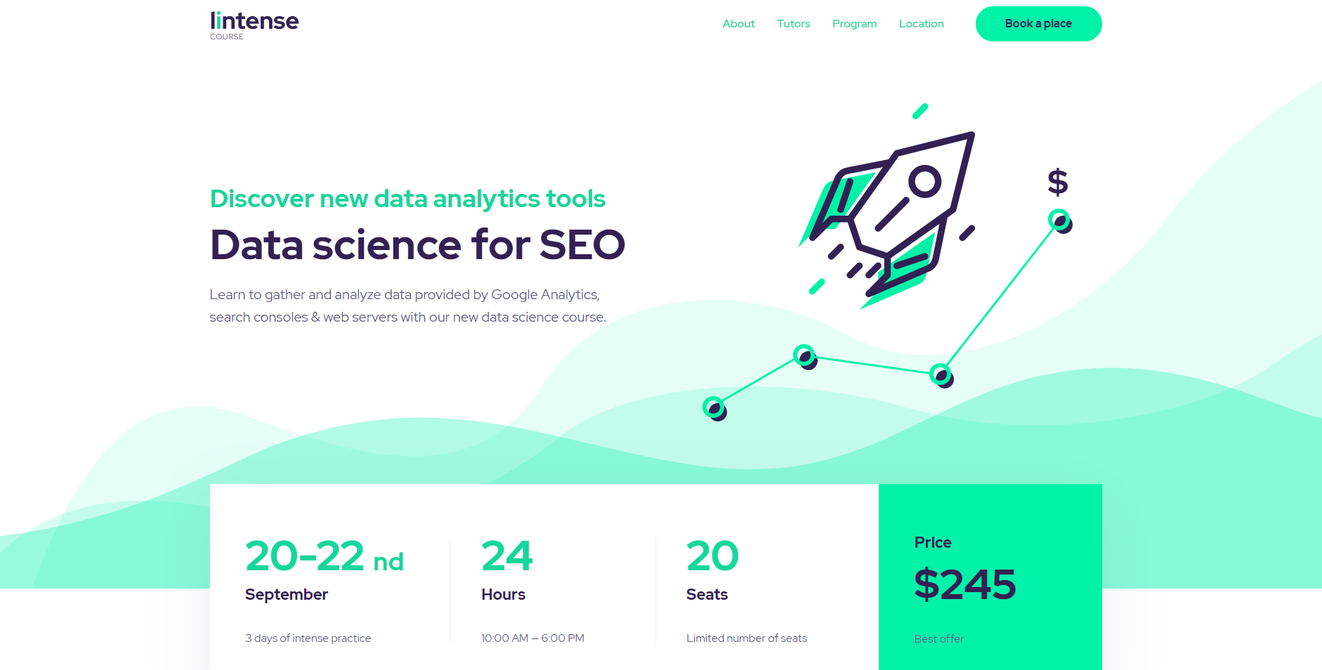
Currently, you can use Lintense Landing Page Template for a corporate website, diverse marketing campaigns, one-product presentations, promotion of agencies or courses, and other purposes. All these and more are presented in 10 skins you can find below.
Discover 10 Smashing Templates
Corporate
Application
Digital Agency
Promotion
SEO

One Product
Course
E-book
Doctor
Clinic
Even though the previously mentioned ready-to-use landing page templates are easy to adjust the way you want, we’re going to increase their number. If you have ideas on what topic is missing, feel free to share it in the comments for Lintense.
As you see, by buying Lintense - All-in-One Landing Page Template you get a full-pack of perks. We also guarantee you timely updates so you can get the most of the best web development practices.
Still, have questions? Then contact our support specialists. They are in touch 24/7 before and after purchase. With their help, your landing page website will always perform flawlessly.
Hurry up to check Lintense!
Also, stay tuned to find out how to increase the effectiveness of a landing!
*This article is a part of the Landing Page Building Course by TemplateMonster.
To read all the tutorials, follow the link and subscribe!
Our feedback won’t make you wait and
you’ll be able to pass the course on landing pages any time you want!
We also promise to share with you per email more tips, discounts, and hot offers!
Subscribe 😉
Previous lessons
Lesson 1. Basic Principles of Landing Pages: What, for What, for Whom
Lesson 2. How to Create Landing Page Websites: 5 Stages
Don’t miss out these all-time favourites
- The best hosting for a WordPress website. Tap our link to get the best price on the market with 82% off. If HostPapa didn’t impress you check out other alternatives.
- Monthly SEO service and On-Page SEO - to increase your website organic traffic.
- Website Installation service - to get your template up and running within just 6 hours without hassle. No minute is wasted and the work is going.
- ONE Membership - to download unlimited number of WordPress themes, plugins, ppt and other products within one license. Since bigger is always better.

Get more to your email
Subscribe to our newsletter and access exclusive content and offers available only to MonsterPost subscribers.

Leave a Reply
You must be logged in to post a comment.