A Piece of Art in Each Template. Magento Themes Compared to Famous Paintings
Want a bit of craziness to make your day sound great? Let’s turn this Thursday into a crazy one. Have some fun and raise your mood. I think, I have something special that you’ll enjoy.
Being an ardent fan of paintings, I draw inspiration from them each time they come my way. Hieronymus Bosch, Gustav Klimt, Claude Monet, Frida Kahlo – the list of the most beloved is a long one. Each of them have their own world-view and technique that helps render all the imagery on the canvas. Loving their wonderful works so much, I often draw an analogy between these painting and everyday life. I mean scenes, colors, characters, etc. These associations sometimes are subtle ones, but still exist. I want to share some of them with you guys.
Artworks & Magento Themes. Anything in Common?
In this post I dare to compare the famous paintings (I’m sure that you have seen all of them at least once) with the templates we all know – those are Magento Themes from TemplateMonster.
You will probably smile when you read it, but I really see some similarities between them. I do not claim that the designers of these templates have found their inspiration in the works of art you’ll see below or even have taken their main color scheme as the primary ones in the templates. It can even happen that you’ll not notice any likeness of the theme I have picked and the featured artwork. But I still dare to show you a bit of my vision of art and design.
What is Meant by Similarity?
In most cases, it’s a color scheme that sets the tone of the work, whether it is a painting or a design.
This is the main point that affects the viewers' interest and drives them in. When it comes to theme designs (in this case premium Magento eCommerce templates), the choice of color is of the primary importance. Because it makes them stylish and distinct, help focus the attention on the products and sell them.
Just look from another point of view at the following Magento themes. Let’s accept them as something more than professional eCommerce designs, but see a piece of art in each of them.
Before we proceed to the showcase, I'd like to remind you of the ongoing eCommerce promo, it will last until October 16, letting you get any eCommerce template at 50% OFF.
***
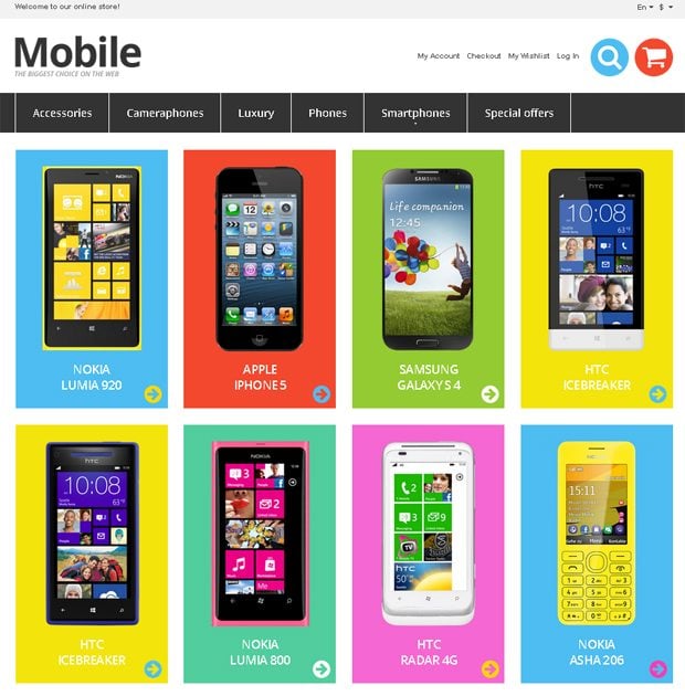
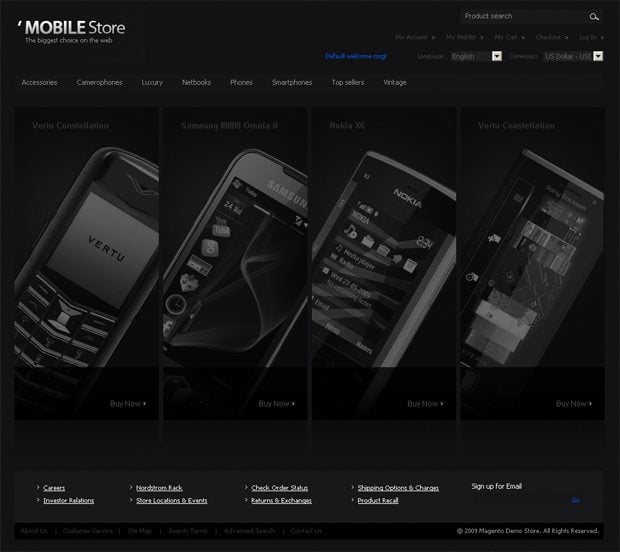
Responsive Mobile Store Magento Theme
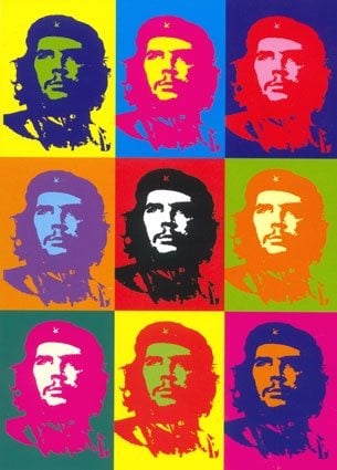
The highly modern look of this theme is achieved due to the usage of metro style in its design. The multicolored banners promoting the latest phone models bring them in the focus of attention, so the viewers can’t miss them. This vibrant mix of colors reminds the colors of the famous pop art work Che Guevara by Andy Warhol.
Did you know that? Che Guevara picture was actually one of the most scandal canvases. Selling fake pictures was always popular among people crawing for money. That's exactly what happened to Gerard Malanga who was selling fake Warhol's pictures in Italy. Howling shame!
***
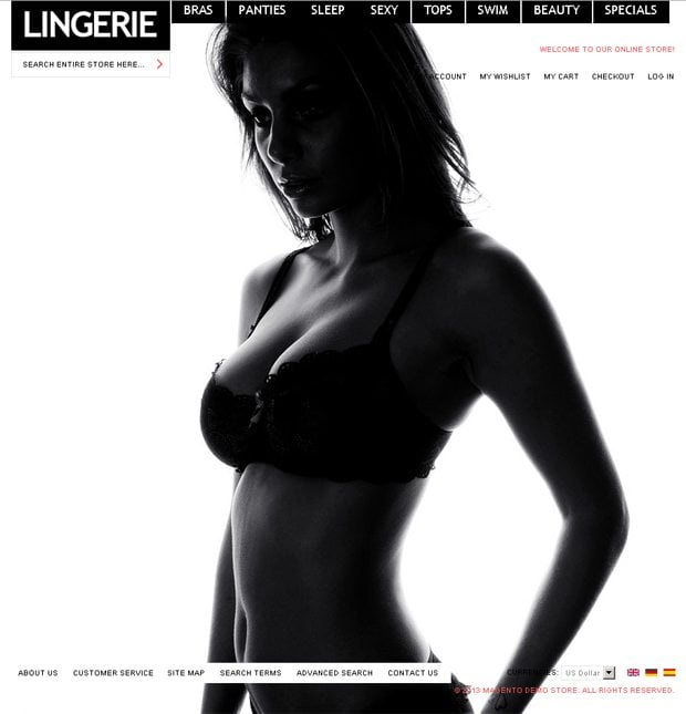
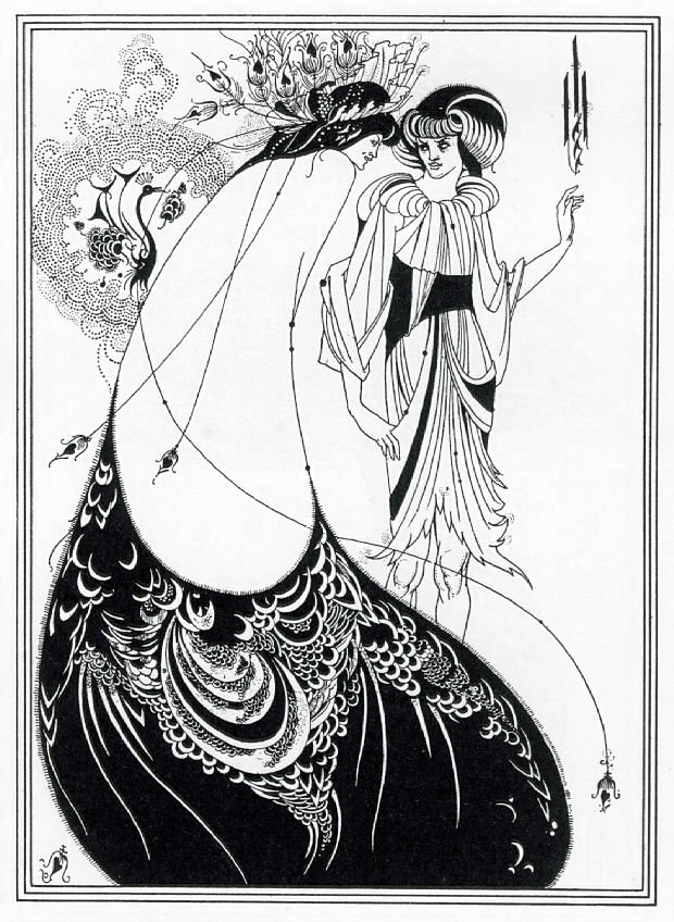
This laconic style that brings the collection of luxury items in the focus of attention is what a good store really needs. Black & white color scheme is the most popular one for making the layout contrasting, elegant and undoubtedly stylish. A spectacular work of art doesn’t need extra coloring to become popular, and the well-known graphics (illustrations for Salome by Oscar Wilde) by Aubrey Beardsley confirms this statement.
Peacock Skirt by Aubrey Beardsley
Did you know that? The Peacock Skirt was a black & white illustration created with a pen and ink (one of 16 pictures for Salome by Oscar Wilde). Aubrey derived some inspiration from James McNeil Whistler 'The Princess from the Land of Porcelain.' This artwork has some traits of Japanese artists with all those decoratively curved lines and floral ornamentations.
***
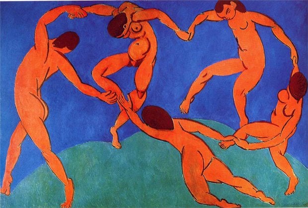
Dark blue sets the serious tone. It’s good for underlining the solidity of the business and the luxury products (yachts in this example). Orange is used as bright accents here: on call-to-action and add to cart buttons. The overall look, mostly because of the color usage has called an association with the well-known painting by modernist, impressionist Henri Matisse whose paintings are so expressive because of their color language.
Did you know that? This portrait was drawn by order of an extremely wealthy Russian industrialist named Sergei Shchukin.
***
High-End Computers Magento Theme
The strong emphasis of this design is given to its central part that is done in red. Being vibrant, it makes the slider with hot promos easily recognisable. You can be sure, that all the key information about your company (presented with this theme online) will be communicated to the viewers in the expressive way.
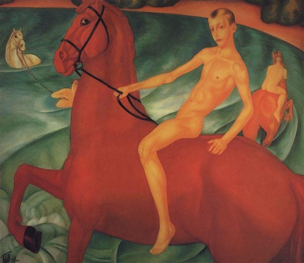
As the strong red accent of this theme, the red horse from of the same name painting makes the latter recognizable.
Bathing the Red Horse by Kuzma Petrov Vodkin
Actually, this is the very picture that inspired Annie Lebovitz to shoot Daniel Radcliff on a horse...naked. This photos managed to spoil impression caused by Bathing of a Red Horse. Parinting that combined Eastern and Western art, elements of traditional Russian icons, Italian frescoes, and neoclassical trends.
***
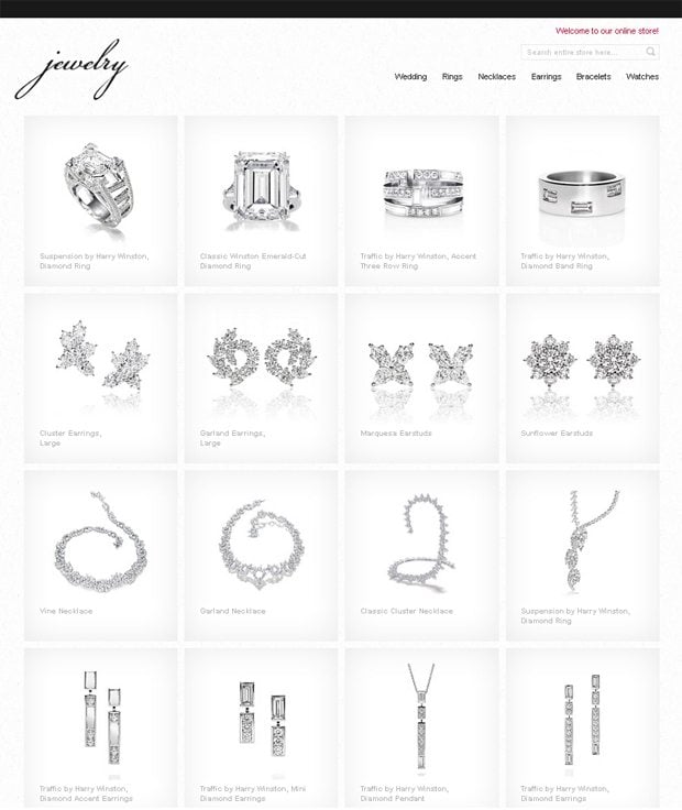
Simplicity now rules our lifes and web is not an exception. This minimal uncluttered layout is the best possible way to present the jewelry that is worth seeing.
Less is more – this rule was applied to a number of world-known paintings. The first one that comes to my mind is Dove of Peace by Pablo Picasso. This painting (quite realistic) stands apart from most of his works in cubism style.
Dove of Peace by Pablo Picasso
Did you know that? There are several variations of the Dove of Peace that was painted by Pablo Picasso for the World Peace Congress of 1949. All of them are created as graphic art and impress with their simplicity and laconic style, though we all associate Picasso with complicated cubism.
***
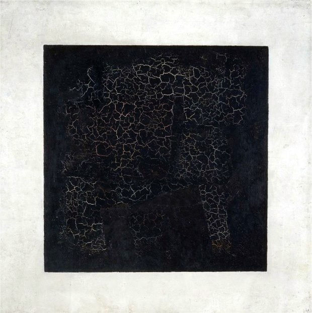
What makes this theme so stylish? It’s black essence. At a first sight, it looks completely black with several metal strokes inside. Undoubtedly effective solution that impresses with its visual clarity for online mobile stores of high-class products. Where have you seen the same visual effect? Yes! It's Black Square by Kazimir Malevich.
Black Square by Kazimir Malevich
Are you sure that it is black? Are you sure that it is square? I will say two times “No”. Look at it attentively, and you’ll notice that the sides of this “square” are not parallel, and its black color is a mix of various colors. To tell more, there is no pure black among them. The cracked structure of this painting will prove it, ‘cause through these tiny chaps you can see the tints of other colors.
***
Responsive Air-Conditioner Store Magento Theme
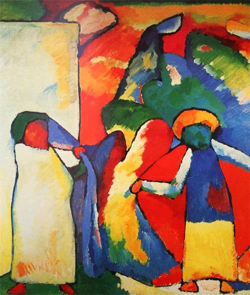
And here is metro style design again. One more cool theme that makes use of multicolored bricks for promoting the products. And this approach works. Future visitors of the site based on this theme will certainly pay attention to the list of featured products placed in the brightly colored blocks. The usage of the same bright colors in the works was extremely popular in times of Wassily Kandinsky whose abstract paintings where mainly red, blue, green and yellow.
Improvisation (African) by Wassily Kandinsky
Did you know that? Metro style designers confessed that Bauhaus school inspired them to create things everyone likes so much. If in 1909 Wassily Kandinsky changed his mind and did something else instead of drawing Improvisations, Metro style would go some other way.
***
Responsive Wheels & Tyres Store Magento Theme
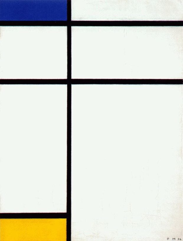
Blue, yellow and anything else. But it’s still enough to create a bold layout for the online store that will for sure drive a lot of visitors in. This method is not a new one, but turns out to be “classical” in terms of art. Have a look at the painting by Piet Mondrian. Any associations?
Composition III with Blue Yellow and White by Piet Mondrian
Did you know that? First works of Piet Mondrian consisted mostly of landscapes. Later he was influenced by cubism and that's the reason we can enjoy this grid-based picture 'Composition III'. If you're a graphic designer, probably this artwork will remind of some layout you've created.
***
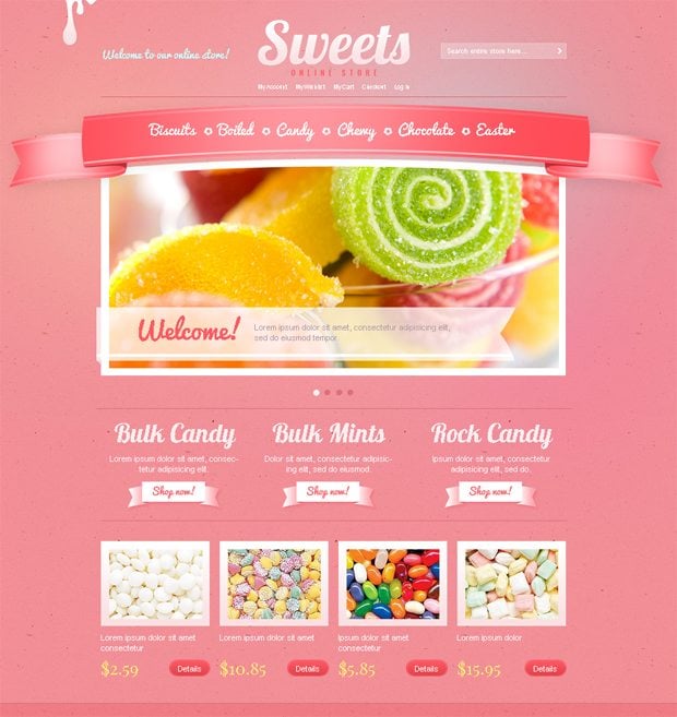
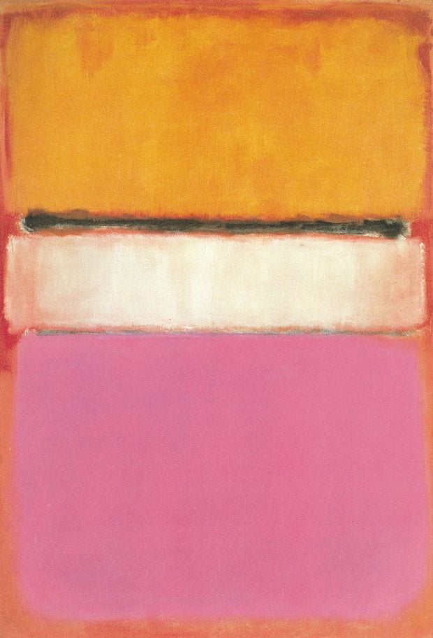
The candy shop should look eye-candy! Sounds funny, but it’s quite true. Make people see a yummy stuff and desire to taste it, and they will certainly do it. This design shows how to make it easily with a sappy pink color scheme and nice visuals.
One more eye-candy work of art has turned out to be one of the most expensive. Which one? See below.
Did you know that? When speaking about contemporary art, "White Center" by Marl Rothko is the only picture sold at Sotheby's auction for almost $80 Mln. It's considered to be one of the most expensive paintings of the century.
***
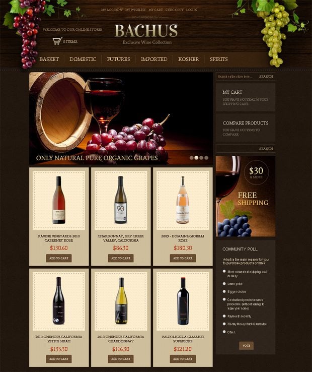
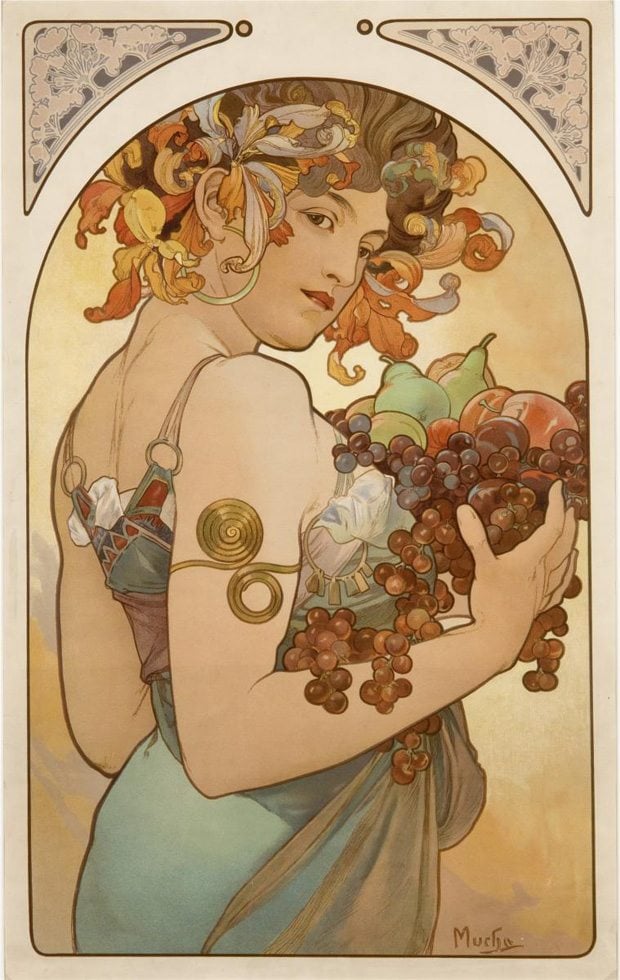
Dark background with pleasant on the eye wooden texture creates a nice tone of this design. The sappy grapes make its look really “tasty”. This is how wine products can be nicely presented in online store. Grape-vines, wood, faded colors, curls, flourish ornaments… Where have you seen it before? In so wonderful (not only I think so) Art Nouveau paintings by Alphonse Mucha. Have a look at one of them here.
Did you know that? Alphonse Mucha was one of the most known graphic designers (if can be called so) of his time. He was the creator of labels for various products (champagne, bisquits, bicycles, matches, etc.) His sketches were used for designing beautiful dresses and jewelry. Playbills, broadsheets – his works were everywhere. Still, we know him for the eternal paintings of beautiful women.
***
If you’re not a great fan of art, but design is still a point of your interest, I want to add the final chord to this post. In case you need some eCommerce theme now, you have a nice chance to save on a purchase. A half!
Get more to your email
Subscribe to our newsletter and access exclusive content and offers available only to MonsterPost subscribers.






Leave a Reply
You must be logged in to post a comment.