How To Make A Good Impression On Your Website Visitors
The use of the Internet is uncountably high today. Every minute, people are wandering from page to page until you show them what they need. As a rule, they expect to spend their time wisely, no matter if they search for educational information or some business service, or if they shop or just try to unwind.
Maybe it sounds unreal, but on average, you have only 15 seconds to grab your visitors’ attention. This time is enough for visitors to a website to decide whether they prefer to stay or leave it. You can also have a look at questions that should be answered by visitors within 15 seconds or less:
- What is this website about? (don’t hide your chief topic under tons of useless information)
- Does it make me interested?
- What am I supposed to do? (call-to-action; make your visitor see clear if they are supposed to buy something, fill out a form, etc.)
- Do I want to share this experience?
So, go on reading this article to deepen your knowledge for making a good impression on your website visitors. Here you will find simple steps to follow to gain a positive reaction from people.
Remove Long Waits
3 seconds is the maximal loading time of any website that people can stand without refusing to leave the page. Take it seriously because your website’s speed is the first thing your visitors notice.
To take control of this situation, use a website speed tracker.
Highlight Your Key Information
Make a sure your main page reflects the leading information on your website. Don’t use unrelated materials. Remember your disappointment when you looked for something important, and a website wasted your time with some messy content. So, be selective when it comes to the feed of your website.
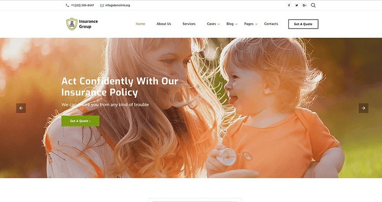
Remember, when you are trying to design your page by adding different elements, you shouldn’t allow them to conquer your most important content. Firstly, decide what you want your visitors to see before all things, and then fix it at the most favourable places. It can be a title for your company or product and a particular call-to-action.

Show Your Product Correctly
As for your product, paste its photos and (or) video, due to them your visitors will understand the main purpose of your site immediately. Don’t neglect the quality of this visual helpers. Check if they accomplish the whole design of your website and look the same good at any browser and on every screen of any gadget.

If you run an online store, lively bright photos can provide your potential clients with a feeling of a real presence in your shop or even studio. Show your ware from different sides and supply it with a detailed description.
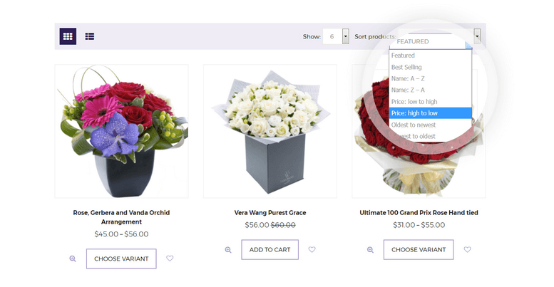
A demonstration of your product in a movement will only put forward its exceptional features. So, make some short clip to prove it.
If you are a decor designer show works in the interior. And of course, clothes will better look being represented by people, but not as a plane picture. Provide your customers with a possibility to imagine themselves in your fashion items.
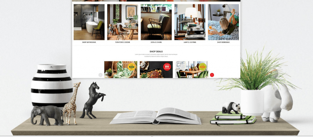
Spend some time to make a spectacular presentation of your brand and product, and the future results won’t make you regret.
Aesthetics
Have you ever heard that a visitor needs only 50 ms to rate a visual appeal of a website? Also, someone supposes simple, minimalistic pages to be more beautiful than pages with more complicated structures. So, keep it tidy: your visitors might stay longer if your site is clear, simple and elegant.
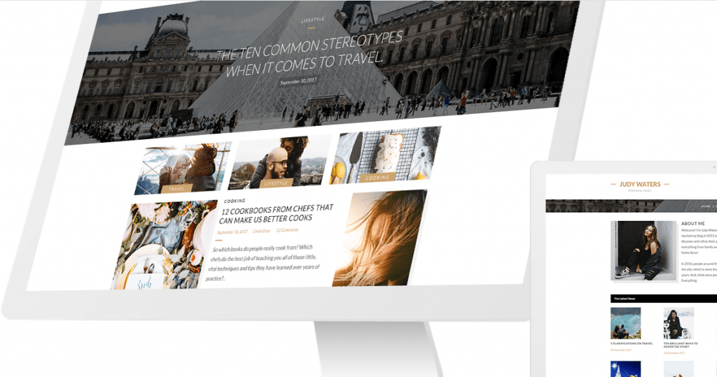
In a word, your website must be attractive and pleasing to eyes. Try also to follow the latest tendentious of web design.
It’s also indispensable to keep all images of your website in one style. Brightness and contrast shouldn’t be ignored.
Responsive Design
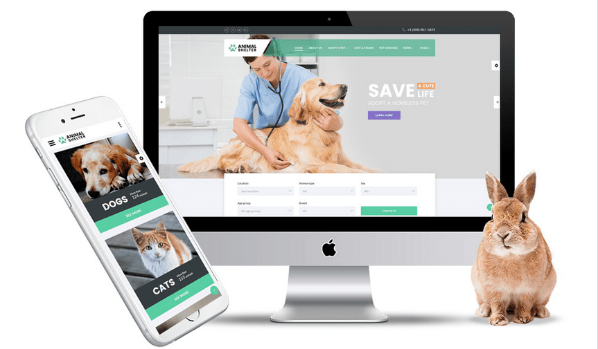
Let your website be the same cool on the screens of smartphones and tablets, for the reason that in 2018, 52,2% of all website traffic worldwide was generated through mobile phones.
Be Open
Real people are the best way to show clients your friendly attitude to them. Just show them your strong knitted team, that cares about the efficiency of your project and good opinion of customers.
Create some sections like “About Project” and “People” which include beautiful photos and engaging, informative constituent. Specific pages are needed when visitors need to find out if they can rely on you.
Plus, don’t skip to get this information updated from time to time.

Link Your Visitors To Other Pages
Don’t hesitate to share links to your blog, Facebook or Instagram pages.
Be In Trend
Here are some web design trends for 2018, according to Webflow:
- Broken grid layouts
- Images take center stage
- More organic and oblique text shapes
- More pervasive interactions and animations
- Floating navigation menus
- Video elements
- Variable fonts
Hopefully, these tips will benefit you to impress your visitors positively and make them stay!
Also, don’t slight to visit our main page to check how all things of attracting visitors’ attention are organized there 🙂 We will be glad if you find there the answers to all your questions. Be assured that our friendly personal consultants are always ready to assist you, 24/7. They will help you to save your time and find the best template that will match your topic and highlight your uniqueness.
So, if you don’t have your own website yet, but have been dreaming for so long to make it, choose our modern templates. Due to these ready-made layouts, you don’t need to be thoroughly enlightened upon the web development to get a website that will represent your work advantageously.
Main features of templates by TemplateMonster:
- topics diversity (we guarantee you will find templates dedicated to all possible themes; also look for multipurpose variants that can easily suit any business, blog page or photography website);
- no coding process;
- user-friendly;
- high-light speed;
- responsible (most of our products are mobile-friendly, or supplied with built-in mobile version);
- pixel-perfect visual effects and animation;
- polished and beautiful design;
- documentation (buying our items, you’ll get step-by-step tutorials to customize your future website);
- 24/7 support (basic and lifetime premium).
Hurry Up! 26 000+ propositions are waiting for you!
Read Also
Inbound Marketing – How to Convert Website Visitors into Leads
11 Parallax WordPress Themes To Retain Your Website Visitors for Longer
3 Killer Tactics to Get Visitors to Your Website
Make it Easy for Your Website Visitors to Take Action by Removing Obstacles
Engage More Visitors to Your Website With New Landing Page Templates
Get more to your email
Subscribe to our newsletter and access exclusive content and offers available only to MonsterPost subscribers.

Leave a Reply
You must be logged in to post a comment.