Back to Basics: Minimalist Design
In the most recent years, there has been a return in focus on simplicity, space and elegance in design that transpires pureness. A lot of design trends such as Flat design, Material design has appeared. And for a good reason. Minimalistic design helps capture the attention of a person to relevant content as well as portraying professionalism. Seen often in interior design, communication supports or decorative objectives, you can use these inspirations for your website’s design. Here are a few reasons why you should adopt a minimalist design for your site and what you should focus on.
What is minimalist design?
Design Shack defines it well: “minimalist design can be identified by a framework that is simple in nature.” This means that only a few elements are necessary (such as color, style or typography) to play around with.
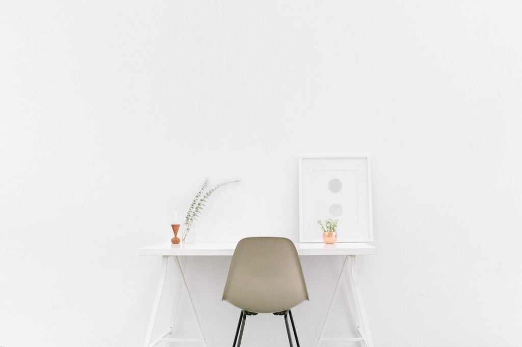
Often, minimalist design is presented with light colors, few bold colors and with a lot of “space” between content and elements to evoke simplicity. Designers who adopt this approach tend to use quite a bit of white space or uniformly colored space. Apple is a fitting example when it comes to simplicity. You can see that through their communication supports, and even on their website, they make sure to keep the focus on their products. They use white space exceptionally well with only black and grey font.
The importance of simplicity
Did you know that 75% of people judge a website’s credibility based on its visual presentation? It also only takes 50 milliseconds for a user to form an opinion about your site. That is why it is highly essential to take care of your website’s design.
It’s not surprising that the saying “less is more” is used widely in today’s context. Going back to basics is essential to help you concentrate on your most principal elements. It also increases faster loading times and compatibility on different devices.
If that doesn’t convince you, having a simple and minimalist design works well on mobile devices. With more than half of the world using mobiles to browse the web, it is essential to have a website that is mobile-friendly and “responsive.”
Focus on few elements
So where should you start? It would be wise to start by thinking about what it is that you want to highlight to your clients. Do you have a fantastic product to sell or a service that is worth highlighting? Can it be presented on its own or do you need to create a universe around it?
When you have decided what it is that you want to highlight, pick on only one or two elements that will make your content stand out. Elements come in the form of color, typography, images, text, graphics, templates or contrasts.
For instance, if you are a photographer, concentrate on highlighting your photos by downplaying the fonts and the colors of your website so that your photos stand out.
If you are a blogger, you may want to focus on your words and choose a bold graphic typography, while highlighting a few relevant keywords in a complementary color.
The idea is to have your website “breathe” with space around your content so that a visitor’s attention can go directly to the most important element. Think about what it is that you want to highlight and design your website around the content that you want to promote. For a better idea of how to get the best minimalist design possible, have a look at this great article that gives you the 7 pillars to think about for your website design.
Choose a “pure” template
If you are not a web expert, you may want to browse through templates that can help you see more clearly. Template Monster offers a variety of templates that cater to every different need. Choose one that is “pure” and “light” to make sure that the style says minimalist and straightforward. Templates give you all the elements necessary in a harmonious way so that you don’t have to worry about whether your design style is out of sync. The colors, fonts, and layouts are carefully chosen so that the overall design looks beautiful and professional.
You can also have a look at Heek, a website builder that accompanies small business owners and independents to build their website in minutes thanks to a chatbot. With its simple edition and choice of beautiful and minimal templates, you can highlight your business activity easily.
If you are creative and want to have a go with your design, make sure to design your website with a limited color choice. The best way to think about your colors is to choose three maximum and to have them be complementary to one another. Don’t overdo it in colors or images as this will take the focus away from what you would like to stand out. Same with fonts, opt for a font that stays coherent with your overall colors. But be careful not to choose colors that don’t associate well with each other.
For instance, if you use a too grey color with black, your website may not look elegant, but dull.

Highlight your information
The principal idea of having a website that has a minimalist design is to highlight the most valuable information for your visitors. Bombarding your potential clients with too much information, images and color can keep their focus away from what you offer.
With a simple and elegant design, you can take the opportunity to go straight to the point. For instance, you can play around with beautiful, high-quality images of your service or product with short and detailed descriptions of what you offer. Or focus on important words that you want to highlight by using the space around to give it more emphasis.
When you concentrate on the content that you would like to highlight, you allow your visitors to understand better what it is that you offer. It provides a better visual flow - the more negative space you have around information that you want attention to, the more the eyes will be drawn to it.
Ready to try out the minimalist approach? Be careful as it may seem easy to coordinate a few elements, but if you do it wrong, your website won’t look professional and elegant but can look sketchy and dull. Play around with a few ideas to see what looks best and be sure to ask advice from someone objective that will tell you how well your website looks. Again, if you do not trust your perception, browse through templates for inspiration or look at website builders to help you.
Related Posts
Is Minimalism a Trend That is Likely to Flicker Off?
This is a World Where Less is More! Minimalism in Web Design
11 Web Design Trends Expected to Run High in 2018
Going Below the Fold: How Do You Make Your Homepage Better?
Don’t miss out these all-time favourites
- The best hosting for a WordPress website. Tap our link to get the best price on the market with 82% off. If HostPapa didn’t impress you check out other alternatives.
- Monthly SEO service and On-Page SEO - to increase your website organic traffic.
- Website Installation service - to get your template up and running within just 6 hours without hassle. No minute is wasted and the work is going.
- ONE Membership - to download unlimited number of WordPress themes, plugins, ppt and other products within one license. Since bigger is always better.

Posting contributed articles about the major web design highlights and novelties. Come across a handful of useful tutorials and guides shared by experts in the web design and online marketing fields.
Get more to your email
Subscribe to our newsletter and access exclusive content and offers available only to MonsterPost subscribers.

Leave a Reply
You must be logged in to post a comment.