Going Below the Fold: How Do You Make Your Homepage Better?
Last week we had a discussion about the importance of the above-the-fold area of your website; let’s continue our conversation since this sensitive part of your website requires some additional attention.
From the top part of your site’s page let’s go a little bit lower, to rest of its body.
Your homepage is the most valuable part of your company’s look, but it may feel as though you are trying too hard to make it look sexy.
Today’s customers want simple website experiences, mostly because mobile users have already outnumbered desktops, and for them, smooth browsing is way more important than it is for a desktop user.
If you don’t believe me, have a look at these stats.
Mobile users can’t stand complicated pages with dozens of elements, simply because they cram the screen of their smartphone making it look like a Turkish bazaar.
If your site’s look dates back to the beginning of the 2000’s, it might be a good time for a facelift.
Keep it Simple, Folks
It’s easy to do too much on your homepage, not realizing that you’re out of line with today’s trends. Ironically enough, simple web design is the hardest to achieve. But when you study the data and evaluate the trends, it’s clear that simple sites always perform better. There are a number of reasons why, including:
- Faster load speeds. The first thing you’ll notice is that simple websites load faster. Without a bunch of different elements weighing the page down, it’s able to load more quickly and prevent delay-related bounces.
- More familiar. Most people agree that change is good, but we’re all creatures of habit. When we see something with which we're familiar with; we’re going to gravitate towards it. A simple homepage gives off a warm vibe and helps visitors feel at ease.
- Fewer distractions. The logic is pretty simple, fewer distractions mean better focus. Better focus typically leads to more conversions. More conversions mean increased revenue and growth.
You know your audience and what they want, but simplicity is a universal craving. As you evaluate your homepage and look for ways to bolster your conversion rate, use the following tips:
Cut Down on Text
One of the biggest misconceptions is that a homepage should convey as much information as possible – fully explaining what the company does, where it’s been, and where it’s going – when it only needs to encapsulate the company’s purpose and nurture leads.
Instead of trying to convey everything at once, stick with a couple of the main value points. Ditch the verbose copy and instead rely on visuals and carefully crafted statements to carry the value. Credit repair firm Lexington Law did an excellent job on their website. Notice that there is text, but nothing is superfluous or out of place. Any text that’s present on the homepage is there for a particular reason. Everything else comes in the form of visual content.
Applying theory to practice
Here're some templates that utilize this trick, check them out.
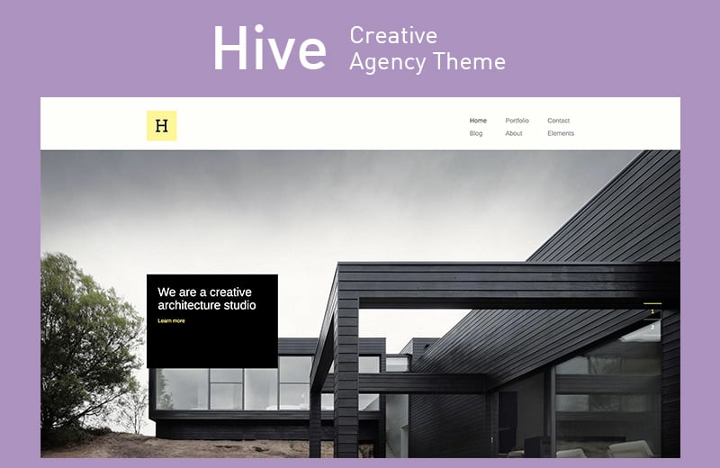
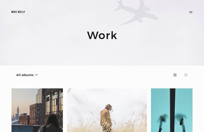
Hive - Creative Agency WordPress Theme
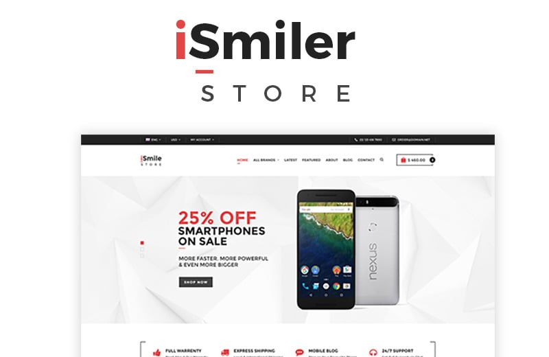
Ismiler - Electronics Store WooCommerce Theme
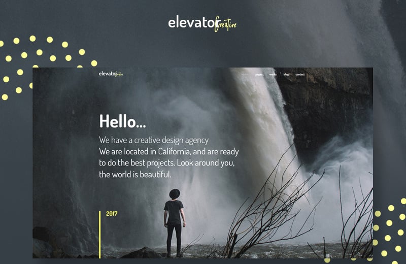
Elevator - Creative Corporate Portfolio WordPress Theme
Utilize White Space
White space – also known as negative space – is your friend. You don’t need to fill up every pixel of the homepage with content. A comfortable reliance on white space will allow you to deliver a smooth homepage experience that looks both modern and refined.
The Philip House homepage is another good example. Notice how the white space puts your mind at ease and allows you to focus on the elements that matter – i.e., the navigation menu.
Applying theory to practice
Here are some examples of templates that might work for you.
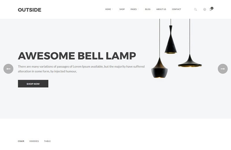
Outside - Minimalist WooCommerce Theme
Siena - Aesthetic Photography Portfolio WordPress Theme
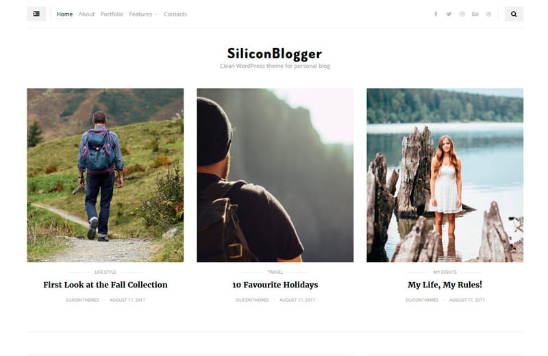
SiliconBlogger - Clean Personal Blog WordPress Theme
Use Dropdown or Flyout Menus
Speaking of navigation menus, you don’t want to get too carried away. The more menu options you give your visitors, the more confused they’ll be. There’s nothing easy about looking at 20 menu options and finding the one you need. If you have 20 menu options that need to be displayed, a drop-down menu is a way to go.
As the name suggests, a drop-down menu is a name for a navigation bar that allows users to hover their mouse pointer over an item to open up a list of options that fall under the respective category. This setup works well because it allows you to offer your users plenty of choices without flooding the homepage.
Interestingly enough, the official White House website does an excellent job of implementing an efficient drop-down menu. For a website with thousands of individual pages and resources, synthesizing everything into five basic headings is a monumental task that’s done perfectly.
Applying theory to practice
Don't forget that we have templates that comprise any possible features and functionalities you might think of. Here are some WordPress themes that have cool menus on board.
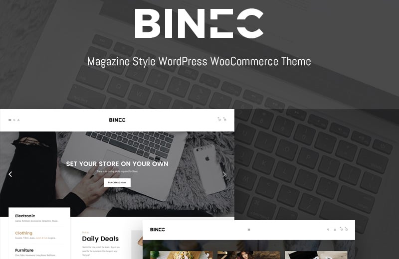
Binec - Unique WordPress Theme WooCommerce Theme
TechLoop - Electronics & Gadgets Store Responsive WooCommerce Theme

Orize - Accessories WooCommerce Theme

Use the 80-20 Rule
The 80-20 Rule is a principle that’s used in many areas, including web design. It simply states that 20 percent of what’s on a page accounts for 80 percent of that page’s value. If you can learn to identify the 20 percent, you’ll find it easier to cut out the stuff that doesn’t matter and simplify the user experience.
In most cases, you’ll find that the 20 percent includes things like call-to-action buttons, social proof, and relevant images and videos. If you’re unsure of what to keep, dig deep into your analytics and make a note of what visitors are clicking on and what leads to better conversion rates and longer sessions.
Applying theory to practice
Check out some most awesome examples of WordPress themes where the 80-20 balance is carefully reserved.
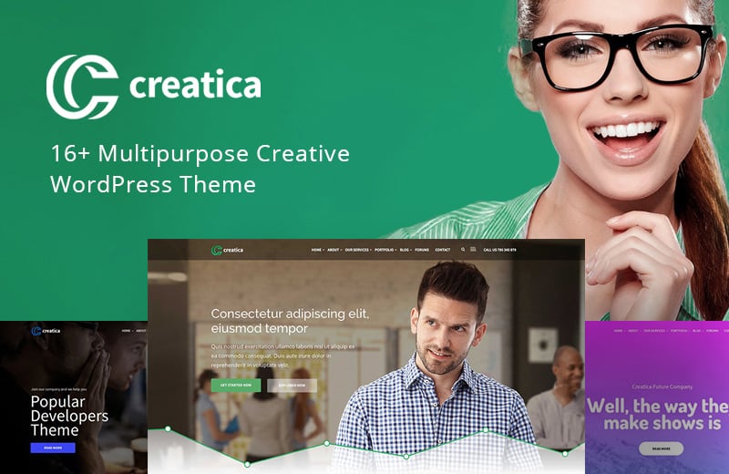
Creatica - Multipurpose WordPress Theme
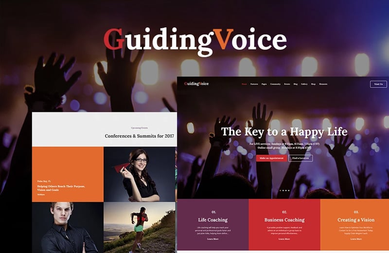
Guiding Voice - Life Coach WordPress Theme
Rights Defender WordPress Theme

Set Yourself Up for Success
If you aren’t prioritizing simplicity and minimalism on your homepage, you’re missing the mark. You can come up with a bunch of excuses about why your homepage needs this element and that element, but the fact of the matter is that your users want a streamlined experience that’s informative, yet not intimidating.
If you can give them exactly what they’re looking for, you won’t have any trouble getting the results you need to be successful.
Related posts
Above-the-Fold Content Design Tips [200 Milliseconds That Matter]
Designing Landing Pages to Maximize Conversions
Let’s Analyze 100 Successful Landing Pages: Statistics and Food for Thought
How to Add More Navigation Menus to Your WordPress Theme
Starting A Website: What Options Do You Have? [Free Ebook]

Get more to your email
Subscribe to our newsletter and access exclusive content and offers available only to MonsterPost subscribers.

Leave a Reply
You must be logged in to post a comment.