Designing Landing Pages to Maximize Conversions
What if there was a marketing element that made it easier for your e-commerce store to sell your product or service? What happens if it doesn’t take much effort, time or sophistication to set this up? In other words—it’s easy! You definitely need this for your marketing, don’t you?
Of course, we’re talking about the landing page.
A landing page is a webpage that has a lead-capture form to capture your leads’ information or has a call to action button that brings leads to your product page to allow them to make an actual purchase. Download our free eBook Extensive Guide on Creating a Persuasive Landing Page.
As far as specific pages go, it’s crucially important because it takes organic or paid search traffic and tries to persuade it to convert for your store. Needless to say, how you design your landing page will be the factor that impacts whether or not it’s going to be successful in its mission.
Let’s take a close look at that now.
Simplicity and Minimalism
A best practice in web design over the past few years has been minimalism, and with great reason. Minimalism ensures simplicity in design, so that the all-important user flows, page goals, and, of course, conversions feature far less friction, helping to raise conversions.
When you keep things simple in landing page design, you raise the chances of the page doing what it’s supposed to do, which is either capture lead information or persuade people to click through to your online store.
Here are some pointers for minimalistic design:
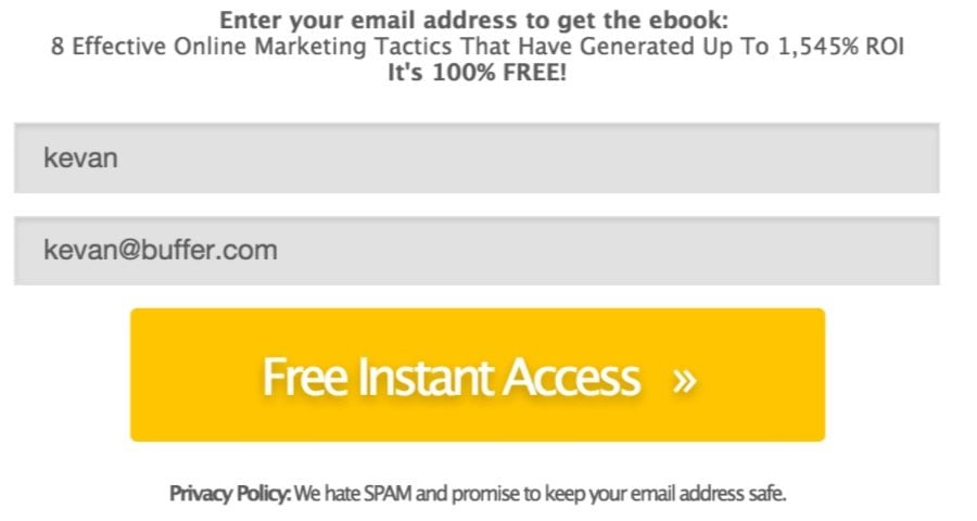
- One web form with very few fields (ideally, you just need a name and email field!)
- A lot of white space to focus site visitors on the offer
- A clear and attention-grabbing headline
- A clear and well-defined explanation of what your offer is
- Persuasive copy
- A huge, noticeable call to action button with clear button copy
That’s just six elements you need for a very successful landing page! The upside to this, besides getting more conversions, is that you’ll spend less time designing the page, freeing you up to actually run your e-commerce store.
Intelligent Information Architecture
Information architecture is how you lay out the content and information on the landing page to seamlessly support your page goal, which is a conversion. The way you organize the content on your landing page will make a huge difference to its conversion rate. Even with only a few elements on the page, placement of these different elements is crucial to support proper user flows and ensure a great user experience to persuade visitors to do what you want!
On any landing page, the headline should be at the top and clearly communicate what the offer will be about. This grabs people’s attention!
Next should be the explanation of your offer: It has to be clear enough for people to understand:
- What it is
- Why it solves their problem
- Why they should buy it or subscribe to it right now (urgency!)
This is where persuasive copy comes into play, too. To get people to convert, you have to include copy that makes them want to convert.
Depending on what the offer on the page is, you’ll either go with a form or a call to action.
If you have a form, simply keep it down to two fields and only ask for names and email addresses; this reduces the sign-up friction and raises conversions.
If you have a call to action, ensure the button is a color that stands out, is big enough to easily notice, and features button copy that is clear and persuasive.
All of these elements should be surrounded by a lot of white space, for highlighting purposes.
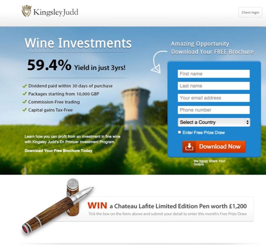
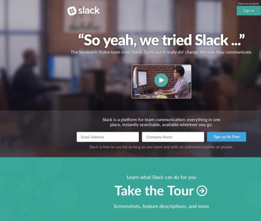
Lead-Capture Forms
Think of your lead-capture forms as the stars of your landing pages. Without them, you’ll never get any conversions! The trick is to make people want to fill them out, so how do you do that?
As mentioned above, the form has to be just two fields. Don’t complete the sign-up process and allow your visitors to think twice! Reduce friction by asking for just two, easy pieces of info that take them only seconds to fill out.
The fields within the form should also be big enough to easily fill out. There’s nothing worse than two tiny spaces for inputting information—think of people who have bad eyesight or are using mobile and so are using their thumbs to fill out these fields!
Finally, ensure that you have in-field text clearly explaining what to put into which field.
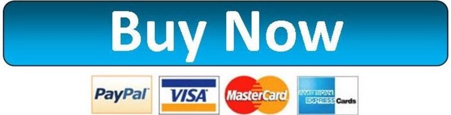
Eye-Grabbing Calls to Action
Your call to action button will be on the landing page whether or not you have a form. Even if you don’t have a form, you’ll still want your users to click through to your site for the final purchase.
The call to action represents the end of your page’s goal, which is to get people to convert via a click or tap. Because it has such great importance, its design is the most vital to get right, so how do you go about designing a perfect call to action?
Here’s how:
- Make it a color that contrasts noticeably with the rest of the page (for instance, blue on white)
- Position it directly under your headline, explanation, copy and form
- Make it big
- Use copy that’s persuasive, with action-oriented words that use urgency (Buy Now!)
By implementing these four parts, you’ll have a very effective call to action!
Example of a Great Template
Here’s an awesome example of a great template that’s optimized to get you the higher conversions that your e-commerce store deserves.
The TemplateMonster Intense Multipurpose Website Template is a picture-perfect illustration of optimization in a template. Let’s look in detail at everything this bestselling template does right.
First, you notice the hero image, which grabs visitors’ attention immediately. Hero images have been shown to boost conversions on sites. The image is also very high-quality and sharp—another thing is done right.
Then, notice the huge and colorful call to action buttons, right underneath a crystal clear description of the product or service and a bold headline that correctly uses large typography.
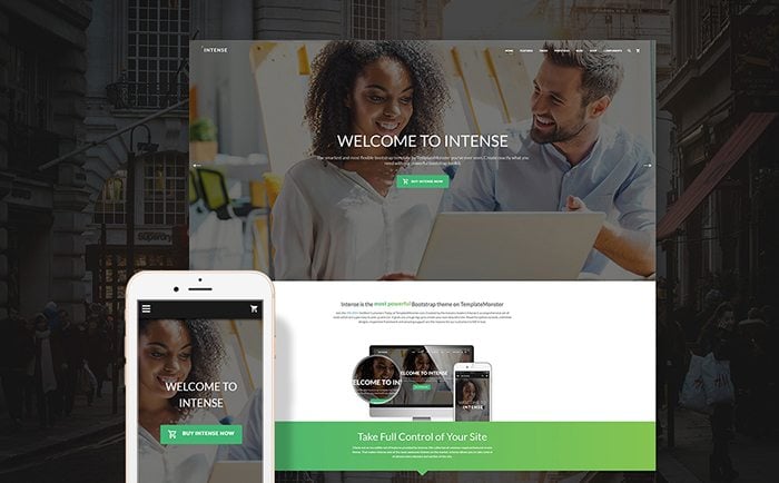
All of this is just above the fold, but when you scroll down, too, you notice other elements that help to optimize this template for conversions, elements like:
- A one-page design
- A lot of white space
- The use of cards to present information efficiently
- Fonts that are legible and attractive
As you can see, when you use a winning template like this one for your e-commerce store, you’ll not just boost your store’s conversions, but also help yourself save time and effort when you run your online store!
What It Takes to a Great Landing Page
As you just read, it doesn’t take that much time or effort to design a high-converting landing page. All it takes is a clear understanding of what your landing page is, what it should do, who you’re trying to appeal to, and how to make that come together on a minimalist page.
It’s really all in the design, which makes or breaks your landing page.

Take care to implement these simple, easy steps, and you’ll create a landing page that’s user-friendly, thus leading to more conversions. When you take a bit of extra thought and care into building your landing page correctly, the results are going to be well worth it in terms of profits and greater sales for your online store.
Once more, what you need for a successful landing page is:
- Minimalism
- Sensible information architecture
- Lead capture forms
- Effective call to action buttons


Marc is a copywriter and content marketer who wrote about WordPress, web design features, and different development insights. These days, he runs The Glorious Company, a content marketing agency.
Get more to your email
Subscribe to our newsletter and access exclusive content and offers available only to MonsterPost subscribers.

Leave a Reply
You must be logged in to post a comment.