

Every freelancer, whether a writer, designer, artist, coder or anyone else, has a choice. In the first case, this person may choose to avoid much attention to his works and never go beyond the tasks and budgets he is used to working with.
OR he might choose the other way; create a design portfolio, learn how to promote it, and start working on large projects from clients from all over the world. If you are at this step, my congratulations: you made the choice in favor of professional development and financial prosperity. Keep reading!
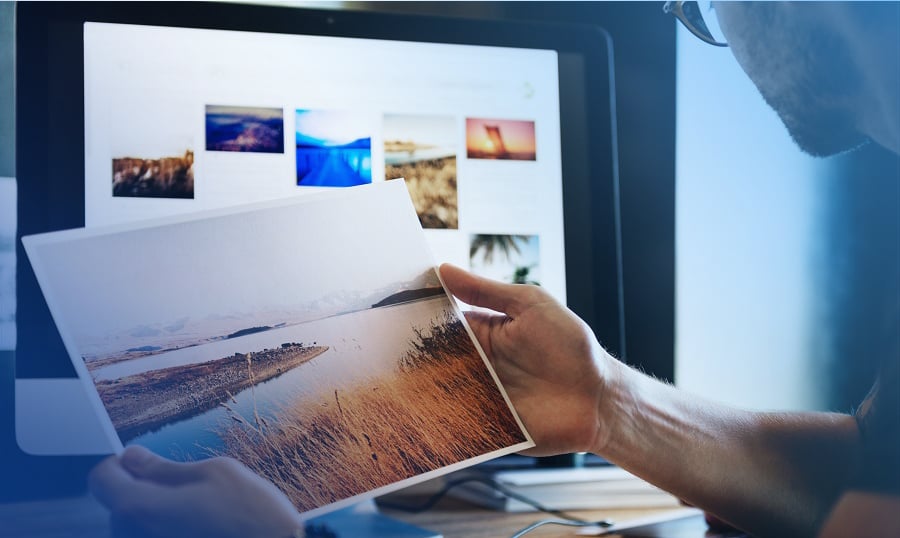
Whether you want to upgrade an existing portfolio or build one from scratch, these six tips will help you increase your website traffic and attract more potential clients. You will finally understand why some specialists, even with excellent work, remain unsuccessful because of their poor portfolios and vice versa.
Here is my 6-step guideline on how to create a killer portfolio. Do not miss any of them!
- Show Your Work Up Front
- Involve More Visuals
- Design With a Personal Touch
- Make It Simple to Reach You
- Be Creative & Know How to Stand Out
- When In Doubt Go Minimalist


Show Your Work Up Front
Quality of work is huge in freelancing. This should be a no-brainer when it comes to portfolio design regardless of what you do. Centering your work means reducing the time for a visitor to find them on a website containing three or more pages.
Also, what’s important is sharing your personal info up front. After all, it’s always about selling yourself first and your product second.
The most irritating part of some portfolios is when you land on their website and you have no idea what the person does. How are visitors supposed to guess if there is no specification on your homepage? Make sure you clarify that moment right from the homepage of your website.

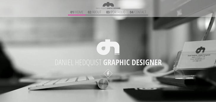
Daniel Hedquist makes it clear for visitors from the very first moment of their visit to his portfolio. It’s a one page website containing the most necessary information, including the portfolio itself and the contact form.
Even such simple portfolios like the one for Tomek Nowak, the Polish designer, looks way cooler than other elaborated website designs with almost no text and no specification of who the person is. This example represents the best about minimalism, with all the unnecessary elements removed to put a greater focus on the text.

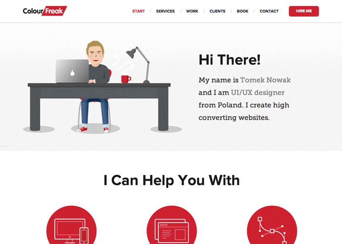
The short introduction is more than enough to convey the main message and explain to the website visitor exactly whose website he was transferred to.
Also, let’s not forget that some clients will leave you after clicking to the website because of a one simple reason. The job you perform just doesn’t fit their requirements or needs. And it’s totally fine. You work is to make sure those people can figure it out right away and not after a long while. This would only lead to misunderstanding and conflicts that can negatively impact your brand. It might seem like you’ll be losing customers but it’s not true. Clients will come, but you must protect yourself from projects you can’t complete or people requiring impossible things from you.
Sell With Visuals
There are only a few creative occupations where portfolios are not connected to visuals. As you could guess, I am talking about writers and coders, whose main instrument is text. But even they tend to use graphics and visuals in their profiles to get more visitors.
So do I really need to talk about the obvious - web designers, photographers, artists and illustrators?
The thing is, visuals grab more attention than text. Images, videos, and moving graphic elements can tell even more than words do. Or they can be absolutely unrelated to your job.
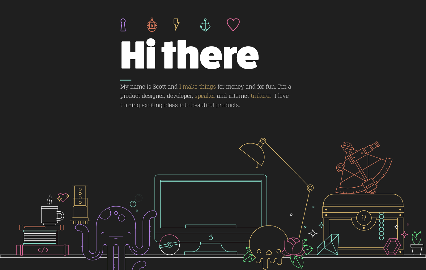
For instance, to me, Scott Riley's portfolio contains amazing background visuals, although it’s just a set of items that have nothing do with product design. Anyway, it looks so great and eye-catching that it makes me want to examine the image to the tiniest detail.

Lynn Fisher’s portfolio is another example for how graphics can change your perception of the same website:

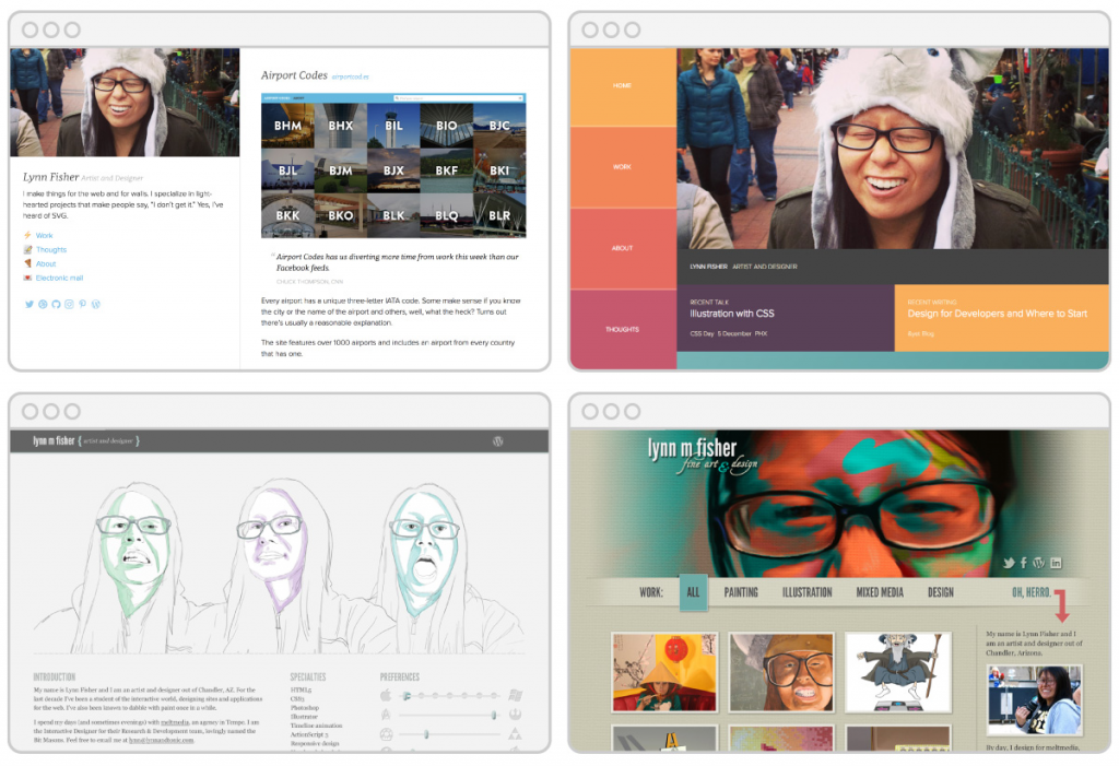
The first and most important thing, she changes her website design every single year! She manages to come up with even more creative visuals than previous ones, and now she’s got a mind-blowing homepage! Lynn literally drew herself standing in a sketched room with the references of who she is and what she does.
I have never seen something more simple and yet creative at the same time. Don’t be afraid to experiment with styles and graphics. The more you try - the faster you’ll find your own perfect design. Using visuals will make your portfolio memorable.
Design with a Personal Touch
I don’t think the following tips work well for portfolios of large firms and companies, but it’s definitely a great marketing trick for individual freelancers and businesses with a small team.
First of all, we should remember that you create a website for other people, not machines. People want to see who stands behind the portfolio. If you show them yourself first, they are more likely to trust you.
The easiest way to give your website a “personal touch” is to include your own photo on the homepage header of your website.
For instance, Matthew Barby managed to combine a personal photo with a call-to-action statement:
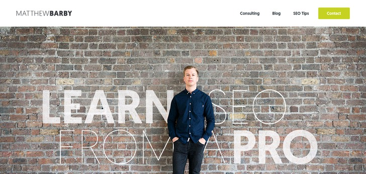
He’s got a compelling tagline that comes with a photo of him standing in the middle. He tried to create an image of someone whom you’d trust as an SEO teacher. And he definitely succeeded. Matthew invested several hundred bucks in a photo shoot that probably helped him earn 10 times more.
Helen Tran is another example of how your personal photo included in the portfolio website can make a difference:

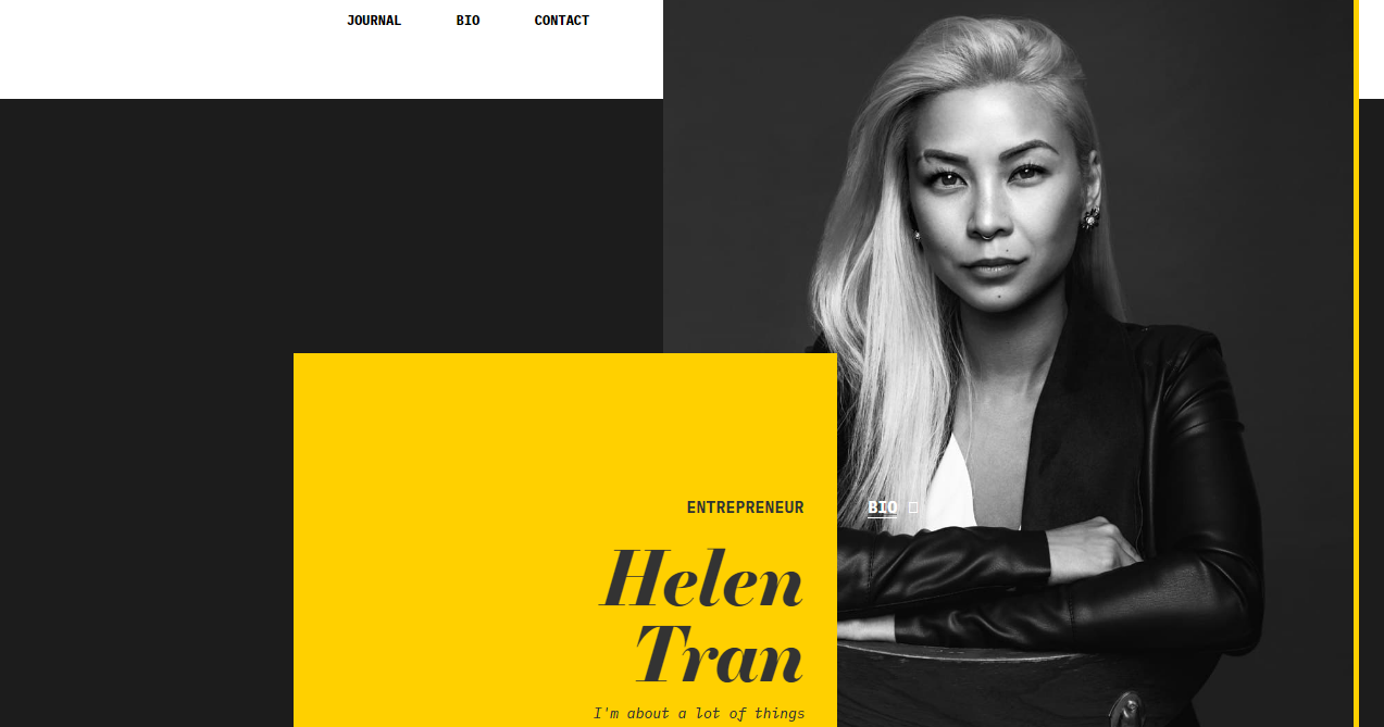
Helen’s confident look makes us believe she is a true professional in her industry. Her picture instantly grabs all the attention on the page and helps us understand what kind of a person stands behind the website.
Even if you don’t have a big budget for doing a professional photo shoot, there is still a way that you can organically blend your photo into a website header and not make it look low-quality.
For instance, you can do something similar to what Taylor Pearson has:

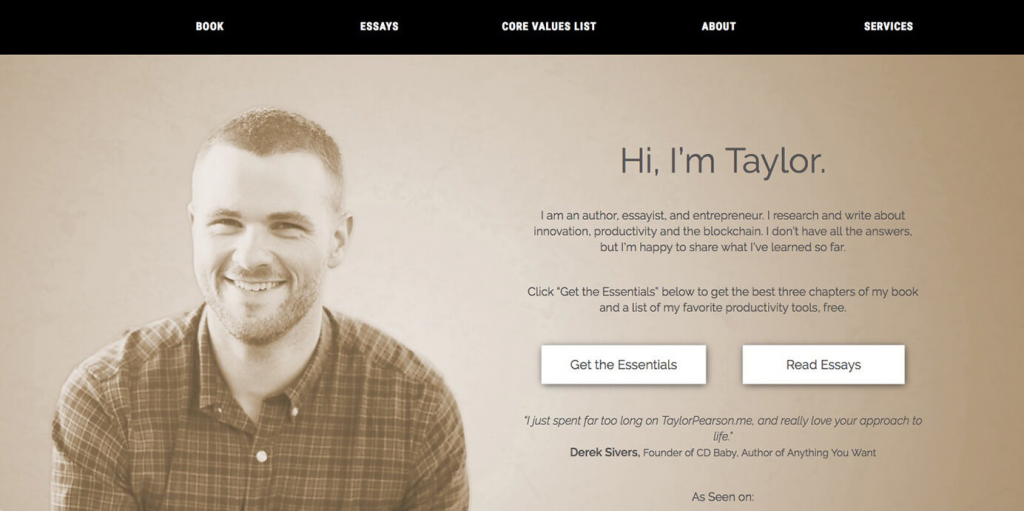
A simple photo of himself turned into a very stylish background for his homepage header. It can be done easily in Photoshop or any other similar software. I mean, if you are a web or graphic designer, this will take you no longer than a few minutes to complete, right?
In general, implementing some elements of a “personal touch” will help you reach out to the audience even more. No magic - just psychology.
Make It Easy To Reach Out
When building a portfolio, think of it as a blog. You create a platform that will make people want to stay and use your service instead of making a one-time purchase like on a landing page.
You want your portfolio to be fully-accessible from every device and resource, whether it’s a phone, tablet, PS, Skype, email, or anything else.
Clearly, your website must be fully-responsive and look “readable” from any gadget. But most importantly, it must have a clear “Contact Me” page where you should list all the possible ways to reach out to you. This not only includes your email, phone, Skype, etc. but also links to social media accounts. The last one is very important for establishing a closer contact with your potential clients.
And don’t forget: the easier it looks - the better! Melanie Daveid’s contact page is a great proof of the statement.

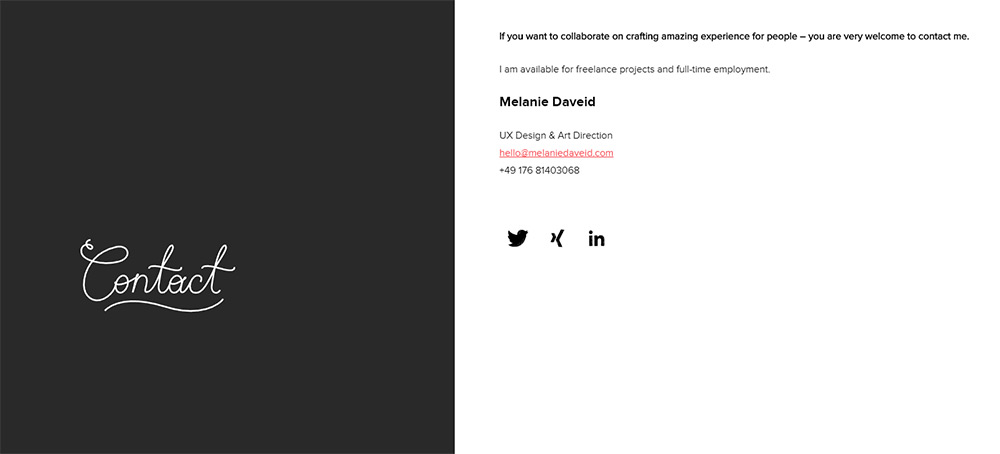
The only negative thing about including a link to your email, like she did, is the fact that your mailbox risks being flooded with spam. That’s why some people prefer doing a one-page contact form for people to send their requests directly from the site.
This looks exactly like Alexey Tretina's contact page:

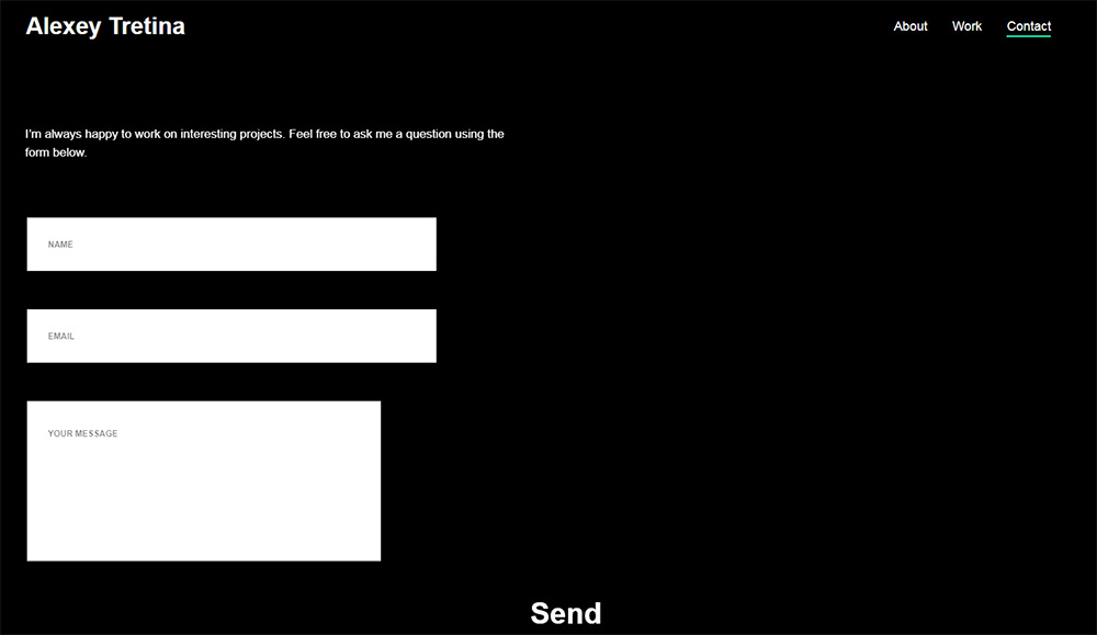
In comparison to Melanie’s contact page, Alexey’s contact form is more convenient. The client doesn’t need to click on the email or other links to get in contact with a person. Besides, the contact page has only three fields, which simplifies the process of a client’s request.
Overall, it’s up to you to decide. The main thing is, your contact information will be visible and easily accessible for every visitor, whether he uses his phone or a PC.
Be Unique & Make Yourself Stand Out
I know, your occupation has to do with creativity - it’s a no-brainer. Nevertheless, even such web designers, artists, photographers, and other creative persons like you may ignore the fact that a majority of visitors expect a creative touch from your portfolio...meanwhile, you may have none.
If you want to make a visitor’s experience on your site memorable, it has to be unique and outstanding. Customized icons and branding, an unusual logo, and other visual elements can have an incredible effect.
A great example of an outstanding portfolio is one of Tom Biskup:

This portfolio creates an unobtrusive and stylish story. To understand what I mean, click on the site and you’ll see for yourself. Animated images in the page header demonstrate Tom's art talent and help you get an idea of the designer's style. Asymmetrically located images on the main page lead to more detailed cases. This is a perfect example of how to use a unique design to your advantage.
One more example of a non-standard creative approach is Toy Fight Manchester design studio.

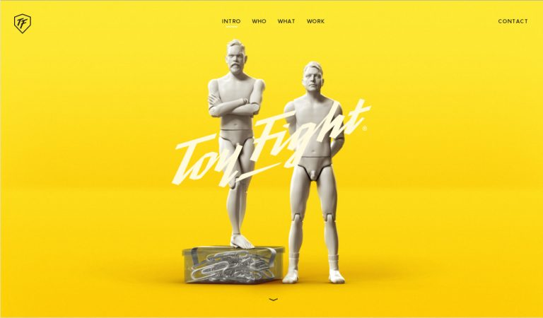
This is an awesome site in a modern bright minimalist style. The variety of effects impresses: from parallax scrolling to beautiful animated transformations and unexpected 3D scenes with the two co-owners involved.
I highly doubt the studio would get as much popularity and success without a portfolio like that. It’s not only full of visual humor and originality but also a great representation of how a minimalistic style can be interesting and eye-catching.
Speaking of that...
When in Doubt Go Minimalist
Sometimes, I feel like even experienced web designers tend to ignore one obvious fact. They try to add to include as much information as possible believing it will attract more attention of potential customers.
The truth is, keeping it simple is more efficient. Once you reduce the amount of information and other design features, you’ll get to highlight the remaining elements.
Just look around and you’ll see that most portfolio websites stick to a basic layout, black and white colors and have no excess graphics. And although a minimalistic approach might sound “kinda boring”, there is never a way you can screw it up.
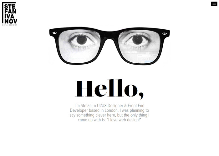
Stefan Ivanov’s website is a perfect blend of a unique and minimalistic design. The portfolio looks eye-catching although Stefan chose a black and white color scheme. At the same time, the site does have a personal touch.
What’s also important in every website presentation is typography. Make sure your font looks organic and easy-to-read.
Let’s take the previous example again and see how well a standard Georgia font fits the entire concept of Stefan’s portfolio.
As weird as it sounds, a minimalistic design is a great choice for those who love experimenting. Just think about it: you can choose almost any elaborated font or a layout without having a fear to look “extra”.
How to Make a Remarkable and Easy-to-Manage Portfolio Website
You could have thousands of ideas about how to create an outstanding portfolio for your business, but does it all make sense if you have no idea how to make these ideas come true?
The good news is, if you are not a coder, there is no need to learn how to write code or hire someone to do it. TemplateMonster offers you modern and highly-functional templates that can replace the need for a professional web developer.
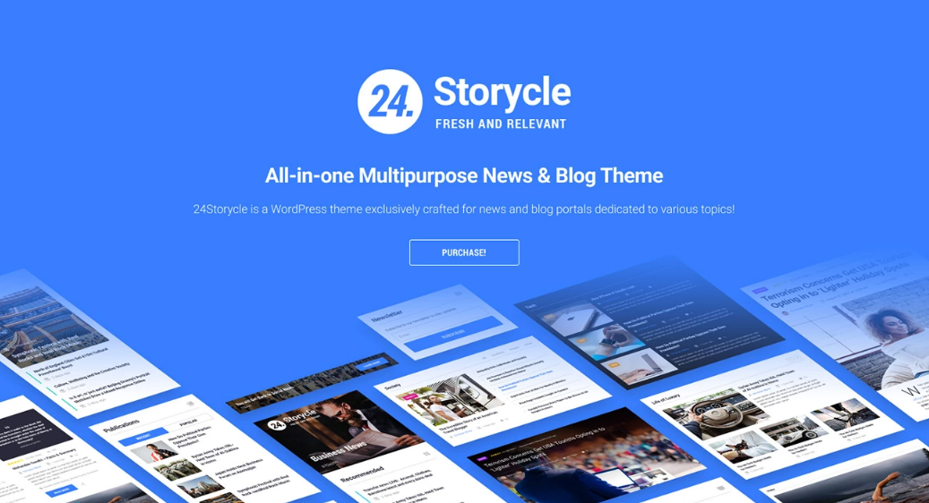
24.Storycle Multi Skin Newspaper WordPress theme is a perfect solution not only for news portals of all kinds but also website portfolios. Convenient and powerful drag and drop Elementor page builder, Jet family plugins (JetBlog, JetReviews, JetTricks, JetElements, JetMenu), JetThemeCore plugin for creating custom headers, footers, sections, and much more!
24.Storycle - Multipurpose News Portal Elementor WordPress Theme


End of the Line...
I am sure that following this universal 6-step guideline will work positively for your freelance business, not to say it may significantly increase the number of clients you’ll be working with.
Of course, aside from an effective presentation of yourself and your product, what really matters is the high quality of your works and good service.
But as long as those three aspects are combined, you’ll come to find big success!


Read Also
How to Create a Portfolio Website that Guarantees Your Employment
30 Cool and Inspiring Portfolio Designs
Collection of Free Portfolio & Gallery WordPress Plugins
How To Create And Shape Up Your Portfolio With Elementor Builder