Negative Space as Effective Web Design Commodity
What's negative space? That's actually a new conformity that has gripped the design world. Negative space by definition is the space not used – the empty space within the actual space. This void is not occupied by any graphics or content, or any other design element. It's the open space between different elements on a web page, the area between text blocks, images, columns, paragraphs, lines, letters, and words, headers, footers, and just about everything else on a website.
 Negative space is not restricted to one medium – it plays an important role in all fields of design, and in web design it also goes by the name of whitespace (although not necessarily encompassing the color white; the term itself stems from the printing practice in which white paper is generally used). When website designers go about composing a layout, they focus their attention mainly on the positive space. The negative space gets very little thought being one of the most underrated and overlooked elements in website design. As some inexperienced designers concentrate heavily on what to put in, as result we have densely packed, overcrowded and taxing to comprehend layouts. Yet incorporating negative space into web designs can be very rewarding.
So What's so Great about Negative Space?
- whitespace organizes text and graphics, provides spacing between visual items, and guides intuitively the reader's eye from one point to another;
- doing so, it creates invisible order and enhances readability of the web page, at the same time functioning as a visual relief to the user's eyes;
- when used intelligently, negative space strengthens the composition and serves to help define the positive space. Essentially, it helps convey the story of the positive space, leading the viewer's attention to the main subject;
- as viewers, many users now tend to skim through web pages as oppose to scanning, negative space helps keep the layout as clutter free as possible, adding a certain level of simplicity to web design.
- designers may often generously use whitespace to create a feeling of sophisticated elegance and refinement; leaving space empty can also affect the brand positioning as it often implies that something is generally expensive and of high quality.
Designing with whitespace is now a usability requirement. Without an adequate amount of negative space, designers can actually end up with an unreadable clutter that hinders perception, drains visitors of time, and eventually leads to abandonment.
Very often people may equate negative space to minimalistic, which is a common misconception as even heavily designed sites, cleaving the positioning, may astutely employ negative space. It is therefore defined not by the amount, but by the distribution and appropriateness of the empty space in website design. This implies that too much of negative space is also not advisable. Some users see whitespace as an indication that there's insufficient content to fill the web page, plus with a lot of negative space the website may fail to present forth the visitor the message implied. Effective use of whitespace is all about proper deployment. To achieve this and create a general balance that's visually satisfying to the viewer, pay attention to the following design aspects.
- Margins and Padding – separate blocks of content and make it easier to access the material because they provide a visual structure. Use margins between different elements to separate them from each other (think in both vertical and horizontal separation). Padding should be deployed when you want space inside an element, so that the items inside don't crowd the edge. Be conscious to keep your margins and padding consistent throughout your layout.
- Proximity and Containment – the latter helps in hierarchical structure and the management of overall content presentation. Containment is used in web page layout to group elements together, while proximity is all about how close or how far visual pieces are from one another. The volume of negative space between objects should be carefully structured – give common objects a similar spacing, while groups of objects place closer together to point the eye over and toward these objects.
- Scale – affects composition as it takes the eye to something or confuses the eye in determining what to look at first. All design elements should be represented properly by being created at the proper scale. It also implies order if there's repetition of items at the same scale and prominence as with visual contrast between differently scaled items.
- Headings – help separate content into manageable chunks. Four different types of headings in common use are H1, H2, H3, and H4.
- Line Spacing – affects the readability on a web page. If the lines pushed too close together, the content will become very cluttered and hard to read. If the lines are too far apart, the text becomes disconnected and loses its flow. Good line spacing establishes a comforting eye flow.
- Repeating Elements – used for several different purposes within a design, mainly to establish identity and help get things easily remembered. When encountering common elements, the user can easily decipher them and comprehend.
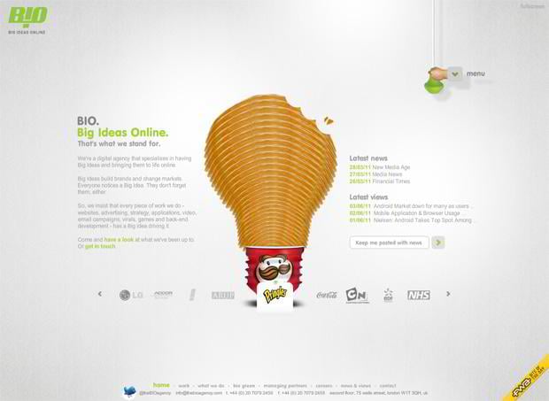
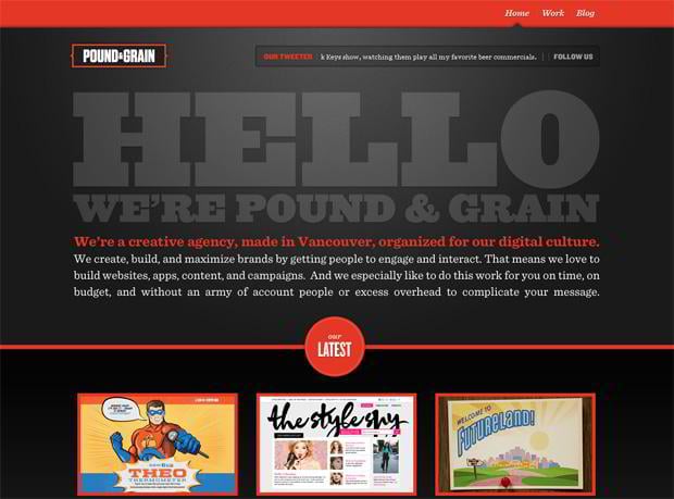
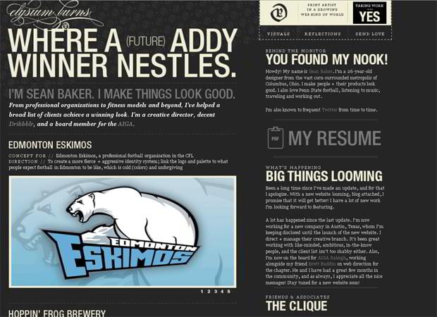
The following website designs treat negative space as a crucial design element. Take notice of how much spacing is between the margins, columns, images and lines of text, they effectively declutter the layouts, The last one is though a website overcrowded with content, yet by adding negative space designer has managed to make it easy to scan and read.
* * *
* * *
* * *
Whitespace or negative space is therefore that essential commodity web designers need to put to good use and then quickly reap the usability rewards. This empty space not just the absence of something, it plays an important role in creating strong, consistent layouts with clear visual messages. So take the time to examine how other great website layouts use negative space (Templates.com Blog's collection of Website Designs Effectively Deploying Negative Space just fits the occasion) and start implementing it in your designs to experience something efficiently different.
Don’t miss out these all-time favourites
- The best hosting for a WordPress website. Tap our link to get the best price on the market with 82% off. If HostPapa didn’t impress you check out other alternatives.
- Monthly SEO service and On-Page SEO - to increase your website organic traffic.
- Website Installation service - to get your template up and running within just 6 hours without hassle. No minute is wasted and the work is going.
- ONE Membership - to download unlimited number of WordPress themes, plugins, ppt and other products within one license. Since bigger is always better.
Get more to your email
Subscribe to our newsletter and access exclusive content and offers available only to MonsterPost subscribers.


Leave a Reply
You must be logged in to post a comment.