


It's time for a new elementor landing page webinar. Last week we've discussed how to create a responsive website with Elementor and this week we'll see how to build landing page with Elementor. As always Alexandra will explain it to you in plain English.


How to Create Landing Page with Elementor in 30 minutes?
iPhone XR page example with Monstroid2

How to Decorate Your Website with One Page Scroll? JetElements Tutorial

Multipurpose Landing Page
Speed Art with WordPress & Elementor & Monstroid2

In the result, you will create a landing page similar to this one:

The landing page will contain:
- the main area with a headline, some text, and a call-to-action button;
- a navigation menu;
- About section with a features area with a big image;
- a gallery with some images, text, socials, and video background;
- a web form.
That’s it. The page looks pretty simple but is functional and includes must-have landing page elements.
As you already understood, creating a similar landing page is not a big deal with Elementor, so let’s start 🙂
Step-by-Step Guideline: Creating a Landing Page with Elementor
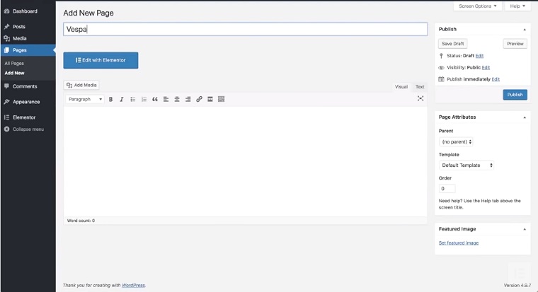
First, open a WordPress Dashboard > Pages > Add a New Page give it a title, and press Edit with Elementor.

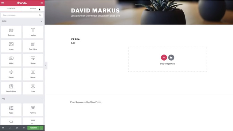
This is how the default page looks like.

Now, go to Settings (the cogwheel icon at the bottom left) > Page Layout > Elementor Canvas.

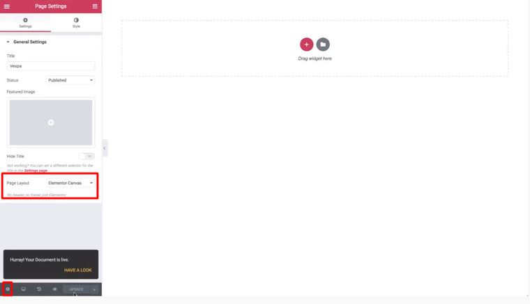
It gives us a clean page without a header, footer, or a sidebar. That’s a good option for a landing page.
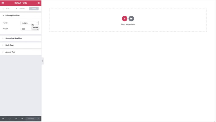
Now, let’s change the default fonts and colors (another good option, though). Click a Hamburger menu to access Style settings where you can select colors and fonts. For this landing page, we chose white as primary, black as secondary + text.

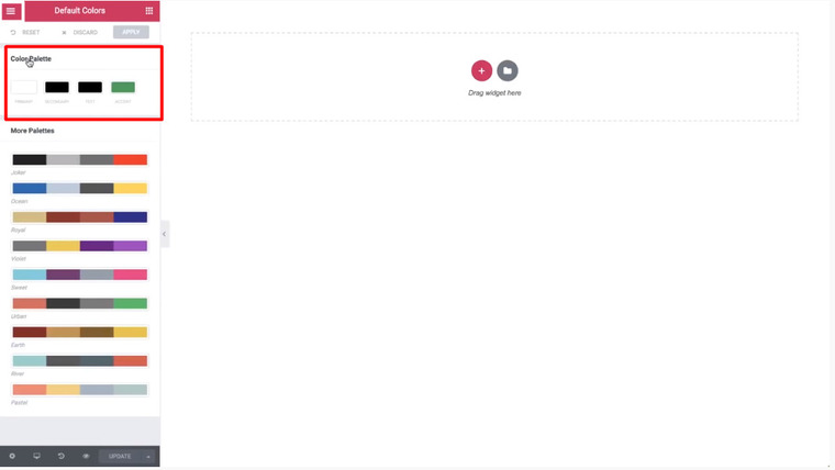
We chose Adobe fonts as primary and secondary but you can use your fonts, as you wish.
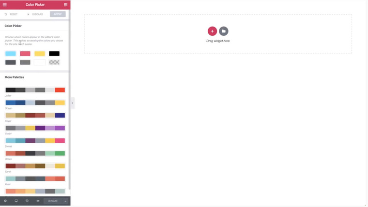
With a color picker, you can pick the needed colors to have easy access to them later.
The first area we will add is the section with one column. For this section, set the height to Min Height of 90 VH, which means 90% of the screen height.
Now, let’s get over to the Style tab and set the background color to blue.
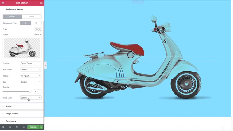
With a Background Overlay, you can set another layer on top – an image, in this case.
Then, set the following settings: Position > Center Center (in the middle of the page), Repeat > No-repeat (so the image won’t repeat itself), Size > Contain, Opacity > 1, Blend Mode > Multiply or Darken.
Blend Mode is a new feature in the Elementor 2.1. It mixes the overlay with a background color:
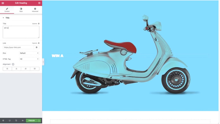
Now, let’s add a headline (Elements > Heading > drop the widget and give it a title). Set the Alignment to the center and open Style > Typography > Size > 120 pixels (or whatever you find suitable). A shadow will help the text stand out more: Text Shadow > Color > Vertical Shadow > -10 (so the shadow points toward the top). You can also add some blur – 50, in this case.
That’s what we got:
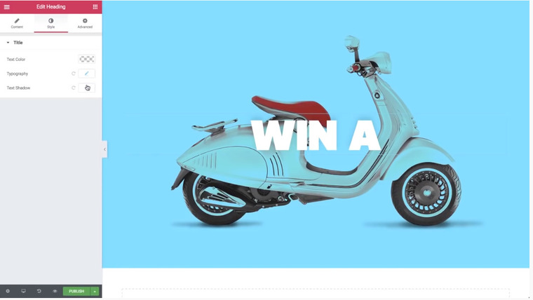
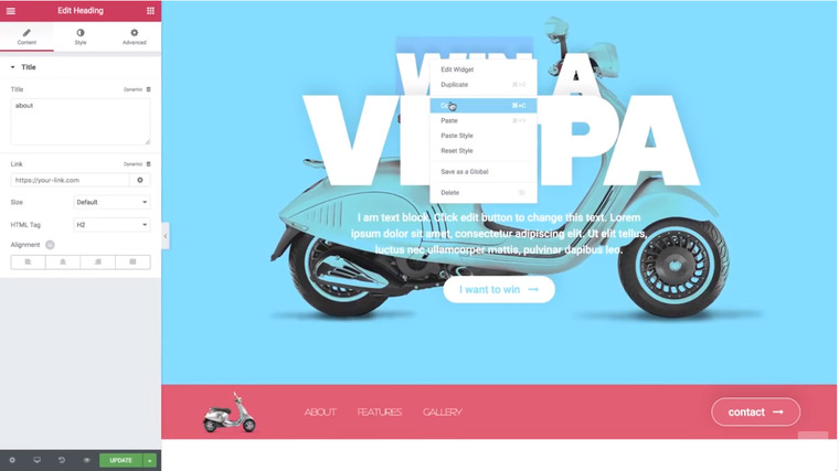
Now, right-click a headline and duplicate it to get the second title. Let’s change the text and adjust the following settings: Size > 230 pixels, Letter Spacing > -8.
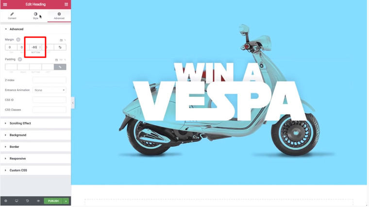
Let's fine-tune the top headline. Select a headline > Advanced > Bottom Margin > -80 pixels:

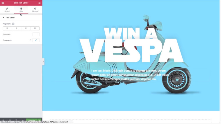
Now, open Elements > Text Editor and drop the widget.
Then, go to Style > Text Color > White + Typography > 20 pixels + Weight > 500. Now, go to Advanced > Margin, switch the value from pixels to percents, and set the Right Margin to 25, the Left Margin to 25, and the Bottom Margin to 3.
Afterward, go back to Style and align the text to the center.
That’s what we got:
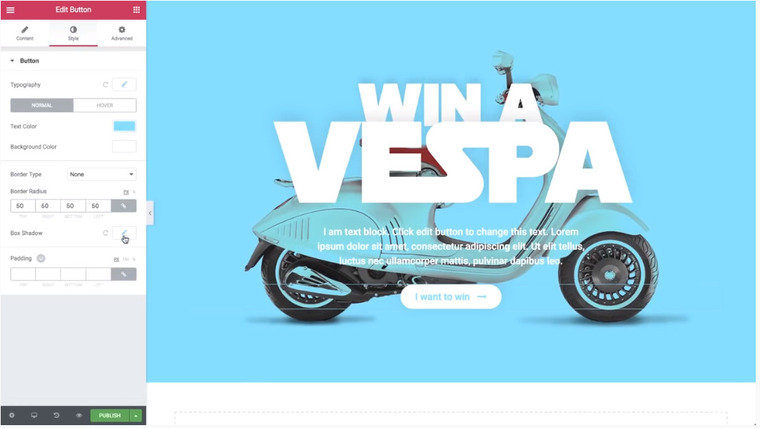
Now, let’s add a button to our page. Go to Elements > Button and drop the widget. Change the text (the button will include this text), set the center alignment, and the medium size (or whatever you find suitable). You can also choose an icon – long-arrow-right, in this case – and set its position – after, in this case – and spacing between the icon and the text – 15, in this case.
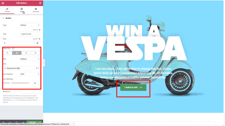
Then, head to Style and select the button's color – blue (same as background) as the text color and white as the background color. Go to Typography to change the size of the text – 20, in this case. To make the button round, set the Border Radius to 50 (everywhere). If you want to give it a shadow, go to the Box Shadow – the same values as the title’s (Vertical Shadow -10 and Blur 50).
The button looks pretty attractive, doesn’t it? 🙂
So, we are done with the first section, and let’s move to the navigation area.
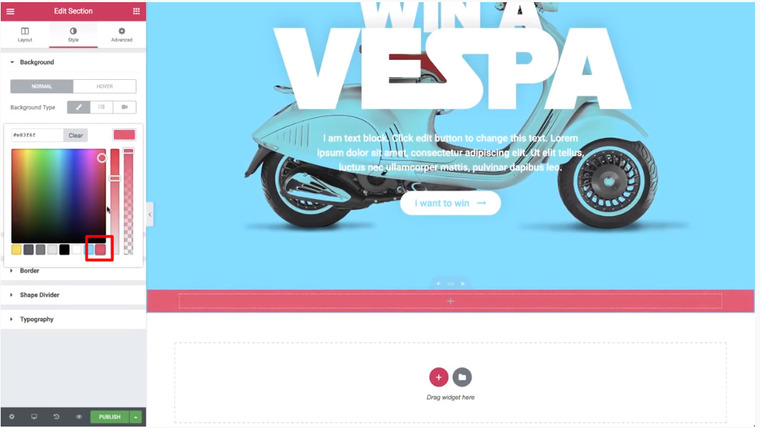
Scroll the page down and add a one-column section below the first one.
Change its color (Style > Background Type and select the color).
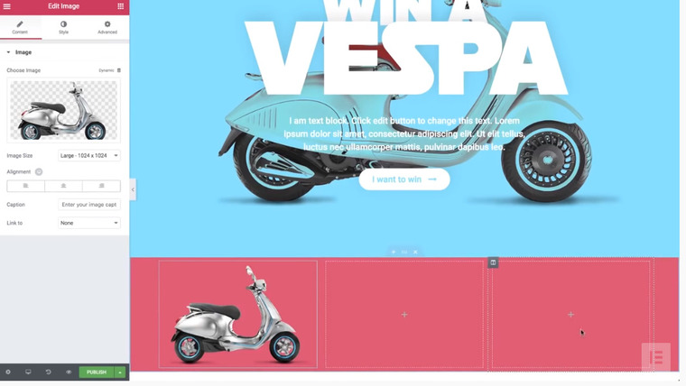
Now, add new columns (right-click duplicate or right-click Add New Column).
So, we got a section with 3 columns. Yes, we could choose a three-columns section from the outset but by duplicating the first column, we got two sections with the same settings. No hassle.
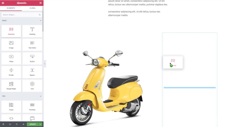
The first column will have an image. So, go to Elements > Image, drop the widget in the first column, and insert an image from your device.
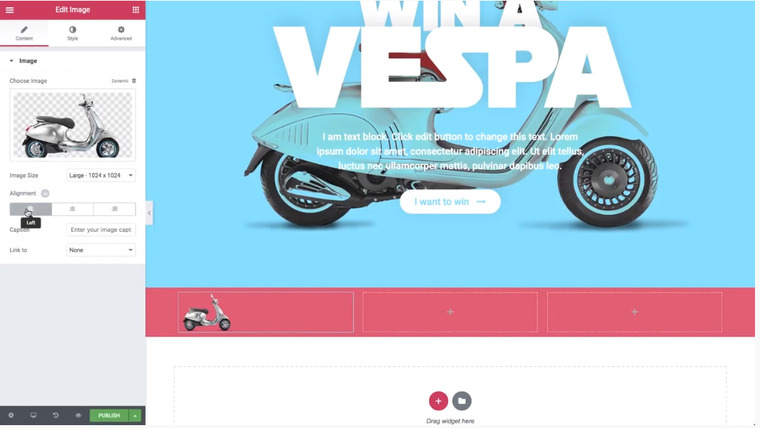
Let’s fine-tune it a bit. Go to Style > Width (change it to pixels) and set it to 120 pixels to make the image smaller. Then, go back to Content and align it to the left.
In the second column, we will add a Nav widget (Elements > Nav Menu and drop the widget) in the column. Since we don’t have a menu yet, let’s create it (Content > Layout > Go to the Menu screen).
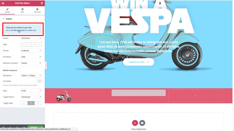
So, we are back in the WordPress dashboard to create a menu.

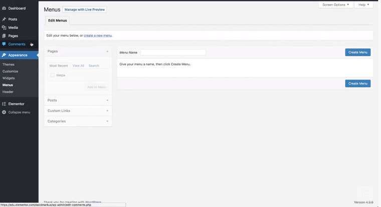
Let’s give it a name (desktop) and click Create Menu.
This is an internal menu – it shouldn’t direct to other pages of the website. To give a menu this functionality, we will add a custom link. Go to Custom Links, type #about hashtag in the URL, and about in the Link Text and click Add to Menu.

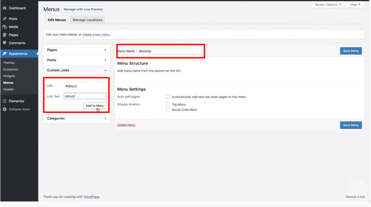
Repeat the same trick with #features & features and #gallery & gallery. Now, you create navigation of the landing page – visitors will see what information the page contains and can easily move to the needed part of the page.
Now, Save Menu and go back to Elementor. Click Update and refresh the page. That’s what we got:
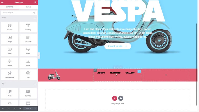
Let’s change the style of the menu.
Change the text color to white (Style > Text Color > White) and play with Typography settings. In this case, we change Weight to 300 to make the text thinner and that’s what we got, so far.
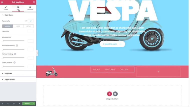
Now, let’s disable animation (Content > Pointer > None). And make the first column smaller:

Then, let’s center the text in the second column to the middle (Content > Layout > Content Position > Middle).
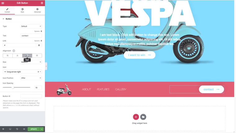
The third column will contain the Contact button. Copy the button we already created and insert it in the third column. Then, change a text (Content > Button > Text) to Contact and change the right alignment.
So far, the column looks like that:
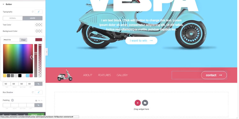
Now, let’s change the style a bit.
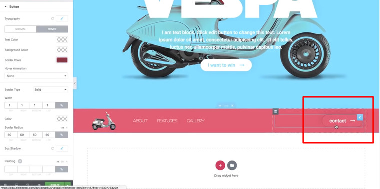
Go to Style and select white as the text color. Lower the opacity of the background color to the bottom. Choose the Solid Border Type and set 1-pixel Width. We can also add some animation (Hover > Border Color and change it to get a subtle effect).

Now, as you hover over the button, the border will change the color, creating an animation effect:

Now, let’s proceed to the About area. Add a new section with one column, set Content Width – 500 pixels, change Height to Min Height, and set 500 pixels.
Then, add a Headline widget (Elements > Heading, drop a widget to a working space, and write About). Go to the top headline, right-click > copy:
Paste it to the new section (Paste Style):
We have the same value as the top headline.
Now, change the alignment to the left. Go to Style > Typography > Size and change it to 90 pixels. Also, change the Text Shadow (both Horizontal and Vertical – 10). Then, head over to Advanced > Margin > Bottom – 30 pixels.
Add a text widget and type what you need. Then, go to Style > Typography > Style – 16 pixels. Change the Line-Height to 1.6.
Then, change the color to gray and go to Advanced > Margin (change it to the percentage and set 12% to the left margin).
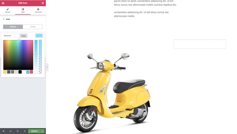
Now, add an icon on top of the headline (Elements > Icon and drop it above the headline About). Change the color to yellow (Style > Primary color). Then, go to Content > View > Framed and search for the icon (search-plus, in this case). Modify its size (32, in this case). Go to Advanced > Margin > Bottom (-55 pixels) & Left (170), so the icon will appear under the title.
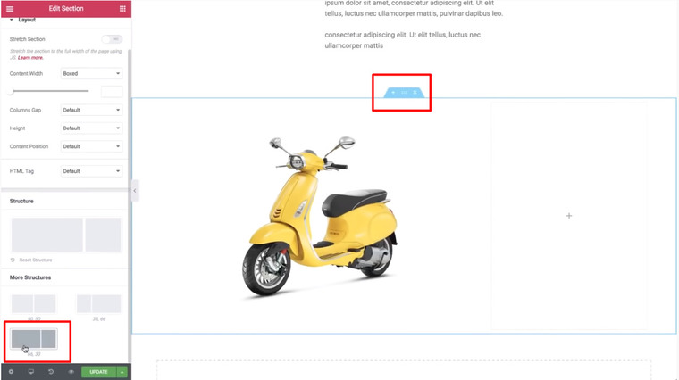
Let’s add a new section under the About section. Drag in an Image widget and choose an image. Then, right-click > Add New Column and choose an option 66.33 in the section settings:
Enlarge an image to 100% in Style > Width. Now, add a column widget to the right column.

Delete one column (right-click > delete) and add an icon widget to the column. Change the color to blue:
Set content alignment to the left and add a headline widget. In the Content tab, choose HTML Tag > p and change the color to black in Style.
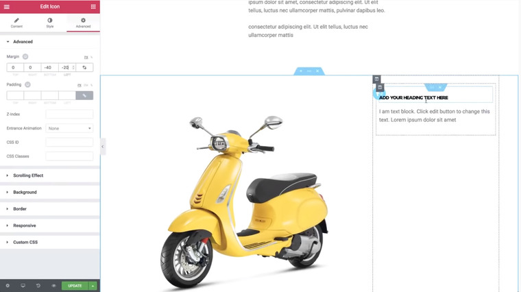
Now, add another text widget under the headline and copy the value of the previous text widget (from the About section) – Copy and Paste Style. Go to Advanced > Margin and cancel the left margin (set 0). In this case, we also changed the size of the headline (13 pixels) and Weight (700). Now, you can change the icon (Content > Icon) – bullhorn, in this case. Change the View to Stacked. Make an icon smaller (Size to 20) and set -40 pixels for the bottom margin and -20 to the left one.
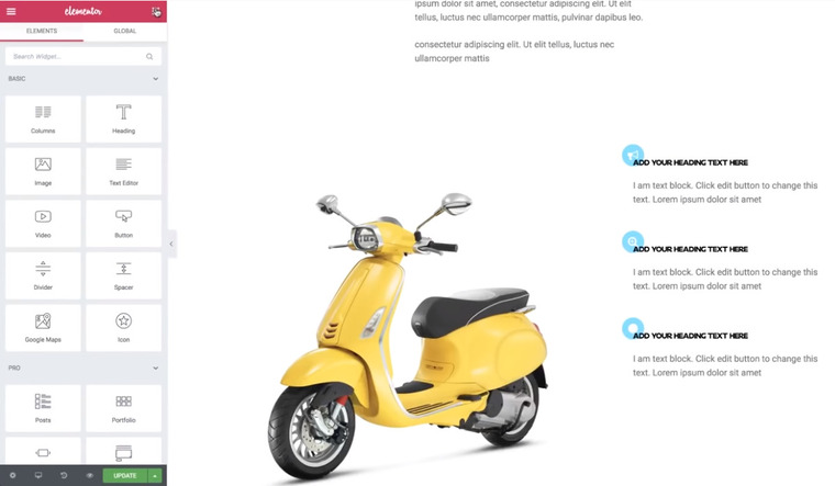
So, now we have a section that contains an icon, a headline, and a text.
Let’s duplicate it three times (right-click > duplicate).
A small tip. Before duplicating a section, make it mobile-ready first.
So, duplicate the section three times and change the icons – search-plus and circle, in this case.

The next area that we will add is a Gallery. So, add a new section with one column and add a headline – Gallery. Again, let’s copy the style from the first headline and set alignment to the right. Go to Style > Typography > Size and change it to 180 pixels.
Add a column widget under the title and add another column.
In the section settings, go to Columns Gap > No Gap to avoid a gap between the columns. Change the Min Height to 300 pixels. Set Content Position to Middle.
Now, add a spacer widget to the left column and give it a white background color (Style > Background). Add an image with a Center-Right position, Contain Size, and No-repeat.
Give a background to the second column, namely blue, and add a spacer widget, as well.
Add a call-to-action widget to the right, third column. Change the Skin to Cover and choose an image. Go to Content and erase the description and the button text. Set the Min Height to 350 pixels under the Style tab. Choose the same blue color as the overlay color (Style > Hover Effects > Overlay Color > Normal) but with a lower opacity. Set the same color for the Hover Color but reduce the opacity, as well.
Now, go back to the headline. Set a bottom margin to -70 and the right one to -150 to reach an effect when the title is off-screen.
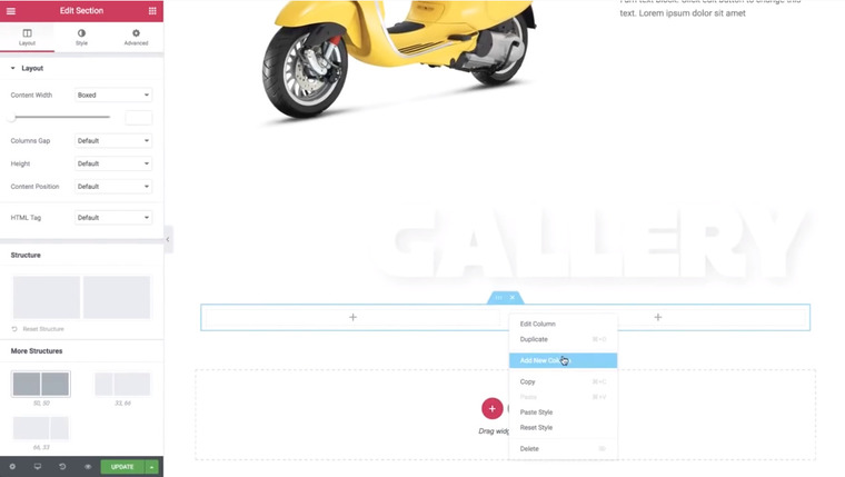
Add another column widget section but this time, we will set a video as a background.

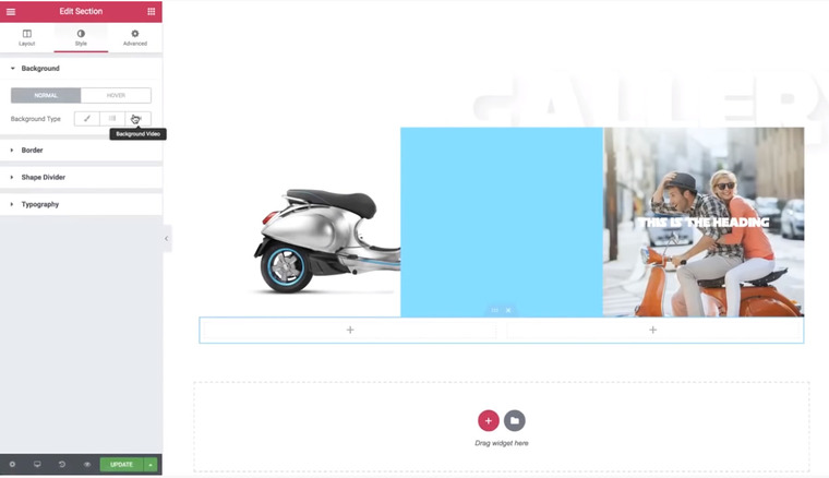
In this case, we searched for a YouTube video on the official Vespa channel. In the new Elementor 2.1, there is a great option of setting a start and an end time for the video, which is great for creating a background loop.
So, search for the video on YouTube, copy its link, and insert it in Elementor:
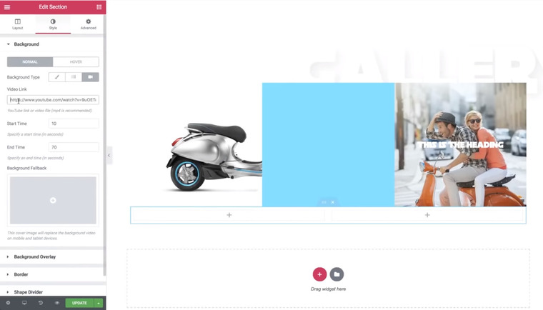
Set a Min Height to 350 pixels. Add a new column. Now, you have three of them.
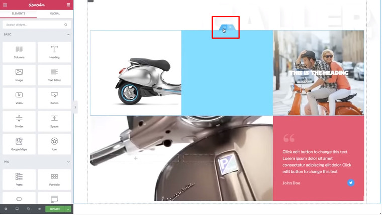
We will add a background color and a Blockquote widget to the right color. First, go to Style > Background > Background Type > Classic and choose a color (pink, in this case). Second, go to Elements, search for a Blockquote widget, and insert it to the right column. Then, go to Layout > Content Position > Middle and proceed to Advanced. Here, set 40 pixels for all Padding parameters to organize text densely. Afterward, change the text and author colors to white under the Style tab. Go back to the Content tab and Skin to Quotation. Let’s change the Tweet Button to Icon only but you can leave both an icon and a text. Under the Style tab, let’s lower the opacity (Style > Quote and lower the opacity of the quote sign – it doesn’t need so much of the attention). In this case, we reduced the Author opacity, as well.
So far, we got something like this:
Now, let’s create a third area. Duplicate the top area:
… and drag it to the bottom (under the section with a video and a quotation).
We changed the position of the columns, as well as a background of the second and the third columns (to yellow), inserted another picture to the third (right) column, added a Social Icons widget, and erased the spacer.
Let’s play with its style now.
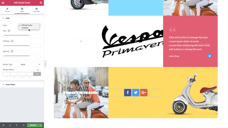
Go to Style > Color > Custom. The primary color is white with the lowest opacity and secondary color – black with the highest opacity. Make the icons a bit smaller (Size > 20 pixels, in this case).
We changed the picture in a Call-to-Action widget (left color) and changed the overlay color to yellow in Style > Hover Effects (both under the Normal and Hover tabs).
Let’s add some blur only on hover (CSS Filters > Blur > 2.6). See the difference:
Now, add a section with one column and set a content width with 500 pixels and min-height with 800 pixels. Set the middle content position.
Then, head over to the Style tab > Background Type > Classic > Pink and add a background overlay image (Background Overlay > Image) with a position Center Center, No Repeat, and Default Size. Also, lower the opacity to 0.14 and set a Multiply Blend Mode.
Add a Headline widget, change the text, and copy & paste the style from the top headline (About). Then, duplicate the headline and change the text to get that:

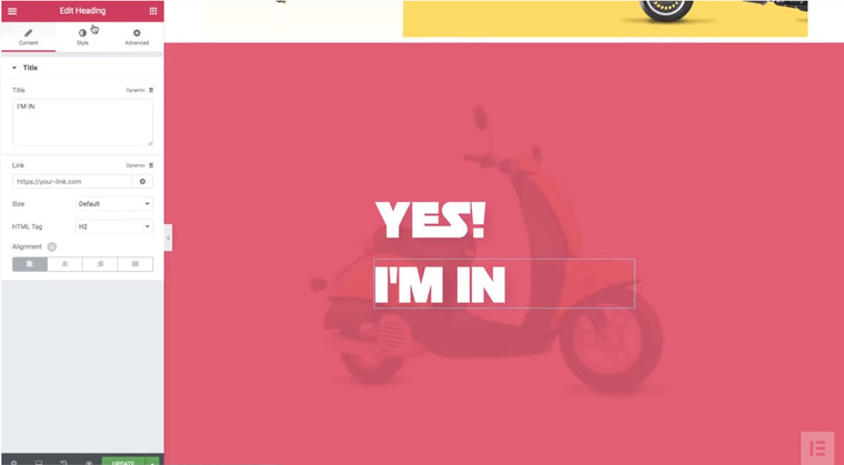
It doesn’t look perfect, so let’s make some fine tunings:
- Make the text a little bigger (Style > Typography > Size > 120 pixels).
- Make the headlines closer to each other (Select the top title > Advanced > Bottom Margin (-45); Select the second title > Margin > Bottom (50 pixels) > Left (-20 pixels)).
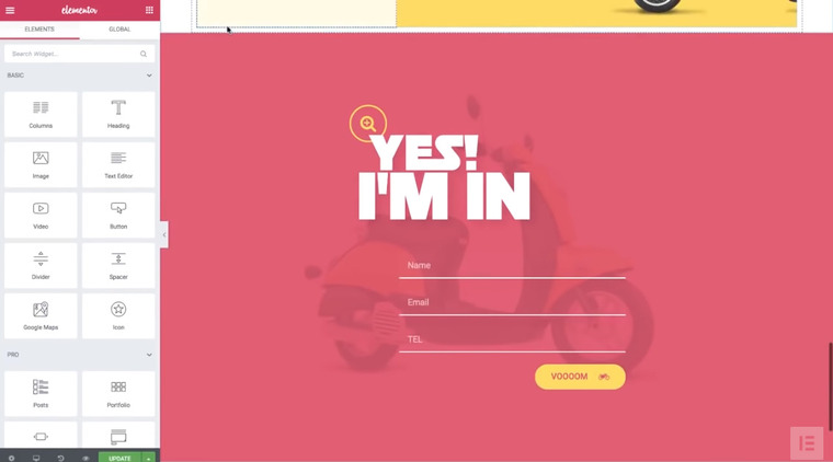
- Add an icon. Let’s take an icon from About. Go to the top of the page, copy the loupe icon, and paste it into the top title (Alignment > left and Margin > Left (-35) > Bottom (-55)).
- Add a Form widget under the second title. Switch off the label. Add item > Type (Tel) > Placeholder (TEL) > Input Size (Medium) > Alignment (right).
- You can change the text (Submit Button > Text).
- Add an icon after the text (Icon > motorcycle, in this case). Set its position after the text (Icon Position > After). In this case, we give it the medium size and larger spacing (20).
- Increase the space between the fields (Style > Form > Rows Gap > 22).In this case, we changed the text color to white, lowered the background color opacity to a minimum, and added a border only to the bottom (Field > Border Color (white), Border Width > Bottom > 2, and set a zero border-radius).
- Style the button (Style > Button). Change the color to yellow, the text color to pink (same as a background color). Set 50 pixels for the border-radius.
- Customize the form a little bit (Advanced > Margin > Left > 12).
So far, you have to get this form:

Now, let’s customize a user-friendly menu.
First, let’s make a sticky menu section. Go back to the top of the page, select this section and edit it:

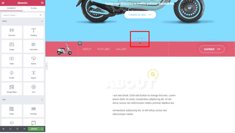
Now, go to Advanced > Scrolling Effect > Sticky > Top. Under the Sticky On, you can choose on which devices the menu will be sticky. Let’s add some anchors (Elements > Menu > Menu Anchor – drag a widget to the About section and move it on top of the title:

Give it ABOUT name (The ID of Menu Anchor). Then, copy the widget and paste it over the image right below the About section. Drag it on top of the image and change the text to FEATURES. Copy it again, paste it into the Gallery section on top of the title, and change the text to GALLERY. Copy and paste it for the fourth time into the Contact section and change its name to CONTACT.
Then, add a link to the button (Content > Button > Link > #CONTACT) and check out if it works (click the Contact button and see if it goes straight to the form).
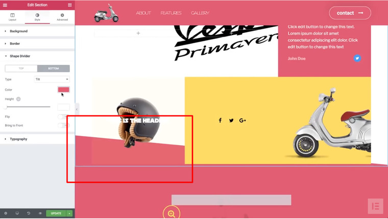
Let’s add one more element. Go to the Features section > Settings > Style > Shape Divider > Bottom and choose Tilt. Change the color to light grey and set the highest opacity. Then, Flip the direction and Bring to Front.
Choose the next section (Gallery) and go to Style > Shape Divider > Top > Type > Tilt and choose the same light grey color. Then, Flip it and play with the Height (437. In this case). To this section, we added a Shape Divider to the bottom, as well (Shape Divider > Bottom > Type > Tilt (pink, in this case).
One more trick with a column and a navigation area. So far, the navigation area is visible throughout a website but let’s hide a bit. Choose the navigation area > Advanced > Z-index (1). Under the gallery section settings, go to Style > Background > white and under the Advanced tab, set 2 to the Z-index, which means that it should cover the menu section. Now, the navigation is gone.
That’s it! We are done and let’s see what we’ve created.
If you have any questions, feel free to leave your comments and we will gladly help you 🙂
Also, stay tuned for more guidelines!