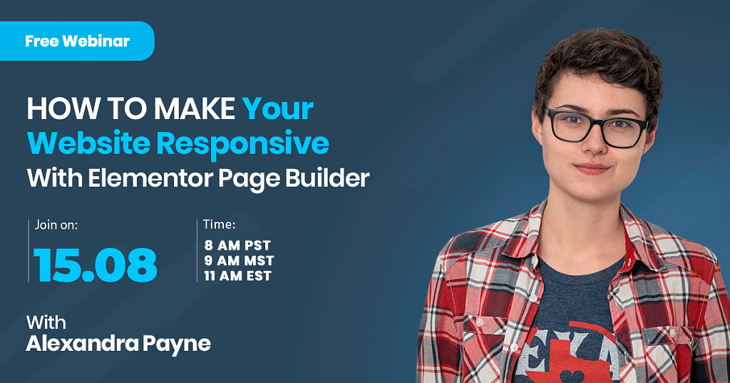
Create a Responsive WordPress Website with Elementor [Free Webinar]
Intro to elementor responsive
Elementor responsive! The modern approach to the development of websites is dictated by the rapid development of mobile devices and increasing the resolution of their screens. Today, developers abandon an idea to design individual mobile versions of websites and trend towards a single adaptive version for all popular devices.
When a user switches from their laptop to an iPad, the website should automatically switch to provide proper resolution and image size. In other words, the website should have the technology to respond to user preferences automatically.
I am sure you have already come across a situation when your website looks beautiful on a desktop, but some elements of the layout go wrong when you switch it to the mobile view. The free Elementor page builder offers a great solution with a few clicks only. Today, we will learn how to fix this issue and make your website responsive with Elementor page builder.
I will take Monstroid2 theme, the best Elementor WordPress theme, which is perfect for both beginners and advanced users. You can use this product for an unlimited number of products, edit its source code, and install it on many domains. Monstroid2 features an irreplaceable functionality that fits Elementor page builder perfectly. The theme package includes awesome Jet plugins for free and other premium features.
Monstroid2 - Multipurpose Modular Elementor WordPress Theme

Moreover, Monstroid2 is available within ONE subscription by TemplateMonster. With ONE subscription, you are getting an ultimate web development kit with unlimited downloads and unlimited products. Only the top-notch themes, high-quality extensions, and professional support are available with ONE by TemplateMonster
And now let’s proceed to the tutorial to learn how to make your website get properly displayed anywhere and on any device.
Tutorial on How to Make Your Website Responsive With Elementor Page Builder
How to Adjust Widget and Text Properties for Mobile Devices
- Open Elementor along with the Monstroid2 theme.
- If your desktop version is completed, proceed to the Responsive mode in the bottom left corner and choose either Tablet or Mobile.
- After Mobile view is chosen, you may notice that the text is super huge. Click the headline element to see the Title settings in the Content tab. You can easily adjust Alignment options for different devices here.
- Go to the Style tab to edit Size, Line Height, and Letter Spacing values. If you return back to Desktop view, the text properties will be changed accordingly to the one selected for the Desktop view.
- Navigate to the Advanced tab to change Margin and Padding values. If you wish to keep Entrance Animation for some specific layouts; e.g. Desktop, make sure to choose None for Mobile module.
- While editing buttons, you can adjust Custom Size, Custom Width, Alignment, Margin, Border Radius, Padding, etc.
- Click Section settings > Style tab, go to Position to choose Center Left value.
How to Resize and Reposition Columns
- Go to Layout tab of Edit Column settings and edit Column Width, Column Order, Vertical Align, etc. If your goal is to position a few columns in a row, set Column Width to 50. Repeat the same for the second column to get them to appear in a row.
- Make changes in Title section, Description section to edit the typography and image to make sure they look good on the mobile view.
- Change the order of the columns by clicking Settings on the section, going to Responsive section and enabling Reverse Columns (Mobile).
- Navigate to the Advanced tab and adjust Margin and Padding values to your mobile view.
How to Hide Widgets, Columns and Sections for Specific Types of Devices
- Choose the column you want to remove and navigate to the Advanced tab > Responsive section.
- Enable Hide On Mobile option.
- The same procedure should be repeated to hide all the widgets, columns and sections.
How to Overcome Position: Absolute Position and Position Fixed
- Click on the widget, proceed to the Advanced tab and Custom Positioning. Custom Positioning allows one to change the Width and Position values.
- Position option allows one to choose Default, Absolute and Fixed. Position Absolute allows one to grab your element to reposition it to any other place on your web page. Position Fixed allows one to grab the element and keep moving, but once you stop and start scrolling, you will see that the element is fixed at the place you left it. This is a great practice for a subscription form, for example. Offset allows to change the placement of the element or section while editing its value.
How to Use Inline Width to Create Flexible Mobile Layouts
Custom Positioning section allows one to set Inline Width. This new feature has been rolled out recently. Once it is selected, you can see that a blue box around the widget is wrapped up tightly. So, you can play with re-positioning and further customization.
In case of any issues, while switching the modes (Desktop/Mobile), you can go ahead and change Offset percentage.
Still, you should understand clearly that custom positioning is not considered a best practice for responsive web design and should not be used too frequently.
Conclusion: elementor responsive
The growth in the use of mobile devices is just the step forward to more convenient use of the Internet. Your goal is to let any user on any device have the best experience of interacting with your website. Hopefully, this tutorial has been useful to you. Simply follow the steps suggested above, and your website will look great and work well on a laptop, tablet, and mobile phone. Feel free to leave your questions, concerns and recommendations in the comments section below.
READ ALSO
How to Sell WooCommerce Virtual Products Internationally
Don’t miss out these all-time favourites
- The best hosting for a WordPress website. Tap our link to get the best price on the market with 82% off. If HostPapa didn’t impress you check out other alternatives.
- Monthly SEO service and On-Page SEO - to increase your website organic traffic.
- Website Installation service - to get your template up and running within just 6 hours without hassle. No minute is wasted and the work is going.
- ONE Membership - to download unlimited number of WordPress themes, plugins, ppt and other products within one license. Since bigger is always better.

Posting contributed articles about the major web design highlights and novelties. Come across a handful of useful tutorials and guides shared by experts in the web design and online marketing fields.
Get more to your email
Subscribe to our newsletter and access exclusive content and offers available only to MonsterPost subscribers.

Leave a Reply
You must be logged in to post a comment.