New jQuery Plugins Aimed Directly at Your Site’s Responsiveness
Discussing responsive layouts is no longer mainstream since every design that's created today is responsive. Anyway one needs some cool bells and whistles hidden in the cushion...
What's the most attractive part of every website, besides the content itself? Of course it's the slider. Content slider is a versatile tool used in those moments when it seems you need to show more than it's possible.
When speaking about automatic sliders, there is one thing every web designer needs to know. Human eye reacts to movement, such sliders may distract user from some really important placed on the same page, like your value proposition, products or offers.
Important! Image sliders get hit by banner blindness, most people don’t even pay attention to them, but even those who do can't really get the message.
Example: user comes to your page, sees the slider, starts reading some text...BAM! and it's gone, slider have switched! Imagine you're website visitor, relax and try to read the text in slides - 60% possibility that they will switch before you finish reading them, try to increase the looping time, it will help a lot.
With all that, said we'd like to offer you some really cool content sliders, menus & some other things intended to play with responsive websites. Scroll the page down and check them out!
***
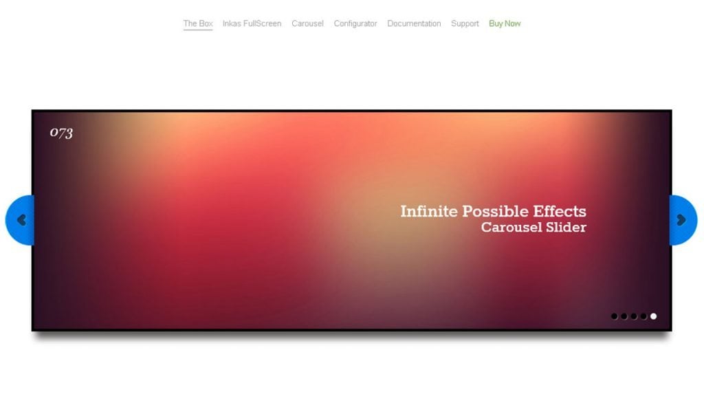
Zuper Responsive Multitouch Slider
Features
- Responsive Slider;
- Video embed;
- Broser Compatibilities – FireFox 2, FireFox 3, IE7 , IE8, IE9 , Opera, Safari, Chrome;
- Individual time delay between each slide;
- Able to load unlimited number of images, each with customizable text description, tooltip, and hyperlink;
- Show or hide components, including play/pause button, directional buttons, thumbnails, text panel, and tooltip;
- Can set to automatically play on startup with customizable timer delay. Also, can set a different time delay for each slide;
- Text description panel can be set at different location and size;
- Configurable tooltip for each thumbnail;
- Support for iOS and android devices;
- Able to shuffle image in random order.
***
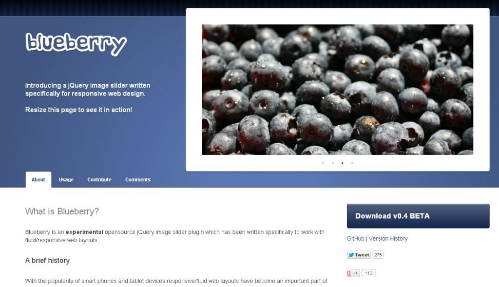
Blueberry Slider
Blueberry is an experimental opensource jQuery image slider plugin which has been written specifically to work with fluid/responsive web layouts.
***
Image Gallery for Mobile and Touch Devices
PhotoSwipe is a FREE HTML/CSS/JavaScript based image gallery specifically targeting mobile devices.
***
Responsly.js
Responsive widgets, written using CSS3 transformations and available as a jQuery Plugin.
Features
- Works from large monitors to laptops, to tablets to mobiles;
- Pure CSS styling;
- CSS3 based transitions (hardware accelerated where possible);
- Animations work on all modern browsers including mobile, (IE degrades gracefully by losing transitions);
- Minimal dependence on jQuery for convenience ( can substitute Zepto, or pure JavaScript);
- Simple lightweight design, adds little to your download size;
- Compartmentalized, so use only what you want;
- Best used with a responsive CSS framework like 1140px or 320plus;
- Can be heavily customized by editing CSS.
***
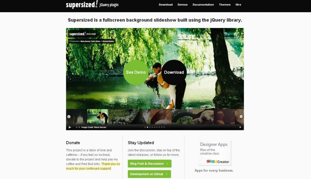
Supersized
Supersized is a fullscreen background slideshow jQuery plugin.
Features
- Resizes images to fill browser while maintaining image dimension ratio;
- Cycles backgrounds via slideshow with transitions and dynamic preloading;
- Core version is available for those that just want background resizing;
- Navigation controls with keyboard support;
- Integration with Flickr – pull photos by user, set, or group;
- Head over to the project page for all the details.
***
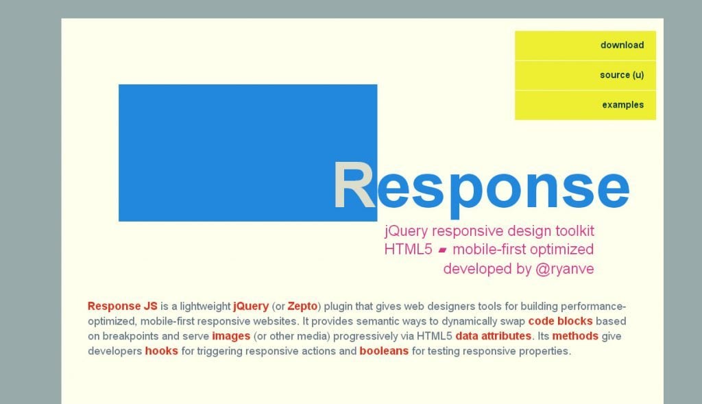
Response JS is a lightweight jQuery plugin that gives web designers tools for building performance-optimized, mobile-first responsive websites. It provides semantic ways to dynamically swap code blocks based on breakpoints and serve images (or other media) progressively via HTML5 data attributes. Its methods give developers hooks for triggering responsive actions and booleans for testing responsive properties.
***
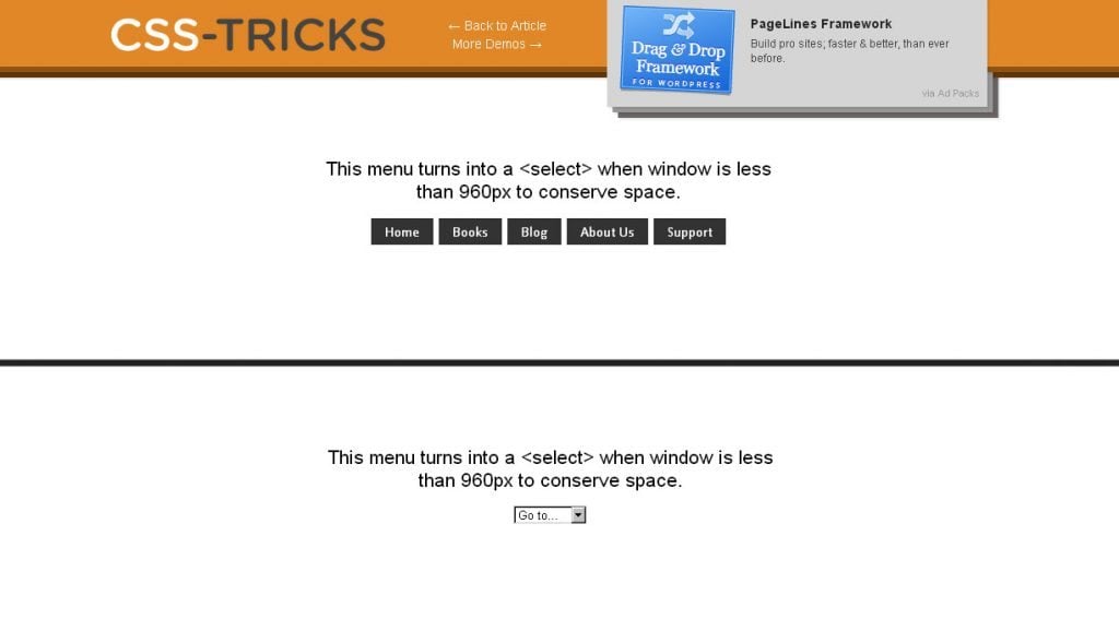
When you're on a small screen (iPhone shown here) and click the dropdown, you get an interface to select an option where each option is nice and big and easy to choose.
***
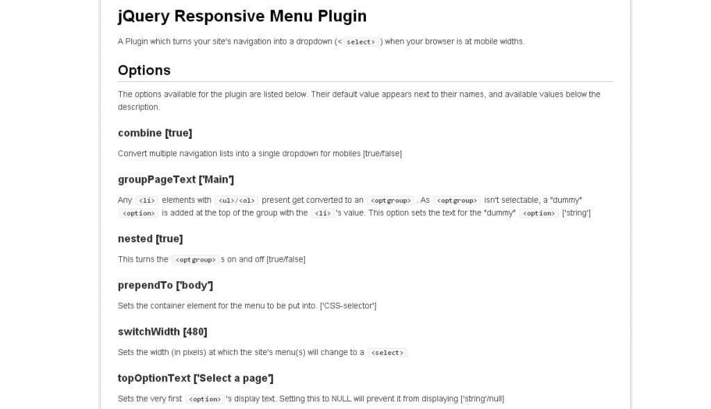
This simple plugin converts menus into a select element for mobile devices and low browser widths.
***
Seamless Responsive Photo Grid
Let's say you have a bunch of images you want to display, and the goal is to get them edge-to-edge on the browser window with no gaps. Just because you think that would be cool. They are of all different sizes. You don't care if they are resized, but they should maintain their aspect ratio.
***
FitVids.JS is a lightweight, easy-to-use jQuery plugin for responsive width video embeds. It automates the Intrinsic Ratio Method by Thierry Koblentz to achieve fluid width videos in your responsive web design.
***
Responsive Content
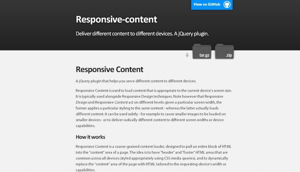
A jQuery plugin that helps you serve different content to different devices. Responsive Content is used to load content that is appropriate to the current device’s screen size.
***
jResize is a responsive web development tool, built in jQuery to assist the workflow of developers on responsive projects. There are various tools for responsive development, iframes at different widths embedded in the page, and the tedious resizing of the browser.
***
Don't forget to use comments section!:)
Get more to your email
Subscribe to our newsletter and access exclusive content and offers available only to MonsterPost subscribers.





Leave a Reply
You must be logged in to post a comment.