The time when we used our mobile phones only to make several calls and send short messages has been left far away. Today mobile apps are broadly used to complete various tasks and it doesn’t matter where you are. Just take your mobile app with you.
It is impossible to ignore the mobile experience nowadays and stay aside if you wanna turn your online project into a successful one. It is absolutely natural that your visitors will try to see your site on their mobile apps and it would be rather confusing if they will not manage to get the desired result. Keep in mind that there are plenty of various screen resolutions and your website needs to adapt to all of them.
As you are not the only one who may face the problem or, it would be better to say, who needs the solution, you are welcome to have it. Even more – you have a choice and can get the solution you consider the most suitable one.
To make your Magento website keep up with the times you can choose a Magento mobile app for the iPhone, iPad, and Andriod. You will get the mobile version of your website and can forget about problems concerning various screen resolutions. There is no need to search for someone who will develop the mobile version. You will really cut the long story short.
Still, keep in mind that there is a fee. Monthly or annual fee, as you wish. But fee. And…keep in mind that your mobile version of the website will be not absolutely identical to your original design. Your visitors will deal with a similar, but another version of the site.
The other way you may choose is to get a responsive solution. Responsive design adapts to different screen resolutions without any harm to your content or design composition thus your clients deal with the familiar website design and even don’t notice they are using a mobile to fulfill their tasks. And, surely, there is no monthly or annual fee. You just get the responsive design and it is yours.
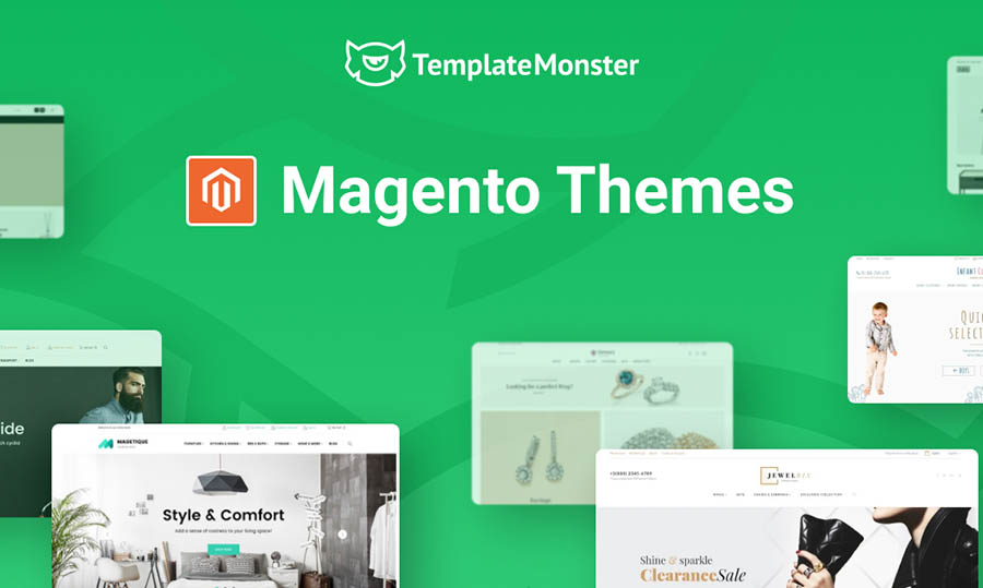
Easy-to-use Responsive Magento themes work seamlessly across various screens. You can choose any responsive Magento theme just by following the link.
Here is the list of the main resolutions:
- Desktop layout – 980px;
- Tablet layout – 768px;
- Smartphone layout (landscape) – 480px;
- Smartphone layout (portrait) – 320px.
No doubt it is up to you which solution to choose. We have just described them so you can make clear what you will deal with choosing this or that one. eСommerce is the sphere that develops with incredible speed and it is really important to be up-to-date not to lose your positions.
