Solutions for Shopping Cart Integration into Magento Store Homepage Designs
It’s difficult to exaggerate the significance of a shopping cart for an e-commerce website. All orders and purchases are completed via it. An apt user-friendly shopping cart design is able to maximize the conversion rates, which is the goal of any online store. As a rule, each web store is supplied with a separate check-out page and a small shopping cart block smoothly incorporated into the homepage layout. As Magento CMS is mainly used for online e-commerce projects, it is very convenient to study the issue on the example of Magento templates.
According to successful marketing rules, a shopping cart block should be present and easily accessible from any website page, and it’s quite reasonable as the buyer won’t spend the time searching for it in the most distant corners of your website. Experienced designers strive to place shopping cart blocks in the most obvious predictable places. More often it is the right upper corner of the homepage.
The shopping cart block usually contains information about selected products and a direct link to the checkout page. The section may be separated by the borders, decorated with graphic icons; sometimes shopping cart icons may even follow the user during scrolling. Shopping cart block design always inherits the general layout concept and never distracts the user from the essential content. The block is incorporated into the homepage for customers’ convenience, as online stores should provide a much more enjoyable shopping experience to compete with regular ones and multiply the number of happy customers.
Now it’s high time to examine all winning solutions of shopping cart block integration into the homepage layout of Magento themes.
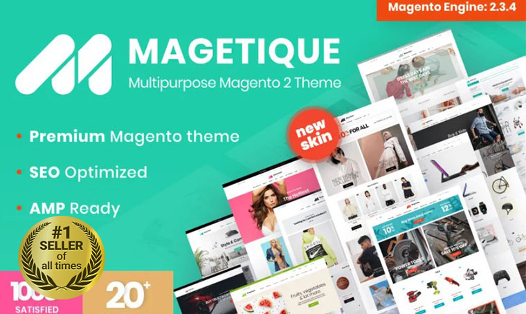
Magetique - AMP-Ready Multipurpose Magento Theme

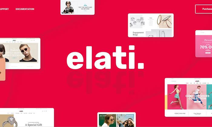
Elati - Multipurpose Fashion Magento Theme

SM Ecogreen - Magento 2 Organic, Fruit, Vegetables Magento Theme

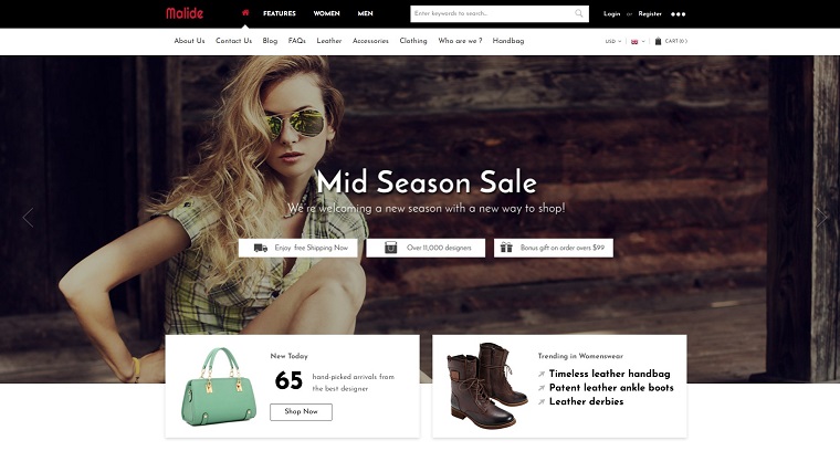
Malide - Multipurpose Responsive Magento 2 Theme

Get more to your email
Subscribe to our newsletter and access exclusive content and offers available only to MonsterPost subscribers.
