How Not to Ruin The Site with Carousel?
Sliders and carousels are pretty popular in web design. Many beginner developers are sure that they are must have attributes of any site. As a result, they stuff sliders in every project. At first sight it may seem that there is nothing wrong with that, but sliders can really ruin your site in no time flat.
As a rule the most troubles are observed on the homepages and it is no wonder. The majority of links lead to the home pages, so they should look and perform perfectly well. The matter is that 75% of users make first judgment about the business based on the design of the homepage.
Here are several failures you may observe when dealing with sliders.
- Slow performance
Carousels can greatly affect the loading speed of websites and that is definitely what you need for setting up a professional business and growing a large audience. How that works? All the sliders, carousels and other visual effects are built on jQuery. In this way, the script loads all the images simultaneously. You may see no difference using small sized images, but when you have a full-screen slider, the page will load much slower, as a result a big percent of your visitors will simply leave the site.
- Bad SEO and Poor Conversion
Slow loading speed is only one side of problem as it can cause to serious SEO issues. Actually, slow speed leads to bounces that result into low search engine rankings and poor conversion. Besides, the all-image content without alt text is not ranked by search engines . Multiple H1 tags used in text sliders are also no good for search engine indexation.
- Bad performance on Mobile Devices
One thing you need to keep in mind is that sliders are not mobile friendly. Just imagine how sliders will perform on smartphones and tablets with 3G connections, if troubles occur on first screen devices with good Internet connection. Besides, due to the small sizes they will be not effective as the users simply won’t be able to see what is displayed there.
- Focus Loss
Constantly changing images overloaded with texts, various kinds of offers and buttons are also useless, as the they distract users from the main content and make it harder to take the right decision. Eventually users just leave the page right away.
***
What’s the way out?
There are many alternatives to sliders that will not affect the loading speed and SEO ratings of the page. So, let’s take a look at them and why they are better.
Hero layouts
Slider is not the only tool that can make the site look more dynamically. Hero layout is a more effective solution. Cleverbirds.com is a great example of this kind of site.
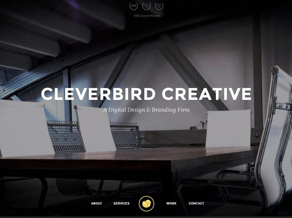
Hero images actually help you show the real content that will be rated by search engines. You are probably interested in how are they better that the regular slider, here are some facts.
- Static
As you already know, the most of troubles connected with sliders come from slow loading time. Hero images are static, so they are the simply do not have such a problem. It works pretty much to the regular image and doesn’t require jQuery scripts or long lines of CSS code. In this way it is easier to synchronize. In addition to that, a static image is more informative and makes it easier the the visitors to focus on the content on any screen, no matter is it a desktop or a phone.
- Consistency
If you need to improve the sales and drive more traffic, it is important that the content was read exactly the way you made it and on all devices. This rule is vital for landing pages that are aimed at generating revenue. Sliders can simply not work on mobile screens or display images that are too small for reading that is equal to no images at all.
- Better SEO
Pretty often sliders include multiple H1 tags. From the point of view of HTML coding, there is nothing wrong with wrapping the content inside this tag, but when it comes to SEO, everything is a bit different. The H1 titles are seen by Google as keyword spamming and that is opposite to what you need. So, it is strongly recommended to use only one H1 tag per page. Hero images are built on the same rule, so search engines will rank it properly that results in better traffic flow.
- Flexible Customization
Hero images are much easier to create and offer more features compared to the sliders. To add some kind of form, frame, or whatever to the slider, you are going to write loads of code to make everything work on different screen resolutions. So, basically all the options are limited to a button on the slide. With hero images you are free to add any element you wish without any troubles at all.
Call to Action
Calls to action are also pretty powerful, actually if combined with static images they can be much more effective than you expect. In this way, the home page looks both attractive and informative. This method works for any kind of site as it helps users take the decision much faster.
Take a look at the squareup website. Everything looks clear and structured.

Sign Up Forms
Sign up form is a great alternative to the slider. It is also more effective to place it at the top of the page as you save a great percentage of email subscribers. It is just more simple for the users to find the form that is distinct rather than scrolling down the page, through loads of information. It is vital to keep them simple and short. Long forms can be distracting to the visitors and will be useless. You can also include sign up forms to the hero layouts to drive attention of the visitors right after they land on the site.
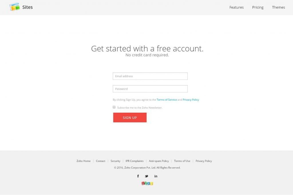
Zoho made a simple full-screen home page with a short sign up form and a call to action. As a result users are able to focus on the offered services much easier.
Video
You may say that videos are similar to sliders and there is no point of using them. Well, this statement is absolutely wrong as videos convert much better than the sliders. Actually, 70 of 100 search results include videos. Up to 85% of users are most likely to buy products after watching the quick preview. Sliders simply don’t give such information as videos that give a clear picture of the product with demonstration and description of all features.
Subhub has actually combined two ideas, on their site. It offers sign up button, and a video that gives users a clear picture of what kind of service the company provides.

***
Are Sliders Totally Useless?
However, there is no need to fully reject sliders. Of course, it is strongly recommended not to use them in the header section to display any kind of important information. Here are some tips on how and where to use sliders to not ruin the website and affect conversion:
Make it simple
There is no need to include full width sliders to your site as they are useless. Small sized sliders are much effective and do not decrease page loading time. It is better to include some kinds of logos, testimonials, brand names, or any other information that is less important than the main content.
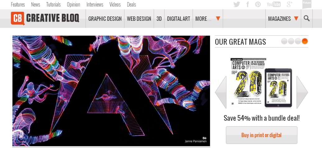
Creativeblog designed its slider pretty interesting. They made it small and stuffed products with discounts inside the slider. So the visitors see all the hot offers right from the top.
Move Down
Move sliders down from the top of the website. They should work as prompts for users who are searching for more information and it is better to place them in the middle or at the bottom of the page.
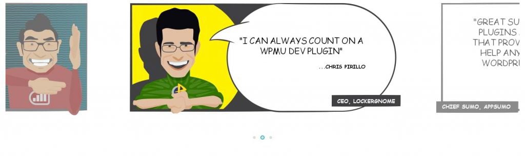
Here is a cool solution from wpmudev. The slider features only three items with cartoon-style images and testimonials.
Auto-scroll
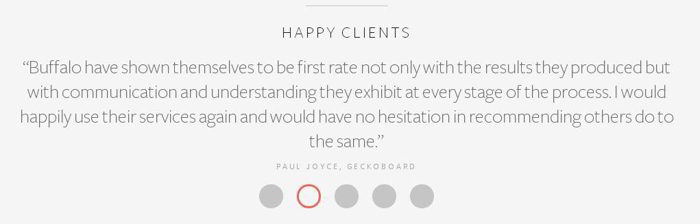
Pay close attention to the auto-scroll. Automatically changing slides and images make the site look live on the one hand and on the other hand they are irritating as users can’t focus on the information. That is why it is recommended to turn off the auto-scroll function giving more control to the users through navigation buttons or thumbnails.
As you can see, builtbybuffalo offers exactly the same kind of slider. Users do not distract on moving slides and can change them whenever they need.
***
When It’s OK to Use Sliders
There are still some cases where sliders are essential and can make your site more user-friendly and informative. There are cases when sliders can work for the project and it is quite hard to find a fair alternative to them.
Online Stores
When you need to demonstrate the product from different dimensions. For example, you sell some kind of shoes, dresses, shirts or whatever, and you need to show how do they look from behind, from the top, etc. For that you will need, on average about 3-5 images on the product. Now imagine how it will look on the site if not hiding them inside the slider.
Here is a good example from debshops. To see some kind of clothes in a specific color you only need to hover on a block behind the image. This function saves visitors a great deal of time and ensure user-friendly interface.

Portfolios
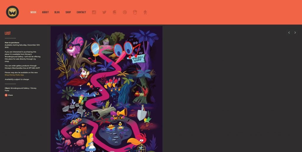
Online portfolios are critical for freelance designers and developers. Here sliders can also become in hand. They allow employers to navigate between the works with a single click and watch these works in high resolution. However, it is still not recommended to integrate auto-scrolling to the slider.
Check out this online portfolio from thebeastisback. Thanks to a built-in slider visitors can preview all the works by only clicking navigation buttons.
Displaying Offers
This is an exception when sliders can be used in the header section. It can work as a tool for showing the best offers from your company. However, there are several strict rules on how to use it the right way. First of all, it is necessary to limit the number of slides to 2 or 3. This number is based on the research from yorkwebteam that says that the first 3 slides get the most conversion. Next you need to exclude auto rotation and add navigation buttons. Regarding the content it is necessary to include an offer with distinct title, image of the product, several core features, etc.
Sephora is one of the best examples of this approach. As you can see, it follows every of the abovementioned steps. As a result, the slider doesn’t affect the loading speed of the website.

***
How to Avoid Main Problems with Slider?
Well, if you just can’t give up the idea of using a slider, here are some tips on how to make it work more smoothly and not affect SEO.
Load speed optimization
So, to make slider load faster, you are going to need make it as light as possible. It can be done through some kind of simple script. If you are familiar with jQuery, you should delete all extra lines of code that won’t be used in your project.
It is also recommended to use minified version of jQuery library, that is twice lighter than the regular version. Using jQuery with a CDN can also be a great way to make the site load faster. For example you can use the library from code.jquery.com.
SEO
Try to integrate deep linking to the slider. In this way, URLs will be changed automatically as the slides are selected. Alt text and key-phrases are also a must. An option will be using some kind of premium plugin like mightyslider that is built in accordance with SEO recommendations .
Better Performance on Mobile Devices
To make slider perform equally well on all devices, first of all, you need to make it responsive. In this way, it will adapt to screen resolutions making the content look clear. Sliders on our themes are built on the same principle, so you can be sure that they will work flawlessly.
Better Focus
As it was mentioned above, it is better to limit the number of slides to 2-3 and eliminate an auto-scroll function. In this way users will be able to navigate to the next slide whenever they need. In this way they will be able to focus on a particular product and take the right decision.
Now you know what are the alternatives to sliders and how to use them properly. Go ahead try one of the listed options on your website and let us know about the changes, also feel free to ask us any questions, or give some of your ideas on this subject.
Don’t miss out these all-time favourites
- The best hosting for a WordPress website. Tap our link to get the best price on the market with 82% off. If HostPapa didn’t impress you check out other alternatives.
- Monthly SEO service and On-Page SEO - to increase your website organic traffic.
- Website Installation service - to get your template up and running within just 6 hours without hassle. No minute is wasted and the work is going.
- ONE Membership - to download unlimited number of WordPress themes, plugins, ppt and other products within one license. Since bigger is always better.

Alex is passionate about all the things related to WordPress and Elementor in particular. At MonsterPost, you can find a handful of cool tutorials shared by him.
Get more to your email
Subscribe to our newsletter and access exclusive content and offers available only to MonsterPost subscribers.

Leave a Reply
You must be logged in to post a comment.