Tearing Marketing Covers: What’s Hiding Beneath Logos of Popular Brands
In 2012, the world has seen another dystopian movie called Branded. If you saw it, then you know what it tells. If not, attention spoilers ahead.
Trying to describe the plot in a few lines (and not to offend anyone), I almost had a headbang. The idea of Branded is actually quite straightforward: people live in a society that is ruled by corporations and their comprehensive marketing machines. According to this movie, brands control human souls, but leave them the illusion of free will and happiness while making them wear, eat, and want things that corporations want them to have.
Even though the grass is always greener on the other side, one must not lose individuality trying to satisfy demands created by marketing heavyweights.
The Ugly Truth of Popular Brand Logos
Talking about brands is a conversation for a dozen of articles. In this one we’d like to talk about or I’d better say mock at brands. If you ask any four-year-old child which logo belongs to which brand and they will define them just like that.
The designer Viktor Hertz and his colleague Cliff Dickens decided to reveal the true story, showing people the true face of brands without marketing masks.
Let's see what Viktor thinks about those corporations.
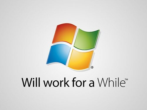
The first one in our list is Windows...anyone who ever used it will agree with this moto. It takes three to five months for Windows to get cluttered will junk files and start all those unbelievable things with blue screen.
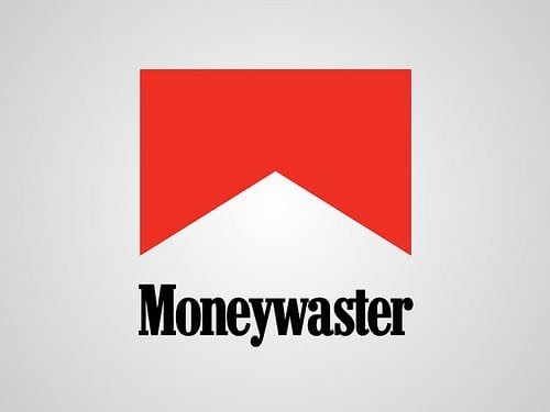
I know a bunch of people who smoked cigarettes of this brand and all of them with certainty called it Coughborro.
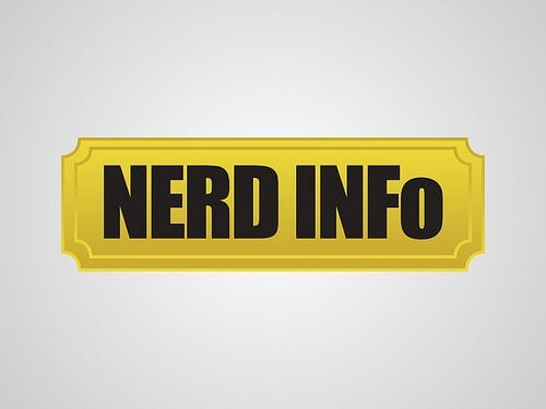
This is a wiki for movie fans, all yo even wanted to find about
There is nothing to comment here 🙂
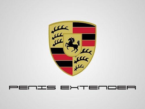
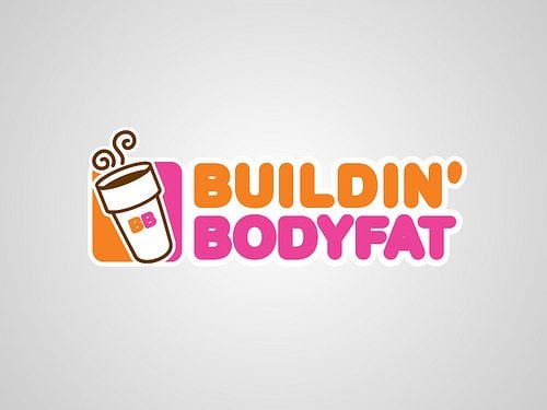
If you treat it wisely your belly will not extend.
Procrastination is one of the "most popular bad habits" modern people have. Using all those charms of technologies this practice of carrying out less urgent tasks becomes a total engagement.
If it's your favorite channel I have bad news for you:)
The new Myspace is all about making music social. The new site incorporates many elements of modern web design, particularly an emphasis on visual media. Although the site excels at discovery, its iconography is sometimes perplexing.
This is from the same category as Bellyexpander, you have to treat Mac wisely if you don't want to get a sad result.
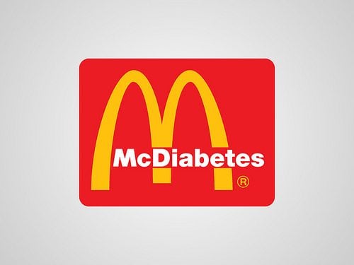
Need calories? Now you know where to get some.
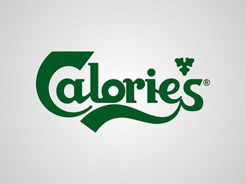
The largest repository of cat videos on the web, and this fact is undeniable.

Procrastination #2, once you logged in to check your inbox five hours later you will come to your senses being who knows where.
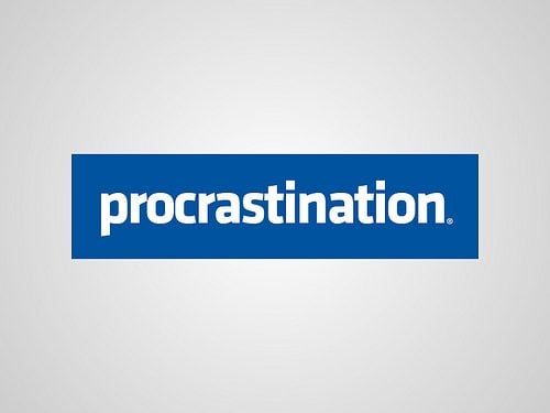
How much sugar is too much no one knows even Starbucks baristas.
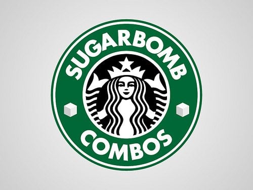
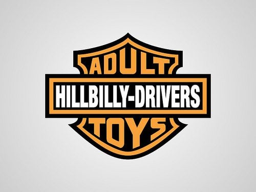
Actually 'Toys for big boys' is one most popular searched at Harley Davidson website.
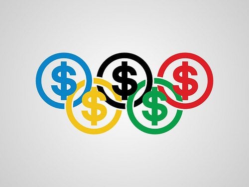
If you thought that medals are best symbols for and Olympiad probably you were a bit wrong.
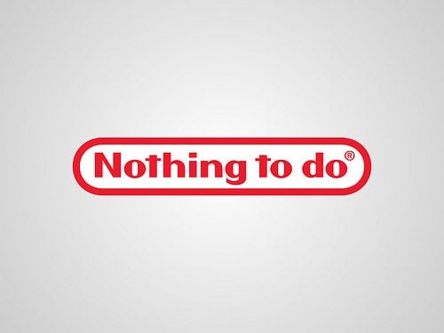
This example can be referred to those procrastination logos. If you have nothing to do Nintendo is the best choice.
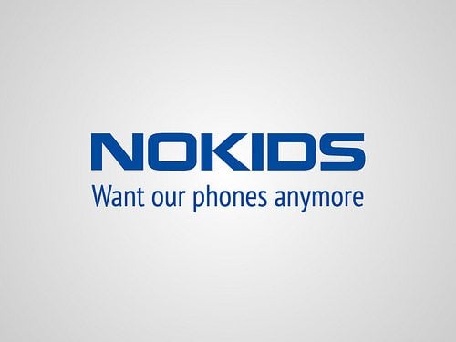
Except for the Lumia 1025 which is the last development of Nokia.
Such a great amount of cops can not be mistaken...
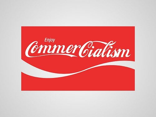
As for commercialism Coca Cola has no equals.
One of Apple workers once said, "We earn billions on teenager's show-offs."
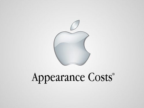
No offence guys, but this is the true face of brands we like so much. If you have any other mocks on famous brands either the ones you've seen on the web or those you created all by yourself, you are free to attach them into the comments below.
Create a Logo!
Need an attractive logotype for your website, but have no way out? Professional web designers from MotoCMS will help you.
Our team will come up with the best solution for your brand according to your personal requirements. If the logo doesn't sit with your requests, we will redesign it up to 3 times.
Get more to your email
Subscribe to our newsletter and access exclusive content and offers available only to MonsterPost subscribers.


Leave a Reply
You must be logged in to post a comment.