Ten Mistakes to Avoid When Designing Your Website
Building a website can be easy but the real challenge lies in making it usable. People often mistake a website’s role. They often forget that the website is their face to the world. In reality, website should not be the only way for people to find about you, but it is the way your customers, fans or your donors interact with you. It is surprising that we see little attention paid to getting web design right. I have seen that sites which are often visually attractive lack focus, or it is embedded with too many different fonts.
Avoiding a few simple mistakes can help you establish a grand website. But I am sure many of the readers are wondering what mistakes have they done while designing their websites? Well! Let me help you with some of the common errors you can avoid next time you design a website.
Lack of search box
A web is an archive of information. Whether it is a corporate website or a blog, people need search box to search their relevant information. With a visible search box, visitors will get what they want and also enable them to search your site in an efficient manner. All you need to do is copy HTML code from the control panel and paste it in your website to set search function on your website.
Cluttered homepage
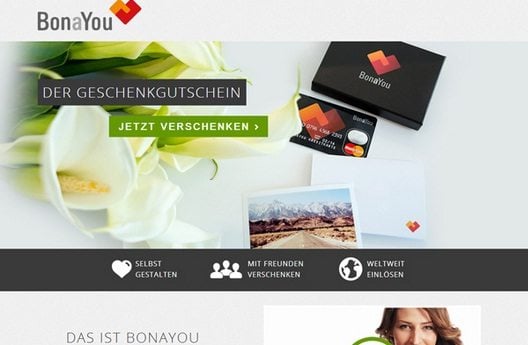 Homepage is the first thing that your visitors see when they visit your website. If you want to take this opportunity to make them continue to browse your website, create a killer impression.
But often designers pack their site’s homepage with tons of unnecessary things. They make visitors simply walk away from your site. Less is really more in a site’s design. Do not use too many fonts, text or images to give your homepage a complete chaotic look.
Frustrating navigation
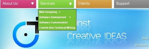 Links are hard to find and buttons are not visible or may be placed in the wrong location. Such a situation can be extremely frustrating for your visitors when they come to your site to search for information they need.
Organizing your site’s navigation demands logic, intuition and lot of common sense. Make your visitors find everything they need with easy-to-use and intuitive navigation bars. Most importantly, don’t make your navigation too flashy by adding too images and sounds to them.
Make your navigation easy with textual description for all links or provide alt text for images, organize and streamline your navigation according to the theme of the website. Professional website requires more clarity.
Want to find out how to design for emotions?
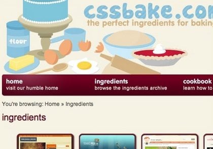
Stale content
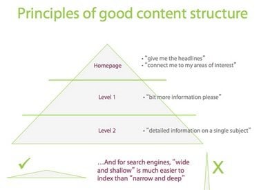 A website’s content is what drives traffic to your site. Success or failure of your site depends on how well your content is structured. Some designers do not bother to put headings, sub-headings, paragraphs, bullets and keywords. Use appropriate page title for each web page to help users know exactly where they are.
However, the worst part is, non-relevant content on your website can drop your site to the bottom of the search engine ranking positions. Therefore, organize content on your website using HTML and CSS when creating the design of your page. Your content should be up-to-date and consistent. However, up-to-date content does not only mean adding new content but correct previous mistakes. In addition, create sufficient white space between your images and text by using proper margins.
Inconsistent interface
 Over-creativity can be excessive for your site. Some designers create different designs for every single web page within a website. This is utterly confusing and annoying to some extent.
No matter how outstanding your site is, if the overall look and feel is inconsistent users cannot relate to it. It is better to use a standard consistenttemplate for every page with links connected to the main section of the site. Also the keywords you use and the overall design should be aesthetically simple and users will never get confused on your website.
No call-to-action
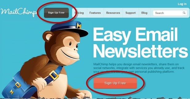 Do you want people to download, subscribe, register, view, share, buy or follow on your website? Most of the web designers forget about call-to-action when it comes to designing their website. Use a call-to-action to make it all clear. Website’s goal should be to get the visitors into action.
Poor usability
Clear readability and legibility is the most important thing in a website than anything else. Users should not face difficulty while reading text and should be able to easily grasp the information they want. However, some website makes use of complicate font style and sizes to make reading extremely painful. For better readability use sans serif typeface as it allow for easy reading on a website. Similarly, use colours that work well with the overall design of your website. Do not use bright colours as your background against the text or avoid using white text on a black background.
Unfavourable screen resolution
 I have come across several websites where I had to scroll the pages horizontally. It was indeed annoying. This is a complete no-no in modern web design. Designers should develop websites that fit appropriately on every screen sizes.
To know your user’s devices and their screen sizes, take help of Google Analytics that provides you information about what monitor resolution they are using.
Automatic music in the background
People do not want music to announce their arrival. Music is nothing but distraction from the message you are trying to conveyon your website. Moreover, different people have different taste in music. So if a visitor does not like the music that is playing in the background, they are most likely to leave your site. So keep things simple.
Insufficient negative space
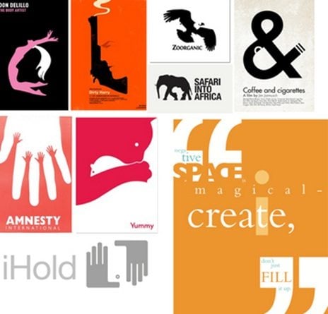 Don’t be afraid to use negative space in your site. You can draw attention to the most important elements of a page by leaving negative space around the key content. This is especially useful with any ‘action items’ that you want your visitors to click on.
Nothing is more frustrating for visitors who find it difficult to click on a particular link as it is placed too close to another. There is no hard and fast rule that you have utilize every inch of space available in a site.
* * *
I am sure you don’t want your site to be like everyone else’s site – so try new things and differentiate yourself.
Don’t miss out these all-time favourites
- The best hosting for a WordPress website. Tap our link to get the best price on the market with 82% off. If HostPapa didn’t impress you check out other alternatives.
- Monthly SEO service and On-Page SEO - to increase your website organic traffic.
- Website Installation service - to get your template up and running within just 6 hours without hassle. No minute is wasted and the work is going.
- ONE Membership - to download unlimited number of WordPress themes, plugins, ppt and other products within one license. Since bigger is always better.

Diving into debts of web design is my real passion. Getting along with new tools and finding useful tricks is more than just a hobby. Let me lead you through the website design ways.
Get more to your email
Subscribe to our newsletter and access exclusive content and offers available only to MonsterPost subscribers.

Leave a Reply
You must be logged in to post a comment.