
- The origin of the tendency
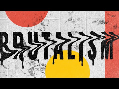
- What a brutalist web design is
- What is common for brutalist design
- What differs brutalist design from other styles
- Benefits of brutalist web design
- Disadvantages of brutalist web design
The brutalist design style came to the portfolios of digital agencies and art museums from architecture. Famous samples, like Buffalo State Court and Boston City Hall, were erected in 1950 -1960s for local authorities. These constructions look monolithic as if they were threatening to “crush” a single person with their form.


Nowadays the trends return and product designers like to use principles of this stream in their work. We will discover where this style comes from, what does it mean and what is its role in UX.
The origin of the tendency
Indeed, the name stems from a word French “béton-brut” which means wet cement and has nothing to do with “brutal”. The design engineers who work with this pattern erected fundamental and massive buildings without any decorations even the wall paint is excluded. The idea was to create plain constructions relevant to low budgets and the mindset of governmental organizations and large corporations.
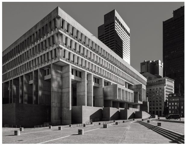

Boston City Hall
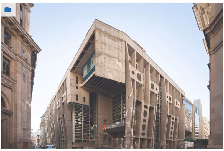

The Bank of London and South America
What a brutalist web design is
The term appeared due to the creative director of the Freundliche Grüsse agency, who launched a Brutalists Website platform gathering samples of this trend.
Applying digital brutalism creators attempt to give their product a raw, unprocessed, somewhat random look. In many ways, they are similar to the first sites of the beginning of the 1990s (refresh the main pages of Craigslist or Drudge Report).
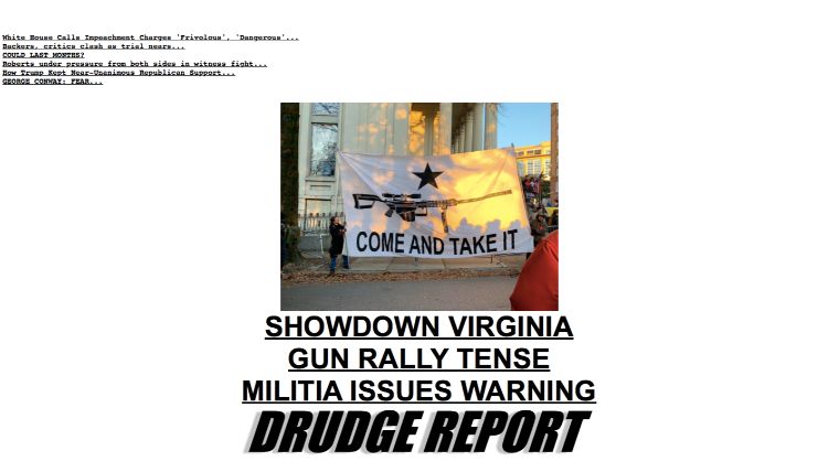

The Drudge Report
The trend maximally uncovers the layout to express the trend: imagine an HTML page that has many blue hyperlinks and one color monospaced text.

The Craiglist
Artists are trying to exceed frames that the sites based on templates have. The latter lost the novelty and flooded the entire Internet. They want the Web to remain actual, fair, and simple. Creators explain this choice with a desire to maintain the priority of functionality over form. And to secure the privilege of the sensual impact that this approach has on followers of convenience opposing excessive pomp in design.
What is common for brutalist design
Although every artist wants to be unique and creative, there is a list of similarities that could be tracked by pages applying the philosophy of the stream.
Originality. Extreme colors and fonts, strange positioning of blocks, lack of logic in intervals, hyperbolization of elements.
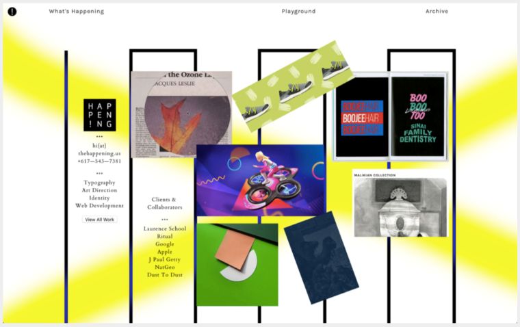

The Happening Studio
Unreadability. UX does not play the main role anymore, but aesthetics.
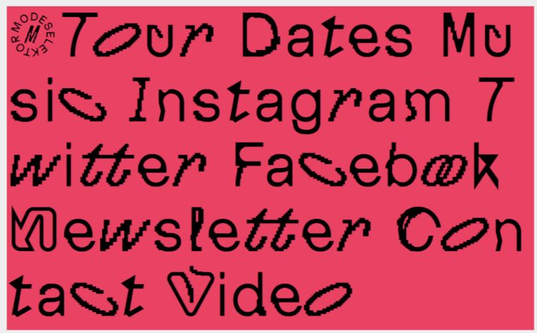

MDSLKTR
No need to embed Intuitive navigation. The trend supports suddenness and experiments with text blocks on the site.
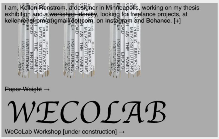

KR [2018]
Web brutalism does not require any value and is often abstract. It has to trigger an emotional response from the user. It should not be logical and understandable.
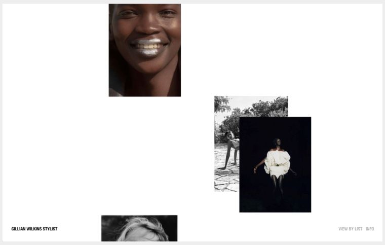

Gillian Wilkins
No alignment. No more frames, grids, rulers, or guides: web brutalism deliberately shifts objects and creates a sense of chaos.


I type NY
Styles are optional. Pages may be designed on bare HTML.
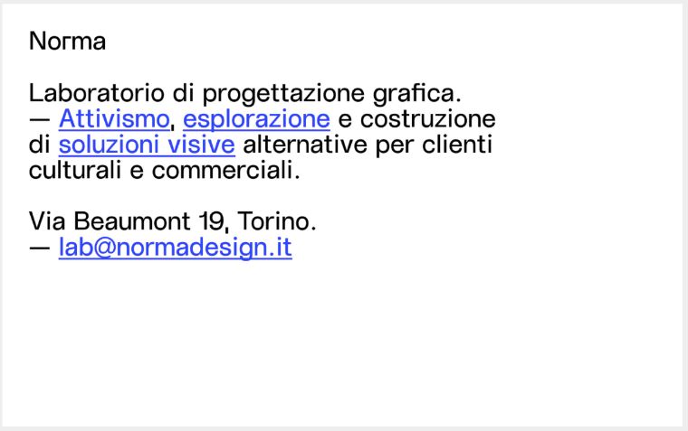

Norma
What differs brutalist design from other styles
It is rather easy to recognize that that is exactly is when you see the layout. It does not have any fine or elegant technique. But some people may like the trend because of his rudeness. Here are some features that make unique from other streams.
- Solid, often white or black backdrop without textures or shadows.
- Sharp colors, unreadable text, and popup windows.
- Absence of techniques, no shadings and gradients.
- Typography applies only one kind of space or only one font.
- Overloaded design, letters stick to each other, flat elements.
- Lack of hierarchy.
- Hyperlinks are underlined and buttons look like buttons. These two segments are the only a user can click.
- Components are developed in analog style.
- Absence of symmetry and spaces.
- Lack of an authentic color palette. The most common are red, green, and cold, dull tones.
- The layout makes an impression of one with many visual errors.
- Animation is not present.
- Images are either missing or black and white.
- Simple page navigation could also be ignored. These are usually one-page sites.
Discover several examples of these characteristics, all borrowed from www.brutalistwebsites.com

Perfect Mag
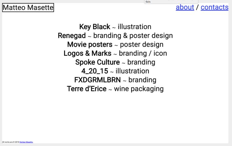

Matteo Masette
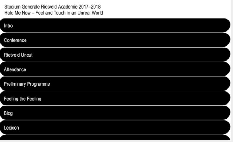

Studium Generale Rietveld Academie 2017-2018
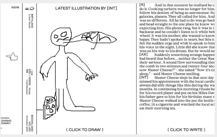

Boook.Land

Kostas Murkudis
Benefits of brutalist web design
Businesses can benefit from the use of brutalism when using it moderately. There is no sense to break the visual hierarchy, the navigation system familiar to users and the logic of interactions, following the only goal – to stand out and have the effect of novelty.
Experts from Webdesigner Depot consider that:
- The trend boosts the site conversion rate.
- Speedy downloads reduce the bounce rate.
- Eight out of 10 customers will not return if they are disappointed with the efficiency of the page.
- One second of delay decreases the conversion rate is 7%.
Disadvantages of brutalist web design
May look very poor for amateur customers, and therefore, could be unsuitable for certain kinds of businesses that require complementary decorations and functionality delivered by more complex web solutions.

A website of an interactive designer David Penuela
It may look too unusual for enterprises that have nothing to do with creative industries that prefer visual and interactive content rather than texts.
Diego Iglesias Gómez
Read Also
61 Awesome Free Resources Every Designer Should Use
TOP 5 Design Conferences 2020: Which Industry Events To Attend In January & February?
TemplateMonster Podcast For Designers