Tips To Create Best Game Icons for PC and Mobile Games
Table of contents:
- What’s a Game Icon?
- Game Icon vs Logo
- Tips to Design Best Gaming Icons
- What Software To Use Creating Videogame Icons
- Free Video Game Icons
- Examples of Game Icons Used In Web Design
- Over To You Now
In the modern online world, there are endless stimuli competing for the user’s attention. That is why many decisions are made based barely on the first impression. For game developers, there should be a way to quickly attract the user’s attention. They use recognizable video game icons.
These game icons can be seen on all kinds of screens and app stores:
- You’ll see them on your desktop, representing the games you’ve installed on your PC.
- You can also come across them on your Xbox One if you’ve installed some games there.
- You’ll also see them on your phone, representing the apps and mobile games that you’ve installed.
- Steam game icons are used across Steam digital distribution service platform.
- And of course, you’ll come across tons of gaming icons on App Store and Google Store.
As a user, you’ll see a certain game icon every time you play the game associated with it. That’s why the appearance of video game icons often influences the user’s decision to play this or that game, especially on mobile.
What’s a Game Icon?
To put it simply, games icons are square images that let users discern games visually on their devices. A game icon is meant to let users unfamiliar with the game grasp what the game is about. Moreover, video games icons are a way for web developers to give users a sneak peek into the feel and atmosphere of the games they create.
A game icon plays the role of the game’s visual anchor. It’s a small image most strongly associated with the game. That’s why icons for games are a piece of game’s branding. They should not only communicate the essence of your game but also look attractive and eye-catching.
Game Icon vs Logo
Some people mix such terms as app logo and game icon. Certainly, both video games icons and logos share certain branding qualities. However, these are, in fact, two different pieces of graphic design, designed according to different conventions.
It’s not a secret that the majority of logos come in vector format to be 100% scalable and fit for both online and offline media. At the same time, games icons are raster-based products that are meant to look good online in a square canvas. Game icons are adapted for specific uses, sizes and contexts.
Tips to Design Best Gaming Icons
Technically, there’s no wrong way to create a game icon. Unless you mess up with technical parameters, you’ll get a game icon right. However, certain icons will work better than others, driving thousands of new players to them. Below, I’ll cover my pieces of advice that will help you to create only the best videogame icons.
Your Icon Should Stand Out
Let’s say that you’ve created a game and need a video game icon to make it available in one of the gaming marketplaces. Of course, you want people to notice your game, download it and play all day long. For this, you need an icon that will somehow catch the user’s attention.
At the same time, application stores are crowded with games. And even more mobile games are developed each day. That’s why the stores are crowded with knock-offs. If a certain game turns out to be a hit, similar games will pop out like mushrooms after the rain. Their icons will copy the original hit as well.
For example, in the past few years, you’ve perhaps seen a handful of yelling warrior videogame icons. Initially, these icons were tested and appeared great in attracting clicks. That’s why so many game developers jumped on the bandwagon that the icons depicting warriors with open mouths now seem ubiquitous and passé.
As you can see, these icons are all the same. That’s why they lose points as endless iterations of the same concept. The unoriginal nature of yelling warrior icons suggests that they’re around just for attracting clicks and extracting profit from game players.
As a creative and invested developer, you can’t afford yourself to jump on the bandwagon. If your video game icon is trite, convoluted or run-of-the-mill, it’s got no chance to win user’s attention against better video games icons. Instead, you need either a completely original game icon or the creative app that adds a new spin to the already existing icon concept.
Research the Competition Prior To Creating The Icon
Above, you’ve just understood that having a unique game icon is a pretty important thing. However, good ideas don't come out of the blue.
It would be a smart thing if, prior to sketching out the video game icon, you research the competition and analyze what your peer developers have to offer. You’ll see what imagery others use for similar gaming icons. Pay attention to the most popular games similar to yours. What are their icons like? Why do these icons win more clicks? If you’re able to answer these questions, now you have a better idea of what the icon for your game should look like.
Keep It Simple
You should keep your icons for games simple. The more minimal your app icon, the easier it will be to discern it on different screens and in different sizes. Every detail of your web icon should have a purpose and a reason to be there.
Create Focus
When creating a mobile game icon, the best strategy is to pick a single visual element and build your icon around it. Within the limited square space of the icon, it’s next to impossible to nail it down with several main elements on a small icon.
That’s why, when designing your game design icon, pick its central or main point. This element is supposed to catch the user’s attention and be strongly associated with your app. In other words, the focal icon element should both catch the essence of your game and express it with the simple and idiosyncratic look. The concept of focusing on a single object creating the icon helps you to have a more potent end product with a clear and focused message.
Make It Recognizable
Well, users won’t have time to scrutinize your icon to figure out what it stands for. Your mobile game icons become recognizable if they’re connected with the essence of your game and represent the unique essence of it.
To have a truly original icon, you should use your skill of abstraction and come up with some really creative concept still connected with the pith of your app.
Snapchat ghost icon serves as a good example of this approach. At first glance, there’s nothing that ties a ghost and a messenger together. However, once you try the app, you’ll understand that the ghost stands for the self-destructing nature of snaps (i.e., media and messages exchanged via Snapchat). You can see a snap for a moment. However, as the given amount of time passes, it will vanish like a ghost.
However, beware that you should not go too “abstract” when making your video game design icon recognizable. If no-one except you can get the tie between your video game and the icon you’ve created, you’ve probably gone too far with this approach.
Perform A/B Tests
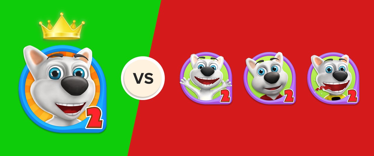
Painters make several picture drafts before choosing the one to use. You’ll also hardly lend with a single version of your icon. Better create a couple of variations to A/B test them and see which one works best for your game and yields the largest number of clicks. I recommend that you use Google App Developer console and A/B testing tool inside it.
What Software To Use Creating Videogame Icons
There are a number of ways in which you can get your game icon design done. If you’re on a tight budget, you can either create the gameicon yourself or use one of the free video game icons from the web. Of course, you can adjust these icons to 100% match your vision. If your budget is larger, you can also consider using a premium gameicon or hiring a web designer to create a custom icon.
If you want to create the gameicon yourself, the best software to use is, of course, Photoshop. It will be the most adequate solution, including all the tools you need. Moreover, on the web, you’ll find a dozen of good YouTube video guides explaining how to create professional video game icons.
You can create icon assets from scratch or grab them from a certain free resource. You may also take the assets directly from your game. For example, think of Temple Run icon depicting an ancient temple face. The icon was taken directly from the game and appears there in many places. Pulling the temple face out of the game and making it a game icon, helped the team to get a simple, engaging and recognizable icon they needed.
If for some reason, you don’t want to work with Photoshop, certain alternative tools also cope well with the task of creating modern video game symbols. You can use the following web tools:
These visual editing tools are both newbie-friendly and free. That’s why I can recommend them for beginners. Take your time to play around all of them, to see which one is the most convenient for you. These online tools won’t be better than Photoshop, but you can still get your job done with them in an awesome way.
Free Video Game Icons
If you don’t want to create your game icon design from scratch, you can search the web for the free video games icons. The web is the place for sharing, and designers often share free video game icons to help you to find the iconic identity of your game. Check out the best free game apps icons below:
Gaming Icon Pack
Free resource platforms like Flaticon offer you thousands of video game icons, available separately or in packs. This game icon pack includes fifty unique flat icons that represent a range of mobile gaming related concepts. All the game icons feature a single focal element inside, and keeping your icons focused and simple. These free game icons are available in a range of formats, such as SVG and EPS (vector), PNG and PSD (raster).
20 Free Sci-fi Game Icon Pack
Cosmic imagery is trendy on the 2019 web. By using these attractive space-related icons, you can give your video game a cool visual identity. This game icon pack includes twenty icons in total. Each of these mobile game icons has a resolution of 128x128.
Video Game Icon Pack
This free pack of free video game icons offers you fifty-one colorful icons for different gaming genres and purposes. A number of icons are quite creative and can be a good choice for your mobile game project. For your convenience, the free game icons inside this pack come in vector SVG and EPS, as well as in raster PSD and PDF formats.
It may be the case that you won’t be happy with any of the free game icons on the web. Then, it makes perfect sense to check out the premium icon sets out there. I’ve included some ideas for you as a bonus.
12 Premium Flat Rocket Iconset
A depiction of a flat-style rocket will make a perfect mobile game icon. This video game icon pack includes twenty space rocket designs that will make your game more clickable on app marketplaces. All the icons are available in four popular formats: AI, EPS, SVG, and PSD.
Jumbo Flat Icons Pack
Jumbo is a huge flat icon pack including more than 1,500 unique icons divided into 30 categories. Inside this video game icon pack, you’ll find the icons for next to all game genres and purposes. The icons come in a range of the most popular formats, ensuring that you can customize them within your favorite visual editor.
Examples of Game Icons Used In Web Design
Still not sure what the best icon for your PC or mobile game will be like? I’ve looked through the top games on Google Play and App Store and was able to see the major trends for various game categories. I’ve sorted the examples of game icons by game category and analyzed the typical colors and elements of these game icons. See the results below:
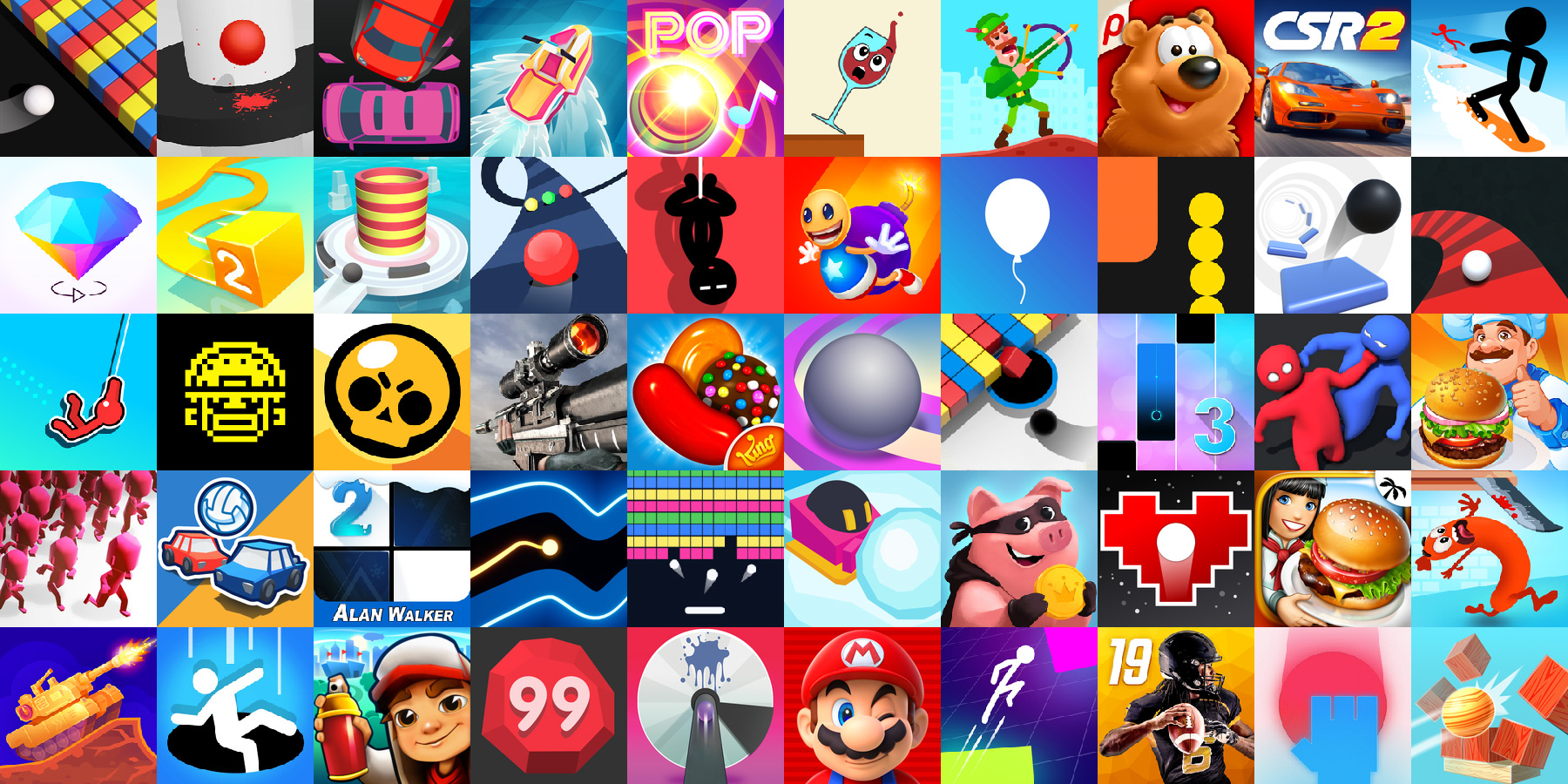
Arcade Games
Arcade game icons are often created in cartoon style using lots of geometrical forms and funny elements. Many arcade icons emphasize creating a sense of motion with their elements.
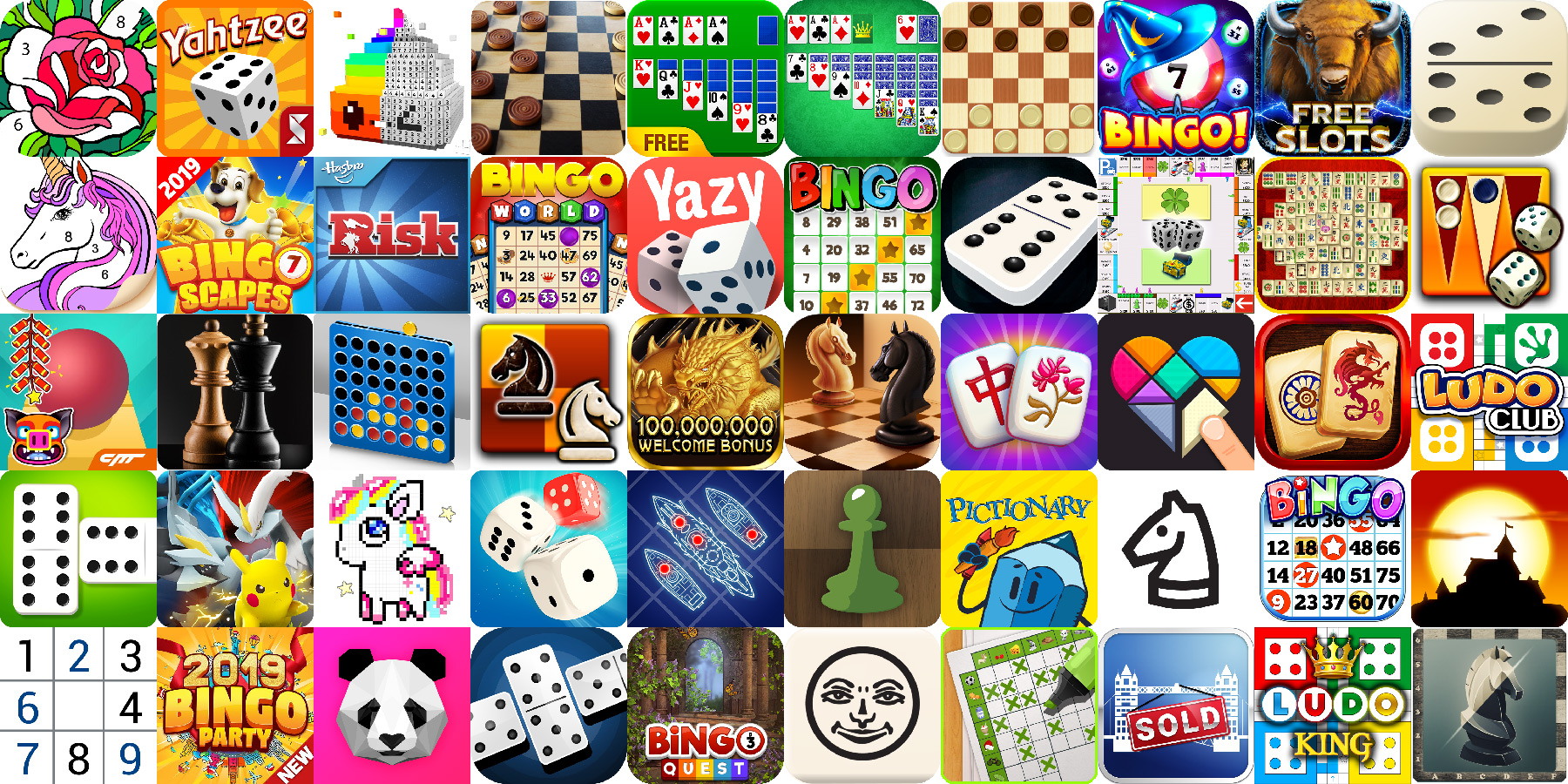
Board Game Icons
The majority of board game icons come in retro style, abounding with elements and looking quite cluttered. So, if you happen to create a mobile/PC board game, it will be smart to go for a more minimal and sleek approach to make your icon stand out. You’ll see that many board games icons feature game names on them. Try to replace letters with the game symbols or elements to keep your game design icon recognizable at glace.
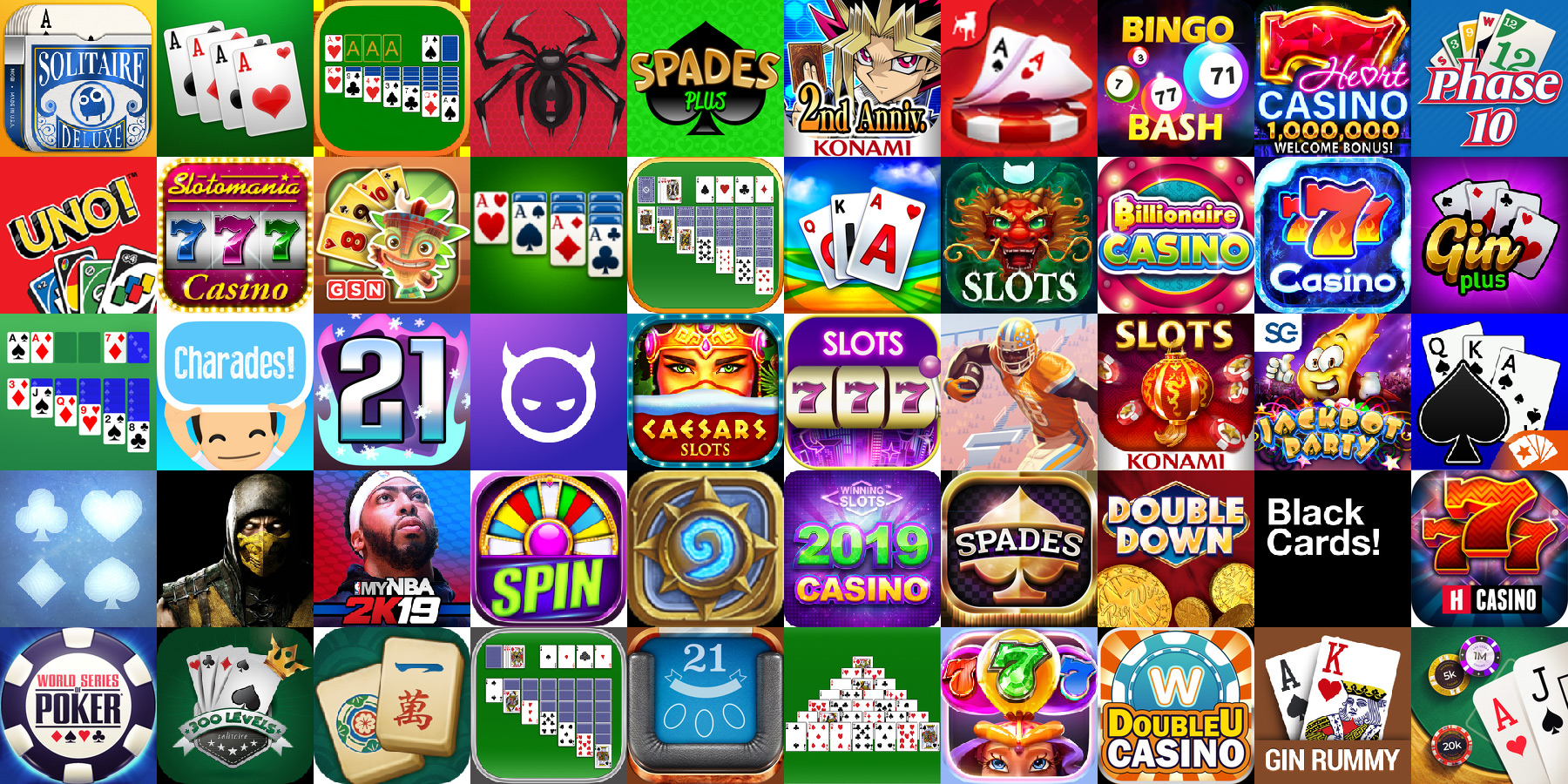
Card Games
Card game icon designs are either green or purple, featuring playing cards and slots. Ace is one of the most popular symbols, standing for good luck and victory.
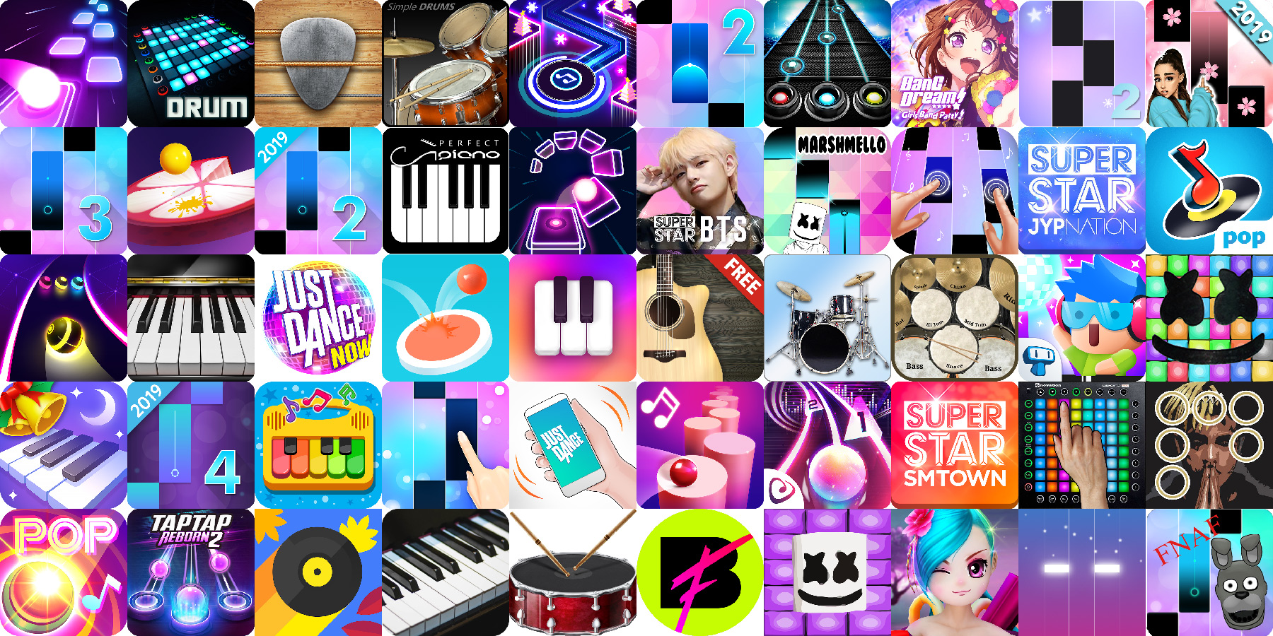
Music Games
It’s not hard to guess that light purple is the most popular color for this icon category. To create a certain color interplay, designers also often include such colors as light pink and blue. Piano tiles and other music-related elements are often present.
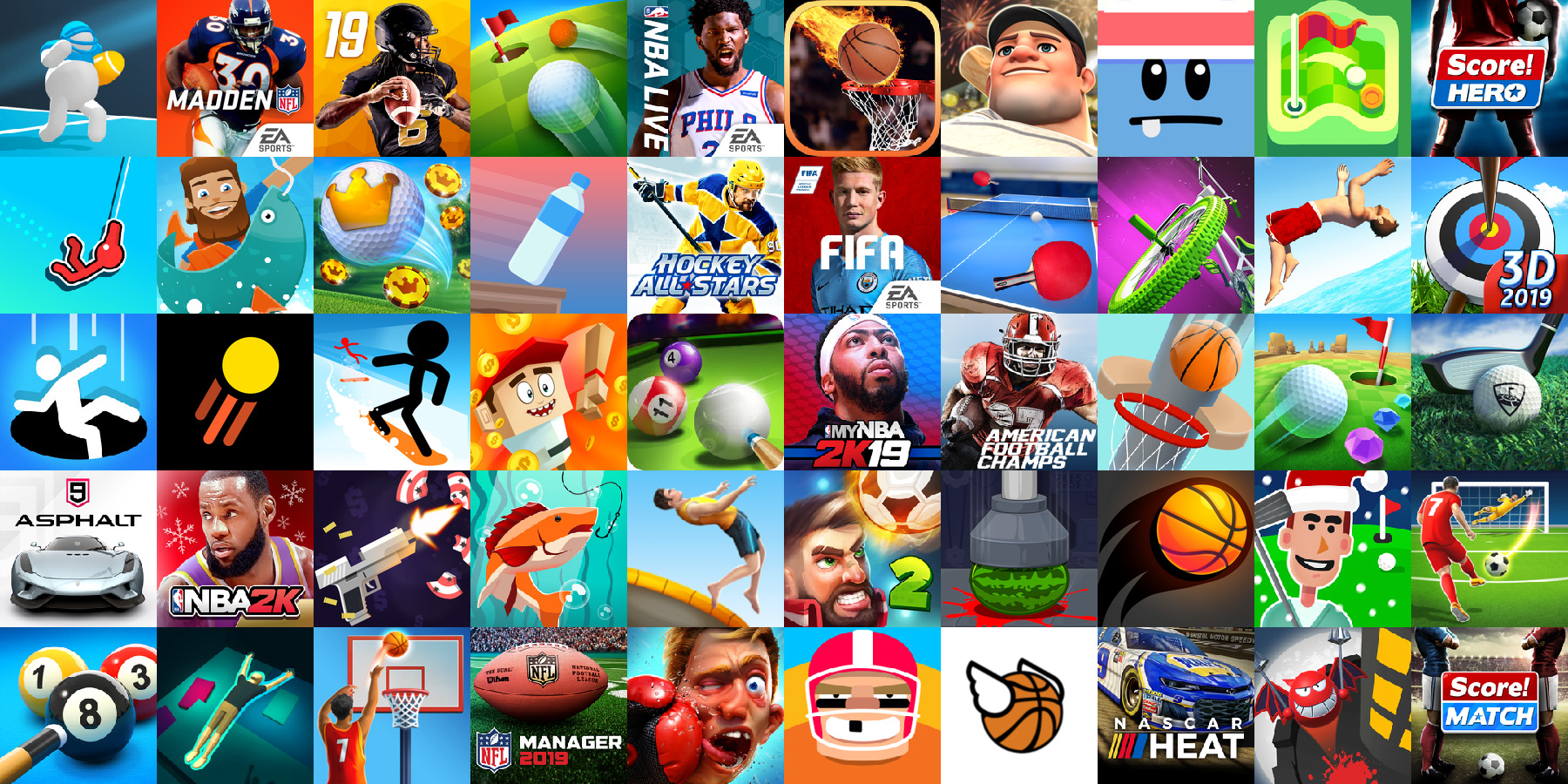
Sports Games
Sports game icons feature all types of balls and human figures in motion. The game apps icons can be either realistic or cartoon. The most frequent icon colors are light blue and green.
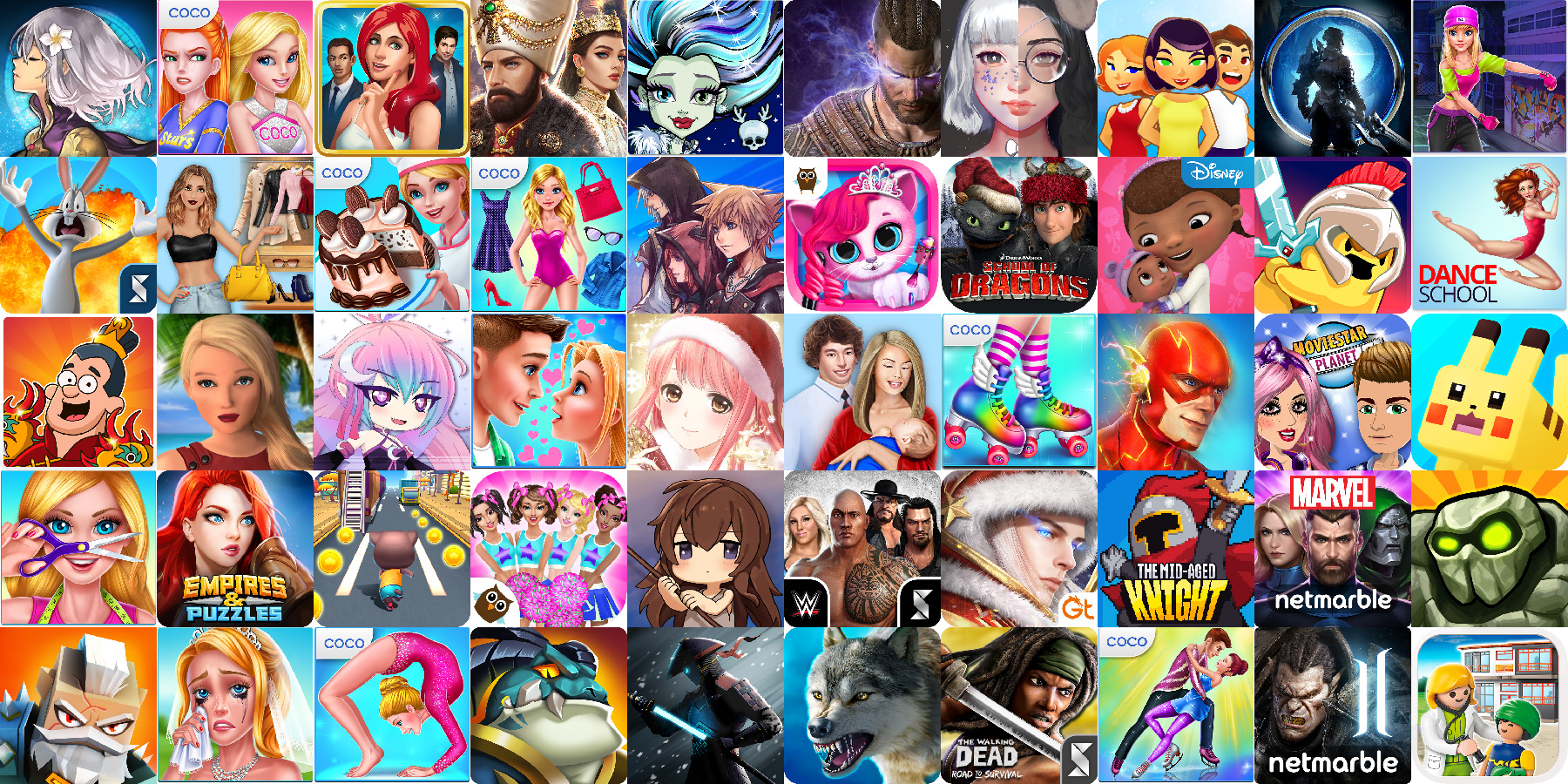
Role-Playing Games
Role-playing games make it to the top with well-thought characters and faces. There are two main color palettes popular: the shades of light neon pink and obscure colors. The typical imagery styles are either manga drawing or something inspired by heroic fantasy.
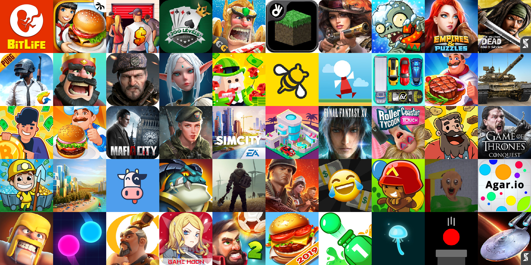
Strategy Games
This is the category where the angry warrior face and all its iterations pop up most often. The style of these mobile game icons is inspired by the fantasy genre and often uses the dark color palette and realistic character depictions. If you’re supplying a new game to this category, make sure that you have an original icon concept that will help potential users to choose your game over others.
Over To You Now
The game icon is a small square image that can highly influence the conversion rate of your game. If you already have a mobile game or plan to launch one in the near future, make sure to closely analyze the icons of your competitors. Then, come up with a concept that is simple, focused and catchy. Most importantly, keep in mind that a good game icon is the result of multiple iterations and tests. Don’t be afraid to experiment and, I’m sure that soon you’ll create the icon that 100% reflects the concept and feel of your game.
Have you ever created a game icon? If there are any tips that I forgot to mention, share them in the comments.
Stay tuned for more!
Get more to your email
Subscribe to our newsletter and access exclusive content and offers available only to MonsterPost subscribers.


Leave a Reply
You must be logged in to post a comment.