Trust Signals for eCommerce Websites and How to Use Them
Every purchase is all about decision making. In this process, we tend to compare two, three, sometimes a dozen of options, weigh up their pros and cons with the intention to find a better and cheaper one that suits our needs.
Product description and photos sometimes are not enough when completing a purchase. People need more reasons to trust you so you should be prepared for this.
According to a Taylor Nelson Sofres's study carried out in 2006, customers complete only 70% of online purchases because of the low level of trust. In another survey by eConsultancy, respondents were asked: “When you buy something from a retailer you don’t know well, how would you decide whether to trust the website or not?”.
And here are the results:

To break customers doubts about making a purchase online, make sure you can provide a new website visitor with the following features I collected in the checklist below:
1. Payment Assurance
- By offering your users a wider choice of payment options, you show that you care about the convenience of the payment process.
- Customers prefer to see familiar payment systems' icons, even if they aren't going to use them.
- According to the Bizrate Insights study, one of the main factors of choosing this or that payment method is a customer age. Besides the two major payment systems (Visa and Mastercard), PayPal tends to be a popular payment option for younger shoppers. But when talking about seniors, it’s a completely different story. Amex ownership is the highest in this group, with 28% of seniors Amex card users; meanwhile, only 15% of Generation Y shoppers has an Amex card.
- Many payment gateways are flexible enough to give customers an opportunity to shop using their smartphones.
- Certain payment gateways are only eligible in specific countries and currencies. Having different options will appeal to a global audience.
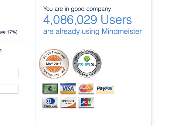
- In a survey conducted by eCons it has been found out that 58% of respondents left the checkout page due to concerns about payment security. So, make sure to create a clear and simple checkout page. Also, don’t forget to display your SSL and PCI badges, just like MindMeister does as it’s shown in the screenshot below.
2. Ratings and Reviews
ReviewsAccording to the Websitebuilder analysis, consumers review is significantly more trusted (almost as many as 12 times more) than manufacturer's’ descriptions. Customers would rather trust other customers, than an unknown seller. Product reviews, testimonials, and other users’ feedback are extremely important in decision making as they at least maintain a semblance that the store is real. Moreover, negative reviews could also bring some points to your karma and wallet if you give a smart answer to them. 94% of customers who had a negative shopping experience became loyal when they were satisfied with the seller’s reaction and answer.
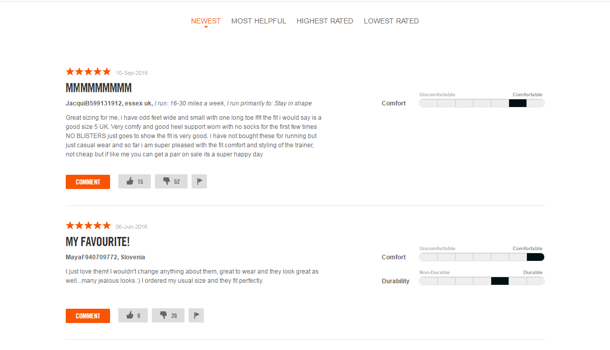
Adding some filter conditions to the reviews can help your customers to make up their mind in your favor. For example, here’s how Nike lets you sort the reviews on the product page.
Before a client looks through the reviews, the first thing that catches his eyes is a rating stars symbol with a summed up score right next to it.
Sometimes half-filled stars don't give a clear idea of product quality. Nike has come up with a nice solution on how to deal with it by showing the percentage of reviewers who recommend the product:

You can also customize your rating system like Newegg store did by replacing cloying stars to the brand elements.

Reviews and ratings on 3rd party websites
Stimulate customers to leave reviews on third party websites and give them the opportunity to see this information. For example, reviews on Facebook are great as you can always check if the profiles are real, and it’s harder to imitate customer activity there. The best level of trust can be gained by websites that check customer reviews or at least check their identities. Look for sites as www.trustpilot.com and ask your customers to leave feedback on them as well.
3. Returns and Refunds Policy
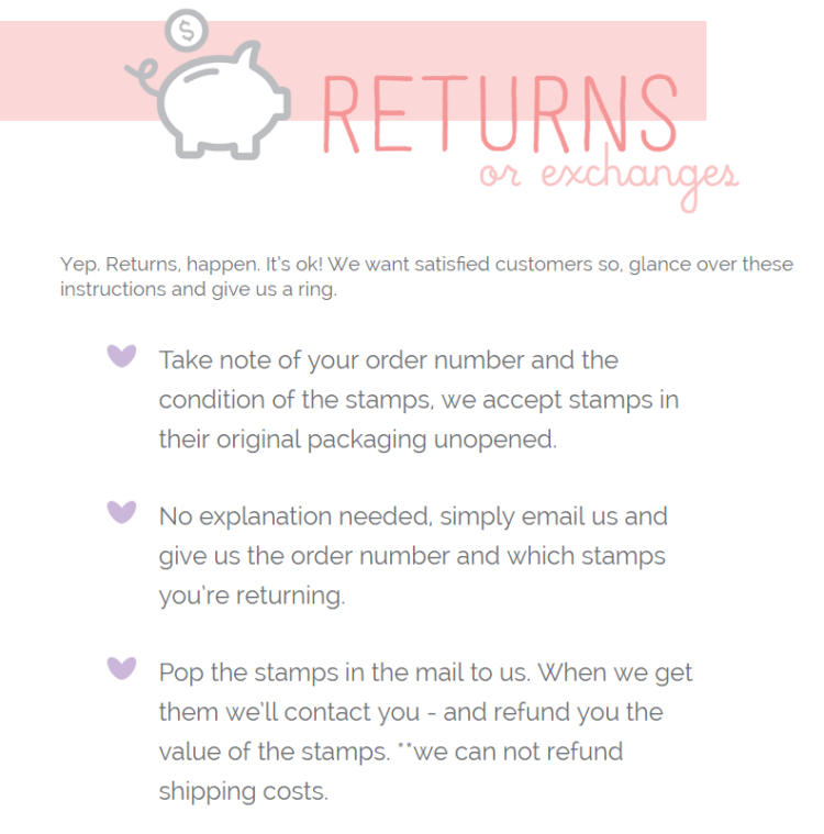
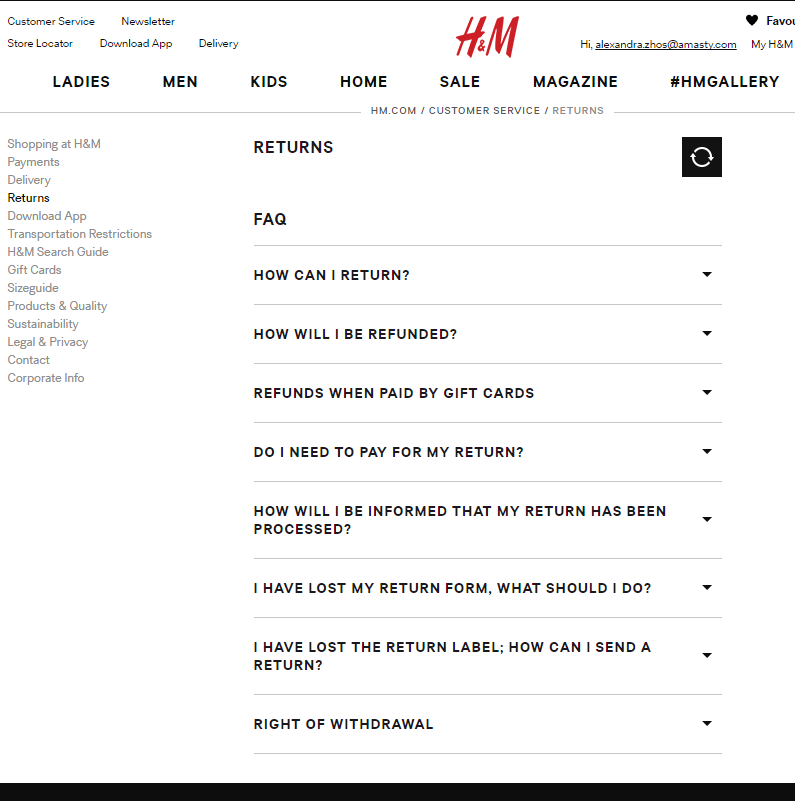
Your potential customers need a guarantee that they won’t get into trouble if something goes wrong. That’s why you need to ease their worries with Returns and Refunds Policy.
Have a look at the following examples:
4. ontact page
Don't be short on information about yourself and your business. Customers prefer to see that you are a real individual or a registered company. Only fraud sellers have reasons to hide their real addresses and contacts.
For example, see the Amasty contact page: it mentions the ticket system, email address, phone number, and some real addresses of registered offices around the world with a map, and a contact form, too.
Anyway, the minimum contact page checklist is:
1) a short and clear description of your company
2) an address and a map
3) phone numbers, email addresses and/or other legit ways of contacting you
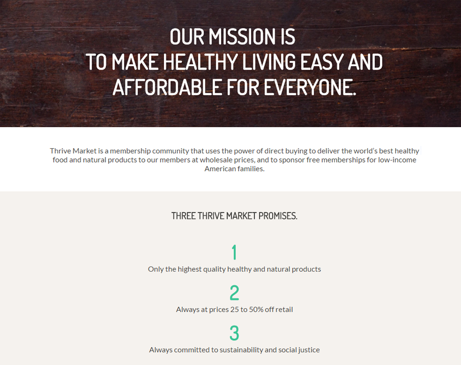
You can support the official information about your company by a mission or a history page. Additional facts that can prove your existence and good reputation are useful for your image as well:
For example, you can promote your business mission like Thrive Market does:
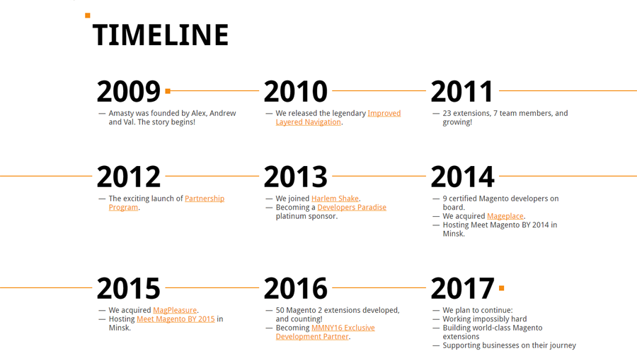
Or design your story using a timeline like Amasty did:
5. Third-party badges and certifications
About 13% of customers who dropped out on the checkout page mentioned “concerns about payment security” as the main reason.
In some surveys, more than 61% participants said that they had declined the purchase because of the lack of a trust proof.
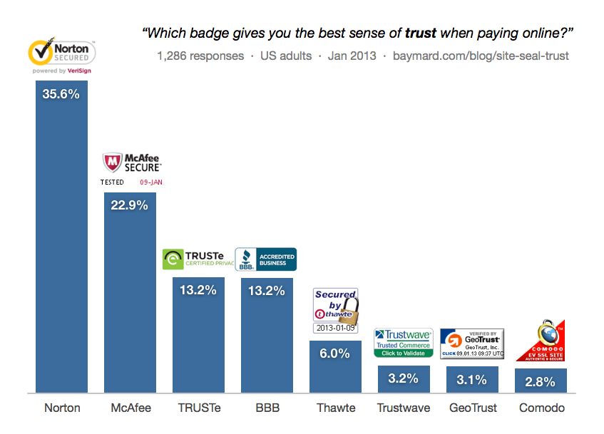
But which badges work best? According to a survey from the Baymard Institute, Norton protection seems to be the most trustworthy to 35,6% of customers, and McAfee being next to it.
6. Privacy policy
A privacy policy is a declaration you are making to your website visitors about your aims and methods of gathering and storing their personal data.
What your privacy policy should look like is really up to your organization. If you have some specific issues, don’t neglect a chance to consult with a specialist in laws related to digital and online media. There are some specific websites that can validate private policy specially for your business and your country.
The Better Business Bureau has a nice sample. But don't forget to tailor it to your organization - this is not a one-size-fits-all solution.
7. Terms and conditions
Having Terms and Conditions agreement for your e-commerce store is essential for a number of reasons:
- It protects you from liability and clarifies the purchasing process
- It can be used as a reason to cancel accounts that do not comply with your terms
- It protects your store’s intellectual property
- It sets out the way in which any disputes will be handled
- It also allows you to use payment gateways with credit card operators (which require you to have this agreement and a Privacy Policy before they will let you use their services)
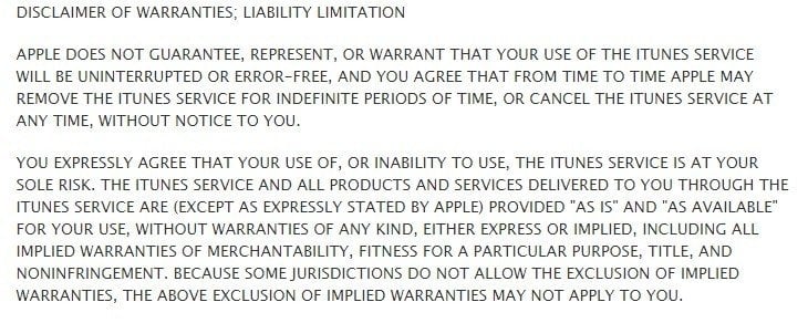
Here’s an example from the terms of Apple iTunes, showing their limitation of liability clause:
There are two ways of displaying your terms, known as browsewrap and clickwrap.
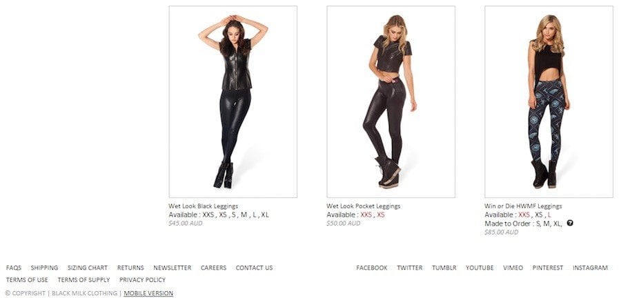
Most websites display the link to the Terms and Conditions agreement at the bottom of each page, as well as at the checkout screen. This is a “browsewrap” method, where a customer needs to go to another page to view your terms.
Here’s are some examples from Black Milk Clothing. You can see the “Terms” displayed in the bottom left corner:
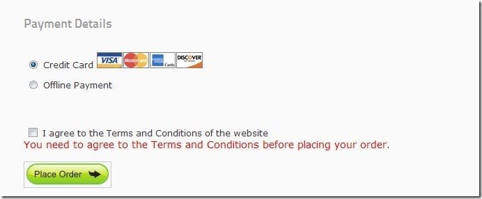
Clickwrap method is when the user clicks “I agree to the Terms” either by ticking a check box or clicking a submit button with an “I agree” statement written above it.
Here’s an example of a clickwrap method explained by Cartviper:
In general, make sure that appropriate terms and conditions can be easily found on all steps of the purchase.
8. FAQ page
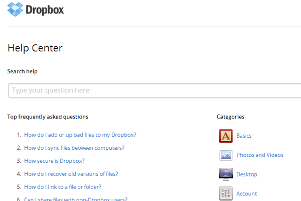
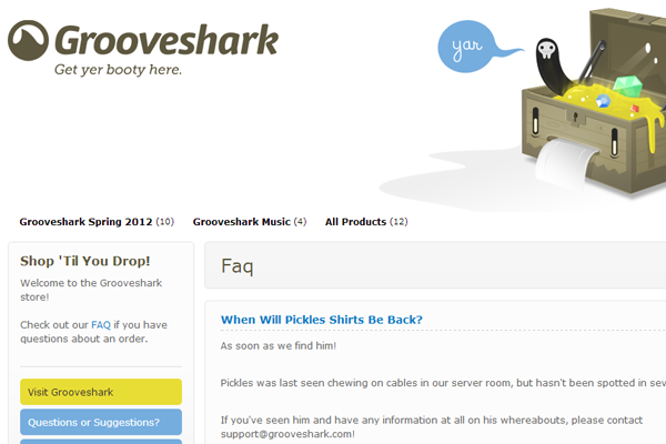
Answering customer questions is the main purpose of the FAQ page but it can be a much more powerful tool than you realize. It’s a powerful, simple and quick way to bring extra benefits to your business. You can identify yourself as an expert and a FAQ page is a perfect platform to demonstrate your expertise.
Customers who can see your attempts to be transparent about addressing queries will consider your business as trustworthy. This improves the perception of your brand and also instills customer’s confidence.
9. Media mentions and Social shares
Even if your business seems to be serious enough, it needs a public proof. Social shares, media mentions, “our clients” list on the main page - it’s all about that. For example, look at what Buffer does to transmit the idea of community:
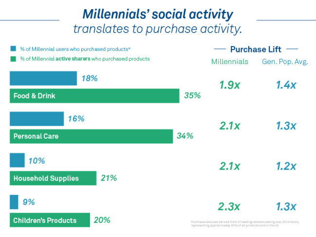
A research has found out that, nevertheless, pre-purchase social shares encourage to buy: millennial shoppers buy a product they’ve personally shared on social media approximately two times as many.
A proof of the positive experience with your store is a super-powerful thing. Don’t be shy and ask your customers to share their purchases and photos in social media. But what’s more important is to aggregate their feedback and display the widgets on your store pages:
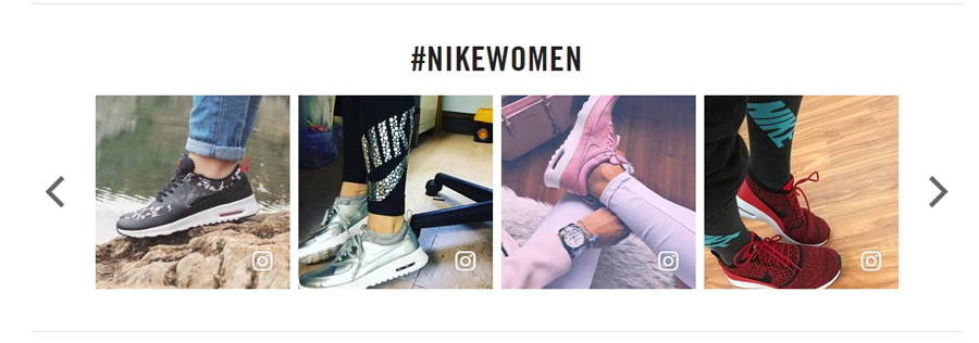
And one more thing: don't take your customers for fools. When it comes to social shares, likes, ratings, and reviews, “Do it yourself” is a wrong motto. Nowadays everyone understands that it’s not so hard to fake them.
10. Product certificates and documents
If you’re a reseller, some badges or links to manufacturer websites where you’re listed as an official seller are welcome! What is more, if you state that the products possess certain qualities, find ways to prove it.
For example, Jim’s Organic Coffee website has a page which explains why the products deserve to be called organic.
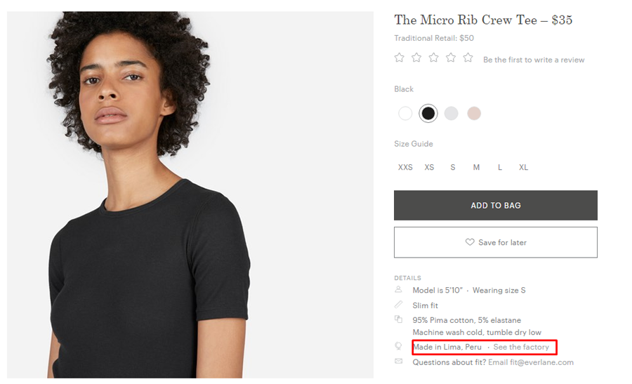
The Everlane brand supports fair trade, and you can check the country and the factory where an item was made:
Conclusion
With time, you’ll understand the needs of your audience and what makes them trust you and your business. And the best method to know how exactly to use trust signals on your site is to perform A/B testing on your store. While some of the trust signals are basic and obligatory, the others can and should be tested inside out, such as security and payment badges.
Don't forget to have a look at any of these marketing templates.
Ready To Go Store Service
This service allows you to get your new store installed and configured without losing products from your existing website. Besides basic installation and configuration (with your shipping, payment, taxes, currencies and contact details) you will also get your products imported to your new website. Furthermore your site will have the company logo, slider and banner images, the content of valuable pages (About Us, Privacy Policy, Terms and Conditions, Delivery, Payment) and include required languages.
Get more to your email
Subscribe to our newsletter and access exclusive content and offers available only to MonsterPost subscribers.


Leave a Reply
You must be logged in to post a comment.