

While working on your website you could notice that the biggest part of the website content is always the text. And even if you diversify your text with a bunch of images, without the typographic hierarchy you will not be able to make it visually attractive and interesting to the website user.
So to those who want to do something about those boring and unattractive texts we compiled a short article to enhance your understanding of what the typographic hierarchy is.
What Is The Typographic Hierarchy?
Basically, this is the way to organize your content and help the reader to find whatever they are looking for and navigate through your article without any problems. Isolating important information and underlining it visually is a key thing to do if you want to keep the attention of your customer and actually convey the idea of your article or blog post to a website visitor.
Understanding the Typographic Hierarchy will result in a much more beautiful design of your website content and will serve you as a tool to communicate with your audience through the article, let them actually hear what you’re saying through the text.
Why don’t we take a look at some examples? So let’s say I’m running a sports website and has to post lots of news and articles on a daily basis. That means that my website visitors will have to read lots of texts and making the readability of my posts higher is a must for me.
What is right and what is wrong?
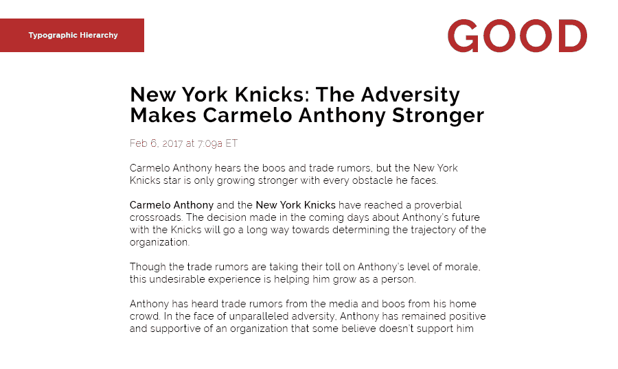
Here is an example of the news text without any styling and typographic tricks, this is how it looks if you do not work on presenting it properly.
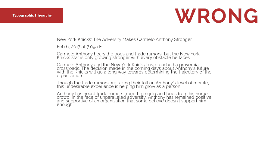
With such approach, the user will not be able to understand where is the heading of your post and what information should he pay his attention to since nothing is highlighted and there is no structure applied to it.
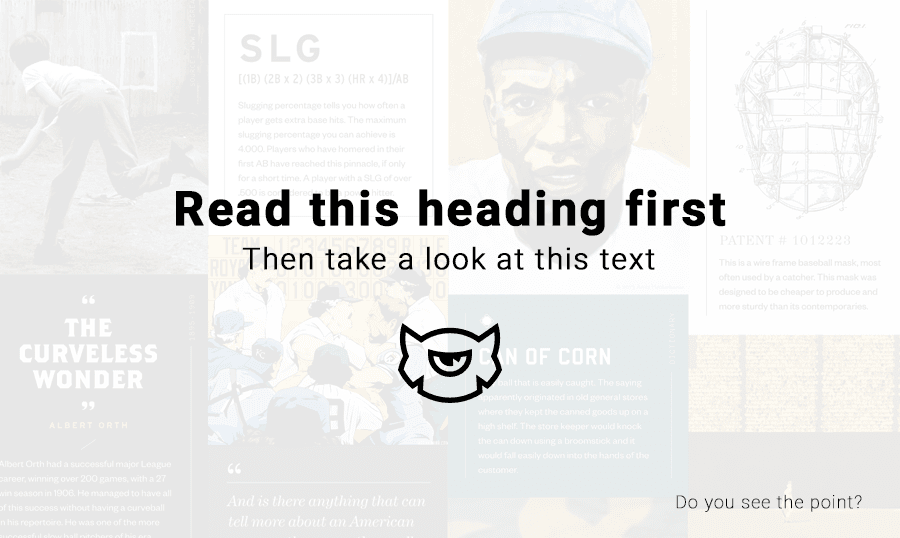
Here is how this article may look if you take a few moments to work on the typography. As you can see, now we have the bold heading and the data is highlighted below. The leading makes the body text much more readable and highlighting the main I also fixed the leading and it made the text more readable. I highlighted the ‘Carmelo Anthony’ and the ‘New York Knicks’ to point out the sides of the conflict described in this article.
Establishing The Typographic Hierarchy
Many designers and experts advise using at least 3 levels of the typographic hierarchy. This is always a must and such approach has been used since the old ages. Just check out any old newspaper and you’ll understand what I’m talking about.
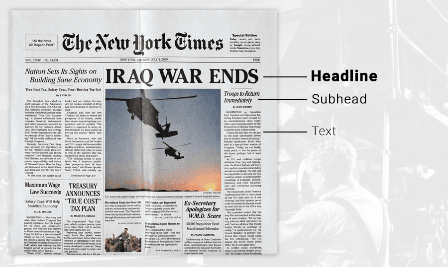
Yeah, time goes by, but the web still uses this old-school approach to the hierarchy. In order to ease your life, we decided to give you a heads up and showcase the existing levels of typography:
- Primary Level - this text will be the most noticeable on your website, so you should use bigger size and brighter color to highlight it.
- Secondary Level - this level is less noticeable than the first one, but it still should be bigger and brighter than the main content, it should stand out as well. This level usually includes the subheads, quotes and the text that should be separated from the main text.
- Tertiary Level - this one contains the main content and it should be least noticeable. Simplicity is the key, you don’t need to distract the customer from anything. Since all the other levels strive to bringing all the attention to the main text, the main text itself should immerse the reader into the actual text.
- Other Levels - these are created by simply playing with the styles applied to the Tertiary level.
Typographic Hierarchy Elements
The methods are all basic as hell, but working with each other they can create a truly beautiful content. Combining those with each other results in endless possibilities to improve the look of the texts on your website.
- Size

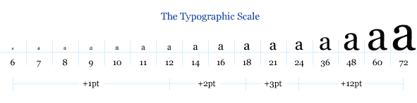
The easiest way to attract the attention to the certain part of the text is using different font sizes.
- Weight
Making some specific text bolder will make it stand out.
- Color

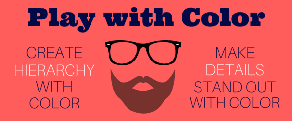
This is a crucial element that plays a huge role in the hierarchy. Highlighting text with the warm colors you will make it pop and cold colors will take less of users attention.
- Position

It plays a big role in relations of the text sections, so use it wisely.
- Capitalization

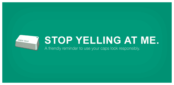
Yeah, you can definitely use it to highlight something, but be careful there buddy! You may end up looking like a screaming idiot and user will not appreciate it.
- Contrast
As I already mentioned in my previous article, contrast is truly important in design. Playing with the size/color/weight contrast will help you create the hierarchy.
Where's Your Spacing?


This is one of the most complicated things to master, but it’s definitely worth it. Remember: you will not be able to establish the hierarchy properly without using the spacing in your texts.
Choose the leading (space between the lines) very attentively and don’t be afraid to experiment. If you are not sure what leading value will fit your website, feel free to create a few samples and give it to the test group. This will help you to gather the statistics and see what kind of leading will give the best readability to your content.
Also, there is such thing as a paragraph spacing and it should be set correctly as well. Personally, I recommend using the value that equals half of your leading value.
And I hope it’s obvious to everyone nowadays that there is no need to fill up all the free space with the text, it will only confuse your reader and the overall reading experience will be horrible.
How You Can Achieve A Better Typographic Hierarchy

The theory is fun, but I understand that everyone wants to get more tips on how to improve the typographic hierarchy. In order to do that you’ll need to follow a few simple rules and I’ll note you those below.
Understand the content you work with


Content is a king, remember? So you have to treat it with respect.
This is where I should make a field note: if you are about to bring the typography hierarchy on your website to the next level, you should care more about your content quality and less about the quantity of posts. First of all, you definitely have to know what you are working with to understand how you can improve it. Let’s say you are a big website with lots of news posts, but it doesn’t mean that you can post them mindlessly without really getting into it.
In order to structure your content, you have to understand what are you trying to say, what thought you want to bring to the visitors’ minds.
With that being said, knowing your own content is a key to a successful structuring, don’t try to avoid getting deeper into your own content, it’s a slippery slope.
Sections and Paragraphs need some space
Don’t be afraid to separate those two, they are not supposed to look alike and cuddle up to each other. Give them some personal space!
This is pretty basic: sections consist of multiple paragraphs. The spacing between paragraphs is always noticeable, but should always be less than the spacing between sections.
If you set the same spacing between paragraphs and sections - your reader will be very annoyed with the feeling of the endless post.
The body text should be large enough
I cannot believe that I should explain this in 2017, but as I can see, many designers neglect this rule completely. The funniest thing that they act so surprised when the website readers do not finish their articles and do not like to read longreads.

Many of you will say that 16px is too big. To those, I say: Hell no!
Just try to read an article with the 12px font and you’ll see my point. You will not be pleased with such an approach while reading.
Use images closer to the related content
If you have a picture that goes with your content, you should always consider placing it right above the related content.
Readers are always processing the pictures much faster than text. They are used to taking a look at the picture and then reading the content related to the picture. So in case, you decide to place it after the content they will have to double-check if it’s not related to the next section.
This is an additional work for the reader’s brain and it’s not something he wants. You should always think how you can make the reader’s life easier and make the overall reading experience of the website user better.
Conclusion
Here is the deal: Nowadays people receive so much information that our daily dose usually varies around 150+ newspapers and I do not think that someone is surprised by that. As a designer you should work on presenting your content to a customer in the most efficient way, so do not afraid to dive into typography and learn the hell out of it.
Mastering the typographic hierarchy will make your designs simple and clean, so don’t waste any minute - organize your content properly!
If you are just too cool to design a website on your own, no worries! We’ve got you covered and prepared thousands of website templates, make sure you check them out!