Web Standardizing: Where Will It Bring Us to?
Web design is a dynamic thing. Each year, bloggers make predictions about the upcoming trends in design. There is one thing that’s all the time in front everyone’s eyes but it seems that it’s given the go-by. Look at following screen shots; see how much these websites are alike.
Mattbango, Design Intellection, Astheria.
That’s all because of web standardizing, for the last twenty years web design has been going by the path of complexity, techniques were getting to be more complex, technologies were getting more advanced. But still visual presentation of info somehow gets simpler. Colors gradually fade out, complex geometric forms are omitted, lines delimiting content blocks are getting thinner, thus increasing the amount of negative space.
How to explain web design fundamentals in public effectively? Use PowerPoint designer slides
.
Slowly and surely we are heading towards our future where everything will be alike, the one most futuristic novels and movies have described where people are nfc-chipped, barcoded species.
***
Standardization of web interfaces will bring us to the “epoch” where all sites will resemble each other, like two crowns in a rainy night. This has two possible ways of expansion:
- All websites will be alike, though it’s known that 46% of users give their hearts to visual coolness of the website, other 54% prefer functionality and usability. People got used to creative interfaces and they will still be created no matter what happens.
- Because of being alike, websites will be created with more efforts dedicated to making them extremely usable. Every feature, tool, function that is created will be made with twice as much efforts given to it. This will result in absolute intuitiveness, allowing user literally “switch off the brain” while running through the pages.
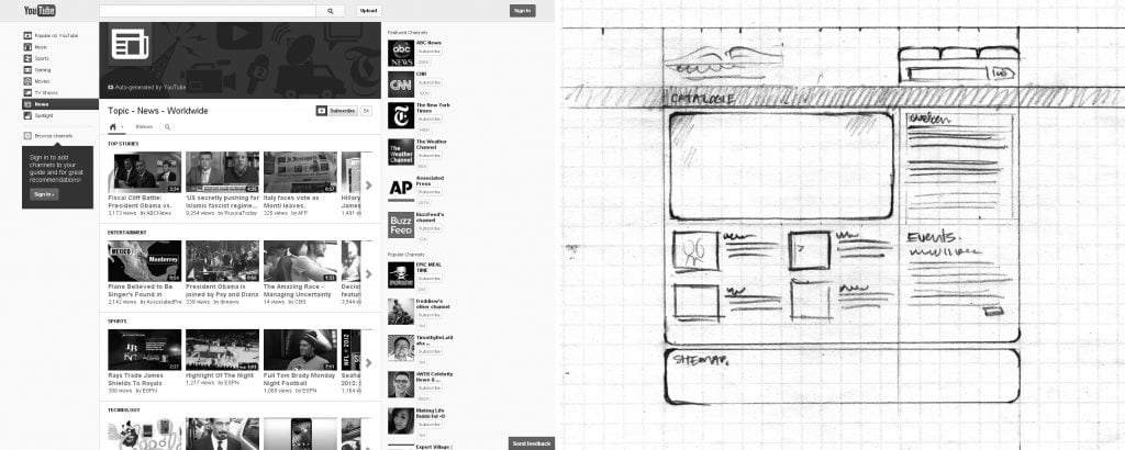
Look at the picture below. Left part is a screenshot of YouTube; right part is the sketch of some homepage.
The colors were grayscaled intentionally for you to see how minimal our future will be. As you may know minimalism is used in web design to reduce all unnecessary elements for achieving clean and super-efficient layout. If you are going to create website in minimal style you must strip everything down to its essential quality. Minimal style is focused on geometric abstraction and has only two rules:
1st RULE: you should keep only the most important things;
2nd RULE: you SHOULD KEEP only the most important things!
So why do we need simplified layouts? Some time ago Bootstrap “saw the light”, great amount designers, developers and users found this CSS framework really interesting and easy-to-use. It allows creating awesome designs simply doing Copy+Paste. Have you seen websites created with Bootstrap? They are all alike, check out the gallery BuiltwithBootstrap, you’ll see it yourself. Bootstrap is simply a trend, as any other thing in the history of humanity, let’s compare it with something diverse...
Jazz appeared as a combination of several musical cultures and national traditions. It originally came from the Africa. At the end of XIX century appeared ragtime. Subsequently, ragtime rhythms, combined with elements of blues gave birth to the new musical direction - jazz.
If we change some words in this sentence it will look like...
Bootstrap appeared as a combination of several techniques and design traditions. It originally came from Twitter. In spring 2010 there appeared Responsive Design. Subsequently, Responsive Design, combined with CSS elements gave birth to the new design direction - Bootstrap.
It’s a matter of evolution, one thing goes into another, or a combination of things result into appearance of something even more extraordinary.
Simplicity
The rise of simple web design started not that long ago. These are user-friendly web sites focused on delivering minimum visualization and maximum effectiveness in navigation and usability, giving visitors positive viewing experience. Using empty spacing around images and text, graphic designers create websites that look really clean, smooth and clear. Users prefer simplicity in presentation of content without using some extraordinary techniques (we are not speaking about gamification here), visitors will stay on the site longer if they could find what they came for easily. To create unique website designer needs to reduce noise and execute following steps:
- Use larger spaces to highlight important text;
- Use large content blocks that break the page (that can be specials, unique offers, content sliders);
- Use attractive images as the background for text and navigation(if necessary);
- Central alignment of the elements does not tire user’s eyes.
If these features are put together, you can create clean website that is easy to use and pleasing for the eye.
More Devices and Users
Recently mobile devices have become really popular. Everyone has a smartphone. As a result of increasing competition in the tablet market the prices are likely to fall, making them one of household goods. Pressing and gestures will soon be used as often as mouse pointing or clicking. In the light of these changes, websites should be fine for viewing on mobile devices.
Website designers should keep this in mind when creating layouts, navigation and placement important information.
All designs are targeted at mobile users, this is due to the fact that people simply do not use desktops, they've moved to sofas with tablets in their arms.
People, mostly, do not use mouse, they simply poke with their fingers or styluses into screens (nowadays, stylus is an analogue of a mouse), but the problem is often with the size of a finger, the touch area starts from 25 to 72 pixels wide (data is taken in accordance with minimum and maximum "sizes" of fingers).
Image Source: Hand browsing via Shutterstock
Responsive Interface
As the number of users who access Internet using smartphones and tablets constantly grows, standardization of web design is becoming more important than ever. Separate websites for mobile devices will not be able to endure the variety of devices.
Create responsive interface simply using special code, @ media queries, responsive web site will automatically adapt to any size and orientation. With the right mix of code and a bit of patience, web designers can create website that will look good and function regardless of which device you render it with.
***
Standardizing is a really strange phenomenon, the question is whether we need it? If all design creation will be alike, but more attentions will be given to develop usability this seems to be a good result. But what about aesthetic appeal? Clean websites do not arouse some strong emotions... What do you think about this? Express your thoughts in the comments.
Don’t miss out these all-time favourites
- The best hosting for a WordPress website. Tap our link to get the best price on the market with 82% off. If HostPapa didn’t impress you check out other alternatives.
- Monthly SEO service and On-Page SEO - to increase your website organic traffic.
- Website Installation service - to get your template up and running within just 6 hours without hassle. No minute is wasted and the work is going.
- ONE Membership - to download unlimited number of WordPress themes, plugins, ppt and other products within one license. Since bigger is always better.
Get more to your email
Subscribe to our newsletter and access exclusive content and offers available only to MonsterPost subscribers.


Leave a Reply
You must be logged in to post a comment.