Website Accessibility: What Is That and Why Is It So Essential?
The internet is such a global and pervasive phenomenon, that it affects all aspects of our life. Think about it, can you imagine the world without the internet? Well, I presume you can, I, myself, am from the generation that had no gadgets in their childhood (maybe except the electronic Chinese watch), but the fact the world will be completely different without it is something you can’t argue with. The web connects people all over the globe, helps us receive news and information, store documents, plan travel routes and even preserve our health. Yet, web accessibility is not always guaranteed.

They say, that web tolerates everything and everyone can come to the internet and learn something. It sounds great, but it is not true. There's a lot of websites, not accessible to people with disabilities. My friend, let’s talk about the website accessibility, why it is so important and how can you make your website fully accessible.
What, actually, is Web Accessibility?

About 15% of people on Earth have certain defects with hearing, seeing, movement or cognitive ability. Access to the information for such people is included in the list of human rights, but still, some websites are unreachable for them. To provide some level of accessibility the website has to be properly designed and coded.
Accessibility features
Color contrast
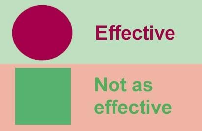
The subtle color transition could look really beautiful and sophisticated, but there are people who don’t see good enough or have some difficulties with color perception. Using highly contrasting colors (like black and white, yellow and black, red and white) could also look magnificent and also be convenient for such people.

Voice recognition
With Siri, Alexa and Cortana appearance, controlling your gadgets with voice is becoming more and more popular. And there also are people who, for some reason, can’t use their hands. However, all of them will be able to operate the website with voice only if it is adjusted for such manipulations.
Text to speech
People, who have big problems with their eyes or are completely blind use specialized software that translates text into speech. However, that software won’t be able to tell what’s on that picture unless you type some text as an alt description.
Layout and design
Complicated and original website design could impress the visitor, but it can also confuse him. If visitors don’t understand what they should do on your website – then you've definitely done something wrong. In this case, the easier your navigation and layout are – the better.

Notifications
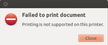
Some website owners don’t think that people need to be notified about the actions they perform. But when you fill out a form and then it disappears without any confirmation, this could be a rather unpleasant surprise. The same thing goes about error notifications. I hate “Invalid data” messages. When the error message clearly tells what you've done wrong and how to fix it everyone can save a lot of time.

Big control elements
Small buttons and clickable elements are good only if you want your visitors to never click them. PC users with normal agility will be able to click them, but those ones who enter your website from tablet or smartphone or older people with normally reduced dexterity would have problems targeting little control arrow. Make sure the most important buttons (like “Buy Now”) of your website are big enough.

Customizable content
Different people have different needs. Some prefer zooming out the text and images and to look at a bigger picture, others won’t be able to read the text if the letters are too small. If you give some customization controls into the viewer’s hands it will definitely improve the UX.
Keyboard controls
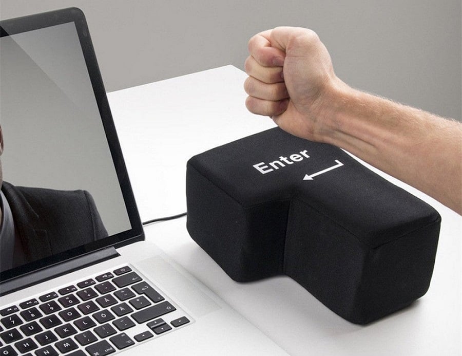
Not everyone can use a mouse. You could think that controlling it is an easy-peasy task, but there are people who have problems with coordination or can only use buttons on the keyboard. If your website could be operated by keyboard it would certainly make the life of such people easier.
Video Subtitles
Deaf and people with poor hearing also want to watch videos, but that’s impossible if there are no subtitles attached to it. Adding some text to the video is not so complicated as you could imagine, so you should think about it.
Of course, it is better to see once than to read thousand times, here’s a W3C Web Accessibility Initiative video that describes all those features in details:
Not only people with disabilities could have used those features. Contrasting colors could help when you try to read something on your phone under the bright sun. Subtitles in the video can help when you want to watch it in the loud place or in the public space where it is forbidden to make noise. Voice recognition will be useful if you temporary can’t use your hand and text to speech transformation will give you an opportunity to multitask. However, is it profitable for a website owner to implement such features?
How can Website Accessibility bring you profit?
Of course, you can say: “Okay, you listed me some advantages the people with disabilities will gain, but what should I get?”. That’s a little selfish, but usually, accessibility implementation demands time, efforts and money, so that is also fair. However, I have an answer – you should apply it to your website because web accessibility could make it more profitable.

First of all, the customization of your website according to accessibility requirements will improve its usability. The interface will become more convenient for all users, not only those that have disabilities. The more pleasure clients have to go through your website – the more often they turn back for you and the more friends they bring with them. You expand your reach and improve the traffic – one way or another it makes your business more efficient.
Secondly, web accessibility features improve SEO rates. Actually, Google can be called a “person with disabilities” too - it can’t hear the audio files and define what is on the picture. Text transcription of the audio files and alt notes, attached to the pictures help Google see it and find your website. The easier it is for Google to find you – the higher you climb in the search engine search rates.
Finally, in some countries, it is demanded by law to do everything possible for people with disabilities. Medicine packages with Braille notifications, inclined ramps near the stairs, sound street notifications – all those already became a must and website accessibility is also slowly being rolled out.
WCAG

To guarantee people with disabilities a high level of accessibility the Web Accessibility Initiative (WAI) within the World Wide Web Consortium (W3C) is constantly developing a document named Web Content Accessibility Guidelines (WCAG). That document provides the set of accessibility standards and ensures that they will be similar in all countries. It contains a set of recommendation on the things one should do to make his website accessible. Those recommendations are called Success Criteria and according to them, the website could achieve one of the three ranks: A, AA or AAA. The testing for a rank is performed by automatic systems and testers, who check if the success criteria are true for the website’s content and evaluate the usability of the platform.
The freshest version of the WCAG, the 2.1 version was published 5 June 2018 and it contains all the requirements the previous versions stated. It means that if the website matches WCAG 2.1 it will automatically also match all other WCAG versions. Every new version just adds new guidelines to the existing list. The previous version, WCAG 2.0 was accepted as an ISO standard ISO/IEK 40500, and the WCAG 2.1 as a European Union Standard EN 301549 standard.
How to make your website WCAG compliant with Website Accessibility Suite?
Of course, you can do all the necessary customizations manually by your own hands. You will have to carefully go through the WCAG 2.1 document and check every detail mentioned there. It takes a lot of time and effort, but there is also another solution. TemplateMonster has recently added a service, called Website Accessibility Suite and that is just the thing that will help you make your website accessible without spending a week on a WCAG 2.1 document.
This service adds a special panel to your website, giving some additional controls to the visitors. The users and potential clients will be able to customize the look of your website according to their specialized needs. They will be able to use the next tools:
- Contrast improvement. The user gets five variants of color modes, which include default one, night mode and three types of high contrast looks.
- Fonts customization. If the visitor will need to make text bigger or more readable (for example choose Sans-Serif instead of some complicated custom font) – this tool will help him to do that.
- Links highlighter. Sometimes links aren’t obvious even for common users, but this instrument will allow anyone to define the clickable parts of the page without searching.
- Heading highlighter. If the structure of content won’t be understandable for the visitor, he will have an option to highlight headers and subheaders in the text.
- Big pointer. The standard cursor could be too small for some people and they would be happy to make it bigger, so this tool is a way to give them that happiness.
- Magnifying lance. Zooming in the page could be very convenient and will help to understand the tiny details.
- Animation disabling. There are types of animation that could make people thick (and that’s not always because they have some disabilities), so they would be very grateful for an option to turn them off.
As you can see, this service will help you to deal with most of the accessibility features and make the user experience much better for the visitors. If you decided to comply with WCAG 2.1 document, this convenient set of tools will reduce the time spent on the process.
Please note, that the TemplateMonster offer will help you to make your website comply with the core basics of WCAG 2.1. However, every country has its own laws, based on WCAG, so please take it into consideration when building your site.

Conclusion
Improving your website accessibility will bring you lots of profit and also will make it easier for people with disabilities to reach it. If you want someone to be your client, you need to give him an opportunity to interact with your site. So don’t waste time, start to comply with the WCAG 2.1, use the Website Accessibility Suite and observe the traffic increase.
Do you pay attention to your website accessibility? Have you ever done something to improve it? Now, after reading this article, how do you feel about complying to WCAG 2.1? Please, share your comments and reviews in the comment section below.
Starting A Website: What Options Do You Have? [Free Ebook]
By clicking the button you agree to the Privacy Policy and Terms and Conditions.
Read Also
65 Web Design Trends of 2019 – Complete Edition
Think Your eCommerce Website is Safe? 7 Ways You Can Lose It Today!
9 Essential Things to Know About Free Website Templates + TOP Free Templates
Get more to your email
Subscribe to our newsletter and access exclusive content and offers available only to MonsterPost subscribers.

Leave a Reply
You must be logged in to post a comment.