Is Your Website Making the Right First Impression?
First impressions are everything. If the first three minutes you spend with someone end up being all about them as they talk endlessly about....
How busy they are. What kind of car they want to buy. Their voice is just annoying enough that you don’t think you can handle it much longer. Then they start in on politics and say every offensive thing you can think of and get going on religion. They start advocating ridiculous ideas and talking your ear off endlessly. They just keep on going and going and now you’re not even listening. You’re just kind of smiling and nodding, trying to be polite but you’re unsure how much longer you can go…
Did you skip that last paragraph?
But, if you did, you’re like the vast majority of your website’s visitors—you want a simple, easy-to-digest user experience.
As it turns out, people decide whether they like your website or not in as little as 0.05 seconds . And, according to Stanford, 75% of people decide whether or not they trust your business based on that first impression of your page.
So, can the wrong page design kill your business? Absolutely.
Fortunately, designing the kind of website that makes a great first impression doesn’t have to be an uphill battle.
Even if you don’t have the money to invest in formally testing and optimizing your site , you can improve the performance of your pages with these 3 easy, affordable techniques.
1. Try a 5 Second Test
If you want to make a good first impression on someone, it doesn’t hurt to practice a little—the same holds true for websites.
One of the easiest ways to see what sort of the first impression your page is delivering is with the 5-second test.
Just show your page (or any test design) to someone for five seconds. After that, ask them what they remember and see how they felt about what they saw.
Now, it’s no concrete, numbers-driven A/B test , but a 5-second test will give you some great insight into how real people perceive your site.
Plus, people might tell you things like “your call to action was a little confusing” or “I didn’t get the headline” which you can’t learn from a person who simply didn’t convert.
Running a 5-Second Test
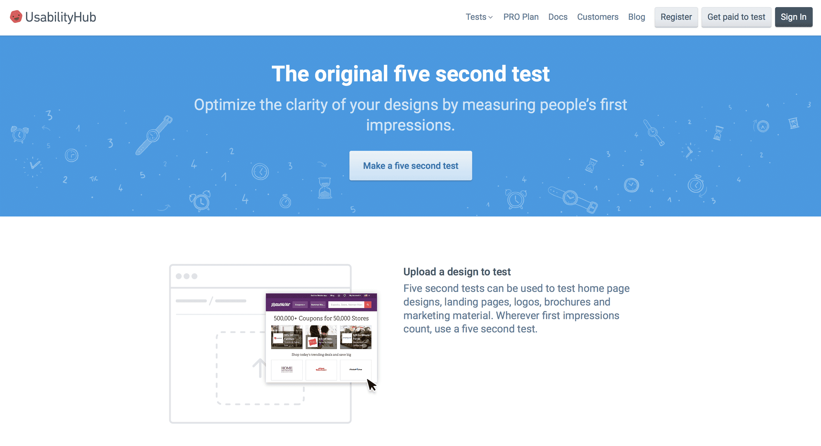
UsabilityHub has a tool that lets you run a five-second test online. You simply upload a design, write a few questions and run your test. Users will see your design for 5 seconds and then answer your questions.
Easy, right?
The only caveat here is that you can’t really choose who takes your test. That means the people who are responding to your questions may not have a lot in common with your target audience.
But still, a 5-second test like this can teach you a lot about what sticks out to people on your page.
Of course, the low-tech way to run a 5-second test is to simply ask someone to look at your page for 5 seconds and then ask them questions about the page.
Make sure to ask more than one person and feel free to ask your colleagues, customers and even your friends about what stands out on your page. Just remember, it’s important to ask each person the same questions so you can identify broad themes in your answers.
Overall, 5-second tests can be a great way to determine the clarity of your page. After all, if someone doesn’t understand your page after 5 seconds, you’re probably not making the right first impression.
2. Use Heat Maps
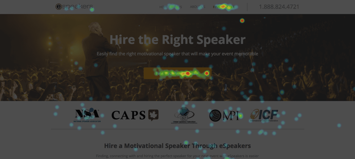
Heat maps show you where people leave their cursors and which parts of your page they are clicking on. In general, the more clicks a part of your page gets, the more interested people probably are.
For example, here’s a heat map we recently ran for a company called eSpeakers . Can you guess which parts of the page people were most interested in?
You can use heat maps for a lot of things, but they are particularly good at showing you where your page might be confusing people.
So, if your customers are clicking on text that doesn’t actually have any sort of link associated with it, that may be a good sign that something is off—either you need to add a link or you need to change your page so that you aren’t confusing people.
Case in point, we recently used this technique to improve eSpeaker’s conversion rates by 11x .
Pretty nice, right?
Trying Out Heat Maps
Lots of companies have heat map services and many even offer trial periods, so you should be able to run a heat map on your site or page for free.
Just remember, heat maps aren’t perfect.
They aren’t eye-tracking technology that tracks where your users are looking, they track where people rest their mouse and where they click.
As a result, not all heat map data tells you something useful. If you see someone has left their cursor hovering over a certain area for a very long time when there’s really nothing interesting there, they may have just left their computer to stop their pizza from burning.
Remember, look for weird data and see if it reoccurs. In all likelihood, anomalies will be just that: anomalies.
But, if you find some significant and problematic trends on your page, you’ve probably uncovered a great opportunity to improve the performance of your site.
3. Add an On-Page Survey
One of the best ways to learn more about what kind of first impression your site made is to simply ask the people on your site about their experience.
Using a service like Qualtrics , Qualaroo or VWO , you can very easily add an on-page survey that triggers when someone tries to leave your page without converting.
However, instead of making a last-ditch attempt to get people to convert, you can simply ask them why they are leaving, what they noticed most about your page or what the best (or worst) part of your page was.
Anyone who completes your survey will give you a lot of insight into their specific experience, but remember, it’s better to focus on trends than it is to respond to individual opinions—no matter how strong of an opinion it may be.
Conclusion
Unfortunately, most people leave a poor first impression without realizing it. The same holds true for many websites.
The good news is, there are a few easy and affordable ways to find out whether or not your pages are setting your site up for success.
- Five-second tests can help you discover what stands out about your site.
- Heat mapping teaches you what people care about on your page...or where they are getting stuck.
- On-page surveys give you specific details about your site experience—what works and what doesn’t.
Remember, when it comes to online traffic, you don’t have long to get their attention, so make sure your site makes the best impression possible!
Have you seen any sites whose user experience made you gag? What about sites that drew you in so much they were almost magical? Let me know in the comments.
Don’t miss out these all-time favourites
- The best hosting for a WordPress website. Tap our link to get the best price on the market with 82% off. If HostPapa didn’t impress you check out other alternatives.
- Monthly SEO service and On-Page SEO - to increase your website organic traffic.
- Website Installation service - to get your template up and running within just 6 hours without hassle. No minute is wasted and the work is going.
- ONE Membership - to download unlimited number of WordPress themes, plugins, ppt and other products within one license. Since bigger is always better.
Get more to your email
Subscribe to our newsletter and access exclusive content and offers available only to MonsterPost subscribers.


Leave a Reply
You must be logged in to post a comment.