


Many elements make a good website great. And one of the elements is smart website navigation design.
We have already discussed how effective website navigation works. Now it’s time to look closely at common website navigation mistakes that stand in the way of perfect web design.
There are our top 5 most frequent mistakes in website navigation and our tips on how to avoid them.
Mistake 1: Too Many Options
You must have already seen all these monstrous websites with the infinite numbers of links and options in the website navigation menu.
Something like that:

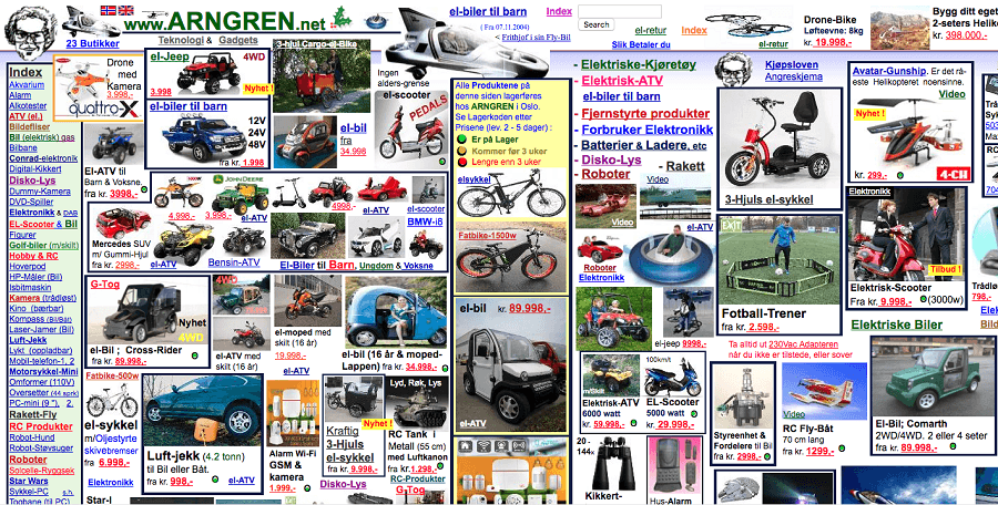
It seems like the designers wanted to make the navigation as much comprehensive as possible. But the result only causes confusion when the users can’t find the core information in this information overload.
There are cases when too many menu items make the result not that bad but not good either:


Solution
There is a proven fact that the ability of human mind to hold information in the memory is limited to 7 items. You should keep it in mind when designing your primary navigation. Challenge yourself by providing the users only the essential information limited to 7 items or even less. Believe us, that’s just the case when fewer is the better - each removed menu option makes the remained ones look catchier.
Mistake 2: Wrong Order Of Options
Let’s imagine, that we managed to pare down the menu options to the minimum cutting away all the fat and bloat. Now what? That’s right; now we have to put them in the right order.
Unfortunately, some people still have some problems doing that. Look how sweet this website navigation example (apart from being a total mistake one disaster) placed the “forum room” link between the “UFO’s and aliens” and “pagan trinity of Rome.” I mean, if you’re having a breakdown, at least put your menu option right:


Source
Solution
Options have the most prominent impact on the users when they positioned first or last on the list. The reason why is the serial-position effect based on the fact that a person recalls the first and last items in a series best. So, all you need is to place the most essential items along the edges and the least important ones in the middle. Remember about the conventions: some elements such as “log in” or “contacts” have their own traditionally established locations.


Mistake 3: Unconventional Navigation Style
Designing website navigation is not the best time for being too creative. The intricate system of odd icons, buttons, and shortcuts placed in the weird site areas is a bad idea that can backfire on your site’s aesthetics and usability. As the car designers don’t experiment with the location of a gas or a brake pedal, so web designers shouldn’t be over-innovative or that daredevil to create this:

Source
We haven’t found the search box yet, have you?
This website’s problem is that it has not one, not even two, but three navigation menus at once! The left menu, the right menu and the top horizontal menu are very unconventional and unproductive choice for the e-commerce.

Solution
Each web navigation’s primary purpose is to guide a user and help him find the relevant information as fast and easy as it possible. Users are hence generally expected to see the navigation bar placed on the top or the left side of the webpage. Toying with the conventions might confuse the users and reduce the number of visitors.
Mistake 4: Unreadability
The importance of web content optimization is already generally recognized. Yet sometimes people forget that all their effort might go in vain if the content is not reader-friendly.
Multiple fonts in the text make the page look cluttered. Large, uninterrupted blocks of text are as bad as the excessive visual content. On the web users do not read the whole text slowly absorbing its essence. They tend to scan the information, jumping from one point to the next. And if your site looks like visual and information overload overwhelms users, well, you’re in big trouble.
This colorful background with the text in capitals will make you feel real pain.

Source
The disastrous website interface can obscure (or ruin, more precisely) even the high-quality content.
Solution
According to a study by the Norman Nielsen Group, site’s visitors scroll through about 50-60% of the text on your site. We don’t want this number to reduce dramatically because the users can’t physically read the text, do we? So how to avoid this website navigation mistake? It’s simple: don’t use controversial color schemes, choose your fonts wisely, all the navigation icons are visible and, ultimately, enhance the conversation with your visitors.
Free Ways To Grow Your Website: $0 Budget Ideas [Free Ebook]
Mistake 5: No Responsive Design
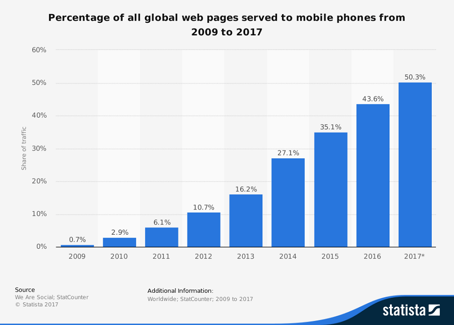
We can’t argue with technical progress. According to Statista, today there are more than 50% of web pages are loaded on the mobile devices. All these mobile users are potential customers, and you can’t ignore such target market.

Unresponsive websites distort the way your website appears on mobile devices: text bounces, images fuse together, the search box is nowhere to be seen. You run risks that your visitors would switch to the competitors.
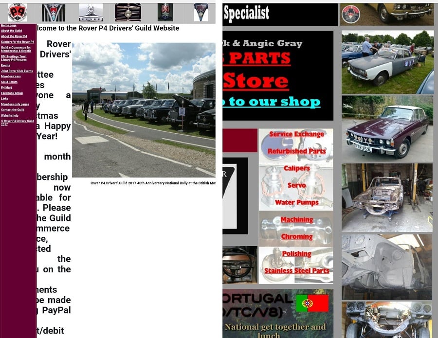
For example, this site (that doesn’t look great on the desktop either) is not good for the mobile devices.

Solution
It’s obvious: make your website responsive! One of the responsive site’s benefits is that there’s lower maintenance plus higher credibility. Everybody knows that Google favors mobile-friendly websites. Don’t make your user choose between the website and a device.
Conclusion
As one of the great design principles state: Keep It Simple, Stupid (KISS). Do not overthink and overcomplicate. The website navigation design best practices are straightforward: The three pillars that the most effective web navigation leans on are a stable structure, clear design, and pure minimalism. Improve yourself and let Umbrella be by your side.


Read Also
Creative and Innovative Eye Catchy Website Navigation Design
What Your Audience Wants From Your Site’s Navigation
20 Strategies to Max Results from Filtered Navigation on Your Site
Creating a WordPress Navigation for your Theme
How Effective is Hamburger Navigation Menu for Responsive Websites?