What Your Audience Wants From Your Site’s Navigation
Something interesting happened to Yahoo’s web page between 2010 and 2012, and it’s something anyone who builds web content can learn from. Visit hweb.archive.org, also known as the Wayback Machine, and take a look at the Yahoo homepage in 2009. Next, look at it in 2010 and 2012. Finally, take a look at the site in the past few years, and the current site.
In addition to dredging up a bunch of old memories, what you’re observing in these builds of the popular search engine and mail client is the evolution of modern UX design. The 2009 site is simple — just a search bar and a box of links.
By 2010, sweeping changes set in. Left navigation links to all manner of things, a light box in the middle, another tabbed box below that, and on the right, trending issues! The page is dominated by an overwhelming amount of text and hyperlinks. As the years pass, all the links move left, and white space increases. Yahoo gets less stressful to look at.
The 80/20 Rule
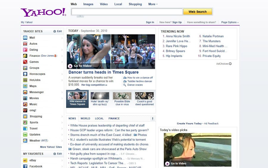
One of the most important components in UX is navigation. The 2010 version of Yahoo’s site is a clinic in how not to build navigation. It’s cluttered with small text that makes it difficult to tell what’s important. Nearly everything is the same color, and there’s almost no white space on the page to break up the different elements.
The 2010 iteration of Yahoo represents their first step into providing content, not just search results. What we got was the kitchen sink. At least they knew enough to put the email link at the top left and the search bar at the top.
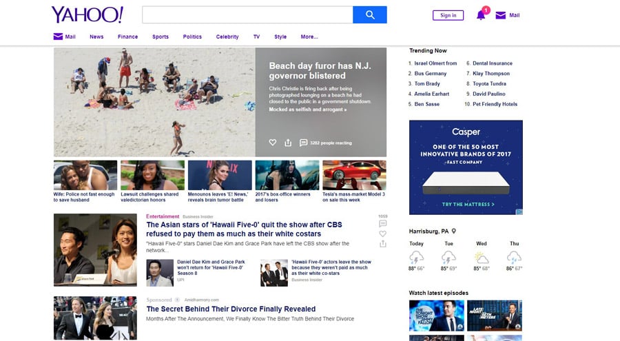
A look at today’s much cleaner Yahoo.com shows what a decade of UX research can do. Gone are the overwhelming small text links. Prominent elements on the page are dedicated to a small number of items most users come for. This is known as the 80/20 rule: If 20 percent of people have to miss out to make the site more usable for 80 percent of people, too bad. You can’t make everyone happy.
Honor the Standards
In 20 years of content creation, we’ve learned a lot more about building personal and business websites than just “Clutter is bad.” Certain aspects of site design have become the convention, and unless you want to spend a lot of time testing new designs on novice users, sticking to them is the best way to ensure user satisfaction.
You’re probably familiar with many of these, even if you don’t realize it. Navigational elements should be placed to the left or across the top of a site, never to the right.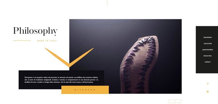
For an excellent example of this, take a look at Measponte.it. This website belongs to an Italian shoemaker, and it delivers on the promise of style the nation is known for, all while keeping the page clean and providing five simple links on the right to take you anywhere you want to go.
Eliminate Ambiguity
Simplicity is always important on a landing page, but if your website is more involved — for example, if your site is for a retail business and needs dedicated content about each product — you’ve also got to communicate clearly.
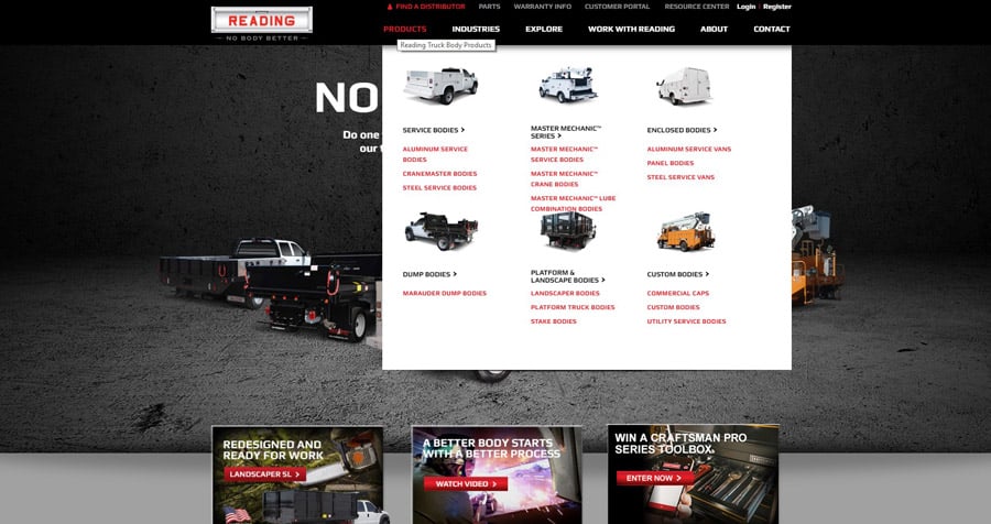
Generic labels like “view our trucks” don’t help users get where they need to go. This can lead to frustration, which leads to exits and lower conversion rates. A good example of how to cater to your audience in a niche retail setting is the Reading Truck Body main menu. This menu contains descriptive links to each of the bodies Reading offers, with pictures for shoppers who don’t know the industry terms.
Recognition, Not Recall
Speaking of pictures, when we talk about navigational conventions, we have to talk about icons. An important UX concept to remember when you’re building navigation is recognition over recall. That is, someone who doesn’t know anything about a given link should be able to look at it and know what it does — don’t assume they’ve already been there and clicked everything to find out.
For this one, we’re going to the champions of the internet themselves, Google. Google’s home page has long been hailed as a triumph of effective design, but for this particular concept let’s focus on the Google ‘Options’ link.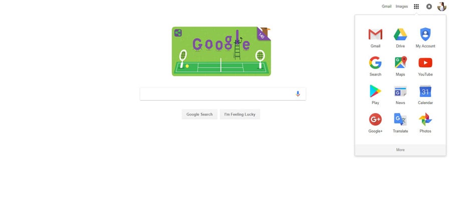
It looks like a grid full of icons, click it, and that’s what you see. Each icon is well thought out, the account icon is shaped like a shield so you know that it’s where you control security, the news icon is styled like a newspaper, and the maps icon looks like a map. These icons have become so popular many competitors now emulate them.
Be Consistent
Consistency is crucial in website design. You might assume consistency and conventions are synonymous, but there are subtle differences between the two practices.
There are many aspects of your website you can — and should — customize. The color scheme is a great example of this. You can bring your site to life with the clever use of colors, but if you get carried away and use a huge palette with different colors in different places, you’re forfeiting a powerful method of communicating with your audience.
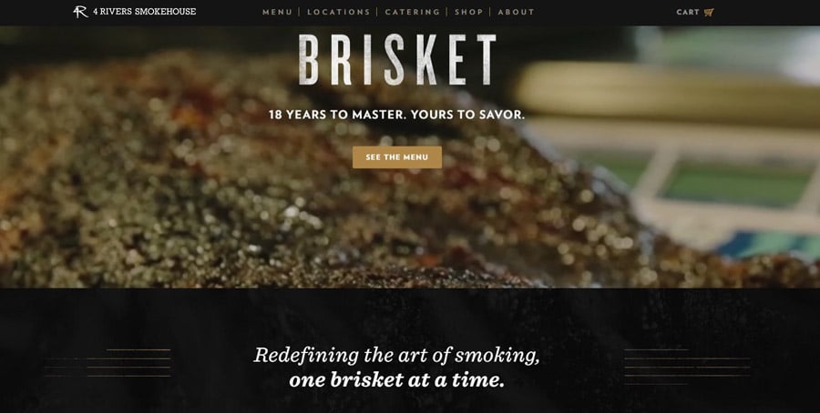
4 Rivers Smokehouse has a website that will make your mouth water, but the semantics of the site’s design is relatively simple. They use a black background, which can be a challenge, but they pull it off with consistency. They have two fonts for use in various cases, and a few italicized headers and all the links on the site have the same hover effect in a meaty red/orange hue. It’s different, in a good way.
Tips by Industry
The needs of your audience will dictate what types of challenges you face in building navigation. Retail sites should focus on clarity and strong graphical examples. Informational sites should promote search features and keep initial options relatively low. Service sites should always give people a prominent contact link, and be clear about what the company does.
Building effective navigation is trickier than you might think, but it’s not impossible. If you need inspiration, you can always pull up a similar site to yours and compare UX, or browse the Web to find other examples of good design. It’s not 2009 anymore — people expect you to get it right.

Related Posts
- The Ten Best WordPress Navigation Menu Plugins for Your Website
- 20 Strategies to Max Results from Filtered Navigation on Your Site
- How to Build a Slide-Out Navigation Menu With CSS & jQuery
- Color-Coded Dropdown Navigation with Submenus
- How to Add More Navigation Menus to Your WordPress Theme
- How to Build WordPress Navigation Using wp_nav_menu

I am a blogger, writer, and designer. Interests: web design, fonts and typography, UX/UI, logo creation, fiction, and non-fiction. Meet me on Quora.
Get more to your email
Subscribe to our newsletter and access exclusive content and offers available only to MonsterPost subscribers.

Leave a Reply
You must be logged in to post a comment.