Complementary Colors
Complementary colors is the term, which is used to describe any combination of 2 hues that are placed accurately opposite each other on the basic color wheel. To illustrate the situation, let’s take a closer look at the picture below. As you can see, there is red color and its opposite green.
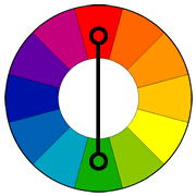
Without a doubt, these days it is quite popular to use the complementary colors for various projects, as such successful pairs of the basic color wheel have a unique relationship. That is why these colors bring you the intense and bright appearance, when they are used together. Thus, being opposite, the chosen colors show us an awesome contrast because one of them is always warm and the next is always cold. By the way, in Color Theory there is a name of such phenomenon, called Simultaneous Contrast. What is more, don’t forget about the fact that any 2 opposites ‘complete’ each other and it means that they will additionally reduce the effect of each other when mixed together. Talking about the mentioned colors (red plus green), their combination reminds people about Christmas and so they are also pretty popular to be used together because of the pleasant appearance of such color mix. Unquestionably, you will remind more winning combinations of contrasting colors, if you will take a closer look at the picture above.
About Color Wheel
First of all, the color wheel (or color circle) is the name of the basic tool, which was made for a pleasant colors combining. Historically, the first circular color diagram was created in 1666 by well-known Sir Isaac Newton. As you can see on the image below, the color circle was made the way that one may take almost each pair of the colors, included to the color wheel, and they will look awesome together. Without a doubt, during the last years there were made a lot of variations of the basic design. Still, these days the shown color wheel, which consists of 12 colors (based on the RYB, or artistic, color model) is the most useful and popular one. Basically, the color wheel may be divided into 2 differing groups of the colors. They are warm colors and the cold ones. Shortly, the cold colors are mainly used to make a restful impression, as they bring one the atmosphere of calm. Alternatively, the warm tones are much more energetic and glowing, so they are usually used to make the atmosphere of joy and action. By the way, that there are also black, white and gray colors but they are called neutral.
About the Complementary Colors Mixing
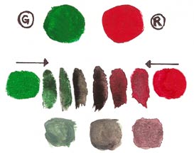
Needless to say, the result of complementary colors anywhere on the color circle always looks incredibly pleasant. Let’s take a look at the picture below, as it shows us a nice example of how the brilliance of every color gets dulled down. All in all, the image tells you how one can quickly get a nice range of neutrals without using black color. The same result you can see with the next colors: red plus green means warm brown; blue plus orange means cool brown; yellow plus purple (violet) means warm gray.
Well, now you know the meaning of complementary colors. Still, I have prepared for you a list of cool articles that may also be helpful. Thus, if you would like to get more information about the subject of this post, don’t forget to view out the next pages: about complementary colors, Color Harmonies - basic techniques for creating color schemes, a basic color wheel: the first step to unlocking the mysteries of color, the International Color Consortium provides more information about color, hue, saturation, and brightness, RGB vs CMS: when to use which and why, role of colors in making websites conversion-friendly, color theory explained: what color scheme should I choose, green color in web design. In addition, I suggest you check this cool color calculator.
All in all, don’t hesitate to leave all your thoughts and questions in the comments below this post. Furthermore, I would like you to tell me your own definition of complementary colors! Maybe you have something to add? For these simple reasons, just leave your comment below!
Finally, it’s time to learn other terms that are related to complementary colors!
Related terms: color harmonies, hue, saturation, and brightness, RGB, CMYK, Primary, Secondary and Tertiary Colors.
References and further reading:
- Color Harmonies or color chords are the combinations of color that include 2 or more colors with a fixed relation in the color wheel and are considered especially satisfying.
- Hue, saturation, and brightness are the aspects of color in the red, green and blue (RGB) color scheme. In general, these terms are mostly used in reference to the color of every pixel in a CRT (cathode ray tube) display. To continue, we can specify all the possible colors according to hue, saturation and, of course, brightness, (that may also be called brilliance) just as the colors can be shown in terms of the R, G and B components.
- RGB means Red, green and blue. To make a long story short, the RGB term refers to a system for representing the colors to be used on a computer display. Thus, red, green, and blue can be combined in various proportions to obtain any color in the visible spectrum. Levels of R, G, and B can each range from 0 to 100 percent of full intensity. That is why each level is represented by the range of decimal numbers from 0 to 255 (256 levels for each color), equivalent to the range of binary numbers from 00000000 to 11111111, or hexadecimal 00 to FF. Logically, the total number of available colors is 256 x 256 x 256, or 16,777,216 possible colors.
- CMYK(cyan, magenta, yellow, key) is an abbreviation for the name of the scheme, which combines the primary pigments. Thus, C means cyan (aqua), M means magenta (pink), Y is for yellow and K stands for the key. As you may know, these days K color means black in the modern printing world. Still, things have not always gone this way. Historically, there were other colors used for Key: brown and even blue.
- Primary, Secondary and Tertiary Colors are the colors included to the substantive (or RYB). Generally speaking, the primary colors are red, yellow and blue, when the secondary ones are green orange and purple – the colors that one can get by mixing the tones from the first group. In addition, there are also 6 tertiary colors that you can get by mixing the colors from the first and the second groups.