TOP 30 Professional Email Templates for Business 2020
Decided to build a productive marketing campaign and drag more customers to your business but don’t know where to start at? We have a perfect solution for you! Browse our great set of email templates for business to get the undivided attention of your clients.
Created by qualified web developers, our business email newsletter templates are highly functional and beautifully designed. Introducing your news, the updates and ads in a right way is a crucial part of any business. That’s why each business email template has been tested with a Campaign monitor, MailChimp and other email services to guarantee that your content will always look neat and organized. Fully responsive design ensures that your emails will look great on any screen, no matter which device your clients are going to use.
Email Listing Done Right: an Ultimate Guide from Template Monster [Free eBook]
Business newsletter templates are perfectly suitable for any type of commercial campaigns, providing you with diverse features from sharing the updates to sending subscriptions to broaden your client base. Buying a newsletter template you will see how the ready email will look like. You will also have an opportunity to set and edit your template any way you like in the Adobe editor. Layered PSD files will make it easy and headache-free.
Astonish your clients and gain some new ones with our business email templates. Look through the best newsletter email templates to find out more about unlimited commercial campaign possibilities.
If you want to create a highly professional and eye-catching marketing campaign via the email, then take a look at the Ultimate Digital Marketing Bundle. This is a newbie but top-notch set of stunning elements that can raise your productivity several times over. Let’s look through some significant features which you should pay attention to:
- sorting for more than 15 holiday
- fully editable and easy to customize
- responsive design
Certainly, you desire to know what is hidden in this fresh bundle. Then, it’s time to show all the aces:
- 15 newsletter templates
- 9 fonts
- 10 icons
- 20 logos and illustrations
- 6 mockups
All of these characteristics will work on your campaign and help to look at its best at any time.
I also want to offer you an opportunity to get more email templates for business at a super low price in order to choose the best of the best. You can do this with the help of our new subscription service with the name ONE. ONE by TemplateMonster offers you endless downloads of templates for only $19 a month! You just subscribe for ONE and get access to a huge bundle of products. Check out Newsletter Templates to know which items are in ONE package. If you are a reader of our blog, you can save much more money with the promo code BecomeThe1. It will give you a 5% discount. Grab the spoon and don’t wait too long!
TOP 30 Professional Email Templates for Business 2020
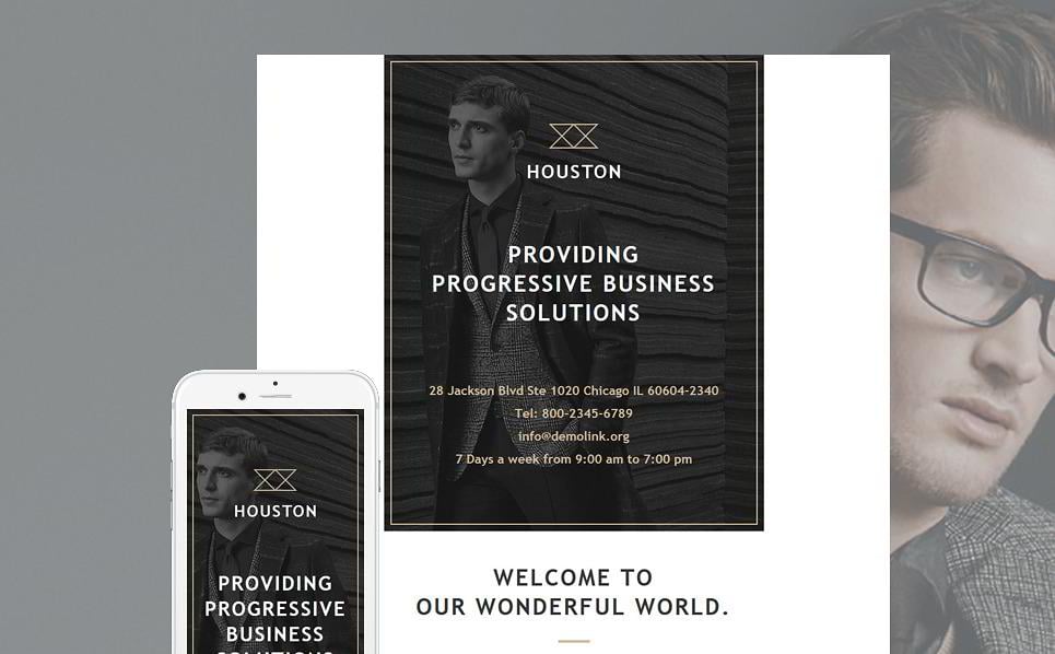
Professional Business Email Template
The Professional Business Email Template is advised for any type of a business website. Though it can be easily used in other spheres. Dark background creates a stylish image and presents your content from the best side. The template supports all major email clients, making it easy to reach your clients and arouse the interest in your product. This template is also featured in the collection of 15 Amazing Responsive Email Newsletter Templates.
LIVE DEMO | VIEW DETAILS | HOSTING
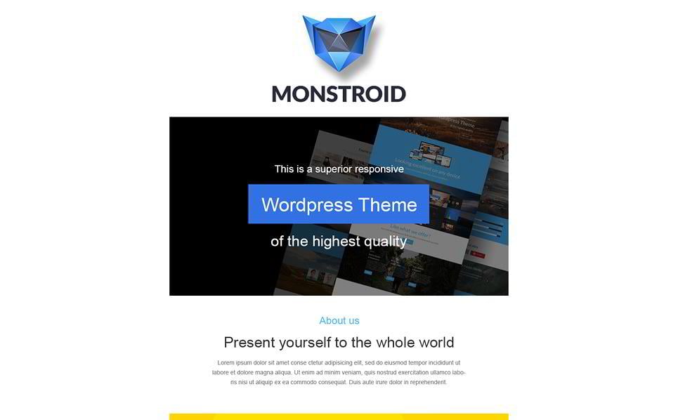
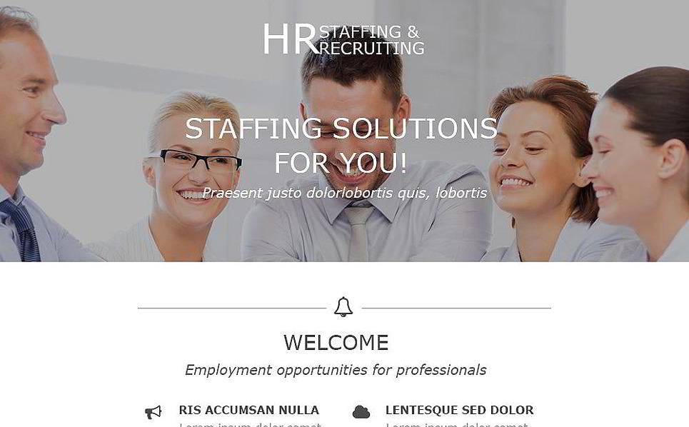
Email Template for Business Solutions
The striking Email Template for Business Solutions with a light background and 1 column structure will give you an opportunity to organize your content highlighting all the important things. The responsive design renders your texts and images correctly on any screen, that’s why your clients will have a perfect data representation using any device.
Steven S.
Template lives up to expectations.
The template is easy to use and contains many great features.
LIVE DEMO | VIEW DETAILS | HOSTING
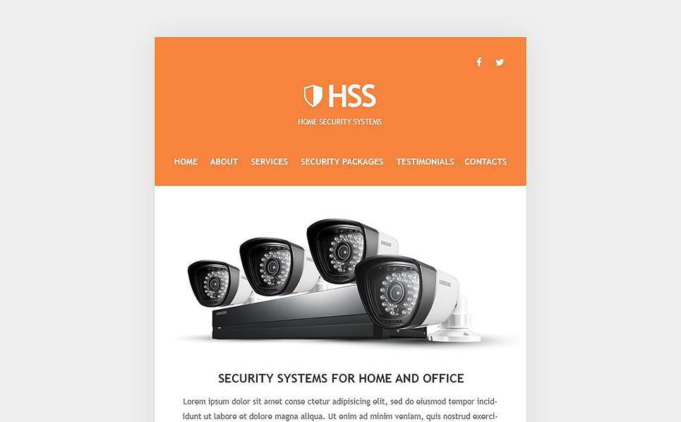
Business Email Newsletter Template
This professional looking Business Email Newsletter Template will be a perfect fit for your company. Designed for security systems dealer, it can also be used for any other type of business. Thanks to the fully responsive design, this template renders well on modern gadgets. It is compatible with a number of email systems. Whether you use AOL Mail, Apple Mail, Gmail App for Android (partly supported) or any other clients, your email will look the same perfect.
Bigica C.
Simple.
It saved me a lot of time from designing one myself since it was for a frined and i was not charging him anything for it. I had the site up and running in under 2 hours so it was a good experience working with templatemonster.
Business Newsletter Template
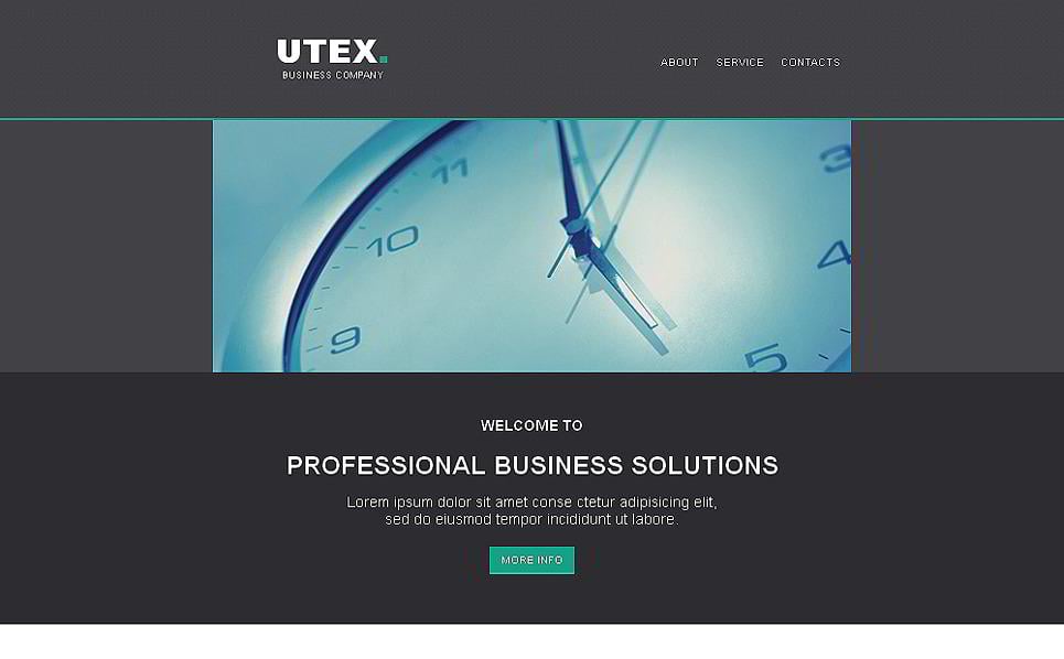
This ambient Utex Business Email Template looks classy and professional. It has quite a reserved design, so it will fit a newsletter in corporate style best. The dark background and 1 column structure will allow organizing your content in the best possible way. Besides, this template is compatible with the majority of modern email systems.
Jeppe K.
Simple, easy to edit and good-looking Newsletter template
I was in need of a Newsletter template for one of my customers. What they needed was a template showing their new products and initiatives, and similarly show their identity through the design of the newsletter.
I found this one, and did some smaller adjustements to make colours and layout fit perfect for my customer needs: https://www.templatemonster.com/demo/49297.html
Starting on the project, after an easy download and install, I had a few questions about CSS and tables, which was quickly answered on template monsters website using the Live Chat …
All in all a great success, both for me and for my customer 🙂
LIVE DEMO | VIEW DETAILS | HOSTING
Business Email Template
The high-quality Business Email Template with a bright red background is perfect for dragging the attention of your customers to the information you want to share. Beautifully designed, it’s also Mailchimp and Campaign Monitor ready to help you make your commercial campaigns easily accessible.
Marcello Savorani (Software Engineer & Security Consultant)
I am very satisfied with the method of research of products that are affected. Excellent implementation of the website. Finally are very professional technical support that has followed me in the various requirements about the products purchased. It will definitely be my point of reference for everything related to the graphics. With excellent technical support.
LIVE DEMO | VIEW DETAILS | HOSTING
Professional Email Template for Business
Exclusive Professional Email Template for Business supports all major emails and ensures high quality, speed and accuracy of your website running. Responsive design makes it look attractive on any screen of handheld devices. You can also easily edit the layout and add various graphic elements just in the Adobe editor.
LIVE DEMO | VIEW DETAILS | HOSTING
Business Solutions Newsletter Template
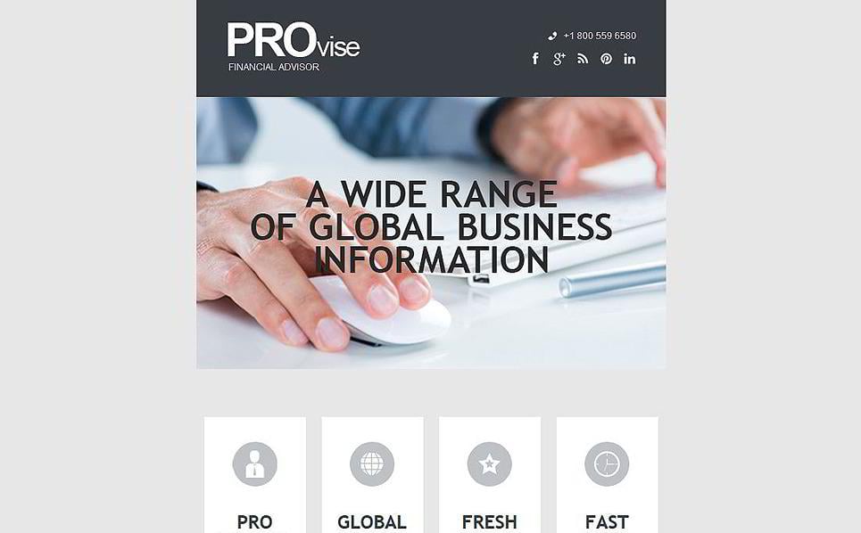
Virginia is the best Business Solutions Newsletter Template for financial advisors. It has a lightweight design and a transparent texture that don't distract from the main content. Great choice of typography gives this item a professional feel. Thanks to the fully layered PSD file you'll be able to change any details with ease.
LIVE DEMO | VIEW DETAILS | HOSTING
Finance Email Newsletter Template
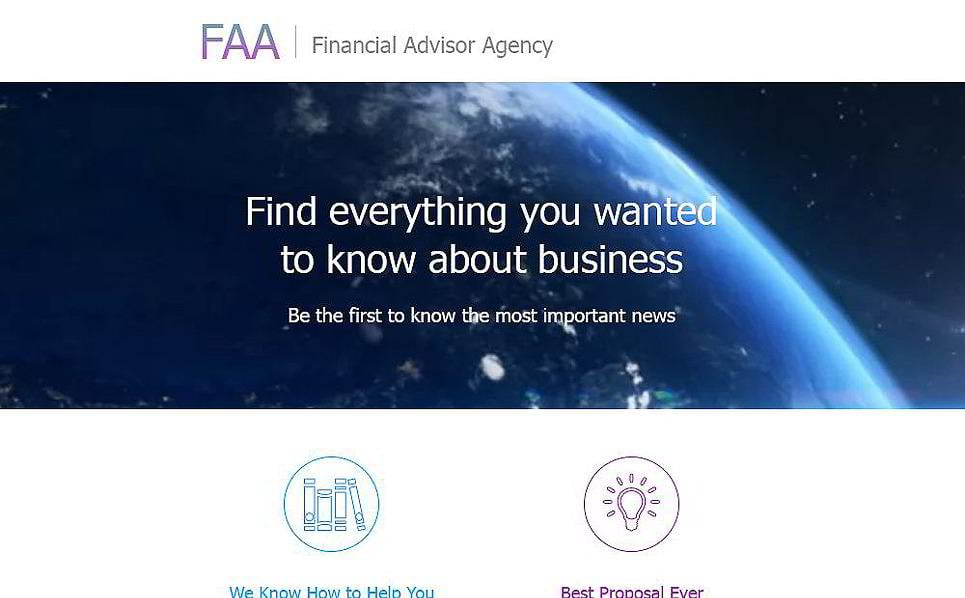
This Finance Email Newsletter Template is best suited for a financial advisor agency. It looks clean and simple, yet this is exactly what you need for a business template to work. Flat minimalist icons look stylish and draw the attention to the most important parts of your content. This template is a Campaign Monitor and MailChimp Ready Template. Feel free to sent out your campaigns fast and easy!
LIVE DEMO | VIEW DETAILS | HOSTING
Email Template for Business
The responsive Email Template for Business with a clean layout is perfect for any business adverts, giveaways and news. You can use a set of stock photos that are provided within the package to make your website more appealing. Template is MailChimp and Campaign Monitor ready helping you easily get into contact with your clients.
Harry P.
Great Template!
Nice layout bugs free template.
LIVE DEMO | VIEW DETAILS | HOSTING
Consulting Responsive Newsletter Template
The foremost Consulting Responsive Newsletter Template is quite the thing for getting more subscriptions and leads. The responsive design and cross-browser compatibility will help your emails look great providing your clients with the best user-experience. Layered files and package guides will help you set the style of your email with ease.
LIVE DEMO | VIEW DETAILS | HOSTING
New Year Email Newsletter Template
LIVE DEMO | VIEW DETAILS | HOSTING
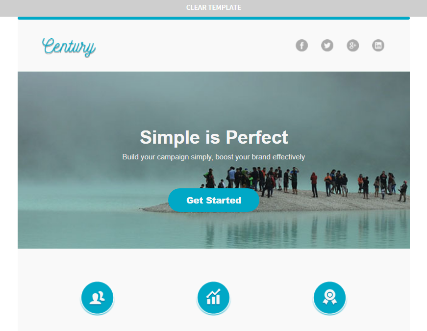
Century Email Newsletter Template
LIVE DEMO | VIEW DETAILS | HOSTING
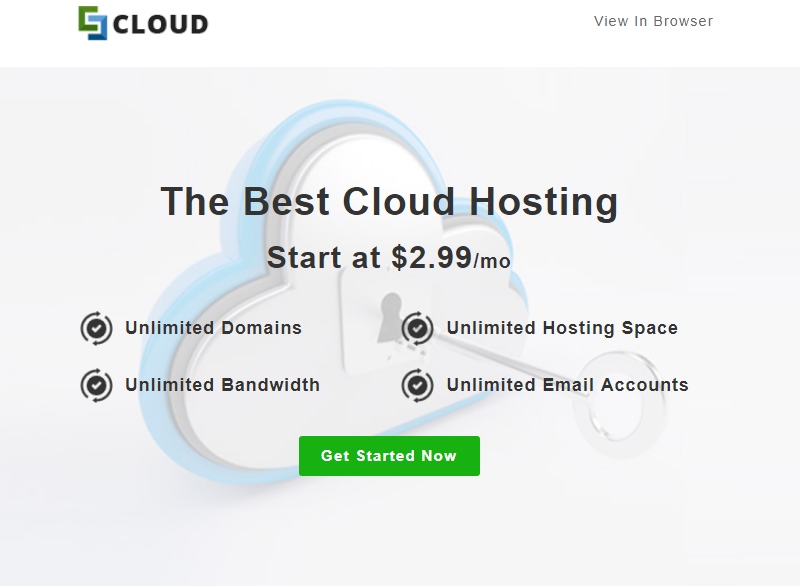
Cloud Newsletter Template
LIVE DEMO | VIEW DETAILS | HOSTING
Domain Newsletter Template
LIVE DEMO | VIEW DETAILS | HOSTING
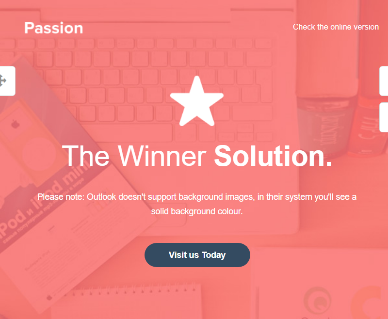
Passion HTML Email + Online Builder Newsletter Template
LIVE DEMO | VIEW DETAILS | HOSTING
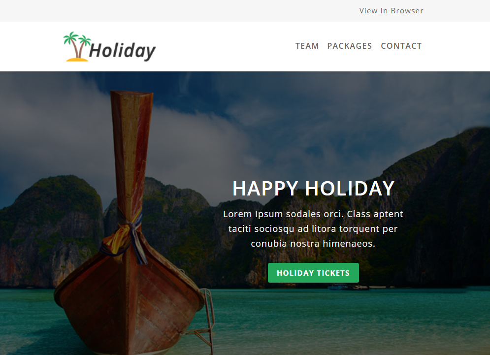
Holiday Newsletter Template
LIVE DEMO | VIEW DETAILS | HOSTING
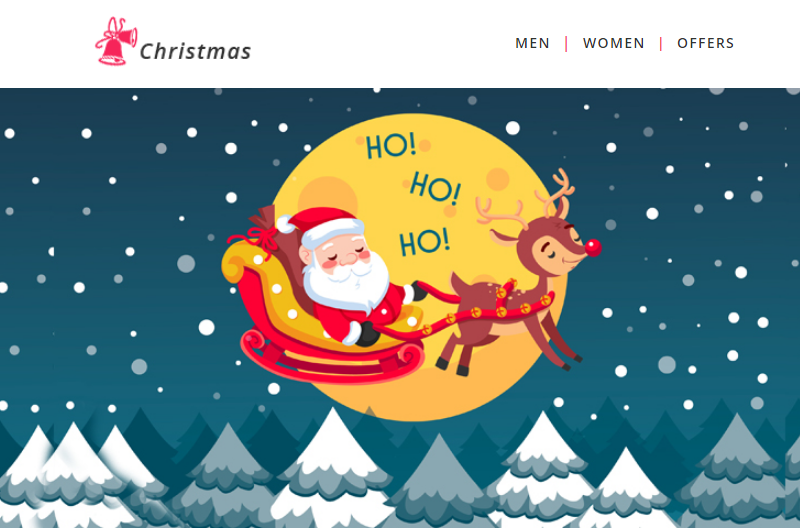
Christmas - Responsive Newsletter Template
LIVE DEMO | VIEW DETAILS | HOSTING
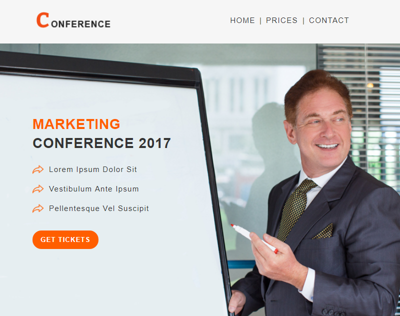
Conference - Responsive Newsletter Template
LIVE DEMO | VIEW DETAILS | HOSTING
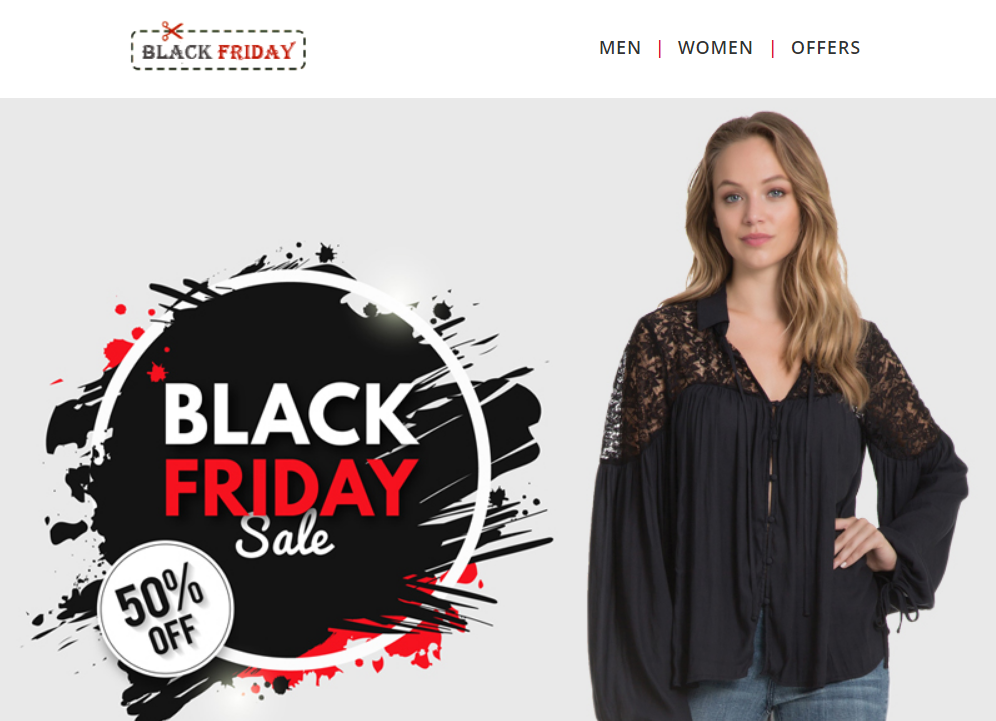
Black Friday - Email Newsletter Template
LIVE DEMO | VIEW DETAILS | HOSTING
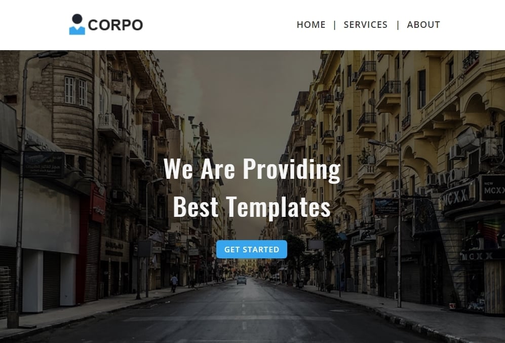
Corporate - Multipurpose Responsive Newsletter Template
LIVE DEMO | VIEW DETAILS | HOSTING
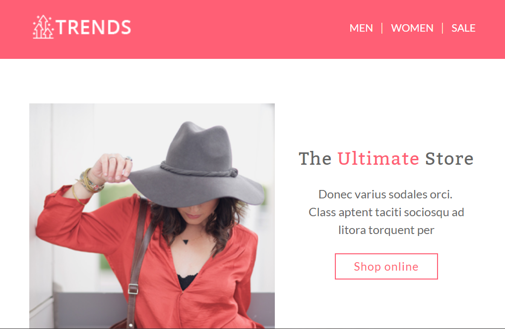
Trends - Responsive Newsletter Template
LIVE DEMO | VIEW DETAILS | HOSTING
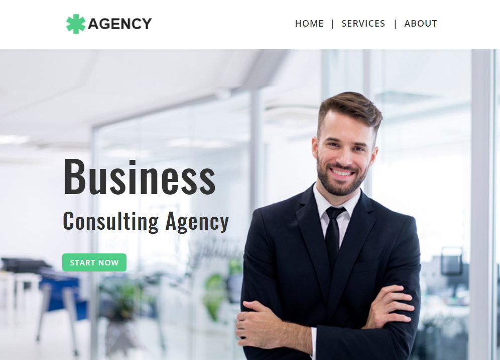
Agency - Multipurpose Responsive Newsletter Template
LIVE DEMO | VIEW DETAILS | HOSTING
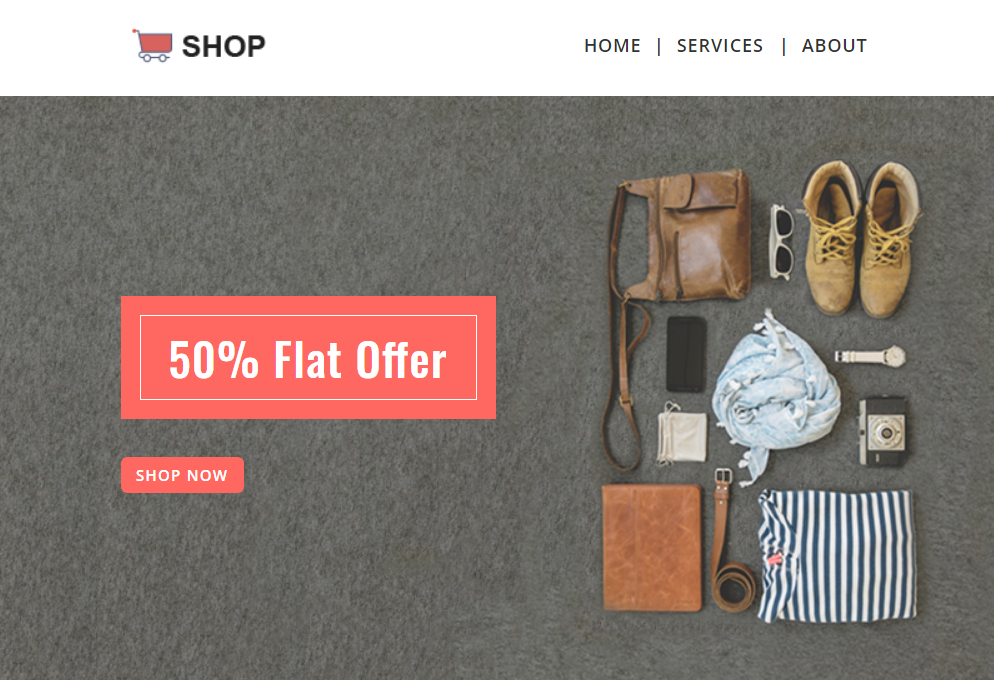
Shopping - Multipurpose Responsive Newsletter Template
LIVE DEMO | VIEW DETAILS | HOSTING
Construction - Multipurpose Responsive Newsletter Template
LIVE DEMO | VIEW DETAILS | HOSTING
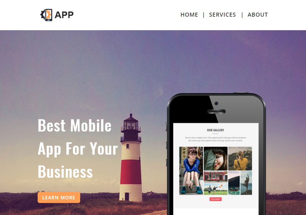
APP - Multipurpose Responsive Newsletter Template
LIVE DEMO | VIEW DETAILS | HOSTING
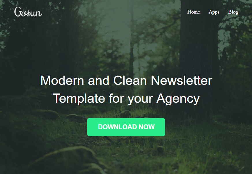
Gurun - Responsive Newsletter Template
LIVE DEMO | VIEW DETAILS | HOSTING
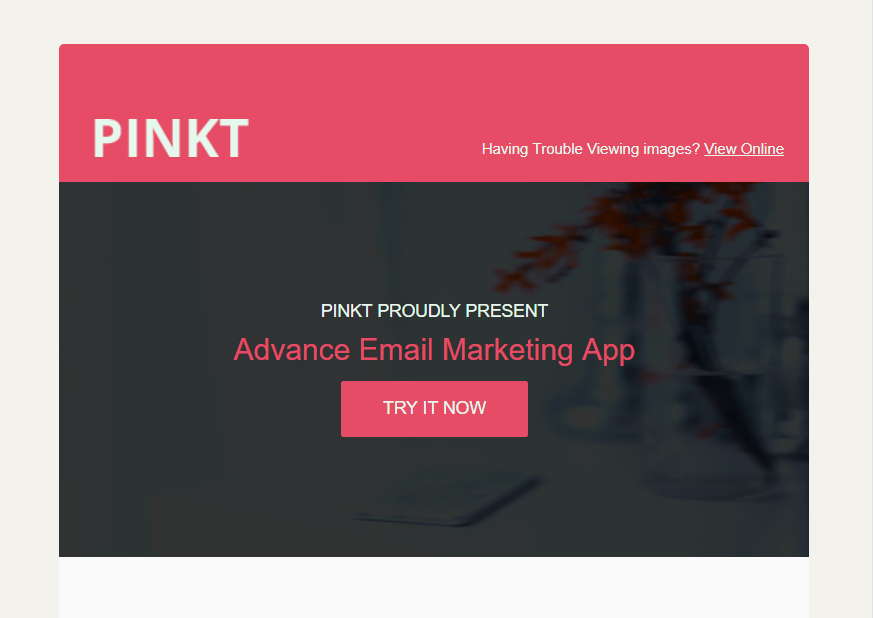
Pinkt - Responsive Newsletter Template
LIVE DEMO | VIEW DETAILS | HOSTING
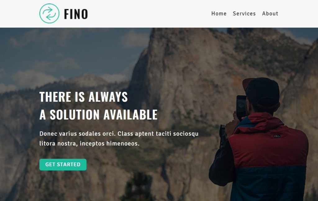
Fino - Responsive Newsletter Template
LIVE DEMO | VIEW DETAILS | HOSTING
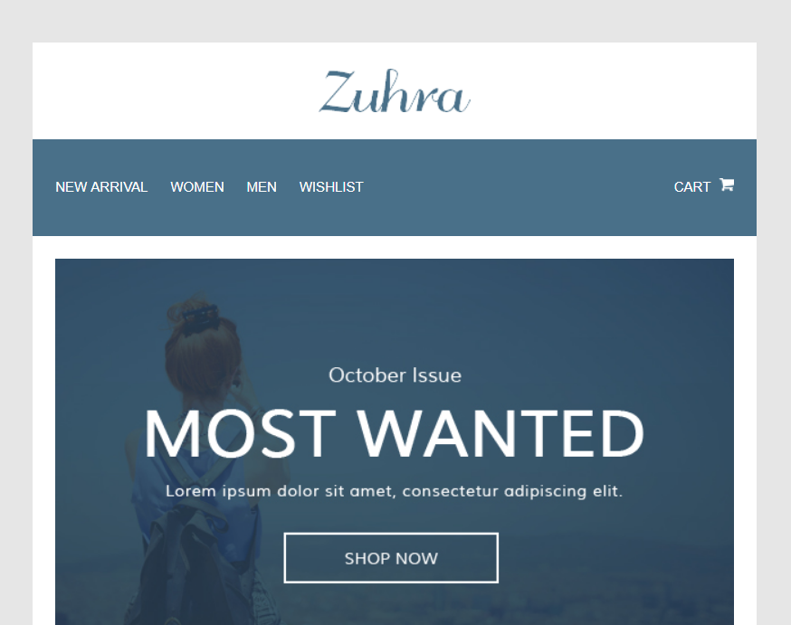
Zuhra - Ecommerce Email Template
LIVE DEMO | VIEW DETAILS | HOSTING
4 Ways to Grow Your Email List
Growing an email list is one of the most important things you should do in your business. This is one of the true assets that you really own. Your search traffic you might lose because of a slight change in Google’s algorithm. Social media channels might disappear. We all know what happened to MySpace.
Email is also one of the best converting channels – it has higher open rates and click-through rates than social media. So it’s clear you should be growing your email list. But how do you it?
Create and give away valuable lead magnets:
Creating and offering valuable lead magnets is one of the best way to grow your email list.
But what type of lead magnet works best? The following 4 examples seem to work really well:
Guide – the most common things you can give away is a free ebook, a how-to guide that teach-es your audience how to solve a specific problem or reach a specific outcome.
The more specific your guides are, the better.
For example:
“How to make money online” is not very specific guide. There are many unanswered things like: how much money, how do you make these money, etc. On the other hand, “How to make $10K/month by blogging” is very specific guide that would be relevant to much more people.
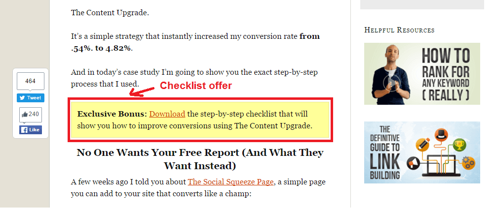
Content Upgrade/Cheat Sheet– the content upgrade is a very simple and effective way to grow your email list. It is easier and faster to create and most often – much more effective. Simply, because you’re offering something that’s much more relevant to your user to what he’s already reading. Imagine that people are reading a blog post on your own website. They really like that content and they’d implement all the things that you thought them to do. However, in order to do that they need to bookmark your page and come back to your site and read it again. It will be much easier and helpful for them if they have a checklist with all the important steps that they need to take in order to accomplish their goal.
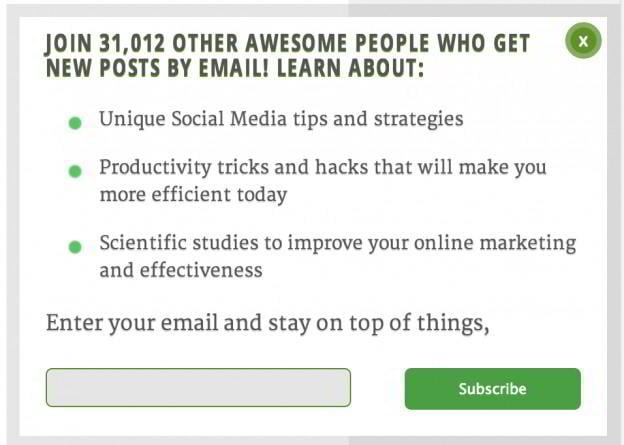
You can offer this checklist inside your blog post like this:
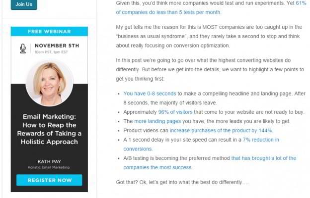
Webinars– KISSmetrics has reported a 10% conversion rate for their web-sites. Which makes webinars one of the best ways to grow your email list fast.
They also tend to attract people who have a stronger intent into solving a particular problem. If you’re willing to spend 1 hour listening on a particular topic you can count that it’s probably really important for you. This means that you will tend to attract not only more but also higher quality leads from your webinar efforts as well. The good thing about webinars is that you can also invite guest speakers to run them so you don’t need to create the content of the webinar yourself.
Video training– the video format is one of the best ways to fully engage your audience. The problem is that if it’s too long people might not spend the time to watch it. So don’t create a 7-day free courses or something like that. Focus on something that is easily consumable and your audience can watch and implement right away. So focus on creating videos that are no more than 1h long. Preferably no more than 30 minutes.
Place your opt-in forms/offers at the right place:
In order to convert as many visitors as you can from your blog, you’d need to place your opt-in forms or offers at the right place. These are the places where we and other marketers have identified as the best for that:
Top bar – the top bar stays on top of the page even when your visitors scroll down the page.
The good thing about it is that it sticks on one place and it is always visible by your visitors. This is where you can present your most desired offer and try to convert as many people as you can into your email list. Be sure to use advanced targeting and display different top bars depending on which blog post people are currently viewing. This will make your top bars much more relevant and will sky rocket your conversion rates.
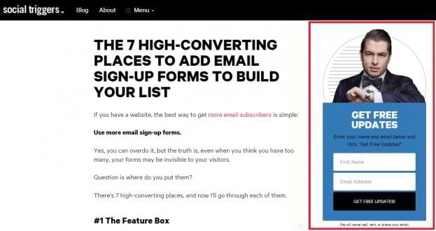
Sidebar – the sidebar is one of the 7 highest converting places forSocial Triggers.
This is where expect to see an opt-in form and will look for your most expected offer. To make your sidebar stand out use contrasting colors. This will naturally drive the eyes of your visitors to look at it.
Inside blog post – as an addition to the yellow box we already described you can also use an embedded form. You can put them anywhere on your page – before, after or in between your blog content. Once again, use contrasting colors to make them stand out visually from the rest of the content.
Slide box– the slide box politely appears in the bottom right cornerwhen the user scrolls down the page. When the visitor closes it down, a cookie is set so it doesn’t show up again for a certain amount of time (that’s set up by the owner of the site – it could be anything from 1 day to 30 days). Buffer states that their slide box is one of their best converting opt-in forms – it accounts for 36.7% of their sign–ups.
Pop-up– exit intent popup is one of the best ways to convert your visitors just before they leave your site. This smart technology tracks the mouse cursor so it knows when someone is about to close the tab within the browser or click the back button. In that moment the exit intent is shown presenting an attractive opt-in offer. Converse Scientist report that 10 to 15% of lost visitors can be saved with exit intent popup forms. To maximize your conversions be sure to use advanced targeting and present offers that are relevant to content your visitor is viewing. Presenting the same offer to everybody will bring you lower conversion rates.
Below blog post CTA– this is HubSpot’s best strategy for converting their blog visitors into email subscribers. Just below the blog post they place a call-to-action banner presenting an attractive offer to the visitor.
Create highly convertible landing page
Usually you will put your lead magnets on a specially designed landing pages. In order to generate as many email subscribers as you can you will need to optimize them for higher conversions. Here’s how to do that:
Focus on the value proposition– the most important aspect of your landing page is the value proposition. What do you offer to your visitors so they will want to give you their email address in ex-change? You need this explain this in a way so that’s clear to them. In order for the value proposition to be effective it must fit the needs of your visitors. It must point that will help them accomplish their most desired goal or solve their biggest problem.
Have 1 clear call-to-action– your most desired action is to capture the email addresses of as many visitors as you can. So keep it that way. Avoid trying to offer sell them something or to promote another lead magnet on the same page. Your clear call-to-action should be get your lead magnet and that’s it.
Remove all distractions– additionally,to maximize conversionson your land-ing pageyou should remove all distracting links and buttons that can loosen the focus. Prefera-bly, remove your main and footer menus and all other navigation.
The focus of your user should be 100% on what you’re offering him in exchange for this email. So he should have only 2 options – opt-in and get the free lead magnet or leave.
Make it relevant to your visitor– your visitor should feel like your landing pages has been created especially for him. A simple way to do that is to add as many specificity as you can.
Who is this page for?
If you state “How to generate real estate leads from social media” this will be really relevant for real estate agents looking for expand on this channel. What will be the end result? “How to make $2,000/month as a copywriter” is a very specific outcome that beginner copywri-ters would be interested to learn. To make your landing page even more relevant to your visitors you should consider adding be-havior targeting based on their interests and the current content people are viewing on your website.
Use urgency– the rule of urgency states thatif something is available only for a limited amount of time, people will be more likely to take action and get it. That’s why it’s a smart move to offer your lead magnets for a limited time only. That way the user will know that he needs to act now. This works incredibly well with webinars and free video trainings.
Drive traffic to your landing page
We have already mentioned how to use your website and blog to grow your email list by plac-ing your opt-in forms at the right places. Additionally, you can use the following ways to drive traffic to your landing pages:
Facebook ads– Facebook provides you with a great way to target your au-dience and generate leads in a cost-effective way.
Target your ads based on:
- Lookalike audience (insert your list of previous customers into Power editor and let Fa-cebook find similar audience to them)
- Interests (segment users based on their interests, likes and changes on their timeline or profile)
- Here are the following best practices to increase your CTRs from Facebook ads:
Use a person, a baby or an animal on the photo - Use the word “Free” and your logo to get the attention of more people
- Use contrasting colors to the Facebook branding – orange, green and red. Avoid white and blue
- Using borders and shadows
AdWords– you can use Adwords to easily generate targeted traffic to your landing page. That way you can also test and identify the best performing keywords for which to further optimize your site. It’s important to optimize your quality score because this allows you to decrease your CPC. That way in the long term with the same amount of budget you will be able to get more clicks and higher position in search (more clicks = more email subscribers) To increase your quality score:
- Stop targeting junk keywords
- Increase your bid
Use tools like SpyFu to dig deeper into the AdWords strategy of your competitors and steal their most profitable keywords.
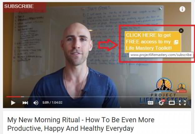
YouTube– to generate leads from YouTube be sure to use clickable annota-tions within your videos pointing to your landing page.
Check out what Project Life Mastery are doing:
Before being able to link to your website from YouTube you need to do the following:
- Verify your YouTube account
- Have an account in good status
- Add your site to Search Console
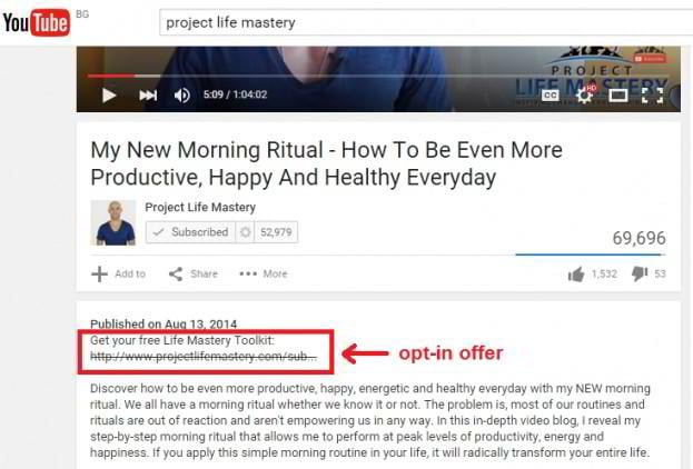
Then to add the annotation go to Video manager -> Creator Studio > Video Manager and select your video. Click the down arrow next to edit button and then annotations. Additionally, you can put a link to your landing page in the video description as well.
Conclusion
Growing an email list is a tough job and it requires a lot of dedication. You will need to get to know your audience better, test different lead magnets, opt-in forms, ways to drive traffic to your landing page, etc. A lot of the strategies that will try will fail, some will work well and you will need to put some work to improve performance. Remember to always be testing new ideas and concepts. That’s the path to success!
Email Listing Done Right: an Ultimate Guide from Template Monster
FAQ
It is a pre-designed email letter you can edit and send to your clients and partners. The template doesn’t contain text but an attractive design.
The professionally designed letter will make a much better impression on the receiver than just a simple text. If you want to amuse the client – the template will help you.
You may be surprised but yes, it is. Lots of people still constantly check their mailboxes and will read the letters you send.
Read Also
How to Write an Effective Follow-Up Email After No Response
8 Free WordPress Email Marketing Plugins for Your Blog
How AMP Technology Can Upgrade Your Email Campaigns
Why Any Business No Matter the Size Needs Email Marketing
Don’t miss out these all-time favourites
- The best hosting for a WordPress website. Tap our link to get the best price on the market with 82% off. If HostPapa didn’t impress you check out other alternatives.
- Monthly SEO service and On-Page SEO - to increase your website organic traffic.
- Website Installation service - to get your template up and running within just 6 hours without hassle. No minute is wasted and the work is going.
- ONE Membership - to download unlimited number of WordPress themes, plugins, ppt and other products within one license. Since bigger is always better.
Get more to your email
Subscribe to our newsletter and access exclusive content and offers available only to MonsterPost subscribers.

