12 Basic Elements Every Graphic Designer Should Know
Have you ever come across a design and felt I can EASILY design this? But, when the time approaches your design deeds doesn’t measure up to the original version.
Don’t despair most of the amateur designers have experienced this. Professional designers are well trained in the basics and have tricks up their sleeves to give their work a professional touch. In this technology-visual realm of digital media, it’s far convenient to create designs but they don’t have to look unprofessional & homemade. You may be wondering how about the tools? Well, the amazing graphic design tools available these days don’t help to build the foundational know-how required for a designer to create well framed professional designs.
I am completely aware of the fact that graphic designing is not as easy as drinking the glass of water. You just cannot begin designing without learning the basics and you cannot succeed till the time you practice with professionals. No matter what you are designing a logo, or some event announcement, a social channel banner or email newsletter, you should start by learning the basics of graphic designing.
Just as a painter needs to master the skills of drawing, color, and material handling before actually coming with an original artwork, a graphic designer needs to master the fundamental and basic concepts of design.
The line, color, shape, space, typeface and such things are the building blocks of a design and you cannot do away with them. Each of these design elements needs detailed understanding and elucidation. Let us explain here 10 basic elements every graphic designer should know.
Line

This is something with which any design endeavor begins. It is about connecting two points for the design purpose of drawing attention to a specific space or a particular location on the interface. For instance, the lines are drawn to separate two series of contents in a magazine or a line is used to separate headlines from the text.
On a different level of explanation, every line has its specific character. For example, vertical lines are strong and they actually stop the movement of our eyes. On the other hand, horizontal lines signify rest and calmness while diagonal lines signify action.
Colour
It is another obvious element in the graphic design that can bestow significance to different on-page elements. There are two important things in this respect, such as color to denote a mood and color to create a harmony. Both have a subtle interrelation as well.
The first one is more about the so-called color theory which gives specific meaning and significance to each color. The second principle is more about creating the right contrast and balance with two or more number of colors.
As per color theory, red is the most energetic, vibrant and violently exuberant color. Blue refers to peace, tranquility, and balance. Green is the color of earthen, humble spirit and invigorates freshness. Yellow is the color of joy, happiness, and intellect. Orange is the color of enthusiasm, fascination, and spiritedness. Purple combines both the stability of blue and vigor and energy of red. White is the color of light, purity, virginity, and cleanliness. Black is equally a color of power, dominance, elegance, and evil.
Shape
Shapes, whether they are geometric or organic in character, helps to incorporate versatility in the interface. With a boundary denoted with either lines or colors, shapes help to emphasize on a particular area or to grab attention on a particular on-page location. In a broader consideration, everything is shaped and how various shapes interact and make harmony with each other ultimately make the difference in design.
Space

Space is another vital element in any design interface. These days use of negative space between on-page elements prove vital to grab attention or to help audience stick to a content. The use of space creates breathing space for the eyes of the onlooker.
Texture
You cannot touch a graphic interface physically, right? But still, if the page offers a sense of three-dimensional feel at least for the eyes, it can be a creative design element.
Proximity
New designers usually arrange the elements randomly around the page trying to decorate the empty space. The picture now looks clumsy and incompetent conveying no information. What’s the solution?
The answer is proximity. Proximity is a technique of grouping different elements together in the relevant section to guide the viewer to the particular part of the message. The proximity brings unity and continuity flow in the concept. The time when these elements unit due to close proximity, they reflect how strong their relationship is.
If you are thinking already designed pictures, like templates it will help you to judge the design principles for customizing an existing design.
Typeface
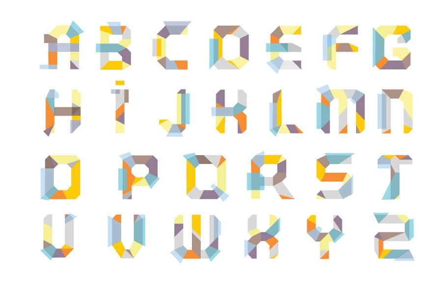
After color, it is the most important design element that every designer should learn to master. There are hundreds of fonts that you can use in your design but you need to consider how every font can help your purpose and your users. For example, if your website is for the kids, you cannot use the same professional font there. Again for website captions and for contents, fonts should be different. The guiding principle about the font in web content should be readability. It should draw the attention of the user to the contents instead of the font itself.
Size
By using different sizes in different design elements designers incorporate creativity and also a sense of hierarchy. From the size of fonts to size of different shapes like text boxes, size can be utilized creatively in more ways than one.
Dominance
Dominance or highlighting of various graphic elements can be utilized to incorporate hierarchy, meaningfulness and creative elements. Dominance can be incorporated with different sizes, color contrasts, depths of shades and depths of lines.
Balance

There are basically two ways to create balance in graphic design, respectively as symmetry and asymmetry. While symmetry helps the balance to be calmer and less distracting, asymmetry is ideal for grabbing attention.
Harmony
Finally, harmony sets itself apart as the main objective of graphic design since it ensures bringing the entire design together with all the constituent elements. Harmony ensures keeping accord among various design elements.
Repetition
Just like the repetition of hooks in a song makes it amazing, the repeating aspects in a design can be visually appealing. The word repetition in design means you repeat few elements of the design throughout the design network. The repetition can vary from the same color to same font or the use of bullet for every particular point.
For example, consider a well-designed book you have in your hand. You will analyze that all the pages have the same format, right from headline stripe to page title, from page number to the corner all the things are consistent. What when one page had comics font and the other page had Calibri font or the headline with different graphic than text styling? It would look eerie.
In short, repetition helps to put emphasis on particular element or goal and accordingly it catches the reader’s attention.
Practice your designs focusing on these basic elements and see what difference you create while implying the basics! Let us know your thoughts, ideas, and tips for learning graphic design.

Don't forget to check out our design studio templates.

I always try to keep up with the freshest changes in the world of design and especially web design. Nowadays, things get outdated really fast. If you don't want to miss something - check up my articles. LinkedIn
Get more to your email
Subscribe to our newsletter and access exclusive content and offers available only to MonsterPost subscribers.

Leave a Reply
You must be logged in to post a comment.